- Published on
How To Make A Button 4 Colors With Tailwind CSS From Scratch
- What is Tailwind CSS?
- The description of Button 4 Colors ui component
- Why use Tailwind CSS to create a Button 4 Colors ui component?
- The preview of Button 4 Colors ui component
- The source code of Button 4 Colors ui component
- How to create a Button 4 Colors with Tailwind CSS?
- Step 1: Create a button element
- Step 2: Add additional color options
- Step 3: Customize the button
- Conclusion
What is Tailwind CSS?
Tailwind CSS is a utility-first CSS framework that helps developers to create responsive and customizable user interfaces quickly. It provides a set of pre-defined CSS classes that can be used to style HTML elements without writing any CSS code.
The description of Button 4 Colors ui component
Button 4 Colors is a user interface component that allows users to select from four different color options. This component is commonly used in web applications to allow users to choose a color for a specific action or feature.
Why use Tailwind CSS to create a Button 4 Colors ui component?
Tailwind CSS provides a set of pre-defined utility classes that can be used to create a Button 4 Colors ui component quickly and easily. These classes can be customized to match the design and branding of your web application.
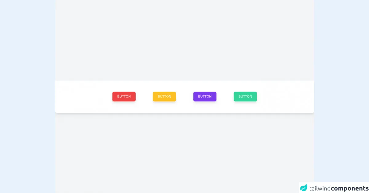
The preview of Button 4 Colors ui component
To create a Button 4 Colors ui component with Tailwind CSS, we will use a combination of background color classes and hover classes to create a visually appealing and interactive button.
Free download of the Button 4 Colors's source code
The source code of Button 4 Colors ui component
The source code for the Button 4 Colors ui component is straightforward and easy to implement. We will use a button element with the appropriate Tailwind CSS classes to create the button.
<div class="min-h-screen bg-gray-100 flex items-center">
  <div class="container mx-auto bg-white rounded-lg shadow-lg">
    <div class="md:h-40 py-20 md:py-0 flex justify-center items-center">
      <div class="md:space-x-20 space-y-10 md:space-y-0">
        <button class="py-3 px-6 text-white rounded-lg bg-red-500 shadow-lg block md:inline-block">BUTTON</button>
        <button class="py-3 px-6 text-white rounded-lg bg-yellow-400 shadow-lg block md:inline-block">BUTTON</button>
        <button class="py-3 px-6 text-white rounded-lg bg-purple-600 shadow-lg block md:inline-block">BUTTON</button>
        <button class="py-3 px-6 text-white rounded-lg bg-green-400 shadow-lg block md:inline-block">BUTTON</button>
      </div>
    </div>
  </div>
</div>
How to create a Button 4 Colors with Tailwind CSS?
To create a Button 4 Colors with Tailwind CSS, follow the steps below:
Step 1: Create a button element
The first step is to create a button element in your HTML code. You can create a button element using the following code:
<button class="bg-red-500 hover:bg-red-600 text-white font-bold py-2 px-4 rounded">
  Red
</button>
This code creates a button element with a red background color and white text. The hover:bg-red-600 class is used to change the background color of the button when the user hovers over it.
Step 2: Add additional color options
To add additional color options to the button, you can duplicate the button element and change the background color and text. For example, to add a blue color option, you can use the following code:
<button class="bg-blue-500 hover:bg-blue-600 text-white font-bold py-2 px-4 rounded">
  Blue
</button>
This code creates a button element with a blue background color and white text. The hover:bg-blue-600 class is used to change the background color of the button when the user hovers over it.
You can repeat this step to add additional color options to the button.
Step 3: Customize the button
You can customize the Button 4 Colors ui component further by adding additional Tailwind CSS classes to the button element. For example, you can change the font size, border radius, and padding of the button using the following code:
<button class="bg-green-500 hover:bg-green-600 text-white font-bold py-3 px-6 rounded-lg border-2 border-green-600">
  Green
</button>
This code creates a button element with a green background color, white text, and a rounded border. The border-2 and border-green-600 classes are used to add a green border to the button.
Conclusion
In this article, we have learned how to create a Button 4 Colors ui component with Tailwind CSS. We have seen how Tailwind CSS provides a set of pre-defined utility classes that can be used to create responsive and customizable user interfaces quickly. By following the steps outlined in this article, you can create a visually appealing and interactive Button 4 Colors ui component for your web application.