- Published on
Ways To Build A Burger Menu With Tailwind CSS In 60 Minutes
- What is Tailwind CSS?
- The description of Burger Menu ui component
- Why use Tailwind CSS to create a Burger Menu ui component?
- The preview of Burger Menu ui component.
- The source code of Burger Menu ui component.
- How to create a Burger Menu with Tailwind CSS?
- Step 1: Set up your HTML
- Step 2: Add your CSS
- Step 3: Test your burger menu
- Conclusion
Are you looking for a way to create a beautiful and functional burger menu for your website? Look no further than Tailwind CSS! In this article, we will go over the steps to create a burger menu ui component using Tailwind CSS in just 60 minutes.
What is Tailwind CSS?
Tailwind CSS is a utility-first CSS framework that makes it easy to create custom designs without having to write any CSS. It provides a set of pre-defined classes that you can use to style your HTML elements, making it a great choice for building UI components quickly.
The description of Burger Menu ui component
A burger menu is a popular UI component that is used to hide navigation links on a website until the user clicks on a button. When the button is clicked, the menu slides out from the side of the screen, revealing the navigation links.
Why use Tailwind CSS to create a Burger Menu ui component?
Tailwind CSS makes it easy to create a burger menu because it provides pre-defined classes for common UI components like buttons and menus. This means that you can create a burger menu quickly and easily without having to write any custom CSS.
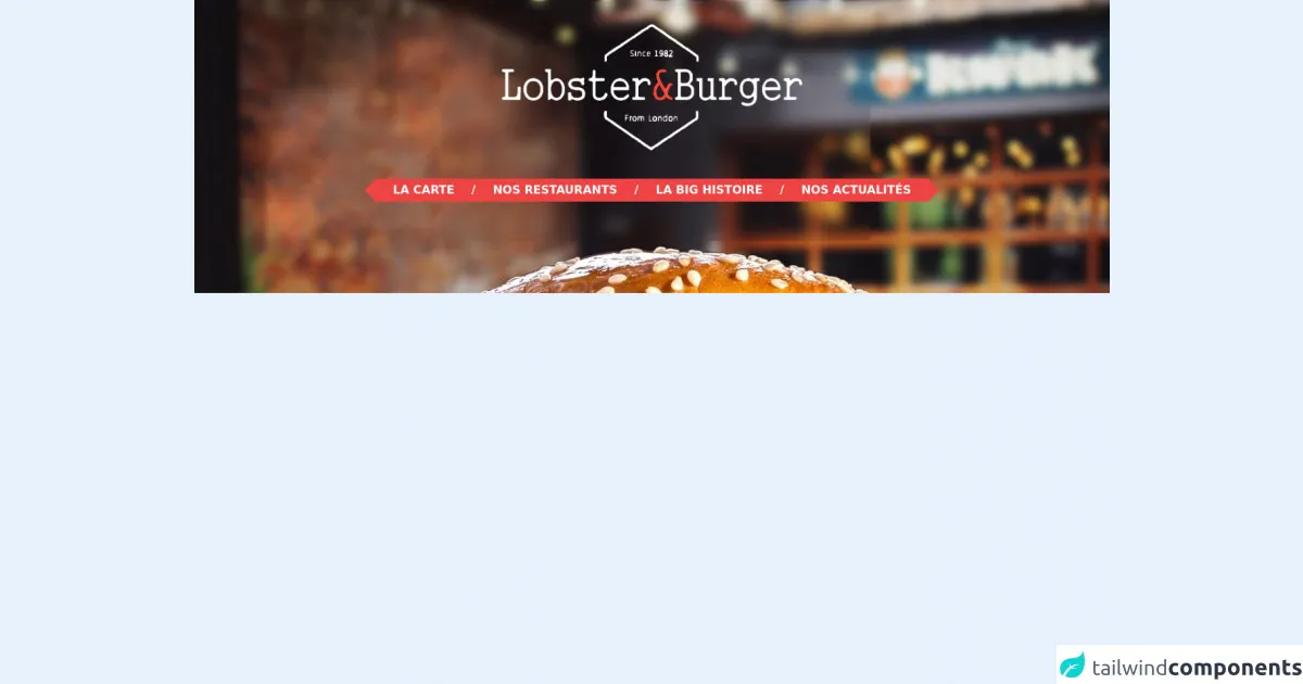
The preview of Burger Menu ui component.
To give you an idea of what the burger menu we will be creating looks like, here is a preview:
Free download of the Burger Menu's source code
The source code of Burger Menu ui component.
Here is the source code for the burger menu ui component we will be creating:
<style>
    .bg-burger {
        background-image: url("https://i.ibb.co/grqSMnw/bg-burger.png");
    }

    .triangle-menu {
        position: relative;
    }

    .triangle-menu::after,
    .triangle-menu::before {
        content: '';
        height: 0;
        width: 0;
        border-style: solid;
        border-width: 16px;
        position: absolute;
    }

    .triangle-menu::after {
        left: 100%;
        border-color: transparent transparent transparent #ef4444;
    }

    .triangle-menu::before {
        right: 100%;
        border-color: transparent #ef4444 transparent transparent;
    }
</style>

<div class="bg-burger bg-top pt-0.5 pb-32 hidden md:block">
  <div class="mt-8 flex">
    <img class="h-44 mx-auto" src="https://i.ibb.co/nsd0DHL/g12899.png" alt="">
  </div>
  <!-- menu -->
  <nav class="mt-10 flex">
    <ul class="triangle-menu bg-red-500 text-white uppercase font-semibold h-8 inline-flex mx-auto items-center">
      <li class="px-6">
        <a href>
          La carte
        </a>
      </li>
      <span>/</span>
      <li class="px-6">
        <a href>
          Nos restaurants
        </a>
      </li>
      <span>/</span>
      <li class="px-6">
        <a href>
          La big histoire
        </a>
      </li>
      <span>/</span>
      <li class="px-6">
        <a href>
          Nos actualités
        </a>
      </li>
    </ul>
  </nav>
</div>
How to create a Burger Menu with Tailwind CSS?
Now that we have covered the basics, let's dive into the steps to create a burger menu with Tailwind CSS.
Step 1: Set up your HTML
The first step is to set up your HTML. You will need a button that will trigger the menu to slide out, and a menu that will contain your navigation links. Here is an example of what your HTML might look like:
<nav class="flex items-center justify-between flex-wrap bg-gray-800 p-6">
  <div class="flex items-center flex-shrink-0 text-white mr-6">
    <span class="font-semibold text-xl tracking-tight">My Website</span>
  </div>
  <div class="block lg:hidden">
    <button id="nav-toggle" class="flex items-center px-3 py-2 border rounded text-gray-500 border-gray-600 hover:text-white hover:border-white">
      <svg class="fill-current h-3 w-3" viewBox="0 0 20 20" xmlns="http://www.w3.org/2000/svg"><title>Menu</title><path d="M0 3h20v2H0V3zm0 6h20v2H0V9zm0 6h20v2H0v-2z"/></svg>
    </button>
  </div>
  <div class="w-full block flex-grow lg:flex lg:items-center lg:w-auto" id="nav-content">
    <div class="text-sm lg:flex-grow">
      <a href="#responsive-header" class="block mt-4 lg:inline-block lg:mt-0 text-gray-500 hover:text-white mr-4">
        Docs
      </a>
      <a href="#responsive-header" class="block mt-4 lg:inline-block lg:mt-0 text-gray-500 hover:text-white mr-4">
        Examples
      </a>
      <a href="#responsive-header" class="block mt-4 lg:inline-block lg:mt-0 text-gray-500 hover:text-white">
        Blog
      </a>
    </div>
  </div>
</nav>
Step 2: Add your CSS
Next, you will need to add your CSS. Tailwind CSS provides pre-defined classes that you can use to style your HTML elements. Here is an example of what your CSS might look like:
/* Set the height of the menu to 0 */
#nav-content {
  height: 0;
  overflow: hidden;
  transition: height 0.3s ease-out;
}

/* Show the menu when the button is clicked */
#nav-toggle:checked ~ #nav-content {
  height: auto;
}

/* Hide the button on large screens */
@media (min-width: 768px) {
  #nav-toggle {
    display: none;
  }
}
Step 3: Test your burger menu
Finally, you will need to test your burger menu to make sure it is working correctly. Click on the button to make sure the menu slides out from the side of the screen, and click on the links to make sure they take you to the correct pages.
Conclusion
Building a burger menu with Tailwind CSS is a great way to create a beautiful and functional UI component for your website. By following the steps outlined in this article, you can create a burger menu in just 60 minutes. So what are you waiting for? Start building your burger menu today!