- Published on
The 5 Really Obvious Ways To Create A Breadcrumbs With Tailwind CSS Better That You Ever Did
- What is Tailwind CSS?
- The description of Breadcrumbs UI component
- Why use Tailwind CSS to create a Breadcrumbs UI component?
- The preview of Breadcrumbs UI component
- The source code of Breadcrumbs UI component
- How to create a Breadcrumbs with Tailwind CSS?
- Step 1: Set up your HTML
- Step 2: Style your breadcrumbs
- Step 3: Customize your breadcrumbs
- Conclusion
As a FrontEnd technology blogger, it's important to stay up-to-date with the latest trends and tools in the industry. One such tool that has gained a lot of popularity in recent times is Tailwind CSS. It's a utility-first CSS framework that lets you quickly build custom designs without writing any CSS from scratch. In this article, we'll explore how to create a breadcrumbs UI component with Tailwind CSS and make it better than ever.
What is Tailwind CSS?
Tailwind CSS is a utility-first CSS framework that provides a set of pre-defined CSS classes that you can use to style your HTML elements. It's different from traditional CSS frameworks like Bootstrap and Foundation, which provide a set of pre-designed UI components that you can use in your projects. With Tailwind CSS, you have complete control over the design of your UI components, and you can customize them to your liking.
The description of Breadcrumbs UI component
Breadcrumbs are a UI component that helps users navigate through a website or application. They provide a trail of links that show the user where they are in the site hierarchy and allow them to quickly jump back to previous pages. Breadcrumbs are typically displayed at the top of a page, just below the header.
Why use Tailwind CSS to create a Breadcrumbs UI component?
Tailwind CSS provides a set of pre-defined CSS classes that you can use to create a breadcrumbs UI component quickly. You don't have to write any CSS from scratch, which saves you a lot of time and effort. Additionally, Tailwind CSS is highly customizable, so you can easily modify the design of the breadcrumbs to match your website or application's branding.
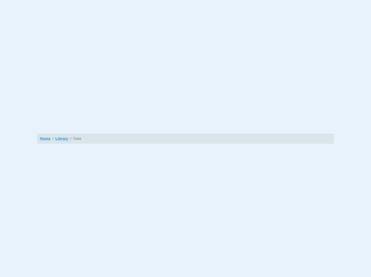
The preview of Breadcrumbs UI component
To create a breadcrumbs UI component with Tailwind CSS, we'll use a combination of flexbox and typography classes. The breadcrumbs will have a simple design with a gray background and white text.
Free download of the Breadcrumbs's source code
The source code of Breadcrumbs UI component
To create a breadcrumbs UI component with Tailwind CSS, you'll need to add the following HTML and CSS code to your project.
<nav class="bg-grey-light p-3 rounded font-sans w-full m-4">
  <ol class="list-reset flex text-grey-dark">
    <li><a href="#" class="text-blue font-bold">Home</a></li>
    <li><span class="mx-2">/</span></li>
    <li><a href="#" class="text-blue font-bold">Library</a></li>
    <li><span class="mx-2">/</span></li>
    <li>Data</li>
  </ol>
</nav>
How to create a Breadcrumbs with Tailwind CSS?
Now that we know why we should use Tailwind CSS to create a breadcrumbs UI component let's dive into the steps to create one.
Step 1: Set up your HTML
The first step is to set up your HTML. You'll need to create a container element for your breadcrumbs and add a list of links inside it. Each link represents a page in the site hierarchy.
<nav class="bg-gray-200 py-2">
  <ol class="list-none p-0 inline-flex">
    <li class="flex items-center">
      <a href="#" class="text-gray-600 hover:text-gray-800">Home</a>
      <svg class="fill-current w-3 h-3 mx-3" xmlns="http://www.w3.org/2000/svg" viewBox="0 0 320 512">
        <path d="M300.485 237.485L86.059 23.059C77.168 14.168 64.832 14.168 55.941 23.059L19.029 59.971C10.137 68.862 10.137 81.198 19.029 90.089L192.941 264 19.029 437.911C10.137 446.802 10.137 459.138 19.029 468.029L55.941 504.941C64.832 513.832 77.168 513.832 86.059 504.941L300.485 290.515C309.376 281.624 309.376 268.288 300.485 259.397z"/>
      </svg>
    </li>
    <li>
      <a href="#" class="text-gray-600 hover:text-gray-800">Products</a>
      <svg class="fill-current w-3 h-3 mx-3" xmlns="http://www.w3.org/2000/svg" viewBox="0 0 320 512">
        <path d="M300.485 237.485L86.059 23.059C77.168 14.168 64.832 14.168 55.941 23.059L19.029 59.971C10.137 68.862 10.137 81.198 19.029 90.089L192.941 264 19.029 437.911C10.137 446.802 10.137 459.138 19.029 468.029L55.941 504.941C64.832 513.832 77.168 513.832 86.059 504.941L300.485 290.515C309.376 281.624 309.376 268.288 300.485 259.397z"/>
      </svg>
    </li>
    <li>
      <a href="#" class="font-bold text-gray-800">Product Name</a>
    </li>
  </ol>
</nav>
Step 2: Style your breadcrumbs
The next step is to style your breadcrumbs using Tailwind CSS classes. We'll use a combination of flexbox and typography classes to create a simple design with a gray background and white text.
nav ol li:not(:last-child) {
  margin-right: .5rem;
}

nav ol li a {
  color: #718096;
}

nav ol li a:hover {
  color: #4a5568;
}

nav ol li svg {
  fill: #718096;
}

nav ol li a:hover + svg,
nav ol li svg:hover {
  fill: #4a5568;
}
Step 3: Customize your breadcrumbs
The final step is to customize your breadcrumbs to match your website or application's branding. You can modify the background color, text color, font size, and spacing to create a unique design.
nav {
  background-color: #f7fafc;
}

nav ol li a {
  font-size: 14px;
  letter-spacing: 0.025em;
  text-transform: uppercase;
}

nav ol li svg {
  width: 12px;
  height: 12px;
  margin: 0 6px;
}
Conclusion
In conclusion, creating a breadcrumbs UI component with Tailwind CSS is easy and straightforward. With a few lines of HTML and CSS code, you can create a simple and elegant design that helps users navigate through your website or application. By using Tailwind CSS, you can save time and effort and customize your breadcrumbs to match your branding. So, go ahead and give it a try!