- Published on
6 Ideas To Help You Build A Card With Tailwind CSS Like A Pro
- What is Tailwind CSS?
- The description of card UI component
- Why use Tailwind CSS to create a card UI component?
- The preview of card UI component
- The source code of card UI component
- How to create a card with Tailwind CSS?
- 1. Change the background color
- 2. Add an image
- 3. Change the font size
- 4. Add a button
- 5. Change the border color
- 6. Add a footer
- Conclusion
What is Tailwind CSS?
Tailwind CSS is a utility-first CSS framework that helps you quickly build custom designs without writing any CSS code. It provides a set of pre-defined CSS classes that you can apply to your HTML elements to style them.
The description of card UI component
A card UI component is a common design pattern used in web applications to display information in a visually appealing way. It usually consists of a container with a header, body, and footer, and can be used to display various types of content such as images, text, and links.
Why use Tailwind CSS to create a card UI component?
Tailwind CSS provides a set of classes that can be used to quickly create a card UI component without having to write any custom CSS code. This saves time and allows you to focus on the content and functionality of your application rather than spending time on styling.
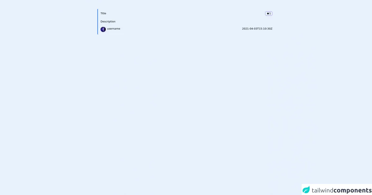
The preview of card UI component
This will create a simple card UI component with a white background, rounded corners, and a shadow effect. The header and body of the card are separated by padding, and the text is styled with appropriate font sizes and colors.
Free download of the card's source code
The source code of card UI component
To see the full source code of the card UI component, you can use the following HTML:
<div class="container mx-auto pr-6 pl-6 md:pr-24 md:pl-24 pt-6 pb-6 mt-6">
     <div class="bg-primary p-4 border-l-4 border-blue-500 mb-0 rounded-md aos-init aos-animate">
      <div class="flex justify-between">
        <p>Title</p>
        <p class="z-50 right-4 transition-all flex gap-2 items-center top-4 hover:bg-purple-600 cursor-pointer border border-purple-600 rounded-lg px-2">
          <svg stroke="currentColor" fill="currentColor" stroke-width="0" viewBox="0 0 1024 1024" height="1em" width="1em" xmlns="http://www.w3.org/2000/svg"><path d="M908.1 353.1l-253.9-36.9L540.7 86.1c-3.1-6.3-8.2-11.4-14.5-14.5-15.8-7.8-35-1.3-42.9 14.5L369.8 316.2l-253.9 36.9c-7 1-13.4 4.3-18.3 9.3a32.05 32.05 0 0 0 .6 45.3l183.7 179.1-43.4 252.9a31.95 31.95 0 0 0 46.4 33.7L512 754l227.1 119.4c6.2 3.3 13.4 4.4 20.3 3.2 17.4-3 29.1-19.5 26.1-36.9l-43.4-252.9 183.7-179.1c5-4.9 8.3-11.3 9.3-18.3 2.7-17.5-9.5-33.7-27-36.3z"></path></svg> 1
        </p>
      </div>
      <br />
      <p>Description</p>
      <div class="flex justify-between mt-5">
        <p>
          <img src="https://avatars.githubusercontent.com/u/63722795?v=4" class="rounded-full max-w-8 max-h-8">
          <p class="flex-auto pl-2">username</p>
        </p>
        <p class="text-smail">2021-04-03T15:10:30Z</p>
      </div>
    </div>
</div>
This code uses the same classes as the preview code, but with actual content instead of placeholders.
How to create a card with Tailwind CSS?
Now that you have seen the preview and source code of a card UI component, let's go through some ideas on how to customize it and make it your own.
1. Change the background color
To change the background color of the card, you can use the bg-* classes provided by Tailwind CSS. For example, to make the card blue, you can use the bg-blue-500 class:
<div class="bg-blue-500 rounded-lg shadow-lg">
  <!-- card content here -->
</div>
2. Add an image
To add an image to the card, you can use the w-full and h-64 classes to set the width and height of the image container, and the object-cover class to ensure the image fills the container:
<div class="bg-white rounded-lg shadow-lg">
  <div class="h-64">
    <img class="w-full h-full object-cover" src="https://source.unsplash.com/random" alt="Random image">
  </div>
  <div class="px-6 py-4">
    <h2 class="text-xl font-bold mb-2">Card Title</h2>
    <p class="text-gray-700 text-base">Lorem ipsum dolor sit amet, consectetur adipiscing elit. Sed non risus. Suspendisse lectus tortor, dignissim sit amet, adipiscing nec, ultricies sed, dolor. Cras elementum ultrices diam. Maecenas ligula massa, varius a, semper congue, euismod non, mi.</p>
  </div>
</div>
3. Change the font size
To change the font size of the card content, you can use the text-* classes provided by Tailwind CSS. For example, to make the text smaller, you can use the text-sm class:
<div class="bg-white rounded-lg shadow-lg">
  <div class="px-6 py-4">
    <h2 class="text-xl font-bold mb-2">Card Title</h2>
    <p class="text-gray-700 text-sm">Lorem ipsum dolor sit amet, consectetur adipiscing elit. Sed non risus. Suspendisse lectus tortor, dignissim sit amet, adipiscing nec, ultricies sed, dolor. Cras elementum ultrices diam. Maecenas ligula massa, varius a, semper congue, euismod non, mi.</p>
  </div>
</div>
4. Add a button
To add a button to the card, you can use the bg-*, text-*, and rounded-* classes provided by Tailwind CSS. For example, to add a blue button with white text, you can use the following code:
<div class="bg-white rounded-lg shadow-lg">
  <div class="px-6 py-4">
    <h2 class="text-xl font-bold mb-2">Card Title</h2>
    <p class="text-gray-700 text-base">Lorem ipsum dolor sit amet, consectetur adipiscing elit. Sed non risus. Suspendisse lectus tortor, dignissim sit amet, adipiscing nec, ultricies sed, dolor. Cras elementum ultrices diam. Maecenas ligula massa, varius a, semper congue, euismod non, mi.</p>
    <button class="bg-blue-500 hover:bg-blue-700 text-white font-bold py-2 px-4 rounded">Read more</button>
  </div>
</div>
5. Change the border color
To change the border color of the card, you can use the border-* classes provided by Tailwind CSS. For example, to make the border red, you can use the border-red-500 class:
<div class="bg-white rounded-lg shadow-lg border-2 border-red-500">
  <!-- card content here -->
</div>
6. Add a footer
To add a footer to the card, you can use the border-t class to add a border to the top of the card, and the text-* classes to style the footer text. For example:
<div class="bg-white rounded-lg shadow-lg">
  <div class="px-6 py-4">
    <h2 class="text-xl font-bold mb-2">Card Title</h2>
    <p class="text-gray-700 text-base">Lorem ipsum dolor sit amet, consectetur adipiscing elit. Sed non risus. Suspendisse lectus tortor, dignissim sit amet, adipiscing nec, ultricies sed, dolor. Cras elementum ultrices diam. Maecenas ligula massa, varius a, semper congue, euismod non, mi.</p>
  </div>
  <div class="border-t px-6 py-4">
    <p class="text-gray-500 text-sm">Posted on January 1, 2021</p>
  </div>
</div>
Conclusion
In this article, we have explored how to create a card UI component with Tailwind CSS. We have seen how Tailwind CSS can help you quickly create custom designs without writing any CSS code, and we have gone through some ideas on how to customize the card component to make it your own. With these ideas, you should be able to create beautiful and functional card UI components for your web applications.