- Published on
6 Ideas To Help You Make A Responsive Expanding Page Layout With Tailwind CSS Like A Pro
- What is Tailwind CSS?
- The description of Responsive Expanding Page Layout ui component
- Why use Tailwind CSS to create a Responsive Expanding Page Layout ui component?
- The preview of Responsive Expanding Page Layout ui component
- The source code of Responsive Expanding Page Layout ui component
- How to create a Responsive Expanding Page Layout with Tailwind CSS?
- 1. Use Flexbox to create the layout
- 2. Use Tailwind CSS utility classes to style the cards
- 3. Use JavaScript to toggle the card content
- 4. Use Tailwind CSS utility classes to style the card content
- 5. Use media queries to make the layout responsive
- 6. Use Tailwind CSS configuration to customize the layout
- Conclusion
What is Tailwind CSS?
Tailwind CSS is a utility-first CSS framework that helps you create responsive and customizable user interfaces. It provides a set of pre-defined classes that you can use to style your HTML elements without writing any CSS code. With Tailwind CSS, you can easily create complex layouts and components with minimal effort.
The description of Responsive Expanding Page Layout ui component
A responsive expanding page layout is a UI component that allows you to display a large amount of content in a compact space. It consists of a set of cards or panels that expand when clicked to reveal more content. This layout is useful for displaying FAQs, product features, or any other type of content that requires additional information.
Why use Tailwind CSS to create a Responsive Expanding Page Layout ui component?
Tailwind CSS provides a set of utility classes that make it easy to create responsive and customizable layouts. With Tailwind CSS, you can easily create a responsive expanding page layout that works on all devices and screen sizes. Additionally, Tailwind CSS provides a set of pre-defined colors, fonts, and spacing values that help you maintain consistency across your UI components.
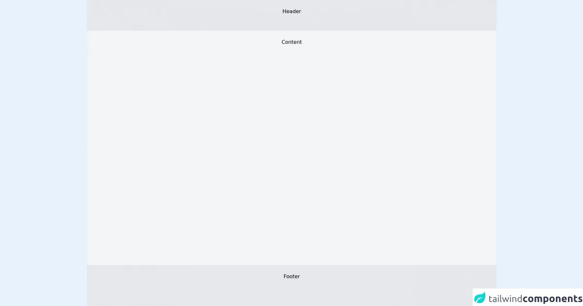
The preview of Responsive Expanding Page Layout ui component
To create a responsive expanding page layout with Tailwind CSS, you can use a combination of HTML, CSS, and JavaScript. The following is a preview of what the layout will look like:
Free download of the Responsive Expanding Page Layout's source code
The source code of Responsive Expanding Page Layout ui component
The source code for the responsive expanding page layout can be found below:
<div class="min-h-screen flex flex-col text-center">
  <div class="bg-gray-200 p-6 h-24">Header</div>
  <div class="bg-gray-100 p-6 flex-grow">Content</div>
  <div class="bg-gray-200 p-6 h-32">Footer</div>
</div>
How to create a Responsive Expanding Page Layout with Tailwind CSS?
Here are six ideas to help you create a responsive expanding page layout with Tailwind CSS:
1. Use Flexbox to create the layout
To create the layout, you can use Flexbox to arrange the cards or panels in a row or column. You can use the flex and justify classes to control the alignment and spacing of the cards.
2. Use Tailwind CSS utility classes to style the cards
You can use Tailwind CSS utility classes to style the cards or panels. For example, you can use the bg-white, shadow-md, and rounded classes to give the cards a clean and modern look.
3. Use JavaScript to toggle the card content
To toggle the card content, you can use JavaScript to add and remove classes from the card element. You can use the hidden class to hide the content by default and the block class to show it when the card is clicked.
4. Use Tailwind CSS utility classes to style the card content
You can use Tailwind CSS utility classes to style the card content. For example, you can use the text-gray-700 class to set the text color and the px-4 class to add padding to the content.
5. Use media queries to make the layout responsive
To make the layout responsive, you can use media queries to adjust the layout and styling based on the screen size. You can use the sm, md, lg, and xl breakpoints to target specific screen sizes.
6. Use Tailwind CSS configuration to customize the layout
Tailwind CSS provides a configuration file that allows you to customize the framework's default values. You can use this file to customize the colors, fonts, spacing, and other properties of the layout.
Conclusion
Creating a responsive expanding page layout with Tailwind CSS is easy and straightforward. With a few lines of HTML, CSS, and JavaScript, you can create a modern and responsive UI component that works on all devices and screen sizes. By using Tailwind CSS, you can save time and effort by leveraging the framework's pre-defined classes and utilities.