- Published on
6 Incredibly Easy Ways To Create A Avatar Dot With Tailwind CSS Better While Spending Less
- What is Tailwind CSS?
- The description of Avatar Dot UI component
- Why use Tailwind CSS to create an Avatar Dot UI component?
- The preview of Avatar Dot UI component
- The source code of Avatar Dot UI component
- How to create an Avatar Dot with Tailwind CSS?
- 1. Using the bg-gray-400 class
- 2. Using the bg-blue-500 class
- 3. Using the bg-red-500 class
- 4. Using the bg-green-500 class
- 5. Using the bg-yellow-500 class
- 6. Using the bg-purple-500 class
- Conclusion
What is Tailwind CSS?
Tailwind CSS is a utility-first CSS framework that helps you create stunning user interfaces with minimal effort. It provides a set of pre-defined classes that you can use to style your HTML elements without writing any custom CSS code. With Tailwind CSS, you can create complex layouts, responsive designs, and beautiful UI components in no time.
The description of Avatar Dot UI component
An Avatar Dot is a UI component that is commonly used in chat applications to represent a user's profile image. It is a small circle that displays the user's profile picture or initials. The Avatar Dot is usually accompanied by the user's name or username.
Why use Tailwind CSS to create an Avatar Dot UI component?
Tailwind CSS provides a set of pre-defined classes that you can use to create an Avatar Dot UI component quickly and easily. With Tailwind CSS, you don't have to write any custom CSS code, which saves you a lot of time and effort. Additionally, Tailwind CSS is highly customizable, which means you can easily modify the Avatar Dot's appearance to match your project's design requirements.
The preview of Avatar Dot UI component
The Avatar Dot UI component is a small circle that displays the user's profile picture or initials. It is usually accompanied by the user's name or username.
Free download of the Avatar Dot's source code
The source code of Avatar Dot UI component
To create an Avatar Dot UI component with Tailwind CSS, you need to define a few classes that define the Avatar Dot's appearance.
<!-- This is an example component -->
<div class="mx-auto max-w-2xl">
<div class="flex items-center space-x-4">
<div class="relative">
<img
class="h-10 w-10 rounded-full"
src="https://flowbite.com/docs/images/people/profile-picture-5.jpg"
alt=""
/>
<span
class="absolute top-0 left-7 h-3.5 w-3.5 rounded-full border-2 border-white bg-green-400 dark:border-gray-800"
></span>
</div>
<div class="relative">
<img
class="h-10 w-10 rounded"
src="https://flowbite.com/docs/images/people/profile-picture-5.jpg"
alt=""
/>
<span
class="absolute top-0 left-8 h-3.5 w-3.5 -translate-y-1/2 transform rounded-full border-2 border-white bg-red-400 dark:border-gray-800"
></span>
</div>
<div class="relative">
<img
class="h-10 w-10 rounded-full"
src="https://flowbite.com/docs/images/people/profile-picture-5.jpg"
alt=""
/>
<span
class="absolute bottom-0 left-7 h-3.5 w-3.5 rounded-full border-2 border-white bg-green-400 dark:border-gray-800"
></span>
</div>
<div class="relative">
<img
class="h-10 w-10 rounded"
src="https://flowbite.com/docs/images/people/profile-picture-5.jpg"
alt=""
/>
<span
class="absolute bottom-0 left-8 h-3.5 w-3.5 translate-y-1/4 transform rounded-full border-2 border-white bg-green-400 dark:border-gray-800"
></span>
</div>
</div>
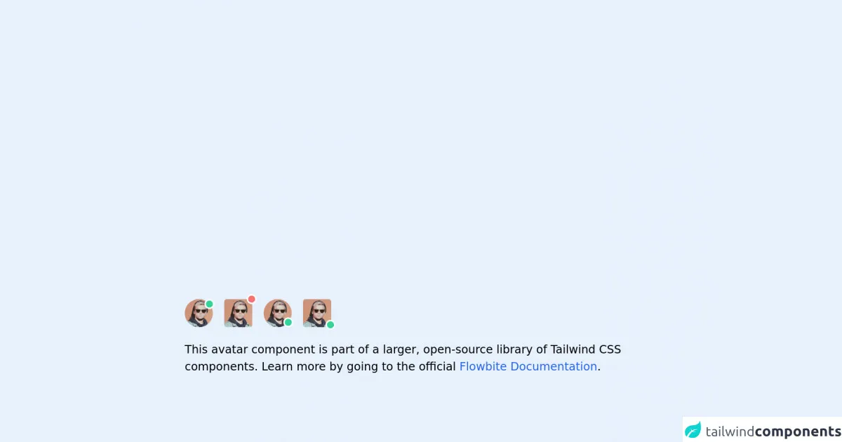
<p class="mt-5">
This avatar component is part of a larger, open-source library of Tailwind CSS components. Learn
more by going to the official
<a
class="text-blue-600 hover:underline"
href="https://flowbite.com/docs/getting-started/introduction/"
target="_blank"
>Flowbite Documentation</a
>.
</p>
</div>
How to create an Avatar Dot with Tailwind CSS?
Here are six incredibly easy ways to create an Avatar Dot with Tailwind CSS:
1. Using the bg-gray-400 class
The bg-gray-400 class sets the background color of an element to gray. You can use this class to create a simple Avatar Dot with a gray background color.
<div class="w-8 h-8 rounded-full bg-gray-400"></div>
2. Using the bg-blue-500 class
The bg-blue-500 class sets the background color of an element to blue. You can use this class to create an Avatar Dot with a blue background color.
<div class="w-8 h-8 rounded-full bg-blue-500"></div>
3. Using the bg-red-500 class
The bg-red-500 class sets the background color of an element to red. You can use this class to create an Avatar Dot with a red background color.
<div class="w-8 h-8 rounded-full bg-red-500"></div>
4. Using the bg-green-500 class
The bg-green-500 class sets the background color of an element to green. You can use this class to create an Avatar Dot with a green background color.
<div class="w-8 h-8 rounded-full bg-green-500"></div>
5. Using the bg-yellow-500 class
The bg-yellow-500 class sets the background color of an element to yellow. You can use this class to create an Avatar Dot with a yellow background color.
<div class="w-8 h-8 rounded-full bg-yellow-500"></div>
6. Using the bg-purple-500 class
The bg-purple-500 class sets the background color of an element to purple. You can use this class to create an Avatar Dot with a purple background color.
<div class="w-8 h-8 rounded-full bg-purple-500"></div>
Conclusion
Creating an Avatar Dot UI component with Tailwind CSS is incredibly easy. With just a few lines of HTML and some pre-defined classes, you can create a beautiful Avatar Dot that matches your project's design requirements. So, if you're looking for a quick and easy way to create an Avatar Dot UI component, give Tailwind CSS a try!