- Published on
Ways To Make A Avatar Placeholder With Tailwind CSS In 60 Minutes
- What is Tailwind CSS?
- The description of Avatar placeholder ui component
- Why use Tailwind CSS to create a Avatar placeholder ui component?
- The preview of Avatar placeholder ui component.
- The source code of Avatar placeholder ui component.
- How to create a Avatar placeholder with Tailwind CSS?
- Conclusion
What is Tailwind CSS?
Tailwind CSS is a utility-first CSS framework that provides a set of pre-defined classes that can be used to style HTML elements. It allows developers to quickly and easily create custom designs without having to write CSS from scratch.
The description of Avatar placeholder ui component
An avatar placeholder is a UI component that is commonly used in web applications to display a user's profile picture or image. It is a placeholder image that is displayed when a user has not uploaded a profile picture yet.
Why use Tailwind CSS to create a Avatar placeholder ui component?
Tailwind CSS is an excellent choice for creating an avatar placeholder UI component because it provides a set of pre-defined classes that can be used to style the component. This allows developers to quickly and easily create a custom design without having to write CSS from scratch.
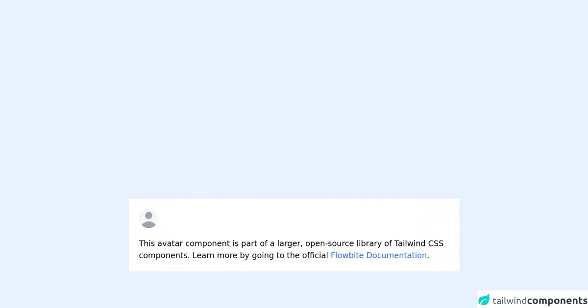
The preview of Avatar placeholder ui component.
To create an avatar placeholder UI component with Tailwind CSS, we will use a combination of HTML and CSS. The HTML will consist of a container element that will hold the avatar placeholder, and the CSS will be used to style the placeholder.
Free download of the Avatar placeholder's source code
The source code of Avatar placeholder ui component.
The source code for the avatar placeholder UI component is relatively simple. It consists of a container element with a background color and a border radius, and an image element with a placeholder image.
<!-- This is an example component -->
<div class="mx-auto max-w-2xl bg-white p-5">
  <div class="relative h-10 w-10 overflow-hidden rounded-full bg-gray-100 dark:bg-gray-600">
    <svg
      class="absolute -left-1 h-12 w-12 text-gray-400"
      fill="currentColor"
      viewBox="0 0 20 20"
      xmlns="http://www.w3.org/2000/svg"
    >
      <path
        fill-rule="evenodd"
        d="M10 9a3 3 0 100-6 3 3 0 000 6zm-7 9a7 7 0 1114 0H3z"
        clip-rule="evenodd"
      ></path>
    </svg>
  </div>

  <p class="mt-5">
    This avatar component is part of a larger, open-source library of Tailwind CSS components. Learn
    more by going to the official
    <a
      class="text-blue-600 hover:underline"
      href="https://flowbite.com/docs/getting-started/introduction/"
      target="_blank"
      >Flowbite Documentation</a
    >.
  </p>
  <script src="https://unpkg.com/[email protected]/dist/flowbite.js"></script>
</div>
How to create a Avatar placeholder with Tailwind CSS?
To create an avatar placeholder with Tailwind CSS, follow these steps:
- Create a container element for the avatar placeholder. This can be any HTML element, such as a div or a span.
<div class="avatar-placeholder"></div>
- Add a background color to the container element. This will be the color of the avatar placeholder.
<div class="avatar-placeholder bg-gray-300"></div>
- Add a border radius to the container element. This will give the avatar placeholder rounded corners.
<div class="avatar-placeholder bg-gray-300 rounded-full"></div>
- Add an image element to the container element. This will be the placeholder image for the avatar.
<div class="avatar-placeholder bg-gray-300 rounded-full">
  <img src="https://via.placeholder.com/150" alt="Avatar Placeholder">
</div>
- Style the image element to fit inside the container element.
<div class="avatar-placeholder bg-gray-300 rounded-full">
  <img class="h-full w-full object-cover" src="https://via.placeholder.com/150" alt="Avatar Placeholder">
</div>
- Customize the avatar placeholder by changing the background color, border radius, and image source.
<div class="avatar-placeholder bg-blue-500 rounded-lg">
  <img class="h-full w-full object-cover" src="https://via.placeholder.com/150/FFFFFF/000000" alt="Avatar Placeholder">
</div>
Conclusion
In conclusion, creating an avatar placeholder UI component with Tailwind CSS is a straightforward process that can be completed in under 60 minutes. By using Tailwind CSS, developers can quickly and easily create custom designs without having to write CSS from scratch. The avatar placeholder UI component is a useful component that can be used in many web applications to display user profile pictures or images.