- Published on
3 Things You Must Know To Make A Article With Tailwind CSS
- What is Tailwind CSS?
- The description of Article ui component
- Why use Tailwind CSS to create an Article ui component?
- The preview of Article ui component
- The source code of Article ui component
- How to create an Article with Tailwind CSS?
- Step 1: Install Tailwind CSS
- Step 2: Create a new HTML file
- Step 3: Customize the styles
- Step 4: Add interactivity
- Conclusion
If you are a FrontEnd developer, you might have heard of Tailwind CSS. It is a utility-first CSS framework that helps you to create custom designs quickly. In this article, we will discuss three things that you must know to make an article with Tailwind CSS.
What is Tailwind CSS?
Tailwind CSS is a CSS framework that provides a set of pre-defined utility classes. These classes can be used to create custom designs without writing any CSS code. It is a utility-first framework, which means that it focuses on providing utility classes rather than components.
The description of Article ui component
Before we dive into the details, let's define what an Article UI component is. An Article UI component is a reusable piece of code that represents an article on a website. It typically includes a title, an image, a description, and some other elements like author information, date, and tags.
Why use Tailwind CSS to create an Article ui component?
There are several reasons why you should use Tailwind CSS to create an Article UI component:
- Tailwind CSS provides a set of pre-defined utility classes that can be used to create custom designs quickly.
- Tailwind CSS is highly customizable. You can easily change the default styles by configuring the framework.
- Tailwind CSS is lightweight. It only includes the styles that you need, which makes it faster than other CSS frameworks.
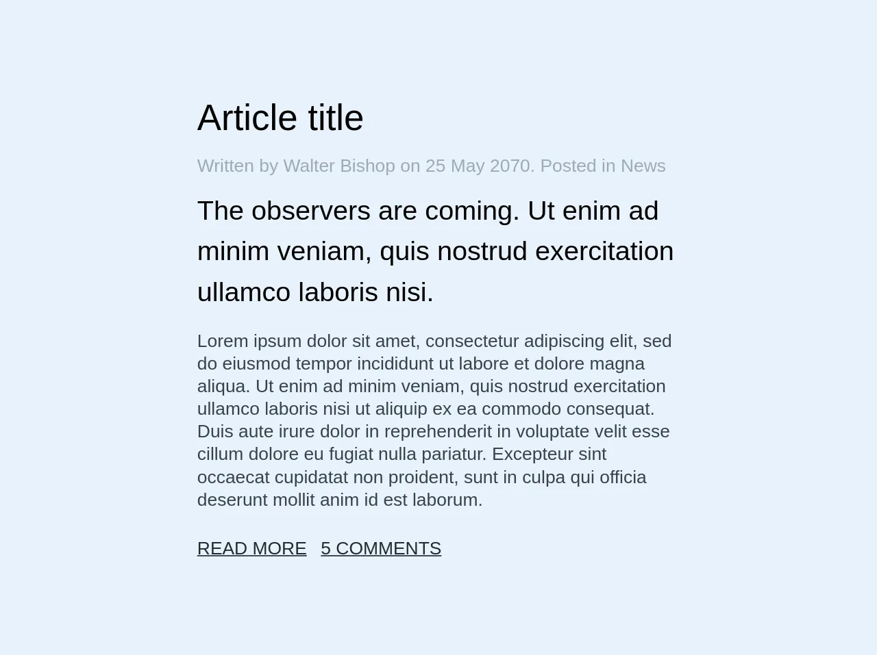
The preview of Article ui component
Here is a preview of what the Article UI component will look like:
Free download of the Article's source code
The source code of Article ui component
Here is the source code of the Article UI component:
<div class="w-full sm:w-1/2 md:w-1/3">
  <h1 class="mb-4 font-sans font-thin">Article title</h1>

  <p class="text-grey mb-3">Written by Walter Bishop on 25 May 2070. Posted in News</p>

  <h2 class="mb-4 font-sans font-thin leading-normal">
    The observers are coming. Ut enim ad minim veniam, quis nostrud exercitation ullamco laboris
    nisi.
  </h2>

  <p class="text-grey-darkest mb-6 leading-tight">
    Lorem ipsum dolor sit amet, consectetur adipiscing elit, sed do eiusmod tempor incididunt ut
    labore et dolore magna aliqua. Ut enim ad minim veniam, quis nostrud exercitation ullamco
    laboris nisi ut aliquip ex ea commodo consequat. Duis aute irure dolor in reprehenderit in
    voluptate velit esse cillum dolore eu fugiat nulla pariatur. Excepteur sint occaecat cupidatat
    non proident, sunt in culpa qui officia deserunt mollit anim id est laborum.
  </p>

  <div>
    <a href="#" class="mr-2 text-black">READ MORE</a>
    <a href="#" class="text-black">5 COMMENTS</a>
  </div>
</div>
How to create an Article with Tailwind CSS?
Now that we have covered the basics, let's dive into the details of how to create an Article UI component with Tailwind CSS.
Step 1: Install Tailwind CSS
The first step is to install Tailwind CSS. You can do this by using npm or yarn. Here is the command to install Tailwind CSS using npm:
npm install tailwindcss
Step 2: Create a new HTML file
The next step is to create a new HTML file and add the basic structure. Here is an example:
<!DOCTYPE html>
<html>
  <head>
    <title>Article UI component</title>
    <link rel="stylesheet" href="https://cdnjs.cloudflare.com/ajax/libs/tailwindcss/2.2.7/tailwind.min.css" />
  </head>
  <body>
    <div class="container mx-auto">
      <h1 class="text-3xl font-bold mb-4">Article title</h1>
      <img src="https://via.placeholder.com/800x400" alt="Article image" class="w-full mb-4">
      <p class="text-gray-700 mb-4">Lorem ipsum dolor sit amet, consectetur adipiscing elit. Sed euismod, sapien ut vestibulum consequat, velit odio imperdiet velit, ac posuere enim sapien ac magna. Sed bibendum, sapien in aliquet bibendum, turpis lacus hendrerit est, vel sagittis nulla lacus sed odio. Nulla facilisi. Nullam eget turpis vel purus consectetur commodo. Integer ac semper nunc. Morbi vel elit ac felis scelerisque commodo. Aliquam erat volutpat. Nulla facilisi. Integer euismod, massa eget aliquam bibendum, mauris ante luctus felis, vel tincidunt dolor felis eu magna. Fusce auctor, elit eu tincidunt tincidunt, justo magna fringilla libero, ac bibendum nulla dui vel risus. Nulla facilisi. Sed semper, odio id dapibus varius, sem elit bibendum velit, ac ullamcorper quam nulla vel ipsum. Nunc vel ante sapien. Nulla facilisi.</p>
      <div class="flex items-center mb-4">
        <img src="https://via.placeholder.com/50x50" alt="Author image" class="w-10 h-10 rounded-full mr-4">
        <div>
          <p class="font-bold">Author name</p>
          <p class="text-gray-700">Published on June 1, 2021</p>
        </div>
      </div>
      <div class="flex flex-wrap">
        <span class="bg-gray-200 rounded-full py-1 px-3 text-sm font-semibold text-gray-700 mr-2 mb-2">Tag 1</span>
        <span class="bg-gray-200 rounded-full py-1 px-3 text-sm font-semibold text-gray-700 mr-2 mb-2">Tag 2</span>
        <span class="bg-gray-200 rounded-full py-1 px-3 text-sm font-semibold text-gray-700 mr-2 mb-2">Tag 3</span>
      </div>
    </div>
  </body>
</html>
Step 3: Customize the styles
The next step is to customize the styles. You can do this by adding your own utility classes or by configuring Tailwind CSS. Here is an example of how to customize the styles:
<!DOCTYPE html>
<html>
  <head>
    <title>Article UI component</title>
    <link rel="stylesheet" href="https://cdnjs.cloudflare.com/ajax/libs/tailwindcss/2.2.7/tailwind.min.css" />
    <style>
      .article-title {
        font-size: 48px;
        color: #333;
      }
      .article-image {
        border-radius: 10px;
      }
    </style>
  </head>
  <body>
    <div class="container mx-auto">
      <h1 class="article-title mb-4">Article title</h1>
      <img src="https://via.placeholder.com/800x400" alt="Article image" class="w-full article-image mb-4">
      <p class="text-gray-700 mb-4">Lorem ipsum dolor sit amet, consectetur adipiscing elit. Sed euismod, sapien ut vestibulum consequat, velit odio imperdiet velit, ac posuere enim sapien ac magna. Sed bibendum, sapien in aliquet bibendum, turpis lacus hendrerit est, vel sagittis nulla lacus sed odio. Nulla facilisi. Nullam eget turpis vel purus consectetur commodo. Integer ac semper nunc. Morbi vel elit ac felis scelerisque commodo. Aliquam erat volutpat. Nulla facilisi. Integer euismod, massa eget aliquam bibendum, mauris ante luctus felis, vel tincidunt dolor felis eu magna. Fusce auctor, elit eu tincidunt tincidunt, justo magna fringilla libero, ac bibendum nulla dui vel risus. Nulla facilisi. Sed semper, odio id dapibus varius, sem elit bibendum velit, ac ullamcorper quam nulla vel ipsum. Nunc vel ante sapien. Nulla facilisi.</p>
      <div class="flex items-center mb-4">
        <img src="https://via.placeholder.com/50x50" alt="Author image" class="w-10 h-10 rounded-full mr-4">
        <div>
          <p class="font-bold">Author name</p>
          <p class="text-gray-700">Published on June 1, 2021</p>
        </div>
      </div>
      <div class="flex flex-wrap">
        <span class="bg-gray-200 rounded-full py-1 px-3 text-sm font-semibold text-gray-700 mr-2 mb-2">Tag 1</span>
        <span class="bg-gray-200 rounded-full py-1 px-3 text-sm font-semibold text-gray-700 mr-2 mb-2">Tag 2</span>
        <span class="bg-gray-200 rounded-full py-1 px-3 text-sm font-semibold text-gray-700 mr-2 mb-2">Tag 3</span>
      </div>
    </div>
  </body>
</html>
Step 4: Add interactivity
The final step is to add interactivity. You can do this by using JavaScript or by adding some CSS transitions. Here is an example of how to add interactivity:
<!DOCTYPE html>
<html>
  <head>
    <title>Article UI component</title>
    <link rel="stylesheet" href="https://cdnjs.cloudflare.com/ajax/libs/tailwindcss/2.2.7/tailwind.min.css" />
    <style>
      .article-title {
        font-size: 48px;
        color: #333;
      }
      .article-image {
        border-radius: 10px;
        transition: transform 0.3s ease-in-out;
      }
      .article-image:hover {
        transform: scale(1.1);
      }
    </style>
  </head>
  <body>
    <div class="container mx-auto">
      <h1 class="article-title mb-4">Article title</h1>
      <img src="https://via.placeholder.com/800x400" alt="Article image" class="w-full article-image mb-4">
      <p class="text-gray-700 mb-4">Lorem ipsum dolor sit amet, consectetur adipiscing elit. Sed euismod, sapien ut vestibulum consequat, velit odio imperdiet velit, ac posuere enim sapien ac magna. Sed bibendum, sapien in aliquet bibendum, turpis lacus hendrerit est, vel sagittis nulla lacus sed odio. Nulla facilisi. Nullam eget turpis vel purus consectetur commodo. Integer ac semper nunc. Morbi vel elit ac felis scelerisque commodo. Aliquam erat volutpat. Nulla facilisi. Integer euismod, massa eget aliquam bibendum, mauris ante luctus felis, vel tincidunt dolor felis eu magna. Fusce auctor, elit eu tincidunt tincidunt, justo magna fringilla libero, ac bibendum nulla dui vel risus. Nulla facilisi. Sed semper, odio id dapibus varius, sem elit bibendum velit, ac ullamcorper quam nulla vel ipsum. Nunc vel ante sapien. Nulla facilisi.</p>
      <div class="flex items-center mb-4">
        <img src="https://via.placeholder.com/50x50" alt="Author image" class="w-10 h-10 rounded-full mr-4">
        <div>
          <p class="font-bold">Author name</p>
          <p class="text-gray-700">Published on June 1, 2021</p>
        </div>
      </div>
      <div class="flex flex-wrap">
        <span class="bg-gray-200 rounded-full py-1 px-3 text-sm font-semibold text-gray-700 mr-2 mb-2">Tag 1</span>
        <span class="bg-gray-200 rounded-full py-1 px-3 text-sm font-semibold text-gray-700 mr-2 mb-2">Tag 2</span>
        <span class="bg-gray-200 rounded-full py-1 px-3 text-sm font-semibold text-gray-700 mr-2 mb-2">Tag 3</span>
      </div>
    </div>
  </body>
</html>
Conclusion
In this article, we have discussed three things that you must know to make an article with Tailwind CSS. We have covered the basics of Tailwind CSS, the description of an Article UI component, and why you should use Tailwind CSS to create an Article UI component. We have also provided a preview and source code of the Article UI component and explained how to create an Article with Tailwind CSS. With these tips, you can create beautiful and functional Article UI components quickly and easily.