- Published on
Most Effective Ways To Build A Animated Dropdowns With Tailwind CSS
- What is Tailwind CSS?
- The description of Animated dropdowns ui component
- Why use Tailwind CSS to create a Animated dropdowns ui component?
- The preview of Animated dropdowns ui component
- The source code of Animated dropdowns ui component
- How to create a Animated dropdowns with Tailwind CSS?
- Step 1: Create the HTML structure of the dropdown
- Step 2: Add the necessary Tailwind CSS classes to the dropdown
- Step 3: Add JavaScript to toggle the visibility of the dropdown
- Step 4: Add CSS classes to create the animation effect
- Conclusion
What is Tailwind CSS?
Tailwind CSS is a utility-first CSS framework that allows developers to quickly create custom designs without writing any CSS. It provides a set of pre-defined classes that can be used to style HTML elements. Tailwind CSS is a popular choice among developers because it allows them to create responsive designs quickly and easily.
The description of Animated dropdowns ui component
Animated dropdowns are a popular UI component used in web applications. They allow users to select an option from a list of choices by clicking on a dropdown menu. Animated dropdowns are a great way to improve the user experience by providing an intuitive interface for selecting options.
Why use Tailwind CSS to create a Animated dropdowns ui component?
Tailwind CSS is a great choice for creating animated dropdowns because it provides a set of pre-defined classes that can be used to create the animation effects. This means that developers can create animated dropdowns quickly and easily without having to write any custom CSS.
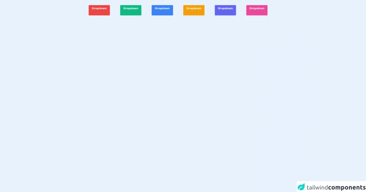
The preview of Animated dropdowns ui component
To create an animated dropdown with Tailwind CSS, we will use a combination of CSS classes to create the animation effect. The dropdown will appear when the user clicks on the dropdown button, and it will disappear when the user clicks outside of the dropdown.
Free download of the Animated dropdowns's source code
The source code of Animated dropdowns ui component
To create an animated dropdown with Tailwind CSS, we will use a combination of HTML and CSS classes. The HTML code will define the structure of the dropdown, and the CSS classes will be used to style the dropdown and create the animation effect.
<div id="app">
  <div class="flex flex-wrap px-5">
    <vue-dropdown animation="fade" color="red"></vue-dropdown>

    <vue-dropdown animation="slide-in-up" color="green"></vue-dropdown>

    <vue-dropdown animation="slide-in-right" color="blue"></vue-dropdown>

    <vue-dropdown animation="slide-in-left" color="yellow"></vue-dropdown>

    <vue-dropdown animation="scale" color="indigo"></vue-dropdown>

    <vue-dropdown animation="rotate" color="pink"></vue-dropdown>
  </div>
</div>

<script src="https://cdn.jsdelivr.net/npm/vue@2/dist/vue.js"></script>

<script>
  Vue.component('vue-dropdown', {
    data: function () {
      return {
        show: false,
        cars: ['BMW', 'Mercedes', 'Audi', 'Volvo'],
      }
    },
    props: {
      color: String,
      animation: String,
    },
    template: `
    <div class="dropdown-wrapper relative m-8">
    <button v-on:click="show = !show" :class="'bg-'+color+'-500'" class="text-white font-bold py-2 px-4 whitespace-no-wrap rounded transition duration-300">Dropdown <i class="fas fa-chevron-down ml-2"></i></button>
    <transition :name="animation">
      <div :class="'bg-'+color+'-500'" class="dropdown-menu text-white mt-1 rounded absolute z-10 shadow-lg w-40 max-w-xs" v-if="show">
        <ul class="list-none overflow-hidden rounded">
          <li v-for="car in cars">
            <a href="" class="flex py-2 px-4 transition duration-300" :class="'theme-'+color">{{car}}</a>
          </li>
        </ul>
      </div>
    </transition>
  </div>
  `,
  })

  const app = new Vue({
    el: '#app',
  })
</script>

<style>
  button {
    cursor: pointer;
    &:focus {
      outline: none;
    }
  }

  /* Animations */
  .fade-enter-active,
  .fade-leave-active {
    transition: opacity 0.5s;
  }
  .fade-enter,
  .fade-leave-to {
    opacity: 0;
  }

  /* Slide-in-up animation*/
  .slide-in-up-enter-active,
  .slide-in-up-leave-active {
    transition: all 0.5s;
    transform: translateY(0);
  }
  .slide-in-up-enter,
  .slide-in-up-leave-to {
    opacity: 0;
    transform: translateY(20px);
  }

  /* Slide-in-right animation*/
  .slide-in-right-enter-active,
  .slide-in-right-leave-active {
    transition: all 0.5s;
    transform: translateX(0);
  }
  .slide-in-right-enter,
  .slide-in-right-leave-to {
    opacity: 0;
    transform: translateX(20px);
  }

  /* Slide-in-left animation*/
  .slide-in-left-enter-active,
  .slide-in-left-leave-active {
    transition: all 0.5s;
    transform: translateX(0);
  }
  .slide-in-left-enter,
  .slide-in-left-leave-to {
    opacity: 0;
    transform: translateX(-20px);
  }

  /* Scale animation*/
  .scale-enter-active,
  .scale-leave-active {
    transition: all 0.5s;
    transform: scale(1);
  }
  .scale-enter,
  .scale-leave-to {
    opacity: 0;
    transform: scale(0);
  }

  /* Rotate animation*/
  .rotate-enter-active,
  .rotate-leave-active {
    transition: all 0.5s;
    transform: scale(1) rotate(-360deg);
  }
  .rotate-enter,
  .rotate-leave-to {
    opacity: 0;
    transform: scale(0) rotate(360deg);
  }
</style>
How to create a Animated dropdowns with Tailwind CSS?
To create an animated dropdown with Tailwind CSS, follow these steps:
- Create the HTML structure of the dropdown
- Add the necessary Tailwind CSS classes to the dropdown
- Add JavaScript to toggle the visibility of the dropdown
- Add CSS classes to create the animation effect
Step 1: Create the HTML structure of the dropdown
The HTML code for the dropdown should include a button that will be used to toggle the visibility of the dropdown, and a list of options that will be displayed when the dropdown is open. Here is an example of the HTML code for the dropdown:
<div class="relative">
  <button class="block w-full py-2 text-left bg-white rounded-md shadow-md focus:outline-none focus:ring-2 focus:ring-blue-500 focus:border-transparent">
    Select an option
  </button>
  <ul class="absolute z-10 w-full py-2 mt-2 bg-white rounded-md shadow-md">
    <li class="px-3 py-2 hover:bg-gray-100">Option 1</li>
    <li class="px-3 py-2 hover:bg-gray-100">Option 2</li>
    <li class="px-3 py-2 hover:bg-gray-100">Option 3</li>
  </ul>
</div>
Step 2: Add the necessary Tailwind CSS classes to the dropdown
To style the dropdown, we will use a combination of Tailwind CSS classes. Here is a breakdown of the classes used in the HTML code:
relative- This class is used to make the dropdown container relative to its parent element.block- This class is used to make the button and dropdown list block-level elements.w-full- This class is used to make the button and dropdown list full-width.py-2- This class is used to add vertical padding to the button and dropdown list.text-left- This class is used to align the text in the button to the left.bg-white- This class is used to set the background color of the button and dropdown list to white.rounded-md- This class is used to add rounded corners to the button and dropdown list.shadow-md- This class is used to add a shadow effect to the button and dropdown list.focus:outline-none- This class is used to remove the outline when the button is in focus.focus:ring-2- This class is used to add a ring around the button when it is in focus.focus:ring-blue-500- This class is used to set the color of the ring to blue.focus:border-transparent- This class is used to remove the border when the button is in focus.absolute- This class is used to position the dropdown list absolutely.z-10- This class is used to set the z-index of the dropdown list to 10.mt-2- This class is used to add top margin to the dropdown list.px-3- This class is used to add horizontal padding to the list items.hover:bg-gray-100- This class is used to change the background color of the list items when the user hovers over them.
Step 3: Add JavaScript to toggle the visibility of the dropdown
To toggle the visibility of the dropdown, we will use JavaScript. Here is an example of the JavaScript code:
const dropdownButton = document.querySelector('.dropdown-button');
const dropdownList = document.querySelector('.dropdown-list');

dropdownButton.addEventListener('click', () => {
  dropdownList.classList.toggle('hidden');
});

document.addEventListener('click', (event) => {
  if (!dropdownButton.contains(event.target) && !dropdownList.contains(event.target)) {
    dropdownList.classList.add('hidden');
  }
});
Step 4: Add CSS classes to create the animation effect
To create the animation effect, we will use a combination of CSS classes. Here is an example of the CSS code:
.dropdown-list {
  transition: opacity 0.2s ease-in-out, transform 0.2s ease-in-out;
  opacity: 0;
  transform: translateY(-10px);
}

.dropdown-list:not(.hidden) {
  opacity: 1;
  transform: translateY(0);
}
The transition property is used to specify the animation effect. The opacity and transform properties are animated over a duration of 0.2 seconds with an ease-in-out timing function. The opacity property is initially set to 0, and the transform property is set to translate the dropdown list 10 pixels up. When the dropdown list is not hidden, the opacity property is set to 1, and the transform property is set to translate the dropdown list back to its original position.
Conclusion
In conclusion, Tailwind CSS is a great choice for creating animated dropdowns because it provides a set of pre-defined classes that can be used to create the animation effect. By following the steps outlined in this article, you can create an animated dropdown quickly and easily. With a little bit of JavaScript and CSS, you can create an intuitive UI component that will improve the user experience of your web application.