- Published on
Beginners Guide: Build A Animated Dynamic Progress Bar With Tailwind CSS
- What is Tailwind CSS?
- The description of Animated dynamic progress bar ui component
- Why use Tailwind CSS to create a Animated dynamic progress bar ui component?
- The preview of Animated dynamic progress bar ui component
- The source code of Animated dynamic progress bar ui component
- How to create a Animated dynamic progress bar with Tailwind CSS?
- Conclusion
What is Tailwind CSS?
Tailwind CSS is a utility-first CSS framework that allows you to rapidly build custom user interfaces. It provides a set of pre-defined classes that can be used to style HTML elements without having to write any custom CSS. Tailwind CSS is a popular choice among developers due to its simplicity and flexibility.
The description of Animated dynamic progress bar ui component
An animated dynamic progress bar is a user interface element that visually displays the progress of a task. It is a great way to provide feedback to users on how much of a task has been completed. The progress bar can be animated to make it more visually appealing and dynamic.
Why use Tailwind CSS to create a Animated dynamic progress bar ui component?
Tailwind CSS provides a set of pre-defined classes that can be used to style HTML elements. This means that you can easily create an animated dynamic progress bar without having to write any custom CSS. Tailwind CSS also provides a range of utility classes that can be used to customize the progress bar and make it more visually appealing.
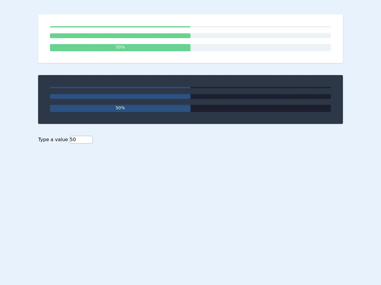
The preview of Animated dynamic progress bar ui component
To create an animated dynamic progress bar with Tailwind CSS, we will be using a combination of HTML and CSS. The progress bar will be displayed as a horizontal bar with a colored fill that represents the progress of the task. The progress bar will also be animated to make it more visually appealing.
Free download of the Animated dynamic progress bar's source code
The source code of Animated dynamic progress bar ui component
To create the animated dynamic progress bar, we will be using a combination of HTML and CSS. The HTML will define the structure of the progress bar, while the CSS will be used to style and animate the progress bar.
<head>
  <script
    src="https://cdn.jsdelivr.net/gh/alpinejs/[email protected]/dist/alpine.min.js"
    defer
  ></script>
</head>

<body>
  <!-- Define the width model within parent div -->
  <div
    class="my-12"
    x-data="{ width: '50' }"
    x-init="$watch('width', value => { if (value > 100) { width = 100 } if (value == 0) { width = 10 } })"
  >
    <!-- Light mode -->
    <div class="mx-32 max-w-full rounded bg-white p-10 shadow">
      <!-- Start Light version -->
      <div
        class="h-1 rounded bg-gray-200"
        role="progressbar"
        :aria-valuenow="width"
        aria-valuemin="0"
        aria-valuemax="100"
      >
        <div
          class="h-1 rounded bg-green-400 text-center"
          :style="`width: ${width}%; transition: width 2s;`"
        ></div>
      </div>
      <!-- End Light version -->

      <!-- Start Regular version -->
      <div
        class="mt-5 h-4 rounded bg-gray-200"
        role="progressbar"
        :aria-valuenow="width"
        aria-valuemin="0"
        aria-valuemax="100"
      >
        <div
          class="h-4 rounded bg-green-400 text-center"
          :style="`width: ${width}%; transition: width 2s;`"
        ></div>
      </div>
      <!-- End Regular version -->

      <!-- Start Regular with text version -->
      <div
        class="mt-5 h-6 rounded bg-gray-200"
        role="progressbar"
        :aria-valuenow="width"
        aria-valuemin="0"
        aria-valuemax="100"
      >
        <div
          class="h-6 rounded bg-green-400 text-center text-sm text-white transition"
          :style="`width: ${width}%; transition: width 2s;`"
          x-text="`${width}%`"
        ></div>
      </div>
      <!-- End Regular with text version -->
    </div>

    <!-- Dark mode -->
    <div class="mx-32 my-10 max-w-full rounded bg-gray-800 p-10 shadow">
      <!-- Start Light version -->
      <div
        class="h-1 rounded bg-gray-900"
        role="progressbar"
        :aria-valuenow="width"
        aria-valuemin="0"
        aria-valuemax="100"
      >
        <div
          class="h-1 rounded bg-blue-800 text-center"
          :style="`width: ${width}%; transition: width 2s;`"
        ></div>
      </div>
      <!-- End Light version -->

      <!-- Start Regular version -->
      <div
        class="mt-5 h-4 rounded bg-gray-900"
        role="progressbar"
        :aria-valuenow="width"
        aria-valuemin="0"
        aria-valuemax="100"
      >
        <div
          class="h-4 rounded bg-blue-800 text-center"
          :style="`width: ${width}%; transition: width 2s;`"
        ></div>
      </div>
      <!-- End Regular version -->

      <!-- Start Regular with text version -->
      <div
        class="mt-5 h-6 rounded bg-gray-900"
        role="progressbar"
        :aria-valuenow="width"
        aria-valuemin="0"
        aria-valuemax="100"
      >
        <div
          class="h-6 rounded bg-blue-800 text-center text-sm text-white transition"
          :style="`width: ${width}%; transition: width 2s;`"
          x-text="`${width}%`"
        ></div>
      </div>
      <!-- End Regular with text version -->
    </div>

    <div class="mx-32 mt-10">
      Type a value
      <input
        class="rounded border border-gray-500"
        type="number"
        class="form-input"
        x-model="width"
        min="1"
        max="100"
      />
    </div>
  </div>
</body>
How to create a Animated dynamic progress bar with Tailwind CSS?
To create an animated dynamic progress bar with Tailwind CSS, follow these steps:
- Create a new HTML file and add the following code:
<div class="relative pt-1">
  <div class="overflow-hidden h-2 mb-4 text-xs flex rounded bg-gray-200">
    <div style="width:{{ progress }}%" class="shadow-none flex flex-col text-center whitespace-nowrap text-white justify-center bg-blue-500"></div>
  </div>
</div>
- Add the following CSS to your file:
<style>
  .progress-bar {
    width: 100%;
    height: 10px;
    background-color: #f2f2f2;
    border-radius: 5px;
    overflow: hidden;
  }

  .progress-bar-fill {
    height: 100%;
    background-color: #007aff;
    border-radius: 5px;
    animation: progress-bar-fill-animation 2s ease-in-out;
  }

  @keyframes progress-bar-fill-animation {
    0% {
      width: 0%;
    }
    100% {
      width: {{ progress }}%;
    }
  }
</style>
Replace the
{{ progress }}placeholder in the HTML and CSS with the progress value you want to display.Save your file and open it in a web browser.
Conclusion
In this article, we have learned how to create an animated dynamic progress bar with Tailwind CSS. We have seen how Tailwind CSS can be used to rapidly build custom user interfaces without having to write any custom CSS. We have also seen how the progress bar can be animated to make it more visually appealing. With this knowledge, you can now create your own animated dynamic progress bars using Tailwind CSS.