- Published on
Practical Guide: Build A Alerts Components With Tailwind CSS
- What is Tailwind CSS?
- The description of Alerts components ui component
- Why use Tailwind CSS to create a Alerts components ui component?
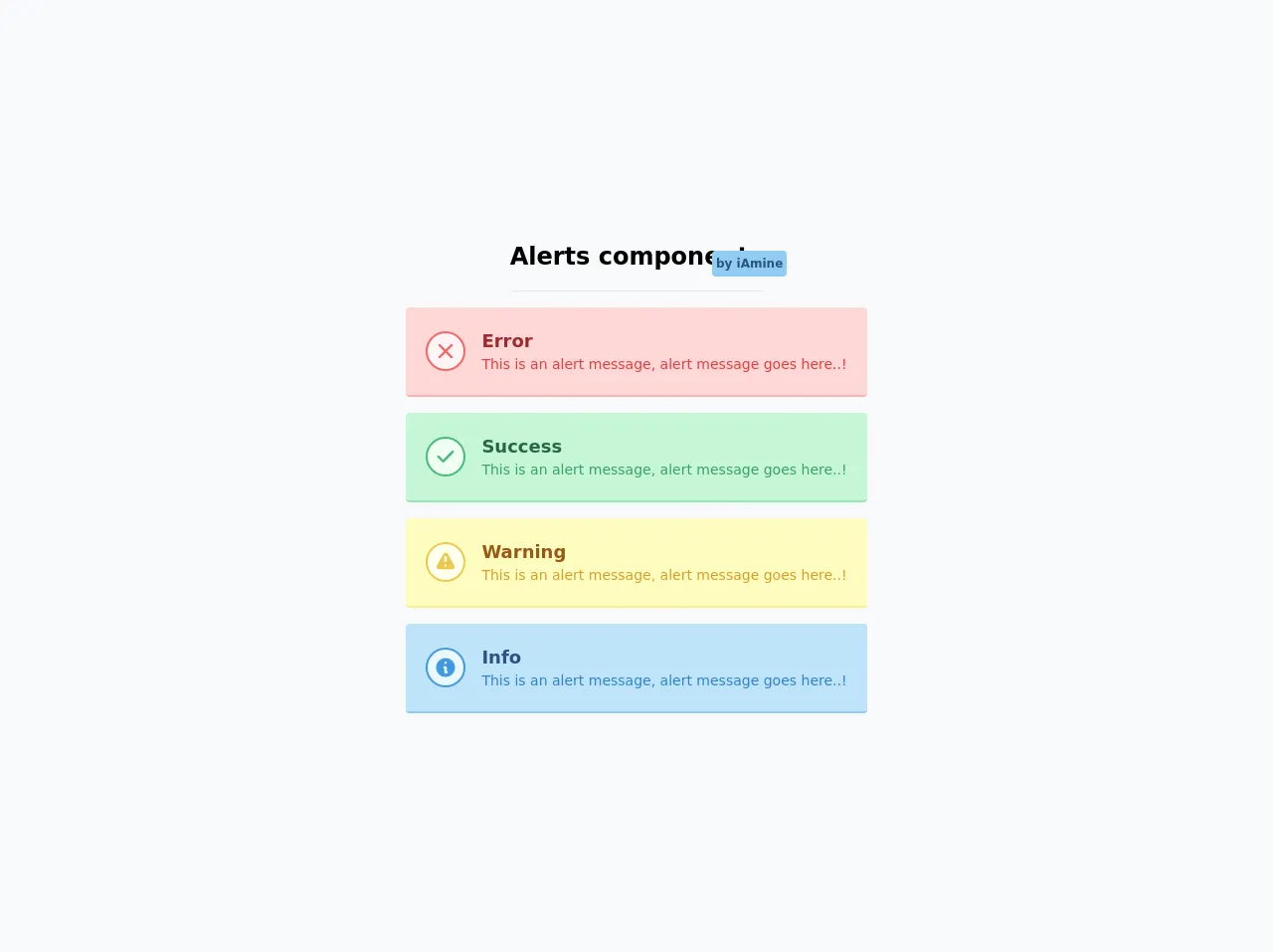
- The preview of Alerts components ui component.
- The source code of Alerts components ui component.
- How to create a Alerts components with Tailwind CSS?
- Conclusion
As a FrontEnd technology blogger, you might have heard of Tailwind CSS, a popular utility-first CSS framework that helps developers create responsive and customizable user interfaces. In this article, we will guide you through building an Alerts component using Tailwind CSS.
What is Tailwind CSS?
Tailwind CSS is a utility-first CSS framework that provides a set of pre-defined CSS classes that can be used to style HTML elements. It allows developers to create custom designs quickly and easily by providing a wide range of utility classes that can be combined to create complex layouts and styles.
The description of Alerts components ui component
Alerts components are a common UI element used to display important information to users. They typically appear at the top of a page or section and are used to notify users of errors, warnings, or other important messages.
Why use Tailwind CSS to create a Alerts components ui component?
Tailwind CSS is an excellent choice for creating Alerts components because it provides a wide range of utility classes that can be used to create custom designs quickly and easily. Additionally, Tailwind CSS is highly customizable, which means that you can easily modify the default styles to match your project's design requirements.
The preview of Alerts components ui component.
To create an Alerts component using Tailwind CSS, we will use the following classes:
.bg-red-100: sets the background color to a light shade of red..border-red-400: sets the border color to a medium shade of red..text-red-700: sets the text color to a dark shade of red..p-4: sets the padding to 1rem..rounded-md: sets the border radius to a medium value..flex: sets the display property to flex..items-center: centers the child elements vertically..justify-between: evenly spaces the child elements horizontally.
Free download of the Alerts components's source code
The source code of Alerts components ui component.
To create an Alerts component using Tailwind CSS, we will use the following HTML and CSS code:
<div class="bg-red-100 border border-red-400 text-red-700 px-4 py-3 rounded-md flex items-center justify-between" role="alert">
  <div>
    <strong class="font-bold">Error</strong>
    <span class="block sm:inline">Something went wrong.</span>
  </div>
  <div>
    <svg class="fill-current h-6 w-6 text-red-500" role="button" xmlns="http://www.w3.org/2000/svg" viewBox="0 0 20 20"><title>Close</title><path d="M14.348 5.652a1 1 0 00-1.414 0L10 8.586 6.066 4.652a1 1 0 00-1.414 1.414L8.586 10l-3.934 3.934a1 1 0 101.414 1.414L10 11.414l3.934 3.934a1 1 0 001.414-1.414L11.414 10l3.934-3.934a1 1 0 000-1.414z"/></svg>
  </div>
</div>
.alert {
  @apply bg-red-100 border border-red-400 text-red-700 px-4 py-3 rounded-md flex items-center justify-between;
}
.alert strong {
  @apply font-bold;
}
.alert svg {
  @apply fill-current h-6 w-6 text-red-500;
}
<div class="flex min-h-screen flex-col items-center justify-center space-y-4 bg-gray-100 py-6">
  <div class="relative border-b border-gray-300 pb-4 text-2xl font-semibold">
    <span>Alerts components</span>
    <span class="absolute right-0 -mt-6 -mr-6 rounded bg-blue-300 p-1 text-xs text-blue-800"
      >by iAmine</span
    >
  </div>

  <div class="alert flex flex-row items-center rounded border-b-2 border-red-300 bg-red-200 p-5">
    <div
      class="alert-icon flex h-10 w-10 flex-shrink-0 items-center justify-center rounded-full border-2 border-red-500 bg-red-100"
    >
      <span class="text-red-500">
        <svg fill="currentColor" viewBox="0 0 20 20" class="h-6 w-6">
          <path
            fill-rule="evenodd"
            d="M4.293 4.293a1 1 0 011.414 0L10 8.586l4.293-4.293a1 1 0 111.414 1.414L11.414 10l4.293 4.293a1 1 0 01-1.414 1.414L10 11.414l-4.293 4.293a1 1 0 01-1.414-1.414L8.586 10 4.293 5.707a1 1 0 010-1.414z"
            clip-rule="evenodd"
          ></path>
        </svg>
      </span>
    </div>
    <div class="alert-content ml-4">
      <div class="alert-title text-lg font-semibold text-red-800">Error</div>
      <div class="alert-description text-sm text-red-600">
        This is an alert message, alert message goes here..!
      </div>
    </div>
  </div>

  <div
    class="alert flex flex-row items-center rounded border-b-2 border-green-300 bg-green-200 p-5"
  >
    <div
      class="alert-icon flex h-10 w-10 flex-shrink-0 items-center justify-center rounded-full border-2 border-green-500 bg-green-100"
    >
      <span class="text-green-500">
        <svg fill="currentColor" viewBox="0 0 20 20" class="h-6 w-6">
          <path
            fill-rule="evenodd"
            d="M16.707 5.293a1 1 0 010 1.414l-8 8a1 1 0 01-1.414 0l-4-4a1 1 0 011.414-1.414L8 12.586l7.293-7.293a1 1 0 011.414 0z"
            clip-rule="evenodd"
          ></path>
        </svg>
      </span>
    </div>
    <div class="alert-content ml-4">
      <div class="alert-title text-lg font-semibold text-green-800">Success</div>
      <div class="alert-description text-sm text-green-600">
        This is an alert message, alert message goes here..!
      </div>
    </div>
  </div>

  <div
    class="alert flex flex-row items-center rounded border-b-2 border-yellow-300 bg-yellow-200 p-5"
  >
    <div
      class="alert-icon flex h-10 w-10 flex-shrink-0 items-center justify-center rounded-full border-2 border-yellow-500 bg-yellow-100"
    >
      <span class="text-yellow-500">
        <svg fill="currentColor" viewBox="0 0 20 20" class="h-6 w-6">
          <path
            fill-rule="evenodd"
            d="M8.257 3.099c.765-1.36 2.722-1.36 3.486 0l5.58 9.92c.75 1.334-.213 2.98-1.742 2.98H4.42c-1.53 0-2.493-1.646-1.743-2.98l5.58-9.92zM11 13a1 1 0 11-2 0 1 1 0 012 0zm-1-8a1 1 0 00-1 1v3a1 1 0 002 0V6a1 1 0 00-1-1z"
            clip-rule="evenodd"
          ></path>
        </svg>
      </span>
    </div>
    <div class="alert-content ml-4">
      <div class="alert-title text-lg font-semibold text-yellow-800">Warning</div>
      <div class="alert-description text-sm text-yellow-600">
        This is an alert message, alert message goes here..!
      </div>
    </div>
  </div>

  <div class="alert flex flex-row items-center rounded border-b-2 border-blue-300 bg-blue-200 p-5">
    <div
      class="alert-icon flex h-10 w-10 flex-shrink-0 items-center justify-center rounded-full border-2 border-blue-500 bg-blue-100"
    >
      <span class="text-blue-500">
        <svg fill="currentColor" viewBox="0 0 20 20" class="h-6 w-6">
          <path
            fill-rule="evenodd"
            d="M18 10a8 8 0 11-16 0 8 8 0 0116 0zm-7-4a1 1 0 11-2 0 1 1 0 012 0zM9 9a1 1 0 000 2v3a1 1 0 001 1h1a1 1 0 100-2v-3a1 1 0 00-1-1H9z"
            clip-rule="evenodd"
          ></path>
        </svg>
      </span>
    </div>
    <div class="alert-content ml-4">
      <div class="alert-title text-lg font-semibold text-blue-800">Info</div>
      <div class="alert-description text-sm text-blue-600">
        This is an alert message, alert message goes here..!
      </div>
    </div>
  </div>
</div>
How to create a Alerts components with Tailwind CSS?
To create an Alerts component with Tailwind CSS, follow these steps:
- Create a new HTML file and add the following code:
<div class="alert" role="alert">
  <div>
    <strong class="font-bold">Error</strong>
    <span class="block sm:inline">Something went wrong.</span>
  </div>
  <div>
    <svg class="fill-current h-6 w-6 text-red-500" role="button" xmlns="http://www.w3.org/2000/svg" viewBox="0 0 20 20"><title>Close</title><path d="M14.348 5.652a1 1 0 00-1.414 0L10 8.586 6.066 4.652a1 1 0 00-1.414 1.414L8.586 10l-3.934 3.934a1 1 0 101.414 1.414L10 11.414l3.934 3.934a1 1 0 001.414-1.414L11.414 10l3.934-3.934a1 1 0 000-1.414z"/></svg>
  </div>
</div>
- Add the following CSS code to your stylesheet:
.alert {
  @apply bg-red-100 border border-red-400 text-red-700 px-4 py-3 rounded-md flex items-center justify-between;
}
.alert strong {
  @apply font-bold;
}
.alert svg {
  @apply fill-current h-6 w-6 text-red-500;
}
- Customize the styles as needed by modifying the utility classes or adding new ones.
Conclusion
In this article, we have shown you how to create an Alerts component using Tailwind CSS. We hope that this practical guide has been helpful and that you are now able to create your own custom Alerts components using Tailwind CSS. Remember, Tailwind CSS is highly customizable, so don't be afraid to experiment and create your own unique designs.