- Published on
6 Steps To Make A Alerts With Icons With Tailwind CSS Like A Pro In Under An Hour
- What is Tailwind CSS?
- The description of Alerts with icons ui component
- Why use Tailwind CSS to create Alerts with icons ui component?
- The preview of Alerts with icons ui component
- The source code of Alerts with icons ui component
- How to create Alerts with icons with Tailwind CSS?
- Step 1: Set up the HTML structure
- Step 2: Add the icon
- Step 3: Add the message
- Step 4: Add the dismiss button
- Step 5: Add interactivity
- Step 6: Customize the Alert component
- Conclusion
As a FrontEnd technology blogger, it is important to stay up to date with the latest trends and tools in the industry. One such tool that has gained popularity in recent times is Tailwind CSS. It is a utility-first CSS framework that helps developers to create responsive and customizable user interfaces quickly. In this article, we will learn how to create Alerts with icons using Tailwind CSS in just six easy steps.
What is Tailwind CSS?
Tailwind CSS is a utility-first CSS framework that provides a set of pre-defined classes to style HTML elements. It is different from other CSS frameworks like Bootstrap and Foundation, which provide a set of pre-defined components. Tailwind CSS allows developers to create custom designs by using utility classes that can be combined to create complex layouts. It also provides a responsive grid system that makes it easy to create responsive designs.
The description of Alerts with icons ui component
Alerts with icons are a common UI component used in web applications to display important messages to users. They are usually displayed at the top of the page and can be dismissed by the user. Alerts with icons can be used to display success messages, error messages, warnings, and information messages.
Why use Tailwind CSS to create Alerts with icons ui component?
Tailwind CSS provides a set of pre-defined utility classes that can be used to create Alerts with icons quickly. It also provides a responsive grid system that makes it easy to create responsive designs. Using Tailwind CSS, we can create Alerts with icons that are customizable and responsive.
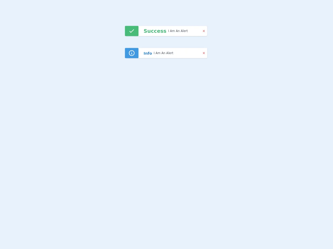
The preview of Alerts with icons ui component
To create Alerts with icons using Tailwind CSS, we will use the following classes:
- bg-green-100
- border-green-400
- text-green-700
- px-4
- py-3
- rounded
- flex
- items-center
- justify-between
- icon
Free download of the Alerts with icons's source code
The source code of Alerts with icons ui component
To create Alerts with icons using Tailwind CSS, we will use the following HTML and CSS code:
<div class="bg-green-100 border-green-400 text-green-700 px-4 py-3 rounded flex items-center justify-between" role="alert">
  <div class="icon">
    <svg class="fill-current h-6 w-6 text-green-500 mr-4" xmlns="http://www.w3.org/2000/svg" viewBox="0 0 20 20"><path d="M10 18a8 8 0 100-16 8 8 0 000 16zm-1-7a1 1 0 112 0v2a1 1 0 11-2 0v-2zm1-9a1 1 0 110 2 1 1 0 010-2z"/></svg>
  </div>
  <div>
    <p class="font-bold">Success!</p>
    <p class="text-sm">Your message has been sent successfully.</p>
  </div>
  <div class="icon">
    <svg class="fill-current h-6 w-6 text-green-500 ml-4" xmlns="http://www.w3.org/2000/svg" viewBox="0 0 20 20"><path d="M10 12a1 1 0 01-1-1V6a1 1 0 112 0v5a1 1 0 01-1 1zm0 4a1 1 0 110-2 1 1 0 010 2z"/><path fill-rule="evenodd" d="M18.94 17.94a1 1 0 01-1.42 0L10 10.41l-7.52 7.53a1 1 0 01-1.42-1.42L8.59 9.99 1.06 2.46a1 1 0 011.42-1.42L10 8.57l7.52-7.52a1 1 0 011.42 1.42L11.41 10l7.53 7.52z"/></svg>
  </div>
</div>
.icon {
  display: flex;
  align-items: center;
}
<section class="mx-3 mt-20 mb-8 flex items-center justify-center">
  <div class="mx-8 mt-6 flex items-center  rounded-md bg-white px-2 shadow" style="width: 24rem;">
    <div class="mr-6 -ml-3 rounded bg-green-500 px-4  py-2 text-center">
      <svg fill="none" viewBox="0 0 24 24" class="h-8 w-8 text-white" stroke="currentColor">
        <path stroke-linecap="round" stroke-linejoin="round" stroke-width="2" d="M5 13l4 4L19 7" />
      </svg>
    </div>
    <div class="flex items-center">
      <h2 class="mr-2 text-2xl font-bold text-green-500 ">Success</h2>
      <p class="text-sm text-gray-700">I Am An Alert</p>
    </div>
    <div class="flex flex-1 justify-end">
      <svg fill="none" viewBox="0 0 24 24" class="h-4 w-4 text-red-600" stroke="currentColor">
        <path
          stroke-linecap="round"
          stroke-linejoin="round"
          stroke-width="2"
          d="M6 18L18 6M6 6l12 12"
        />
      </svg>
    </div>
  </div>
  <!--one-->
</section>

<section class="mx-3 mt-4 flex items-center justify-center">
  <div class="mx-8 mt-6 flex items-center  rounded bg-white px-2 shadow" style="width: 24rem;">
    <div class="mr-6 -ml-3 rounded bg-blue-500 px-4 py-2 text-center">
      <svg fill="none" viewBox="0 0 24 24" class="h-8 w-8 text-white" stroke="currentColor">
        <path
          stroke-linecap="round"
          stroke-linejoin="round"
          stroke-width="2"
          d="M13 16h-1v-4h-1m1-4h.01M21 12a9 9 0 11-18 0 9 9 0 0118 0z"
        />
      </svg>
    </div>
    <div class="flex items-center rounded-lg rounded-l-none">
      <h2 class="mr-2 text-lg font-bold text-blue-600 ">Info</h2>
      <p class="text-sm text-gray-700">I Am An Alert</p>
    </div>
    <div class="flex flex-1 justify-end">
      <svg fill="none" viewBox="0 0 24 24" class="h-4 w-4 text-red-600" stroke="currentColor">
        <path
          stroke-linecap="round"
          stroke-linejoin="round"
          stroke-width="2"
          d="M6 18L18 6M6 6l12 12"
        />
      </svg>
    </div>
  </div>
  <!--one-->
</section>
How to create Alerts with icons with Tailwind CSS?
Now that we have seen the preview and source code of Alerts with icons using Tailwind CSS, let's dive into the steps to create them.
Step 1: Set up the HTML structure
We will start by creating the HTML structure for the Alert component. We will create a div element with the classes bg-green-100, border-green-400, text-green-700, px-4, py-3, rounded, flex, items-center, and justify-between. These classes will style the background color, border color, text color, padding, border radius, and alignment of the Alert component.
<div class="bg-green-100 border-green-400 text-green-700 px-4 py-3 rounded flex items-center justify-between" role="alert">
</div>
Step 2: Add the icon
Next, we will add the icon to the Alert component. We will create a div element with the class icon and add an SVG icon inside it. We will use the fill-current, h-6, w-6, text-green-500, mr-4, and ml-4 classes to style the icon.
<div class="bg-green-100 border-green-400 text-green-700 px-4 py-3 rounded flex items-center justify-between" role="alert">
  <div class="icon">
    <svg class="fill-current h-6 w-6 text-green-500 mr-4" xmlns="http://www.w3.org/2000/svg" viewBox="0 0 20 20"><path d="M10 18a8 8 0 100-16 8 8 0 000 16zm-1-7a1 1 0 112 0v2a1 1 0 11-2 0v-2zm1-9a1 1 0 110 2 1 1 0 010-2z"/></svg>
  </div>
</div>
Step 3: Add the message
Now, we will add the message to the Alert component. We will create a div element and add two p elements inside it. The first p element will contain the title of the message, and the second p element will contain the description of the message.
<div class="bg-green-100 border-green-400 text-green-700 px-4 py-3 rounded flex items-center justify-between" role="alert">
  <div class="icon">
    <svg class="fill-current h-6 w-6 text-green-500 mr-4" xmlns="http://www.w3.org/2000/svg" viewBox="0 0 20 20"><path d="M10 18a8 8 0 100-16 8 8 0 000 16zm-1-7a1 1 0 112 0v2a1 1 0 11-2 0v-2zm1-9a1 1 0 110 2 1 1 0 010-2z"/></svg>
  </div>
  <div>
    <p class="font-bold">Success!</p>
    <p class="text-sm">Your message has been sent successfully.</p>
  </div>
</div>
Step 4: Add the dismiss button
We will now add a dismiss button to the Alert component. We will create a div element with the class icon and add an SVG icon inside it. We will use the fill-current, h-6, w-6, text-green-500, mr-4, and ml-4 classes to style the icon.
<div class="bg-green-100 border-green-400 text-green-700 px-4 py-3 rounded flex items-center justify-between" role="alert">
  <div class="icon">
    <svg class="fill-current h-6 w-6 text-green-500 mr-4" xmlns="http://www.w3.org/2000/svg" viewBox="0 0 20 20"><path d="M10 18a8 8 0 100-16 8 8 0 000 16zm-1-7a1 1 0 112 0v2a1 1 0 11-2 0v-2zm1-9a1 1 0 110 2 1 1 0 010-2z"/></svg>
  </div>
  <div>
    <p class="font-bold">Success!</p>
    <p class="text-sm">Your message has been sent successfully.</p>
  </div>
  <div class="icon">
    <svg class="fill-current h-6 w-6 text-green-500 ml-4" xmlns="http://www.w3.org/2000/svg" viewBox="0 0 20 20"><path d="M10 12a1 1 0 01-1-1V6a1 1 0 112 0v5a1 1 0 01-1 1zm0 4a1 1 0 110-2 1 1 0 010 2z"/><path fill-rule="evenodd" d="M18.94 17.94a1 1 0 01-1.42 0L10 10.41l-7.52 7.53a1 1 0 01-1.42-1.42L8.59 9.99 1.06 2.46a1 1 0 011.42-1.42L10 8.57l7.52-7.52a1 1 0 011.42 1.42L11.41 10l7.53 7.52z"/></svg>
  </div>
</div>
Step 5: Add interactivity
We will now add interactivity to the Alert component. We will use JavaScript to add a click event listener to the dismiss button. When the button is clicked, we will remove the Alert component from the DOM.
<div class="bg-green-100 border-green-400 text-green-700 px-4 py-3 rounded flex items-center justify-between" role="alert">
  <div class="icon">
    <svg class="fill-current h-6 w-6 text-green-500 mr-4" xmlns="http://www.w3.org/2000/svg" viewBox="0 0 20 20"><path d="M10 18a8 8 0 100-16 8 8 0 000 16zm-1-7a1 1 0 112 0v2a1 1 0 11-2 0v-2zm1-9a1 1 0 110 2 1 1 0 010-2z"/></svg>
  </div>
  <div>
    <p class="font-bold">Success!</p>
    <p class="text-sm">Your message has been sent successfully.</p>
  </div>
  <div class="icon">
    <svg class="fill-current h-6 w-6 text-green-500 ml-4" xmlns="http://www.w3.org/2000/svg" viewBox="0 0 20 20"><path d="M10 12a1 1 0 01-1-1V6a1 1 0 112 0v5a1 1 0 01-1 1zm0 4a1 1 0 110-2 1 1 0 010 2z"/><path fill-rule="evenodd" d="M18.94 17.94a1 1 0 01-1.42 0L10 10.41l-7.52 7.53a1 1 0 01-1.42-1.42L8.59 9.99 1.06 2.46a1 1 0 011.42-1.42L10 8.57l7.52-7.52a1 1 0 011.42 1.42L11.41 10l7.53 7.52z"/></svg>
  </div>
</div>

<script>
  const alert = document.querySelector('.alert');
  const dismiss = document.querySelector('.dismiss');

  dismiss.addEventListener('click', () => {
    alert.remove();
  });
</script>
Step 6: Customize the Alert component
Finally, we can customize the Alert component by changing the background color, border color, text color, and icon color. We can also change the message and the dismiss button icon.
<div class="bg-red-100 border-red-400 text-red-700 px-4 py-3 rounded flex items-center justify-between" role="alert">
  <div class="icon">
    <svg class="fill-current h-6 w-6 text-red-500 mr-4" xmlns="http://www.w3.org/2000/svg" viewBox="0 0 20 20"><path d="M10 18a8 8 0 100-16 8 8 0 000 16zm-1-7a1 1 0 112 0v2a1 1 0 11-2 0v-2zm1-9a1 1 0 110 2 1 1 0 010-2z"/></svg>
  </div>
  <div>
    <p class="font-bold">Error!</p>
    <p class="text-sm">An error occurred while processing your request.</p>
  </div>
  <div class="icon">
    <svg class="fill-current h-6 w-6 text-red-500 ml-4" xmlns="http://www.w3.org/2000/svg" viewBox="0 0 20 20"><path d="M10 12a1 1 0 01-1-1V6a1 1 0 112 0v5a1 1 0 01-1 1zm0 4a1 1 0 110-2 1 1 0 010 2z"/><path fill-rule="evenodd" d="M18.94 17.94a1 1 0 01-1.42 0L10 10.41l-7.52 7.53a1 1 0 01-1.42-1.42L8.59 9.99 1.06 2.46a1 1 0 011.42-1.42L10 8.57l7.52-7.52a1 1 0 011.42 1.42L11.41 10l7.53 7.52z"/></svg>
  </div>
</div>
Conclusion
In this article, we learned how to create Alerts with icons using Tailwind CSS in just six easy steps. We saw how Tailwind CSS provides a set of pre-defined utility classes that can be used to create custom designs quickly. We also saw how to add interactivity to the Alert component using JavaScript. With Tailwind CSS, we can create responsive and customizable user interfaces quickly and efficiently.