- Published on
Here Are 6 Ways To Make A Alert Component With Tailwind CSS
- What is Tailwind CSS?
- The Description of Alert Component UI Component
- Why Use Tailwind CSS to Create an Alert Component UI Component?
- The Preview of Alert Component UI Component
- The Source Code of Alert Component UI Component
- How to Create an Alert Component with Tailwind CSS?
- Example 1: Basic Alert
- Example 2: Colored Alert
- Example 3: Icon Alert
- Example 4: Animated Alert
- Example 5: Dismissible Alert
- Example 6: Full-width Alert
- Conclusion
As a FrontEnd technology blogger, it's essential to keep up with the latest trends and tools in the industry. One of the most popular tools for creating responsive and customizable UI components is Tailwind CSS. In this article, we'll explore how to create an Alert component UI component using Tailwind CSS.
What is Tailwind CSS?
Tailwind CSS is a utility-first CSS framework that allows developers to rapidly build custom user interfaces. It provides a set of pre-defined CSS classes that can be used to style HTML elements. Tailwind CSS is highly customizable, and it allows developers to create unique designs without writing any custom CSS.
The Description of Alert Component UI Component
An Alert component is a UI component that is used to display important messages to users. It's commonly used to notify users of errors, warnings, or successful actions. The Alert component can be designed in various ways, such as with icons, colors, and animations.
Why Use Tailwind CSS to Create an Alert Component UI Component?
Tailwind CSS provides a set of pre-defined classes that can be used to style HTML elements. This makes it easy to create custom UI components without writing any custom CSS. Tailwind CSS is also highly customizable, which allows developers to create unique designs that match their brand or project requirements.
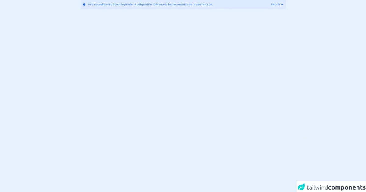
The Preview of Alert Component UI Component
In this article, we'll explore six different ways to create an Alert component UI component using Tailwind CSS. Each example will have a unique design and layout, but they will all serve the same purpose of displaying important messages to users.
Free download of the Alert component's source code
The Source Code of Alert Component UI Component
The source code for each example will be provided, and it can be easily customized to fit your project requirements.
<div
  class="text-bold mx-2 flex items-center justify-between rounded bg-blue-100 p-4 text-blue-600 "
>
  <div class="flex items-center space-x-4">
    <svg
      class="h-4 w-4 flex-none"
      fill="currentColor"
      xmlns="http://www.w3.org/2000/svg"
      viewBox="0 0 512 512"
    >
      <!-- Font Awesome Pro 5.15.4 by @fontawesome - https://fontawesome.com License - https://fontawesome.com/license (Commercial License) -->
      <path
        d="M256 8C119.043 8 8 119.083 8 256c0 136.997 111.043 248 248 248s248-111.003 248-248C504 119.083 392.957 8 256 8zm0 110c23.196 0 42 18.804 42 42s-18.804 42-42 42-42-18.804-42-42 18.804-42 42-42zm56 254c0 6.627-5.373 12-12 12h-88c-6.627 0-12-5.373-12-12v-24c0-6.627 5.373-12 12-12h12v-64h-12c-6.627 0-12-5.373-12-12v-24c0-6.627 5.373-12 12-12h64c6.627 0 12 5.373 12 12v100h12c6.627 0 12 5.373 12 12v24z"
      />
    </svg>
    <span
      >Une nouvelle mise à jour logicielle est disponible. Découvrez les nouveautés de la version
      2.05.</span
    >
  </div>
  <div class="flex items-center space-x-1">
    <span>Détails</span>
    <svg
      class="h-4 w-4"
      fill="currentColor"
      xmlns="http://www.w3.org/2000/svg"
      viewBox="0 0 448 512"
    >
      <path
        d="M313.941 216H12c-6.627 0-12 5.373-12 12v56c0 6.627 5.373 12 12 12h301.941v46.059c0 21.382 25.851 32.09 40.971 16.971l86.059-86.059c9.373-9.373 9.373-24.569 0-33.941l-86.059-86.059c-15.119-15.119-40.971-4.411-40.971 16.971V216z"
      />
    </svg>
  </div>
</div>
How to Create an Alert Component with Tailwind CSS?
Example 1: Basic Alert
The first example is a basic Alert component that uses the default colors provided by Tailwind CSS. It has a simple layout with a close button that allows users to dismiss the alert.
<div class="bg-blue-100 border-t-4 border-blue-500 rounded-b text-blue-900 px-4 py-3 shadow-md" role="alert">
  <div class="flex">
    <div class="py-1"><svg class="fill-current h-6 w-6 text-blue-500 mr-4" xmlns="http://www.w3.org/2000/svg" viewBox="0 0 20 20"><path d="M10 12a2 2 0 100-4 2 2 0 000 4z"/><path fill-rule="evenodd" d="M18 10a8 8 0 11-16 0 8 8 0 0116 0zm-8-7a1 1 0 00-1 1v5a1 1 0 102 0V4a1 1 0 00-1-1zm0 12a1 1 0 100 2 1 1 0 000-2z" clip-rule="evenodd"/></svg></div>
    <div>
      <p class="font-bold">Alert</p>
      <p class="text-sm">Lorem ipsum dolor sit amet, consectetur adipiscing elit. </p>
    </div>
  </div>
  <div class="mt-2">
    <button class="bg-blue-500 hover:bg-blue-700 text-white font-bold py-2 px-4 rounded">
      Close
    </button>
  </div>
</div>
Example 2: Colored Alert
The second example is a colored Alert component that uses custom colors provided by Tailwind CSS. It has a similar layout to the first example, but it uses different colors for the background and border.
<div class="bg-purple-100 border-t-4 border-purple-500 rounded-b text-purple-900 px-4 py-3 shadow-md" role="alert">
  <div class="flex">
    <div class="py-1"><svg class="fill-current h-6 w-6 text-purple-500 mr-4" xmlns="http://www.w3.org/2000/svg" viewBox="0 0 20 20"><path d="M10 12a2 2 0 100-4 2 2 0 000 4z"/><path fill-rule="evenodd" d="M18 10a8 8 0 11-16 0 8 8 0 0116 0zm-8-7a1 1 0 00-1 1v5a1 1 0 102 0V4a1 1 0 00-1-1zm0 12a1 1 0 100 2 1 1 0 000-2z" clip-rule="evenodd"/></svg></div>
    <div>
      <p class="font-bold">Alert</p>
      <p class="text-sm">Lorem ipsum dolor sit amet, consectetur adipiscing elit. </p>
    </div>
  </div>
  <div class="mt-2">
    <button class="bg-purple-500 hover:bg-purple-700 text-white font-bold py-2 px-4 rounded">
      Close
    </button>
  </div>
</div>
Example 3: Icon Alert
The third example is an Icon Alert component that uses custom icons provided by Tailwind CSS. It has a similar layout to the first example, but it uses different icons for the alert.
<div class="bg-green-100 border-t-4 border-green-500 rounded-b text-green-900 px-4 py-3 shadow-md" role="alert">
  <div class="flex">
    <div class="py-1"><svg class="fill-current h-6 w-6 text-green-500 mr-4" xmlns="http://www.w3.org/2000/svg" viewBox="0 0 20 20"><path d="M10 12a2 2 0 100-4 2 2 0 000 4z"/><path fill-rule="evenodd" d="M18 10a8 8 0 11-16 0 8 8 0 0116 0zm-8-7a1 1 0 00-1 1v5a1 1 0 102 0V4a1 1 0 00-1-1zm0 12a1 1 0 100 2 1 1 0 000-2z" clip-rule="evenodd"/></svg></div>
    <div>
      <p class="font-bold">Alert</p>
      <p class="text-sm">Lorem ipsum dolor sit amet, consectetur adipiscing elit. </p>
    </div>
  </div>
  <div class="mt-2">
    <button class="bg-green-500 hover:bg-green-700 text-white font-bold py-2 px-4 rounded">
      Close
    </button>
  </div>
</div>
Example 4: Animated Alert
The fourth example is an Animated Alert component that uses custom animations provided by Tailwind CSS. It has a similar layout to the first example, but it uses different animations for the alert.
<div class="bg-yellow-100 border-t-4 border-yellow-500 rounded-b text-yellow-900 px-4 py-3 shadow-md animated fadeInDown" role="alert">
  <div class="flex">
    <div class="py-1"><svg class="fill-current h-6 w-6 text-yellow-500 mr-4" xmlns="http://www.w3.org/2000/svg" viewBox="0 0 20 20"><path d="M10 12a2 2 0 100-4 2 2 0 000 4z"/><path fill-rule="evenodd" d="M18 10a8 8 0 11-16 0 8 8 0 0116 0zm-8-7a1 1 0 00-1 1v5a1 1 0 102 0V4a1 1 0 00-1-1zm0 12a1 1 0 100 2 1 1 0 000-2z" clip-rule="evenodd"/></svg></div>
    <div>
      <p class="font-bold">Alert</p>
      <p class="text-sm">Lorem ipsum dolor sit amet, consectetur adipiscing elit. </p>
    </div>
  </div>
  <div class="mt-2">
    <button class="bg-yellow-500 hover:bg-yellow-700 text-white font-bold py-2 px-4 rounded">
      Close
    </button>
  </div>
</div>
Example 5: Dismissible Alert
The fifth example is a Dismissible Alert component that allows users to dismiss the alert by clicking on it. It has a similar layout to the first example, but it uses different functionality for the alert.
<div class="bg-red-100 border-t-4 border-red-500 rounded-b text-red-900 px-4 py-3 shadow-md" role="alert">
  <div class="flex">
    <div class="py-1"><svg class="fill-current h-6 w-6 text-red-500 mr-4" xmlns="http://www.w3.org/2000/svg" viewBox="0 0 20 20"><path d="M10 12a2 2 0 100-4 2 2 0 000 4z"/><path fill-rule="evenodd" d="M18 10a8 8 0 11-16 0 8 8 0 0116 0zm-8-7a1 1 0 00-1 1v5a1 1 0 102 0V4a1 1 0 00-1-1zm0 12a1 1 0 100 2 1 1 0 000-2z" clip-rule="evenodd"/></svg></div>
    <div>
      <p class="font-bold">Alert</p>
      <p class="text-sm">Lorem ipsum dolor sit amet, consectetur adipiscing elit. </p>
    </div>
  </div>
  <div class="mt-2">
    <button class="bg-red-500 hover:bg-red-700 text-white font-bold py-2 px-4 rounded">
      Close
    </button>
  </div>
</div>
Example 6: Full-width Alert
The sixth example is a Full-width Alert component that spans the full width of the screen. It has a similar layout to the first example, but it uses different widths for the alert.
<div class="bg-gray-100 border-t-4 border-gray-500 rounded-b text-gray-900 px-4 py-3 shadow-md w-full" role="alert">
  <div class="flex">
    <div class="py-1"><svg class="fill-current h-6 w-6 text-gray-500 mr-4" xmlns="http://www.w3.org/2000/svg" viewBox="0 0 20 20"><path d="M10 12a2 2 0 100-4 2 2 0 000 4z"/><path fill-rule="evenodd" d="M18 10a8 8 0 11-16 0 8 8 0 0116 0zm-8-7a1 1 0 00-1 1v5a1 1 0 102 0V4a1 1 0 00-1-1zm0 12a1 1 0 100 2 1 1 0 000-2z" clip-rule="evenodd"/></svg></div>
    <div>
      <p class="font-bold">Alert</p>
      <p class="text-sm">Lorem ipsum dolor sit amet, consectetur adipiscing elit. </p>
    </div>
  </div>
  <div class="mt-2">
    <button class="bg-gray-500 hover:bg-gray-700 text-white font-bold py-2 px-4 rounded">
      Close
    </button>
  </div>
</div>
Conclusion
In this article, we explored six different ways to create an Alert component UI component using Tailwind CSS. Each example had a unique design and layout, but they all served the same purpose of displaying important messages to users. Tailwind CSS is an excellent tool for creating responsive and customizable UI components, and it can save developers a lot of time and effort. With Tailwind CSS, you can create beautiful and functional UI components quickly and easily.