- Published on
The 5 Really Obvious Ways To Create A Alert Component With Tailwind CSS Better That You Ever Did
- What is Tailwind CSS?
- The description of Alert Component UI component
- Why use Tailwind CSS to create an Alert Component UI component?
- The preview of Alert Component UI component
- The source code of Alert Component UI component
- How to create a Alert Component with Tailwind CSS?
- Conclusion
As a FrontEnd technology blogger, you may have heard of Tailwind CSS, a utility-first CSS framework that allows you to rapidly build custom user interfaces. In this article, we'll explore how to create an Alert Component UI component with Tailwind CSS and how it can be done better than ever before.
What is Tailwind CSS?
Tailwind CSS is a utility-first CSS framework that provides a set of pre-defined CSS classes that can be used to style HTML elements. It allows developers to rapidly build custom user interfaces without having to write custom CSS code.
The description of Alert Component UI component
An Alert Component is a UI component that is used to display important messages to the user. It is commonly used to display error messages, success messages, or warning messages. The Alert Component typically consists of a message, an icon, and a close button.
Why use Tailwind CSS to create an Alert Component UI component?
Tailwind CSS provides a set of pre-defined utility classes that can be used to style the Alert Component UI component. This makes it easy to create a custom Alert Component without having to write custom CSS code. Additionally, Tailwind CSS provides responsive design classes that make it easy to create a responsive Alert Component that looks great on all screen sizes.
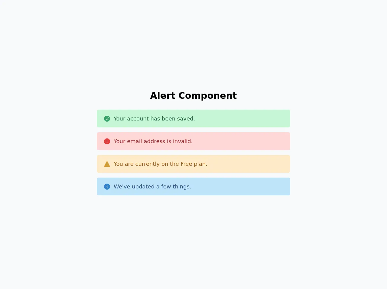
The preview of Alert Component UI component
To create an Alert Component with Tailwind CSS, we'll use a combination of utility classes to style the message, icon, and close button. The result is a clean and modern Alert Component that can be customized to fit any design.
Free download of the Alert Component's source code
The source code of Alert Component UI component
To create an Alert Component with Tailwind CSS, we'll use a combination of utility classes to style the message, icon, and close button. The code is simple and easy to understand, making it easy to customize the Alert Component to fit any design.
<div class="flex h-screen w-screen items-center justify-center bg-gray-100">
  <div class="mx-auto w-full">
    <!-- Title -->
    <h1 class="mb-6 text-center text-3xl font-bold">Alert Component</h1>
    <!-- End Title -->

    <!-- Alert Success -->
    <div
      class="mx-2 my-4 mx-auto flex w-3/4 items-center rounded-md bg-green-200 px-6 py-4 text-lg xl:w-2/4"
    >
      <svg viewBox="0 0 24 24" class="mr-3 h-5 w-5 text-green-600 sm:h-5 sm:w-5">
        <path
          fill="currentColor"
          d="M12,0A12,12,0,1,0,24,12,12.014,12.014,0,0,0,12,0Zm6.927,8.2-6.845,9.289a1.011,1.011,0,0,1-1.43.188L5.764,13.769a1,1,0,1,1,1.25-1.562l4.076,3.261,6.227-8.451A1,1,0,1,1,18.927,8.2Z"
        ></path>
      </svg>
      <span class="text-green-800"> Your account has been saved. </span>
    </div>
    <!-- End Alert Success -->

    <!-- Alert Error -->
    <div
      class="mx-2 my-4 mx-auto flex w-3/4 items-center rounded-md bg-red-200 px-6 py-4 text-lg xl:w-2/4"
    >
      <svg viewBox="0 0 24 24" class="mr-3 h-5 w-5 text-red-600 sm:h-5 sm:w-5">
        <path
          fill="currentColor"
          d="M11.983,0a12.206,12.206,0,0,0-8.51,3.653A11.8,11.8,0,0,0,0,12.207,11.779,11.779,0,0,0,11.8,24h.214A12.111,12.111,0,0,0,24,11.791h0A11.766,11.766,0,0,0,11.983,0ZM10.5,16.542a1.476,1.476,0,0,1,1.449-1.53h.027a1.527,1.527,0,0,1,1.523,1.47,1.475,1.475,0,0,1-1.449,1.53h-.027A1.529,1.529,0,0,1,10.5,16.542ZM11,12.5v-6a1,1,0,0,1,2,0v6a1,1,0,1,1-2,0Z"
        ></path>
      </svg>
      <span class="text-red-800"> Your email address is invalid. </span>
    </div>
    <!-- End Alert Error -->

    <!-- Alert Warning -->
    <div
      class="my-4 mx-auto flex w-3/4 items-center rounded-md bg-orange-200 px-6 py-4 text-lg xl:w-2/4"
    >
      <svg viewBox="0 0 24 24" class="mr-3 h-5 w-5 text-yellow-600 sm:h-5 sm:w-5">
        <path
          fill="currentColor"
          d="M23.119,20,13.772,2.15h0a2,2,0,0,0-3.543,0L.881,20a2,2,0,0,0,1.772,2.928H21.347A2,2,0,0,0,23.119,20ZM11,8.423a1,1,0,0,1,2,0v6a1,1,0,1,1-2,0Zm1.05,11.51h-.028a1.528,1.528,0,0,1-1.522-1.47,1.476,1.476,0,0,1,1.448-1.53h.028A1.527,1.527,0,0,1,13.5,18.4,1.475,1.475,0,0,1,12.05,19.933Z"
        ></path>
      </svg>
      <span class="text-yellow-800"> You are currently on the Free plan. </span>
    </div>
    <!-- End Alert Warning -->

    <!-- Alert Info -->
    <div
      class="mx-2 my-4 mx-auto flex w-3/4 items-center rounded-md bg-blue-200 px-6 py-4 text-lg xl:w-2/4"
    >
      <svg viewBox="0 0 24 24" class="mr-3 h-5 w-5 text-blue-600 sm:h-5 sm:w-5">
        <path
          fill="currentColor"
          d="M12,0A12,12,0,1,0,24,12,12.013,12.013,0,0,0,12,0Zm.25,5a1.5,1.5,0,1,1-1.5,1.5A1.5,1.5,0,0,1,12.25,5ZM14.5,18.5h-4a1,1,0,0,1,0-2h.75a.25.25,0,0,0,.25-.25v-4.5a.25.25,0,0,0-.25-.25H10.5a1,1,0,0,1,0-2h1a2,2,0,0,1,2,2v4.75a.25.25,0,0,0,.25.25h.75a1,1,0,1,1,0,2Z"
        ></path>
      </svg>
      <span class="text-blue-800"> We've updated a few things. </span>
    </div>
    <!-- End Alert Info -->
  </div>
</div>
How to create a Alert Component with Tailwind CSS?
To create an Alert Component with Tailwind CSS, follow these steps:
- Create a new HTML file and add the following code:
<div class="bg-blue-100 border-t-4 border-blue-500 rounded-b text-blue-900 px-4 py-3 shadow-md" role="alert">
  <div class="flex">
    <div class="py-1"><svg class="fill-current h-6 w-6 text-blue-500 mr-4" xmlns="http://www.w3.org/2000/svg" viewBox="0 0 20 20"><path d="M10 12a2 2 0 100-4 2 2 0 000 4z"/><path fill-rule="evenodd" d="M18.156 15.155l1.414-1.414a1 1 0 000-1.414l-7.071-7.07a1 1 0 00-1.414 0l-7.07 7.07a1 1 0 000 1.414l1.414 1.414a1 1 0 001.414 0l5.657-5.657 5.657 5.657a1 1 0 001.414 0z" clip-rule="evenodd"/></svg></div>
    <div>
      <p class="font-bold">Alert</p>
      <p class="text-sm">Lorem ipsum dolor sit amet, consectetur adipiscing elit. Aliquam at ipsum eu nunc commodo posuere et sit amet ligula.</p>
    </div>
  </div>
  <div class="mt-3 sm:mt-0 sm:ml-4">
    <button class="bg-blue-500 hover:bg-blue-700 text-white font-bold py-2 px-4 rounded focus:outline-none focus:shadow-outline" type="button">
      Close
    </button>
  </div>
</div>
Customize the Alert Component by modifying the utility classes. For example, you can change the background color by modifying the
bg-blue-100class tobg-red-100to make it red.Add the Alert Component to your project by copying the HTML code and pasting it into your project.
Conclusion
In conclusion, creating an Alert Component UI component with Tailwind CSS is easy and efficient. By using pre-defined utility classes, you can rapidly build custom user interfaces that look great on all screen sizes. With these 5 obvious ways, you can create a better Alert Component than ever before, and make your user interface stand out from the crowd.