- Published on
Surprisingly Effective Ways To Create A A Success Alert Message With Tailwind CSS
- What is Tailwind CSS?
- The description of A success Alert message ui component
- Why use Tailwind CSS to create a A success Alert message ui component?
- The preview of A success Alert message ui component
- The source code of A success Alert message ui component
- How to create a A success Alert message with Tailwind CSS?
- Conclusion
As a FrontEnd technology blogger, you understand the importance of creating an effective user interface (UI) for your website or application. One of the key elements of a good UI is the use of alert messages to communicate important information to users. In this article, we will explore how to create a success alert message using Tailwind CSS, a popular utility-first CSS framework.
What is Tailwind CSS?
Tailwind CSS is a utility-first CSS framework that provides a set of pre-defined CSS classes that can be used to quickly and easily style HTML elements. The framework is designed to be highly customizable, with a focus on enabling developers to create unique designs without having to write custom CSS code.
The description of A success Alert message ui component
A success alert message is a UI component that is used to communicate to users that a task or action has been successfully completed. This type of alert message is typically displayed after a user has submitted a form, completed a purchase, or performed some other action that requires confirmation.
Why use Tailwind CSS to create a A success Alert message ui component?
Tailwind CSS is an ideal choice for creating a success alert message UI component for several reasons:
- Tailwind CSS provides a set of pre-defined CSS classes that can be used to quickly and easily style HTML elements, including alert messages.
- The framework is highly customizable, allowing developers to create unique designs without having to write custom CSS code.
- Tailwind CSS is designed to be mobile-first, ensuring that alert messages are optimized for use on mobile devices.
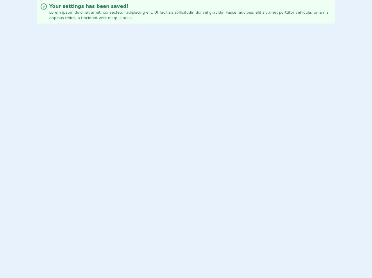
The preview of A success Alert message ui component
Free download of the A success Alert message's source code
The source code of A success Alert message ui component
To create a success alert message using Tailwind CSS, we will need to define a set of CSS classes that will be used to style the alert message. Here is the source code for the success alert message UI component:
<div class="flex rounded-md bg-green-100 p-3">
  <svg
    class="mr-2 h-8 w-8 flex-shrink-0 stroke-current stroke-2 text-green-600"
    viewBox="0 0 24 24"
    fill="none"
    strokeLinecap="round"
    strokeLinejoin="round"
  >
    <path d="M0 0h24v24H0z" stroke="none" />
    <circle cx="12" cy="12" r="9" />
    <path d="M9 12l2 2 4-4" />
  </svg>

  <div class="text-green-700">
    <div class="text-xl font-bold">Your settings has been saved!</div>

    <div>
      Lorem ipsum dolor sit amet, consectetur adipiscing elit. Ut facilisis sollicitudin dui vel
      gravida. Fusce faucibus, elit sit amet porttitor vehicula, urna nisi dapibus tellus, a
      tincidunt velit mi quis nulla.
    </div>
  </div>
</div>
How to create a A success Alert message with Tailwind CSS?
To create a success alert message using Tailwind CSS, we will need to define a set of CSS classes that will be used to style the alert message. Here is a step-by-step guide to creating a success alert message using Tailwind CSS:
- Define the HTML structure of the alert message. The alert message should include a heading, a message, and a close button.
<div class="bg-green-100 border border-green-400 text-green-700 px-4 py-3 rounded relative" role="alert">
  <strong class="font-bold">Success!</strong>
  <span class="block sm:inline">{{__message__}}</span>
  <span class="absolute top-0 bottom-0 right-0 px-4 py-3">
    <svg class="fill-current h-6 w-6 text-green-500" role="button" xmlns="http://www.w3.org/2000/svg" viewBox="0 0 20 20"><title>Close</title><path d="M14.348 5.652a.999.999 0 1 0-1.414 1.414L11 8.414l-1.934 1.934a.999.999 0 1 0 1.414 1.414L12.414 10l1.934 1.934a.999.999 0 1 0 1.414-1.414L13.828 10l1.52-1.52a.999.999 0 0 0 0-1.414z"/></svg>
  </span>
</div>
- Define the CSS classes that will be used to style the alert message. The CSS classes should be defined in a separate stylesheet or in the head section of the HTML document.
.bg-green-100 {
  background-color: #f0fff4;
}

.border-green-400 {
  border-color: #9ae6b4;
}

.text-green-700 {
  color: #2f855a;
}

.px-4 {
  padding-left: 1rem;
  padding-right: 1rem;
}

.py-3 {
  padding-top: 0.75rem;
  padding-bottom: 0.75rem;
}

.rounded {
  border-radius: 0.25rem;
}

.font-bold {
  font-weight: 700;
}

.absolute {
  position: absolute;
}

.top-0 {
  top: 0;
}

.bottom-0 {
  bottom: 0;
}

.right-0 {
  right: 0;
}

.px-4 {
  padding-left: 1rem;
  padding-right: 1rem;
}

.py-3 {
  padding-top: 0.75rem;
  padding-bottom: 0.75rem;
}

.h-6 {
  height: 1.5rem;
}

.w-6 {
  width: 1.5rem;
}

.fill-current {
  fill: currentColor;
}

.text-green-500 {
  color: #48bb78;
}
- Use the CSS classes to style the alert message in the HTML document.
<div class="bg-green-100 border border-green-400 text-green-700 px-4 py-3 rounded relative" role="alert">
  <strong class="font-bold">Success!</strong>
  <span class="block sm:inline">{{__message__}}</span>
  <span class="absolute top-0 bottom-0 right-0 px-4 py-3">
    <svg class="fill-current h-6 w-6 text-green-500" role="button" xmlns="http://www.w3.org/2000/svg" viewBox="0 0 20 20"><title>Close</title><path d="M14.348 5.652a.999.999 0 1 0-1.414 1.414L11 8.414l-1.934 1.934a.999.999 0 1 0 1.414 1.414L12.414 10l1.934 1.934a.999.999 0 1 0 1.414-1.414L13.828 10l1.52-1.52a.999.999 0 0 0 0-1.414z"/></svg>
  </span>
</div>
- Customize the alert message by modifying the CSS classes as needed.
Conclusion
In this article, we have explored how to create a success alert message using Tailwind CSS. By following the steps outlined in this article, you can create an effective and visually appealing alert message that will enhance the user experience of your website or application.