- Published on
6 Incredibly Easy Ways To Create A WYSIWYG With Tailwind CSS Better While Spending Less
- What is Tailwind CSS?
- The description of WYSIWYG ui component
- Why use Tailwind CSS to create a WYSIWYG ui component?
- The preview of WYSIWYG ui component.
- The source code of WYSIWYG ui component.
- How to create a WYSIWYG with Tailwind CSS?
- Step 1: Set up your HTML structure
- Step 2: Style the toolbar
- Step 3: Style the content area
- Step 4: Add functionality with JavaScript
- Conclusion
As a FrontEnd technology blogger, I'm always on the lookout for ways to make my work more efficient and effective. Recently, I discovered Tailwind CSS, a utility-first CSS framework that has revolutionized the way I approach web design. In this article, I'll show you how to use Tailwind CSS to create a WYSIWYG (What You See Is What You Get) UI component that is both easy to use and visually appealing.
What is Tailwind CSS?
Tailwind CSS is a utility-first CSS framework that provides a set of pre-defined classes that you can use to style your HTML elements. It's designed to be highly customizable and easy to use, making it perfect for both beginners and experienced developers.
The description of WYSIWYG ui component
A WYSIWYG UI component is a user interface element that allows users to edit content in a visual way, similar to how it will appear on the final page. It's commonly used in content management systems, email editors, and other applications where users need to create and edit content.
Why use Tailwind CSS to create a WYSIWYG ui component?
Tailwind CSS is the perfect choice for creating a WYSIWYG UI component for several reasons:
It provides a set of pre-defined classes that you can use to style your UI component, making it easy to create a visually appealing design.
It's highly customizable, allowing you to tweak the design to meet your specific needs.
It's easy to use, even for beginners, because you don't need to write any CSS code from scratch.
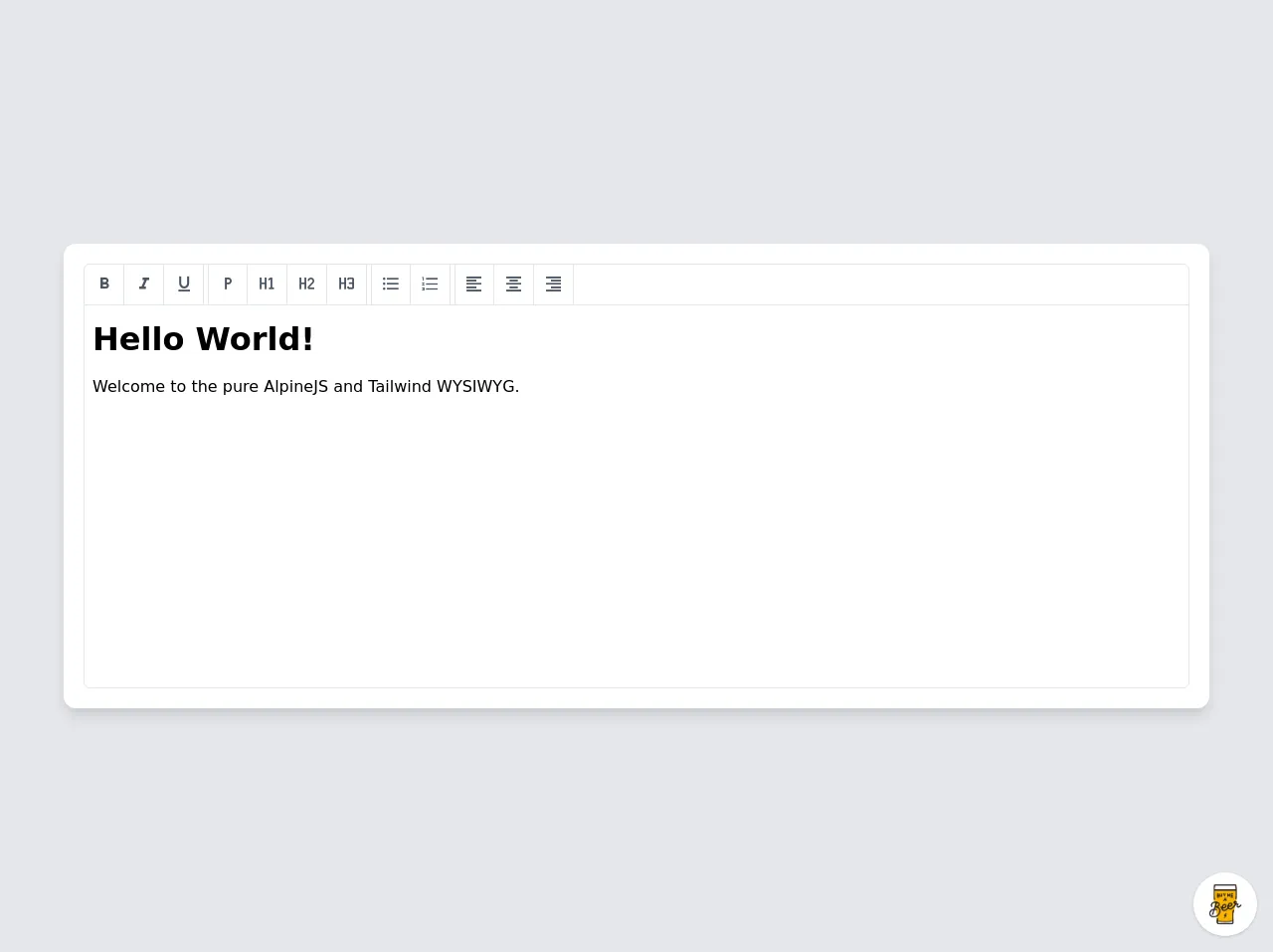
The preview of WYSIWYG ui component.
Creating a WYSIWYG UI component with Tailwind CSS is easy and fun. Here's a preview of what the final product will look like:
Free download of the WYSIWYG's source code
The source code of WYSIWYG ui component.
To create a WYSIWYG UI component with Tailwind CSS, you'll need to write some HTML and CSS code. Here's a sample code snippet to get you started:
<script src="https://cdn.jsdelivr.net/gh/alpinejs/[email protected]/dist/alpine.js" defer></script>
<style>
@import url(https://cdnjs.cloudflare.com/ajax/libs/MaterialDesign-Webfont/5.3.45/css/materialdesignicons.min.css);
/**
* tailwind.config.js
* module.exports = {
* variants: {
* extend: {
* backgroundColor: ['active'],
* }
* },
* }
*/
.active\:bg-gray-50:active {
--tw-bg-opacity:1;
background-color: rgba(249,250,251,var(--tw-bg-opacity));
}
</style>
<div class="min-w-screen min-h-screen bg-gray-200 flex items-center justify-center px-5 py-5">
<div class="w-full max-w-6xl mx-auto rounded-xl bg-white shadow-lg p-5 text-black" x-data="app()" x-init="init($refs.wysiwyg)">
<div class="border border-gray-200 overflow-hidden rounded-md">
<div class="w-full flex border-b border-gray-200 text-xl text-gray-600">
<button class="outline-none focus:outline-none border-r border-gray-200 w-10 h-10 hover:text-indigo-500 active:bg-gray-50" @click="format('bold')">
<i class="mdi mdi-format-bold"></i>
</button>
<button class="outline-none focus:outline-none border-r border-gray-200 w-10 h-10 hover:text-indigo-500 active:bg-gray-50" @click="format('italic')">
<i class="mdi mdi-format-italic"></i>
</button>
<button class="outline-none focus:outline-none border-r border-gray-200 w-10 h-10 mr-1 hover:text-indigo-500 active:bg-gray-50" @click="format('underline')">
<i class="mdi mdi-format-underline"></i>
</button>
<button class="outline-none focus:outline-none border-l border-r border-gray-200 w-10 h-10 hover:text-indigo-500 active:bg-gray-50" @click="format('formatBlock','P')">
<i class="mdi mdi-format-paragraph"></i>
</button>
<button class="outline-none focus:outline-none border-r border-gray-200 w-10 h-10 hover:text-indigo-500 active:bg-gray-50" @click="format('formatBlock','H1')">
<i class="mdi mdi-format-header-1"></i>
</button>
<button class="outline-none focus:outline-none border-r border-gray-200 w-10 h-10 hover:text-indigo-500 active:bg-gray-50" @click="format('formatBlock','H2')">
<i class="mdi mdi-format-header-2"></i>
</button>
<button class="outline-none focus:outline-none border-r border-gray-200 w-10 h-10 mr-1 hover:text-indigo-500 active:bg-gray-50" @click="format('formatBlock','H3')">
<i class="mdi mdi-format-header-3"></i>
</button>
<button class="outline-none focus:outline-none border-l border-r border-gray-200 w-10 h-10 hover:text-indigo-500 active:bg-gray-50" @click="format('insertUnorderedList')">
<i class="mdi mdi-format-list-bulleted"></i>
</button>
<button class="outline-none focus:outline-none border-r border-gray-200 w-10 h-10 mr-1 hover:text-indigo-500 active:bg-gray-50" @click="format('insertOrderedList')">
<i class="mdi mdi-format-list-numbered"></i>
</button>
<button class="outline-none focus:outline-none border-l border-r border-gray-200 w-10 h-10 hover:text-indigo-500 active:bg-gray-50" @click="format('justifyLeft')">
<i class="mdi mdi-format-align-left"></i>
</button>
<button class="outline-none focus:outline-none border-r border-gray-200 w-10 h-10 hover:text-indigo-500 active:bg-gray-50" @click="format('justifyCenter')">
<i class="mdi mdi-format-align-center"></i>
</button>
<button class="outline-none focus:outline-none border-r border-gray-200 w-10 h-10 hover:text-indigo-500 active:bg-gray-50" @click="format('justifyRight')">
<i class="mdi mdi-format-align-right"></i>
</button>
</div>
<div class="w-full">
<iframe x-ref="wysiwyg" class="w-full h-96 overflow-y-auto"></iframe>
</div>
</div>
</div>
</div>
<script>
function app() {
return {
wysiwyg: null,
init: function(el) {
// Get el
this.wysiwyg = el;
// Add CSS
this.wysiwyg.contentDocument.querySelector('head').innerHTML += ``;
this.wysiwyg.contentDocument.body.innerHTML += ``;
// Make editable
this.wysiwyg.contentDocument.designMode = "on";
},
format: function(cmd, param) {
this.wysiwyg.contentDocument.execCommand(cmd, !1, param||null)
}
}
}
</script>
<!-- BUY ME A BEER AND HELP SUPPORT OPEN-SOURCE RESOURCES -->
<div class="flex items-end justify-end fixed bottom-0 right-0 mb-4 mr-4 z-10">
<div>
<a title="Buy me a beer" href="https://www.buymeacoffee.com/scottwindon" target="_blank" class="block w-16 h-16 rounded-full transition-all shadow hover:shadow-lg transform hover:scale-110 hover:rotate-12">
<img class="object-cover object-center w-full h-full rounded-full" src="https://i.pinimg.com/originals/60/fd/e8/60fde811b6be57094e0abc69d9c2622a.jpg"/>
</a>
</div>
</div>
How to create a WYSIWYG with Tailwind CSS?
Now that you know why Tailwind CSS is the perfect choice for creating a WYSIWYG UI component, let's dive into the steps to create one:
Step 1: Set up your HTML structure
The first step is to set up the HTML structure for your WYSIWYG UI component. You'll need to create a container element that will hold all the other elements. Inside the container, you'll need to create a toolbar element and a content element.
<div class="wysiwyg">
  <div class="toolbar">
    <!-- Toolbar buttons go here -->
  </div>
  <div class="content">
    <!-- Content goes here -->
  </div>
</div>
Step 2: Style the toolbar
Next, you'll need to style the toolbar element. You can use Tailwind CSS classes to create a visually appealing design. Here's an example:
<div class="toolbar bg-gray-200 p-2">
  <button class="bg-blue-500 hover:bg-blue-700 text-white font-bold py-2 px-4 rounded">
    Bold
  </button>
  <button class="bg-blue-500 hover:bg-blue-700 text-white font-bold py-2 px-4 rounded">
    Italic
  </button>
  <button class="bg-blue-500 hover:bg-blue-700 text-white font-bold py-2 px-4 rounded">
    Underline
  </button>
</div>
Step 3: Style the content area
Next, you'll need to style the content area. You can use Tailwind CSS classes to create a visually appealing design. Here's an example:
<div class="content p-2">
  <div contenteditable="true" class="bg-white border border-gray-300 p-2">
    <!-- Content goes here -->
  </div>
</div>
Step 4: Add functionality with JavaScript
Finally, you'll need to add some JavaScript code to make your WYSIWYG UI component functional. Here's an example:
const boldButton = document.querySelector('.toolbar button:nth-child(1)');
const italicButton = document.querySelector('.toolbar button:nth-child(2)');
const underlineButton = document.querySelector('.toolbar button:nth-child(3)');
const contentEditable = document.querySelector('.content div[contenteditable]');

boldButton.addEventListener('click', () => {
  document.execCommand('bold', false, null);
});

italicButton.addEventListener('click', () => {
  document.execCommand('italic', false, null);
});

underlineButton.addEventListener('click', () => {
  document.execCommand('underline', false, null);
});
Conclusion
Creating a WYSIWYG UI component with Tailwind CSS is easy and fun. With just a few lines of code, you can create a visually appealing and functional UI component that your users will love. So why not give it a try today?