- Published on
Here Are 6 Ways To Make A Wicked Design Cards With Tailwind CSS
- What is Tailwind CSS?
- The description of Wicked Design Cards ui component
- Why use Tailwind CSS to create a Wicked Design Cards ui component?
- The preview of Wicked Design Cards ui component.
- The source code of Wicked Design Cards ui component.
- How to create a Wicked Design Cards with Tailwind CSS?
- 1. Define the card container
- 2. Create the card element
- 3. Add the card image
- 4. Add the card title and description
- 5. Customize the card colors
- 6. Add hover effects
- Conclusion
What is Tailwind CSS?
Tailwind CSS is a utility-first CSS framework that provides pre-defined classes to create a responsive and customizable user interface. It allows developers to build complex layouts and designs without writing custom CSS code. With Tailwind CSS, you can create a consistent and maintainable design system for your web application.
The description of Wicked Design Cards ui component
Wicked Design Cards is a UI component that displays a collection of cards with images, titles, and descriptions. It is a popular design pattern used in many web applications to showcase products, services, or blog posts. The Wicked Design Cards UI component has a modern and minimalist design that can be easily customized to fit your brand's style.
Why use Tailwind CSS to create a Wicked Design Cards ui component?
Tailwind CSS provides a set of utility classes that make it easy to create responsive and customizable UI components like Wicked Design Cards. With Tailwind CSS, you can define the layout, typography, colors, and spacing of your UI components using pre-defined classes. This approach reduces the amount of custom CSS code you need to write, making your code more maintainable and scalable.
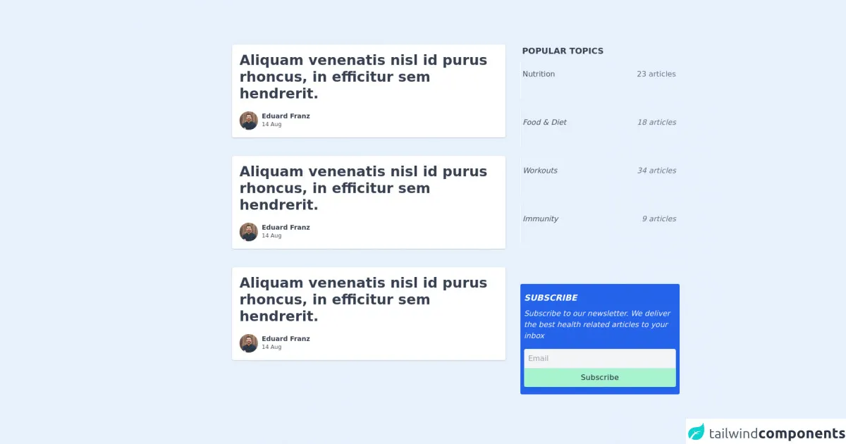
The preview of Wicked Design Cards ui component.
To create a Wicked Design Cards UI component, we will use Tailwind CSS to define the layout, typography, and colors of the card elements. The preview of the Wicked Design Cards UI component is shown below:
Free download of the Wicked Design Cards's source code
The source code of Wicked Design Cards ui component.
The source code of the Wicked Design Cards UI component is shown below:
<section class="text-gray-900 body-font">
<div class="container px-5 py-12 mx-auto">
<div class="block lg:flex lg:space-x-2 sm:px-4 px-2 py-12 mb-10">
<div class="w-full lg:w-2/3">
<a class="block rounded w-full lg:flex mb-10" href=".">
<div class="h-48 lg:w-48 flex-none bg-cover text-center overflow-hidden opacity-75" style={{backgroundImage: 'url("https://dummyimage.com/720x400/")'}} >
</div>
<div class="bg-white rounded px-4 py-4 flex flex-col justify-between leading-normal shadow">
<div>
<div class="mt-3 md:mt-0 text-gray-700 font-bold text-3xl mb-2">
Aliquam venenatis nisl id purus rhoncus, in efficitur sem hendrerit.
</div>
</div>
<div class="flex mt-3">
<img alt="" src="https://randomuser.me/api/portraits/men/11.jpg" class="h-10 w-10 rounded-full mr-2 object-cover" />
<div>
<p class="font-semibold text-gray-700 text-sm capitalize"> eduard franz </p>
<p class="text-gray-600 text-xs"> 14 Aug </p>
</div>
</div>
</div>
</a>
</div>
<div class="w-full lg:w-1/3 px-6">
<div class="mb-4">
<h5 class="font-bold text-lg uppercase text-gray-700 px-1 mb-2"> Popular Topics </h5>
<ul>
<li class="px-1 py-4 border-l border-white hover:border-gray-200 transition duration-300">
<a href="." class="flex items-center text-gray-600 cursor-pointer">
Nutrition
<span class="text-gray-500 ml-auto">23 articles</span>
<i class="text-gray-500 bx bx-right-arrow-alt ml-1" />
</a>
</li>
<li class="px-1 py-4 border-l border-white hover:border-gray-200 transition duration-300">
<a href="." class="flex items-center text-gray-600 cursor-pointer">
Food & Diet
<span class="text-gray-500 ml-auto">18 articles</span>
<i class="text-gray-500 bx bx-right-arrow-alt ml-1" />
</a>
</li>
<li class="px-1 py-4 border-l border-white hover:border-gray-200 transition duration-300">
<a href="." class="flex items-center text-gray-600 cursor-pointer">
Workouts
<span class="text-gray-500 ml-auto">34 articles</span>
<i class="text-gray-500 bx bx-right-arrow-alt ml-1" />
</a>
</li>
<li class="px-1 py-4 border-l border-white hover:border-gray-200 transition duration-300">
<a href="." class="flex items-center text-gray-600 cursor-pointer">
Immunity
<span class="text-gray-500 ml-auto">9 articles</span>
<i class="text-gray-500 bx bx-right-arrow-alt ml-1" />
</a>
</li>
</ul>
</div>
<div class="py-4 bg-blue-600 px-2 rounded">
<h5 class="font-bold text-lg uppercase text-white mb-2"> Subscribe </h5>
<p class="text-gray-100">
Subscribe to our newsletter. We deliver the best health related articles to your inbox
</p>
<input placeholder="Email" class="text-gray-700 bg-gray-100 rounded-t p-2 w-full mt-4 border focus:outline-none" />
<button class="px-4 py-2 bg-green-200 text-gray-800 rounded-b w-full capitalize tracking-wide">
Subscribe
</button>
</div>
</div>
</div>
</div>
</section>
How to create a Wicked Design Cards with Tailwind CSS?
Here are six ways to create a Wicked Design Cards UI component with Tailwind CSS:
1. Define the card container
The first step is to define the container element that will hold the card elements. We will use the flex and flex-wrap classes to create a responsive grid of cards. The justify-center and items-center classes will center the cards horizontally and vertically.
<div class="flex flex-wrap justify-center items-center">
  <!-- card elements will be added here -->
</div>
2. Create the card element
Next, we will create the card element using the bg-white, shadow-md, and rounded-lg classes to add a white background, box shadow, and rounded corners to the card. We will also use the max-w-sm class to limit the width of the card to 20rem.
<div class="bg-white shadow-md rounded-lg max-w-sm">
  <!-- card content will be added here -->
</div>
3. Add the card image
To add an image to the card, we will use the object-cover, w-full, and h-48 classes to set the image size and position. We will also use the rounded-t-lg class to round the top corners of the image.
<div class="bg-white shadow-md rounded-lg max-w-sm">
  <img class="object-cover w-full h-48 rounded-t-lg" src="card-image.jpg" alt="Card Image">
  <!-- card content will be added here -->
</div>
4. Add the card title and description
To add a title and description to the card, we will use the text-gray-900, font-bold, and text-xl classes to style the title, and the text-gray-600 and text-base classes to style the description.
<div class="bg-white shadow-md rounded-lg max-w-sm">
  <img class="object-cover w-full h-48 rounded-t-lg" src="card-image.jpg" alt="Card Image">
  <div class="p-4">
    <h2 class="text-gray-900 font-bold text-xl">Card Title</h2>
    <p class="text-gray-600 text-base">Card Description</p>
  </div>
</div>
5. Customize the card colors
To customize the card colors, we can use the bg-[color] and text-[color] classes to set the background and text colors of the card. For example, to set the background color to blue and the text color to white, we can use the bg-blue-500 and text-white classes.
<div class="bg-blue-500 shadow-md rounded-lg max-w-sm">
  <img class="object-cover w-full h-48 rounded-t-lg" src="card-image.jpg" alt="Card Image">
  <div class="p-4">
    <h2 class="text-white font-bold text-xl">Card Title</h2>
    <p class="text-white text-base">Card Description</p>
  </div>
</div>
6. Add hover effects
To add hover effects to the card, we can use the hover:[class] syntax to apply styles when the card is hovered. For example, to add a box shadow and scale effect on hover, we can use the hover:shadow-lg and hover:scale-105 classes.
<div class="bg-blue-500 shadow-md rounded-lg max-w-sm hover:shadow-lg hover:scale-105">
  <img class="object-cover w-full h-48 rounded-t-lg" src="card-image.jpg" alt="Card Image">
  <div class="p-4">
    <h2 class="text-white font-bold text-xl">Card Title</h2>
    <p class="text-white text-base">Card Description</p>
  </div>
</div>
Conclusion
In this article, we have learned how to create a Wicked Design Cards UI component using Tailwind CSS. We have explored six ways to customize the layout, typography, colors, and hover effects of the card elements. With Tailwind CSS, you can create beautiful and responsive UI components with minimal custom CSS code.