- Published on
The Ninja Guide To How To Build A Whimsical - Pricing With Tailwind CSS Better
- What is Tailwind CSS?
- The description of Whimsical - Pricing ui component
- Why use Tailwind CSS to create a Whimsical - Pricing ui component?
- The preview of Whimsical - Pricing ui component.
- The source code of Whimsical - Pricing ui component.
- How to create a Whimsical - Pricing with Tailwind CSS?
- Conclusion
Are you tired of spending hours trying to style your pricing component? Look no further than Tailwind CSS! In this guide, we will walk through how to create a Whimsical - Pricing ui component using Tailwind CSS.
What is Tailwind CSS?
Tailwind CSS is a utility-first CSS framework that allows you to quickly style your website without writing custom CSS. With Tailwind CSS, you can easily create custom designs by using pre-defined classes to style your HTML elements.
The description of Whimsical - Pricing ui component
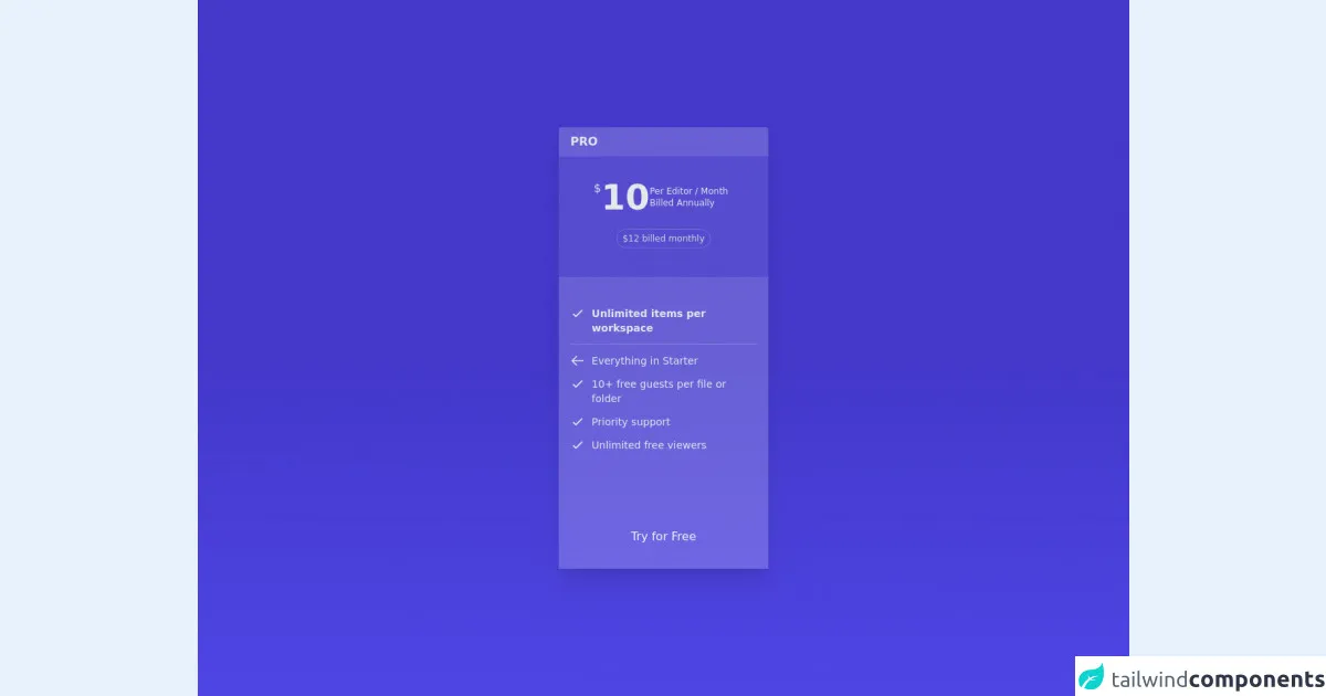
The Whimsical - Pricing ui component is a pricing table design that is both fun and functional. It features a whimsical design with playful colors and icons that make it stand out from traditional pricing tables. It also includes pricing plans with different features and pricing options.
Why use Tailwind CSS to create a Whimsical - Pricing ui component?
Tailwind CSS is the perfect tool for creating a Whimsical - Pricing ui component because it allows you to easily customize the design without writing custom CSS. With Tailwind CSS, you can quickly create custom styles by using pre-defined classes to style your HTML elements. This saves you time and allows you to focus on creating a unique design for your pricing component.
The preview of Whimsical - Pricing ui component.
Free download of the Whimsical - Pricing's source code
The source code of Whimsical - Pricing ui component.
<div class="h-screen flex justify-center items-center bg-gradient-to-t from-indigo-600 via-indigo-700 to-indigo-700">
  <card class="rounded w-72 shadow-xl flex flex-col text-gray-200">
    <!-- Title -->
    <p class="font-semibold bg-white bg-opacity-20 rounded-t px-4 py-2">PRO</p>

    <!-- Pricing -->
    <div class="flex flex-row items-center pt-8 bg-white bg-opacity-10 pl-12 pr-10 gap-3">
      <div class="flex flex-row gap-1">
        <span class="text-base"> $ </span>
        <p class="text-5xl font-semibold">10</p>
      </div>
      <p class="font-light text-xs">Per Editor / Month Billed Annually</p>
    </div>

    <!-- Pricing Additional Description -->
    <div class="flex flex-row items-center justify-center bg-white bg-opacity-10 pt-5 pb-10">
      <p class="text-xs text-gray-300 border border-gray-50 border-opacity-20 rounded-full py-1 px-2">$12 billed monthly</p>
    </div>

    <div class="grid grid-cols-12 bg-white bg-opacity-20 px-4 gap-y-3 pt-10">
      <!-- Details 1 -->
      <div>
        <svg xmlns="http://www.w3.org/2000/svg" class="h-5 w-5" fill="none" viewBox="0 0 24 24" stroke="currentColor" stroke-width="2">
          <path stroke-linecap="round" stroke-linejoin="round" d="M5 13l4 4L19 7" />
        </svg>
      </div>

      <div class="col-span-11 text-sm flex items-center font-semibold pl-2">Unlimited items per workspace</div>

      <!-- Line -->
      <div class="col-span-12 h-[1px] bg-white bg-opacity-20"></div>

      <!-- Details 2 -->
      <div>
        <svg xmlns="http://www.w3.org/2000/svg" class="h-5 w-5" fill="none" viewBox="0 0 24 24" stroke="currentColor" stroke-width="2">
          <path stroke-linecap="round" stroke-linejoin="round" d="M10 19l-7-7m0 0l7-7m-7 7h18" />
        </svg>
      </div>

      <div class="col-span-11 text-sm flex items-center font-light pl-2">Everything in Starter</div>

      <!-- Details 3 -->
      <div>
        <svg xmlns="http://www.w3.org/2000/svg" class="h-5 w-5" fill="none" viewBox="0 0 24 24" stroke="currentColor" stroke-width="2">
          <path stroke-linecap="round" stroke-linejoin="round" d="M5 13l4 4L19 7" />
        </svg>
      </div>

      <div class="col-span-11 text-sm flex items-center font-light pl-2">10+ free guests per file or folder</div>

      <!-- Details 4 -->
      <div>
        <svg xmlns="http://www.w3.org/2000/svg" class="h-5 w-5" fill="none" viewBox="0 0 24 24" stroke="currentColor" stroke-width="2">
          <path stroke-linecap="round" stroke-linejoin="round" d="M5 13l4 4L19 7" />
        </svg>
      </div>

      <div class="col-span-11 text-sm flex items-center font-light pl-2">Priority support</div>

      <!-- Details 5 -->
      <div>
        <svg xmlns="http://www.w3.org/2000/svg" class="h-5 w-5" fill="none" viewBox="0 0 24 24" stroke="currentColor" stroke-width="2">
          <path stroke-linecap="round" stroke-linejoin="round" d="M5 13l4 4L19 7" />
        </svg>
      </div>

      <div class="col-span-11 text-sm flex items-center font-light pl-2">Unlimited free viewers</div>

      <!-- CTA Button -->
      <div class="col-span-12 mt-20 mb-5 text-gray-100">
        <button class="rounded hover:bg-teal-400 bg-teal-500 w-full py-3">Try for Free</button>
      </div>
    </div>
  </card>
</div>
How to create a Whimsical - Pricing with Tailwind CSS?
Create the HTML structure for the pricing component. This should include the pricing plans, features, and pricing options.
Add the necessary Tailwind CSS classes to style the pricing component. This includes classes for font size, font color, background color, padding, margin, and more.
Use Tailwind CSS to add custom styles to the pricing component. This includes adding custom colors, icons, and animations to make the pricing component stand out.
Test the pricing component to ensure that it looks and functions as expected.
Conclusion
Creating a Whimsical - Pricing ui component is easy with Tailwind CSS. By using pre-defined classes and custom styles, you can quickly create a unique design that stands out from traditional pricing tables. So why wait? Start building your own Whimsical - Pricing ui component today!