- Published on
Learn How To Create A Welcome Page With Tailwind CSS from the Pros
- What is Tailwind CSS?
- The description of Welcome Page ui component
- Why use Tailwind CSS to create a Welcome Page ui component?
- The preview of Welcome Page ui component
- The source code of Welcome Page ui component
- How to create a Welcome Page with Tailwind CSS?
- Conclusion
As a FrontEnd technology blogger, it is important to stay up to date with the latest trends and tools in the industry. One such tool that has gained a lot of popularity in recent times is Tailwind CSS. In this article, we will learn how to create a Welcome Page with Tailwind CSS from the pros.
What is Tailwind CSS?
Tailwind CSS is a utility-first CSS framework that allows you to create custom designs without having to write any CSS code. It provides a set of pre-defined classes that you can use to style your HTML elements. Tailwind CSS is highly customizable and can be used to create designs that are unique to your project.
The description of Welcome Page ui component
A Welcome Page is the first page that a user sees when they visit a website or application. It is important to make a good first impression and provide users with a clear idea of what the website or application is about. A Welcome Page typically includes a header, a hero section, a call-to-action, and some information about the website or application.
Why use Tailwind CSS to create a Welcome Page ui component?
Tailwind CSS provides a set of pre-defined classes that can be used to create a Welcome Page quickly and easily. It allows you to focus on the design of the page rather than the CSS code. Tailwind CSS is also highly customizable, which means that you can create a unique design that matches your project's branding.
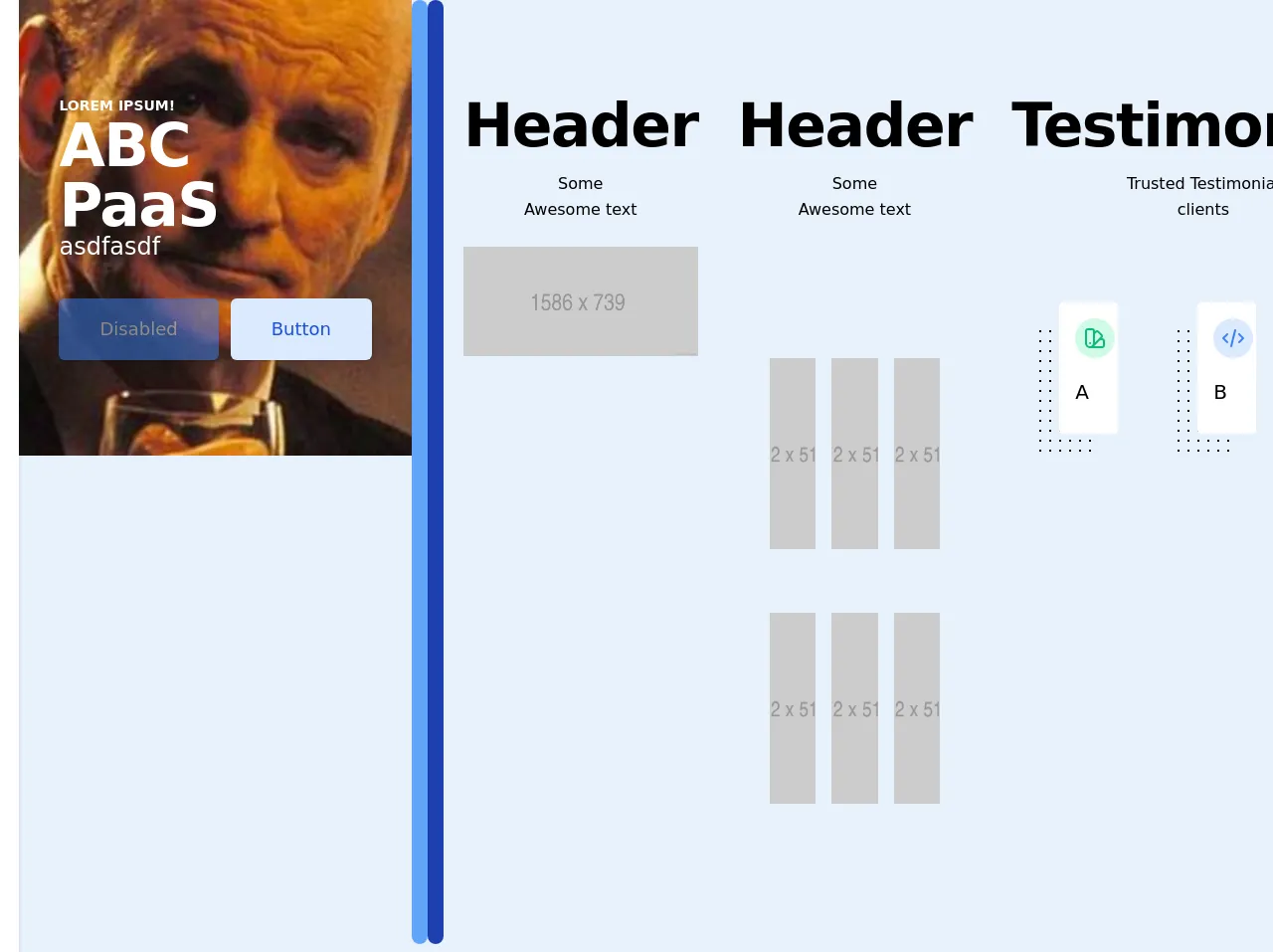
The preview of Welcome Page ui component
To create a Welcome Page with Tailwind CSS, we will be using a sample design. The design includes a header, a hero section, a call-to-action, and some information about the website or application.
Free download of the Welcome Page's source code
The source code of Welcome Page ui component
To create the Welcome Page, we will be using HTML and Tailwind CSS. The HTML code will include the necessary elements, and the Tailwind CSS classes will be used to style the elements.
<header class="shadow bg-white index9 flex items-center justify-between flex-wrap p-6 sticky top-0"><meta http-equiv="Content-Type" content="text/html; charset=utf-8">
<div class="flex items-center flex-shrink-0 text-black mr-6">

<a href="#">
    <svg width='90' viewBox='0 0 177 100' fill='none' xmlns='http://www.w3.org/2000/svg'><path d='M88 32.5C88 42.165 80.165 50 70.5 50H53V32.5C53 22.835 60.835 15 70.5 15C80.165 15 88 22.835 88 32.5Z' fill='#17CF97'/><path d='M88 67.5C88 57.835 95.835 50 105.5 50H123V67.5C123 77.165 115.165 85 105.5 85C95.835 85 88 77.165 88 67.5Z' fill='#17CF97'/><path d='M53 67.5C53 77.165 60.835 85 70.5 85H88V67.5C88 57.835 80.165 50 70.5 50C60.835 50 53 57.835 53 67.5Z' fill='#17CF97'/><path d='M123 32.5C123 22.835 115.165 15 105.5 15H88V32.5C88 42.165 95.835 50 105.5 50C115.165 50 123 42.165 123 32.5Z' fill='#17CF97'/></svg>
    </a></div>

<style>
html{
	  scroll-behavior: smooth;
}
.index9{
	z-index:9999!important;
}
.logobox{
	height:50px;
}

.floating {
    animation-name: floating;
    animation-duration: 3s;
    animation-iteration-count: infinite;
    animation-timing-function: ease-in-out;
    margin-top: 5px;
}

@keyframes floating {
    0% { transform: translate(0,  0px); }
    50%  { transform: translate(0, 5px); }
    100%   { transform: translate(0, -0px); }
}
.greyscale {
  -webkit-filter: grayscale(100%); /* Safari 6.0 - 9.0 */
  filter: grayscale(100%);
}
.outline-only {
  -webkit-text-stroke: 0.015em black;
  color:#fff;
}
.hovbtn:hover {
  box-shadow: 0 0 11px rgba(33,33,33,.2);
}
</style>
</header>
<div class="sliderAx h-auto">
<div id="slider-1" class="container mx-auto" style="display: none;">
<div class="bg-cover bg-center  h-auto text-white py-24 px-10 object-fill" style="background-image: url(https://www.fillmurray.com/460/300)">
<div class="md:w-1/2">
<p class="font-bold text-sm uppercase text-black ">Lorem Ipsum!</p>
<p class="text-4xl tracking-tight font-extrabold text-black sm:text-5xl md:text-6xl">ABC PaaS</p>
<p class="text-2xl mb-10 leading-none text-black ">asdfasdf</p>
<div class="mt-5 sm:mt-8 sm:flex sm:justify-center lg:justify-start">
<div class="rounded-md shadow">
<button class="opacity-50 w-full flex items-center justify-center px-8 py-3 border border-transparent text-base font-medium rounded-md text-white bg-blue-500 hover:bg-blue-700 md:py-4 md:text-lg md:px-10 shadow-md" disabled="">
Diaabled
</button>
</div>
<div class="mt-3 sm:mt-0 sm:ml-3">
<a href="#" class="w-full flex items-center justify-center px-8 py-3 border border-transparent text-base font-medium rounded-md text-blue-700 bg-blue-100 hover:bg-blue-200 md:py-4 md:text-lg md:px-10 shadow">
Button
</a>
</div>
</div>
</div>
</div>
<br>
</div>
<div id="slider-2" class="container mx-auto" style="display: block;">
<div class="bg-cover bg-top  h-auto text-white py-24 px-10 object-fill" style="background-image: url(https://www.fillmurray.com/460/300)">
<div class="md:w-1/2">
<p class="font-bold text-sm uppercase">Lorem Ipsum!</p>
<p class="text-4xl tracking-tight font-extrabold text-white sm:text-5xl md:text-6xl">ABC PaaS</p>
<p class="text-2xl mb-10 leading-none">asdfasdf</p>
<div class="mt-5 sm:mt-8 sm:flex sm:justify-center lg:justify-start">
<div class="rounded-md shadow">
<button class="opacity-50 w-full flex items-center justify-center px-8 py-3 border border-transparent text-base font-medium rounded-md text-white bg-blue-500 hover:bg-blue-700 md:py-4 md:text-lg md:px-10 shadow-md" disabled="">
Disabled
</button>
</div>
<div class="mt-3 sm:mt-0 sm:ml-3">
<a href="#" class="w-full flex items-center justify-center px-8 py-3 border border-transparent text-base font-medium rounded-md text-blue-700 bg-blue-100 hover:bg-blue-200 md:py-4 md:text-lg md:px-10 shadow">
Button
</a>
</div>
</div>
</div>
</div>
<br>
</div>
</div>
<div class="flex justify-between w-12 mx-auto pb-2">
<button id="sButton1" onclick="sliderButton1()" class="bg-blue-400 rounded-full w-4 pb-2"></button>
<button id="sButton2" onclick="sliderButton2() " class="bg-blue-400 rounded-full w-4 p-2 bg-blue-800"></button>
</div>
<section class="">
<script src="https://code.jquery.com/jquery-2.2.4.min.js"></script>
<link href="https://unpkg.com/pattern.css" rel="stylesheet">
</section>
<section class="" id="onemorething">
<div class="max-w-6xl mx-auto px-5 py-24 ">
<div class="text-center mb-20">
<h1 class=" title-font  mb-4 text-4xl font-extrabold leading-10 tracking-tight sm:text-5xl sm:leading-none md:text-6xl">Header</h1>
<p class="text-base leading-relaxed xl:w-2/4 lg:w-3/4 mx-auto">Some Awesome text</p>
<div class="flex mt-6 justify-center">
</div>
<img src="https://via.placeholder.com/1586x739.png">
</div>
</div></section>
<section class="">
<div class="max-w-6xl mx-auto px-5 py-24 ">
<div class="text-center mb-20">
<h1 class=" title-font  mb-4 text-4xl font-extrabold leading-10 tracking-tight sm:text-5xl sm:leading-none md:text-6xl">Header</h1>
<p class="text-base leading-relaxed xl:w-2/4 lg:w-3/4 mx-auto">Some Awesome text</p>
<div class="flex mt-6 justify-center">
</div>
</div>
<div class="container mx-auto p-8">
<div class="flex flex-row flex-wrap -mx-2">
<div class="w-full sm:w-1/3 h-32 md:h-48 mb-4 sm:mb-0 px-2">
<a class="block w-full h-full bg-grey-dark bg-no-repeat bg-center bg-cover" href="#" title="Link" style="background-image: url(https://via.placeholder.com/512x512.png);">
</a>
</div>
<div class="w-full sm:w-1/3 h-32 md:h-48 mb-4 sm:mb-0 px-2">
<a class="block w-full h-full bg-grey-dark bg-no-repeat bg-center bg-cover" href="#" title="Link" style="background-image: url(https://via.placeholder.com/512x512.png);">
</a>
</div>
<div class="w-full sm:w-1/3 h-32 md:h-48 mb-4 sm:mb-0 px-2">
<a class="block w-full h-full bg-grey-dark bg-no-repeat bg-center bg-cover" href="#" title="Link" style="background-image: url(https://via.placeholder.com/512x512.png);">
</a>
</div>
</div>
</div>
<div class="container mx-auto p-8">
<div class="flex flex-row flex-wrap -mx-2">
<div class="w-full sm:w-1/3 h-32 md:h-48 mb-4 sm:mb-0 px-2">
<a class="block w-full h-full bg-grey-dark bg-no-repeat bg-center bg-cover" href="#" title="Link" style="background-image: url(https://via.placeholder.com/512x512.png);">
</a>
</div>
<div class="w-full sm:w-1/3 h-32 md:h-48 mb-4 sm:mb-0 px-2">
<a class="block w-full h-full bg-grey-dark bg-no-repeat bg-center bg-cover" href="#" title="Link" style="background-image: url(https://via.placeholder.com/512x512.png);">
</a>
</div>
<div class="w-full sm:w-1/3 h-32 md:h-48 mb-4 sm:mb-0 px-2">
<a class="block w-full h-full bg-grey-dark bg-no-repeat bg-center bg-cover" href="#" title="Link" style="background-image: url(https://via.placeholder.com/512x512.png);">
</a>
</div>
</div></div>
</div></section>
<section class="">
<div class="max-w-6xl mx-auto px-5 py-24 ">
<div class="text-center mb-20">
<h1 class=" title-font  mb-4 text-4xl font-extrabold leading-10 tracking-tight sm:text-5xl sm:leading-none md:text-6xl">Testimonals</h1>
<p class="text-base leading-relaxed xl:w-2/4 lg:w-3/4 mx-auto">Trusted Testimonial clients</p>

</div>
<div class="flex flex-wrap sm:-m-4 -mx-4 -mb-10 -mt-4 ">
<div class="p-10 md:w-1/3 md:mb-0 mb-6 flex flex-col ">
<div class="pattern-dots-md gray-light">
 <div class="rounded bg-white p-4 transform translate-x-6 -translate-y-6  ">
<div class="w-10 h-10 inline-flex items-center justify-center rounded-full bg-green-100 text-green-500 mb-5 flex-shrink-0 p-2">
<svg class="w-6 h-6" fill="none" stroke="currentColor" viewBox="0 0 24 24" xmlns="http://www.w3.org/2000/svg"><path stroke-linecap="round" stroke-linejoin="round" stroke-width="2" d="M7 21a4 4 0 01-4-4V5a2 2 0 012-2h4a2 2 0 012 2v12a4 4 0 01-4 4zm0 0h12a2 2 0 002-2v-4a2 2 0 00-2-2h-2.343M11 7.343l1.657-1.657a2 2 0 012.828 0l2.829 2.829a2 2 0 010 2.828l-8.486 8.485M7 17h.01"></path></svg> </div>
<div class="flex-grow ">
<h2 class=" text-xl title-font font-medium mb-3">A</h2>
<p class="leading-relaxed text-sm text-justify"></p>
</div>
</div>
</div>
</div>
<div class="p-10 md:w-1/3 md:mb-0 mb-6 flex flex-col ">
<div class="pattern-dots-md gray-light">
<div class="rounded  bg-white  p-4 transform translate-x-6 -translate-y-6 ">
<div class="w-10 h-10 inline-flex items-center justify-center rounded-full bg-blue-100 text-blue-500 mb-5 flex-shrink-0">
<svg class="w-6 h-6" fill="none" stroke="currentColor" viewBox="0 0 24 24" xmlns="http://www.w3.org/2000/svg"><path stroke-linecap="round" stroke-linejoin="round" stroke-width="2" d="M10 20l4-16m4 4l4 4-4 4M6 16l-4-4 4-4"></path></svg>
</div>
<div class="flex-grow">
<h2 class=" text-xl title-font font-medium mb-3">B</h2>
<p class="leading-relaxed text-sm text-justify">
</p>
</div>
</div>
</div>
</div>
<div class="p-10 md:w-1/3 md:mb-0 mb-6 flex flex-col ">
<div class="pattern-dots-md gray-light">
<div class="rounded  bg-white  p-4 transform translate-x-6 -translate-y-6 ">
<div class="w-10 h-10 inline-flex items-center justify-center rounded-full bg-yellow-100 text-yellow-500 mb-5 flex-shrink-0">
<svg class="w-6 h-6" fill="none" stroke="currentColor" viewBox="0 0 24 24" xmlns="http://www.w3.org/2000/svg"><path stroke-linecap="round" stroke-linejoin="round" stroke-width="2" d="M4 7v10c0 2.21 3.582 4 8 4s8-1.79 8-4V7M4 7c0 2.21 3.582 4 8 4s8-1.79 8-4M4 7c0-2.21 3.582-4 8-4s8 1.79 8 4m0 5c0 2.21-3.582 4-8 4s-8-1.79-8-4"></path></svg>
</div>
<div class="flex-grow">
<h2 class=" text-xl title-font font-medium mb-3">C</h2>
<p class="leading-relaxed text-sm text-justify">
</p>
</div>
</div>
</div>
</div></div></div></section>
How to create a Welcome Page with Tailwind CSS?
To create a Welcome Page with Tailwind CSS, follow the steps below:
Create a new HTML file and add the necessary elements for the Welcome Page. This includes a header, a hero section, a call-to-action, and some information about the website or application.
Add the Tailwind CSS CDN to the HTML file.
<link href="https://cdn.jsdelivr.net/npm/[email protected]/dist/tailwind.min.css" rel="stylesheet">
- Add the Tailwind CSS classes to the HTML elements. For example, to style the header, you can use the following classes:
<header class="bg-white shadow">
  <div class="container mx-auto py-4 px-5 flex justify-between items-center">
    <a class="text-gray-900 font-bold text-xl" href="#">Logo</a>
    <nav class="flex">
      <a class="text-gray-900 py-2 px-3" href="#">Home</a>
      <a class="text-gray-900 py-2 px-3" href="#">About</a>
      <a class="text-gray-900 py-2 px-3" href="#">Contact</a>
    </nav>
  </div>
</header>
Continue adding Tailwind CSS classes to the other elements on the page.
Preview the Welcome Page in the browser.
Conclusion
In this article, we learned how to create a Welcome Page with Tailwind CSS. Tailwind CSS is a powerful tool that allows you to create custom designs quickly and easily. With its pre-defined classes and highly customizable nature, Tailwind CSS is a great choice for creating Welcome Pages and other UI components.