- Published on
How to Create A website landing page With Tailwind CSS?
- What is Tailwind CSS?
- The Description of Website Landing Page UI Component
- Why Use Tailwind CSS to Create a Website Landing Page UI Component?
- The Preview of Website Landing Page UI Component
- The Source Code of Website Landing Page UI Component
- How to Create a Website Landing Page with Tailwind CSS?
- Step 1: Set Up Your Project
- Step 2: Create the Hero Section
- Step 3: Create the Features Section
- Step 4: Create the Testimonials Section
- Step 5: Create the Pricing Section
- Step 6: Create the Call-to-Action Section
- Step 7: Preview and Refine
- Conclusion
In today's digital age, creating a website landing page has become a crucial part of any business or organization's online presence. A landing page is a web page that is specifically designed to convert visitors into leads or customers. In this article, we will discuss how to create a website landing page with Tailwind CSS.
What is Tailwind CSS?
Tailwind CSS is a utility-first CSS framework that allows developers to quickly build custom user interfaces. It provides a set of pre-defined CSS classes that can be used to style HTML elements. With Tailwind CSS, you can easily create responsive and mobile-first designs.
The Description of Website Landing Page UI Component
A website landing page typically consists of several UI components such as a hero section, features section, testimonials section, pricing section, and a call-to-action section. Each of these sections has a specific purpose and is designed to convert visitors into leads or customers.
The hero section is the first section that visitors see when they land on the website. It typically contains a headline, a subheadline, and a call-to-action button. The features section highlights the key features of the product or service being offered. The testimonials section displays customer reviews and feedback. The pricing section shows the different pricing plans available. Finally, the call-to-action section encourages visitors to take action such as signing up for a free trial or purchasing the product or service.
Why Use Tailwind CSS to Create a Website Landing Page UI Component?
Tailwind CSS provides a set of pre-defined CSS classes that can be used to style HTML elements. This makes it easy to create custom user interfaces without having to write custom CSS code. With Tailwind CSS, you can easily create responsive and mobile-first designs, which is essential for a website landing page.
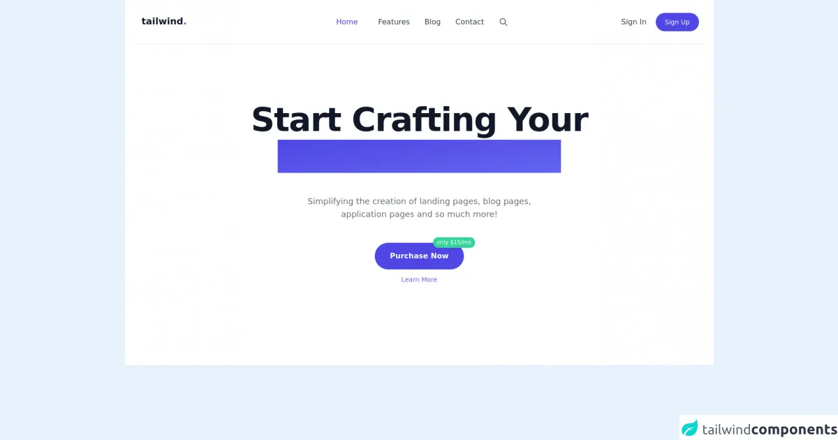
The Preview of Website Landing Page UI Component
Free download of the website landing page's source code
The Source Code of Website Landing Page UI Component
<!-- Section 1 -->
    <section class="w-full px-6 pb-12 antialiased bg-white">
      <div class="mx-auto max-w-7xl">
        <nav
          class="relative z-50 h-24 select-none"
          x-data="{ showMenu: false }"
        >
          <div
            class="container relative flex flex-wrap items-center justify-between h-24 mx-auto overflow-hidden font-medium border-b border-gray-200 md:overflow-visible lg:justify-center sm:px-4 md:px-2"
          >
            <div class="flex items-center justify-start w-1/4 h-full pr-4">
              <a href="#_" class="inline-block py-4 md:py-0">
                <span class="p-1 text-xl font-black leading-none text-gray-900"
                  ><span>tailwind</span
                  ><span class="text-indigo-600">.</span></span
                >
              </a>
            </div>
            <div
              class="top-0 left-0 items-start hidden w-full h-full p-4 text-sm bg-gray-900 bg-opacity-50 md:items-center md:w-3/4 md:absolute lg:text-base md:bg-transparent md:p-0 md:relative md:flex"
              :class="{'flex fixed': showMenu, 'hidden': !showMenu }"
            >
              <div
                class="flex-col w-full h-auto overflow-hidden bg-white rounded-lg md:bg-transparent md:overflow-visible md:rounded-none md:relative md:flex md:flex-row"
              >
                <a
                  href="#_"
                  class="inline-flex items-center block w-auto h-16 px-6 text-xl font-black leading-none text-gray-900 md:hidden"
                  >tails<span class="text-indigo-600">.</span></a
                >
                <div
                  class="flex flex-col items-start justify-center w-full space-x-6 text-center lg:space-x-8 md:w-2/3 md:mt-0 md:flex-row md:items-center"
                >
                  <a
                    href="#_"
                    class="inline-block w-full py-2 mx-0 ml-6 font-medium text-left text-indigo-600 md:ml-0 md:w-auto md:px-0 md:mx-2 lg:mx-3 md:text-center"
                    >Home</a
                  >
                  <a
                    href="#_"
                    class="inline-block w-full py-2 mx-0 font-medium text-left text-gray-700 md:w-auto md:px-0 md:mx-2 hover:text-indigo-600 lg:mx-3 md:text-center"
                    >Features</a
                  >
                  <a
                    href="#_"
                    class="inline-block w-full py-2 mx-0 font-medium text-left text-gray-700 md:w-auto md:px-0 md:mx-2 hover:text-indigo-600 lg:mx-3 md:text-center"
                    >Blog</a
                  >
                  <a
                    href="#_"
                    class="inline-block w-full py-2 mx-0 font-medium text-left text-gray-700 md:w-auto md:px-0 md:mx-2 hover:text-indigo-600 lg:mx-3 md:text-center"
                    >Contact</a
                  >
                  <a
                    href="#_"
                    class="absolute top-0 left-0 hidden py-2 mt-6 ml-10 mr-2 text-gray-600 lg:inline-block md:mt-0 md:ml-2 lg:mx-3 md:relative"
                  >
                    <svg
                      class="inline w-5 h-5"
                      fill="none"
                      stroke-linecap="round"
                      stroke-linejoin="round"
                      stroke-width="2"
                      viewBox="0 0 24 24"
                      stroke="currentColor"
                    >
                      <path
                        d="M21 21l-6-6m2-5a7 7 0 11-14 0 7 7 0 0114 0z"
                      ></path>
                    </svg>
                  </a>
                </div>
                <div
                  class="flex flex-col items-start justify-end w-full pt-4 md:items-center md:w-1/3 md:flex-row md:py-0"
                >
                  <a
                    href="#"
                    class="w-full px-6 py-2 mr-0 text-gray-700 md:px-0 lg:pl-2 md:mr-4 lg:mr-5 md:w-auto"
                    >Sign In</a
                  >
                  <a
                    href="#_"
                    class="inline-flex items-center w-full px-6 py-3 text-sm font-medium leading-4 text-white bg-indigo-600 md:px-3 md:w-auto md:rounded-full lg:px-5 hover:bg-indigo-500 focus:outline-none md:focus:ring-2 focus:ring-0 focus:ring-offset-2 focus:ring-indigo-600"
                    >Sign Up</a
                  >
                </div>
              </div>
            </div>
            <div
              @click="showMenu = !showMenu"
              class="absolute right-0 flex flex-col items-center items-end justify-center w-10 h-10 bg-white rounded-full cursor-pointer md:hidden hover:bg-gray-100"
            >
              <svg
                class="w-6 h-6 text-gray-700"
                x-show="!showMenu"
                fill="none"
                stroke-linecap="round"
                stroke-linejoin="round"
                stroke-width="2"
                viewBox="0 0 24 24"
                stroke="currentColor"
                x-cloak=""
              >
                <path d="M4 6h16M4 12h16M4 18h16"></path>
              </svg>
              <svg
                class="w-6 h-6 text-gray-700"
                x-show="showMenu"
                fill="none"
                stroke="currentColor"
                viewBox="0 0 24 24"
                xmlns="http://www.w3.org/2000/svg"
                x-cloak=""
              >
                <path
                  stroke-linecap="round"
                  stroke-linejoin="round"
                  stroke-width="2"
                  d="M6 18L18 6M6 6l12 12"
                ></path>
              </svg>
            </div>
          </div>
        </nav>

        <!-- Main Hero Content -->
        <div
          class="container max-w-lg px-4 py-32 mx-auto text-left md:max-w-none md:text-center"
        >
          <h1
            class="text-5xl font-extrabold leading-10 tracking-tight text-left text-gray-900 md:text-center sm:leading-none md:text-6xl lg:text-7xl"
          >
            <span class="inline md:block">Start Crafting Your</span>
            <span
              class="relative mt-2 text-transparent bg-clip-text bg-gradient-to-br from-indigo-600 to-indigo-500 md:inline-block"
              >Next Great Idea</span
            >
          </h1>
          <div
            class="mx-auto mt-5 text-gray-500 md:mt-12 md:max-w-lg md:text-center lg:text-lg"
          >
            Simplifying the creation of landing pages, blog pages, application
            pages and so much more!
          </div>
          <div class="flex flex-col items-center mt-12 text-center">
            <span class="relative inline-flex w-full md:w-auto">
              <a
                href="#_"
                class="inline-flex items-center justify-center w-full px-8 py-4 text-base font-bold leading-6 text-white bg-indigo-600 border border-transparent rounded-full md:w-auto hover:bg-indigo-500 focus:outline-none focus:ring-2 focus:ring-offset-2 focus:ring-indigo-600"
              >
                Purchase Now
              </a>
              <span
                class="absolute top-0 right-0 px-2 py-1 -mt-3 -mr-6 text-xs font-medium leading-tight text-white bg-green-400 rounded-full"
                >only $15/mo</span
              >
            </span>
            <a href="#" class="mt-3 text-sm text-indigo-500">Learn More</a>
          </div>
        </div>
        <!-- End Main Hero Content -->
      </div>
    </section>
How to Create a Website Landing Page with Tailwind CSS?
Now that we have a basic understanding of what a website landing page is and why Tailwind CSS is a great choice for creating one, let's dive into the steps involved in creating a website landing page with Tailwind CSS.
Step 1: Set Up Your Project
The first step is to set up your project. You can use any code editor of your choice. Create a new HTML file and add the necessary HTML boilerplate code.
Next, you need to include the Tailwind CSS stylesheet. You can do this by adding the following code to the head section of your HTML file:
<link rel="stylesheet" href="https://cdn.jsdelivr.net/npm/tailwindcss@latest/dist/tailwind.min.css">
Step 2: Create the Hero Section
The hero section is the first section that visitors see when they land on the website. It typically contains a headline, a subheadline, and a call-to-action button.
To create the hero section, add the following code to your HTML file:
<section class="bg-gray-900 text-white py-20">
  <div class="container mx-auto">
    <h1 class="text-5xl font-bold mb-4">Welcome to our website</h1>
    <p class="text-xl mb-8">Lorem ipsum dolor sit amet, consectetur adipiscing elit. Nullam euismod, magna a faucibus tincidunt, orci neque egestas turpis, vel bibendum velit elit vel ex.</p>
    <a href="#" class="bg-blue-500 hover:bg-blue-700 text-white font-bold py-2 px-4 rounded">Get started</a>
  </div>
</section>
This code creates a full-width section with a dark background color and white text. The container class centers the content on the page. The text-5xl class sets the font size of the headline to 5xl (which is equivalent to 72px). The mb-4 and mb-8 classes add margin to the bottom of the headline and subheadline, respectively. The bg-blue-500 and hover:bg-blue-700 classes style the call-to-action button.
Step 3: Create the Features Section
The features section highlights the key features of the product or service being offered.
To create the features section, add the following code to your HTML file:
<section class="py-20">
  <div class="container mx-auto">
    <h2 class="text-3xl font-bold mb-8">Features</h2>
    <div class="flex flex-wrap -mx-4">
      <div class="w-full md:w-1/2 lg:w-1/3 px-4 mb-8">
        <div class="bg-white rounded-lg shadow-lg p-6">
          <h3 class="text-xl font-bold mb-4">Feature 1</h3>
          <p class="text-gray-700">Lorem ipsum dolor sit amet, consectetur adipiscing elit. Nullam euismod, magna a faucibus tincidunt, orci neque egestas turpis, vel bibendum velit elit vel ex.</p>
        </div>
      </div>
      <div class="w-full md:w-1/2 lg:w-1/3 px-4 mb-8">
        <div class="bg-white rounded-lg shadow-lg p-6">
          <h3 class="text-xl font-bold mb-4">Feature 2</h3>
          <p class="text-gray-700">Lorem ipsum dolor sit amet, consectetur adipiscing elit. Nullam euismod, magna a faucibus tincidunt, orci neque egestas turpis, vel bibendum velit elit vel ex.</p>
        </div>
      </div>
      <div class="w-full md:w-1/2 lg:w-1/3 px-4 mb-8">
        <div class="bg-white rounded-lg shadow-lg p-6">
          <h3 class="text-xl font-bold mb-4">Feature 3</h3>
          <p class="text-gray-700">Lorem ipsum dolor sit amet, consectetur adipiscing elit. Nullam euismod, magna a faucibus tincidunt, orci neque egestas turpis, vel bibendum velit elit vel ex.</p>
        </div>
      </div>
    </div>
  </div>
</section>
This code creates a section with a light background color and a title. The flex and flex-wrap classes create a flexbox layout that wraps the feature items to the next line on smaller screens. The w-full, md:w-1/2, and lg:w-1/3 classes set the width of the feature items to full width on small screens, half width on medium screens, and one-third width on large screens. The px-4 and mb-8 classes add padding and margin to the feature items.
Step 4: Create the Testimonials Section
The testimonials section displays customer reviews and feedback.
To create the testimonials section, add the following code to your HTML file:
<section class="bg-gray-900 text-white py-20">
  <div class="container mx-auto">
    <h2 class="text-3xl font-bold mb-8">Testimonials</h2>
    <div class="flex flex-wrap -mx-4">
      <div class="w-full md:w-1/2 lg:w-1/3 px-4 mb-8">
        <div class="bg-white rounded-lg shadow-lg p-6">
          <p class="text-gray-700 mb-4">"Lorem ipsum dolor sit amet, consectetur adipiscing elit. Nullam euismod, magna a faucibus tincidunt, orci neque egestas turpis, vel bibendum velit elit vel ex."</p>
          <div class="flex items-center">
            <img src="https://randomuser.me/api/portraits/women/17.jpg" alt="Testimonial" class="w-12 h-12 rounded-full mr-4">
            <div>
              <h4 class="font-bold">Jane Doe</h4>
              <p class="text-gray-700">CEO, Company Name</p>
            </div>
          </div>
        </div>
      </div>
      <div class="w-full md:w-1/2 lg:w-1/3 px-4 mb-8">
        <div class="bg-white rounded-lg shadow-lg p-6">
          <p class="text-gray-700 mb-4">"Lorem ipsum dolor sit amet, consectetur adipiscing elit. Nullam euismod, magna a faucibus tincidunt, orci neque egestas turpis, vel bibendum velit elit vel ex."</p>
          <div class="flex items-center">
            <img src="https://randomuser.me/api/portraits/men/17.jpg" alt="Testimonial" class="w-12 h-12 rounded-full mr-4">
            <div>
              <h4 class="font-bold">John Doe</h4>
              <p class="text-gray-700">CTO, Company Name</p>
            </div>
          </div>
        </div>
      </div>
      <div class="w-full md:w-1/2 lg:w-1/3 px-4 mb-8">
        <div class="bg-white rounded-lg shadow-lg p-6">
          <p class="text-gray-700 mb-4">"Lorem ipsum dolor sit amet, consectetur adipiscing elit. Nullam euismod, magna a faucibus tincidunt, orci neque egestas turpis, vel bibendum velit elit vel ex."</p>
          <div class="flex items-center">
            <img src="https://randomuser.me/api/portraits/women/27.jpg" alt="Testimonial" class="w-12 h-12 rounded-full mr-4">
            <div>
              <h4 class="font-bold">Jane Smith</h4>
              <p class="text-gray-700">COO, Company Name</p>
            </div>
          </div>
        </div>
      </div>
    </div>
  </div>
</section>
This code creates a section with a dark background color and a title. The flex and flex-wrap classes create a flexbox layout that wraps the testimonial items to the next line on smaller screens. The w-full, md:w-1/2, and lg:w-1/3 classes set the width of the testimonial items to full width on small screens, half width on medium screens, and one-third width on large screens. The px-4 and mb-8 classes add padding and margin to the testimonial items.
Step 5: Create the Pricing Section
The pricing section shows the different pricing plans available.
To create the pricing section, add the following code to your HTML file:
<section class="py-20">
  <div class="container mx-auto">
    <h2 class="text-3xl font-bold mb-8">Pricing</h2>
    <div class="flex flex-wrap -mx-4">
      <div class="w-full md:w-1/2 lg:w-1/3 px-4 mb-8">
        <div class="bg-white rounded-lg shadow-lg p-6">
          <h3 class="text-xl font-bold mb-4">Basic</h3>
          <p class="text-gray-700 mb-4">Lorem ipsum dolor sit amet, consectetur adipiscing elit. Nullam euismod, magna a faucibus tincidunt, orci neque egestas turpis, vel bibendum velit elit vel ex.</p>
          <p class="text-2xl font-bold mb-4">$19.99/month</p>
          <a href="#" class="bg-blue-500 hover:bg-blue-700 text-white font-bold py-2 px-4 rounded">Get started</a>
        </div>
      </div>
      <div class="w-full md:w-1/2 lg:w-1/3 px-4 mb-8">
        <div class="bg-white rounded-lg shadow-lg p-6">
          <h3 class="text-xl font-bold mb-4">Pro</h3>
          <p class="text-gray-700 mb-4">Lorem ipsum dolor sit amet, consectetur adipiscing elit. Nullam euismod, magna a faucibus tincidunt, orci neque egestas turpis, vel bibendum velit elit vel ex.</p>
          <p class="text-2xl font-bold mb-4">$49.99/month</p>
          <a href="#" class="bg-blue-500 hover:bg-blue-700 text-white font-bold py-2 px-4 rounded">Get started</a>
        </div>
      </div>
      <div class="w-full md:w-1/2 lg:w-1/3 px-4 mb-8">
        <div class="bg-white rounded-lg shadow-lg p-6">
          <h3 class="text-xl font-bold mb-4">Enterprise</h3>
          <p class="text-gray-700 mb-4">Lorem ipsum dolor sit amet, consectetur adipiscing elit. Nullam euismod, magna a faucibus tincidunt, orci neque egestas turpis, vel bibendum velit elit vel ex.</p>
          <p class="text-2xl font-bold mb-4">$99.99/month</p>
          <a href="#" class="bg-blue-500 hover:bg-blue-700 text-white font-bold py-2 px-4 rounded">Get started</a>
        </div>
      </div>
    </div>
  </div>
</section>
This code creates a section with a title and a flexbox layout that wraps the pricing items to the next line on smaller screens. The w-full, md:w-1/2, and lg:w-1/3 classes set the width of the pricing items to full width on small screens, half width on medium screens, and one-third width on large screens. The px-4 and mb-8 classes add padding and margin to the pricing items.
Step 6: Create the Call-to-Action Section
The call-to-action section encourages visitors to take action such as signing up for a free trial or purchasing the product or service.
To create the call-to-action section, add the following code to your HTML file:
<section class="bg-gray-900 text-white py-20">
  <div class="container mx-auto">
    <h2 class="text-3xl font-bold mb-8">Get started today</h2>
    <p class="text-xl mb-8">Lorem ipsum dolor sit amet, consectetur adipiscing elit. Nullam euismod, magna a faucibus tincidunt, orci neque egestas turpis, vel bibendum velit elit vel ex.</p>
    <a href="#" class="bg-blue-500 hover:bg-blue-700 text-white font-bold py-2 px-4 rounded">Sign up now</a>
  </div>
</section>
This code creates a section with a dark background color, a title, a subheadline, and a call-to-action button.
Step 7: Preview and Refine
Now that we have created the different sections of the website landing page, it's time to preview and refine the design. Open the HTML file in your web browser and make any necessary adjustments to the layout, typography, and color scheme.
Conclusion
In this article, we have discussed how to create a website landing page with Tailwind CSS. We have covered the different UI components that make up a website landing page, why Tailwind CSS is a great choice for creating one, and the steps involved in creating a website landing page with Tailwind CSS. With Tailwind CSS, you can easily create custom user interfaces that are responsive and mobile-first. So go ahead and give it a try!