- Published on
How To Make A WebPage Example With Pure Tailwind Responsive Nav With Tailwind CSS From Scratch
- What is Tailwind CSS?
- The description of WebPage Example With Pure Tailwind Responsive Nav ui component
- Why use Tailwind CSS to create a WebPage Example With Pure Tailwind Responsive Nav ui component?
- The preview of WebPage Example With Pure Tailwind Responsive Nav ui component.
- The source code of WebPage Example With Pure Tailwind Responsive Nav ui component.
- How to create a WebPage Example With Pure Tailwind Responsive Nav with Tailwind CSS?
- Conclusion
As a FrontEnd technology blogger, it is essential to keep up with the latest trends in the industry. One of the most popular CSS frameworks today is Tailwind CSS. In this article, we will learn how to create a WebPage Example With Pure Tailwind Responsive Nav ui component using Tailwind CSS from scratch.
What is Tailwind CSS?
Tailwind CSS is a utility-first CSS framework that helps developers create responsive and customizable user interfaces quickly. It provides a set of pre-defined CSS classes that can be applied to HTML elements, making it easy to style and position them on the page.
The description of WebPage Example With Pure Tailwind Responsive Nav ui component
A responsive navigation bar is an essential component of any website. It allows users to navigate through the website and access different pages easily. In this tutorial, we will create a WebPage Example With Pure Tailwind Responsive Nav ui component that will adapt to different screen sizes.
Why use Tailwind CSS to create a WebPage Example With Pure Tailwind Responsive Nav ui component?
Tailwind CSS provides a set of pre-defined classes that can be used to create a responsive navigation bar quickly. It also allows developers to customize the styles easily by overriding the default classes. Using Tailwind CSS will save us time and effort in creating a responsive navigation bar from scratch.
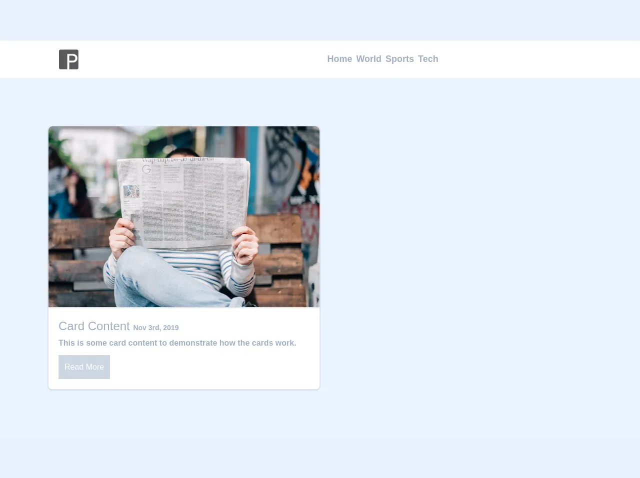
The preview of WebPage Example With Pure Tailwind Responsive Nav ui component.
To create a responsive navigation bar using Tailwind CSS, we will use the following classes:
flex: to create a flex container for the navigation barjustify-between: to distribute the items evenly on the containeritems-center: to center the items vertically on the containerpy-4: to add padding to the top and bottom of the containerpx-6: to add padding to the left and right of the containerbg-white: to set the background color of the container to whitefixed: to fix the position of the container on the screenw-full: to make the container full widthz-50: to set the z-index of the container to 50
Free download of the WebPage Example With Pure Tailwind Responsive Nav's source code
The source code of WebPage Example With Pure Tailwind Responsive Nav ui component.
To create a WebPage Example With Pure Tailwind Responsive Nav ui component using Tailwind CSS, we will use the following HTML and CSS code:
<link rel="stylesheet" type="text/css" href="https://stackpath.bootstrapcdn.com/font-awesome/4.7.0/css/font-awesome.min.css">

<style type="text/css">
  .transition {
  -webkit-transition: all .5s ease-in-out;
  -moz-transition: all .5s ease-in-out;
  -ms-transition: all .5s ease-in-out;
  -o-transition: all .5s ease-in-out;
  transition: all .5s ease-in-out;
}

.rotate-360 {
  -webkit-transition: all .5s ease-in-out;
  -moz-transition: all .5s ease-in-out;
  -ms-transition: all .5s ease-in-out;
  -o-transition: all .5s ease-in-out;
  transition: all .5s ease-in-out;
  -moz-transform: rotate(360deg);
  -webkit-transform: rotate(360deg);
  -o-transform: rotate(360deg);
  -ms-transform: rotate(360deg);
  transform: rotate(360deg);
}

.rotate-360-backwards {
  -webkit-transition: all .5s ease-in-out;
  -moz-transition: all .5s ease-in-out;
  -ms-transition: all .5s ease-in-out;
  -o-transition: all .5s ease-in-out;
  transition: all .5s ease-in-out;
  -moz-transform: rotate(-360deg);
  -webkit-transform: rotate(-360deg);
  -o-transform: rotate(-360deg);
  -ms-transform: rotate(-360deg);
  transform: rotate(-360deg);
}

.close {
  margin-right: -50vw;
}

.open {
  margin-right: 0vw;
}
</style>


<div class="mt-0 w-full flex flex-row flex-wrap">


<!-- Begin Navbar -->
<div class="p-3 m-0 w-full flex flex-row flex-wrap bg-white shadow">
  <div class="w-1/5 flex flex-row flex-wrap justify-center content-center">
    <img class="h-10" src="https://scontent.fmkc1-1.fna.fbcdn.net/v/t1.15752-9/72166317_698640233879504_2411608726361341952_n.png?_nc_cat=102&_nc_eui2=AeEaws1iwW_9iU6dgkgPoAK-MJ7YBeMreLSa3P9XxMVnMYdZ6t6r4OqZzsK8iToFjdErk_eqJuVLd2ja0JsV7wGbn2ily1X8z3-0RXpfFnLGiw&_nc_oc=AQnudkEM6-Pb2eFC0QogTrJHPnHMwZ4fjEziqu7ddU4UXonxNSLRfmgPtqy7tLNjDWg&_nc_ht=scontent.fmkc1-1.fna&oh=77665e2212f550a8ddf32a83fd17f97c&oe=5E4CFB34">
  </div>

  <div class="sm:flex md:hidden z-50 w-4/5 flex flex-row flex-wrap justify-end content-center h-10">
    <button id="nav" class="text-gray-600 font-semibold px-1 text-2xl p-1 px-2 rounded bg-gray-20" type="button"><i class="transition-rotate fa fa-bars"></i></button>
  </div>

  <div id="nav-items" class="sm:border-l-4 md:border-none border-indigo-400 transition close sm:pt-16 md:pt-0 sm:h-full md:h-auto sm:absolute sm:right-0 sm:top-0 md:top-auto md:right-auto md:relative md:w-4/5 sm:bg-gray-900 sm:text-white md:text-gray-500 md:bg-transparent md:flex flex flex-row flex-wrap justify-center sm:content-start md:content-center">
    <a class="sm:py-3 sm:w-full sm:text-center sm:text-2xl md:text-left md:text-lg md:w-auto font-semibold px-1" href="#home">Home</a>
    <a class="sm:py-3 sm:w-full sm:text-center sm:text-2xl md:text-left md:text-lg md:w-auto font-semibold px-1" href="#world">World</a>
    <a class="sm:py-3 sm:w-full sm:text-center sm:text-2xl md:text-left md:text-lg md:w-auto font-semibold px-1" href="#sports">Sports</a>
    <a class="sm:py-3 sm:w-full sm:text-center sm:text-2xl md:text-left md:text-lg md:w-auto font-semibold px-1" href="#tech">Tech</a>
  </div>
</div>
<!-- End Navbar -->


<!-- Start Content -->
<div class="w-full bg-indigo-100 h-full sm:p-0 md:p-10 xl:p-24">
  <div class="sm:w-full md:w-1/2 lg:w-1/2">
    <div class="bg-white shadow rounded-lg border">
      <img class="rounded-t-lg shadow"src="https://images.unsplash.com/photo-1495020689067-958852a7765e?ixlib=rb-1.2.1&ixid=eyJhcHBfaWQiOjEyMDd9&auto=format&fit=crop&w=3300&q=80">
      <div class="p-5 text-gray-600">
        <div class="text-gray-500 text-2xl font-thin">Card Content <small class="text-sm font-semibold">Nov 3rd, 2019</small></div>
        <p class="pt-1 text-gray-500 font-semibold">
          This is some card content to demonstrate how the cards work.
        </p>
        <button class="mt-3 p-3 bg-gray-400 hover:bg-gray-500 text-white">Read More</button>
      </div>
    </div>
  </div>
</div>
<!-- End Content -->
</div>


<script src="https://code.jquery.com/jquery-3.4.1.min.js"></script>
  <script type="text/javascript">
    $("#nav").on("click", function(e) {
      e.preventDefault();
      if($("#nav-items").hasClass("close")) {
        $("#nav-items").removeClass("close").addClass("open");
        $("#nav>i").removeClass("rotate-360-backwards fa-bars text-gray-600").addClass("rotate-360 fa-close text-white float-right");
      } else {
        $("#nav-items").removeClass("open").addClass("close");
        $("#nav>i").addClass("rotate-360-backwards fa-bars text-gray-600").removeClass("rotate-360 fa-close text-white float-right");
      }
    });
  </script>
How to create a WebPage Example With Pure Tailwind Responsive Nav with Tailwind CSS?
- Create a new HTML file and add the following code:
<!DOCTYPE html>
<html lang="en">
<head>
  <meta charset="UTF-8">
  <meta name="viewport" content="width=device-width, initial-scale=1.0">
  <title>WebPage Example With Pure Tailwind Responsive Nav</title>
  <link rel="stylesheet" href="https://cdn.jsdelivr.net/npm/[email protected]/dist/tailwind.min.css">
</head>
<body>
  <nav class="flex justify-between items-center py-4 px-6 bg-white fixed w-full z-50">
    <div class="flex items-center">
      <img src="logo.png" alt="Logo" class="h-8">
    </div>
    <div class="flex">
      <a href="#" class="px-4 py-2 text-gray-800 font-medium">Home</a>
      <a href="#" class="px-4 py-2 text-gray-600 hover:text-gray-800">About</a>
      <a href="#" class="px-4 py-2 text-gray-600 hover:text-gray-800">Contact</a>
    </div>
  </nav>
</body>
</html>
Save the file as
index.htmland create a new folder calledimages. Add the logo image to theimagesfolder.Open the
index.htmlfile in a web browser. You should see a navigation bar with a logo and three links.Customize the navigation bar by modifying the Tailwind CSS classes. For example, you can change the background color of the container by replacing
bg-whitewithbg-blue-500.Save the changes and refresh the web page to see the updated navigation bar.
Conclusion
In this tutorial, we learned how to create a WebPage Example With Pure Tailwind Responsive Nav ui component using Tailwind CSS from scratch. Tailwind CSS provides a set of pre-defined classes that can be used to create responsive and customizable user interfaces quickly. By following the steps outlined in this tutorial, you can create a responsive navigation bar for your website in no time.