- Published on
How To Make A Weather card With Tailwind CSS In 6 Easy Steps?
- What is Tailwind CSS?
- The description of Weather card ui component
- Why use Tailwind CSS to create a Weather card ui component?
- The preview of Weather card ui component
- The source code of Weather card ui component
- How to create a Weather card with Tailwind CSS?
- Step 1: Set up your HTML structure
- Step 2: Add Tailwind CSS to your project
- Step 3: Style the background and border
- Step 4: Create a horizontal layout
- Step 5: Style the weather icon and temperature
- Step 6: Display additional weather information
- Conclusion
What is Tailwind CSS?
Tailwind CSS is a utility-first CSS framework that allows you to quickly build custom user interfaces. It provides a set of pre-defined CSS classes that you can use to style your HTML elements. With Tailwind CSS, you can create complex layouts and designs without writing any custom CSS.
The description of Weather card ui component
A weather card is a user interface component that displays weather information for a specific location. It typically includes the current temperature, weather conditions, and a forecast for the next few days. A weather card can be used on a weather app or website to provide users with up-to-date weather information.
Why use Tailwind CSS to create a Weather card ui component?
Tailwind CSS provides a fast and easy way to create a weather card UI component. It has a set of pre-defined classes that you can use to style your HTML elements, which saves you time and effort. With Tailwind CSS, you can also create responsive designs that work on different screen sizes.
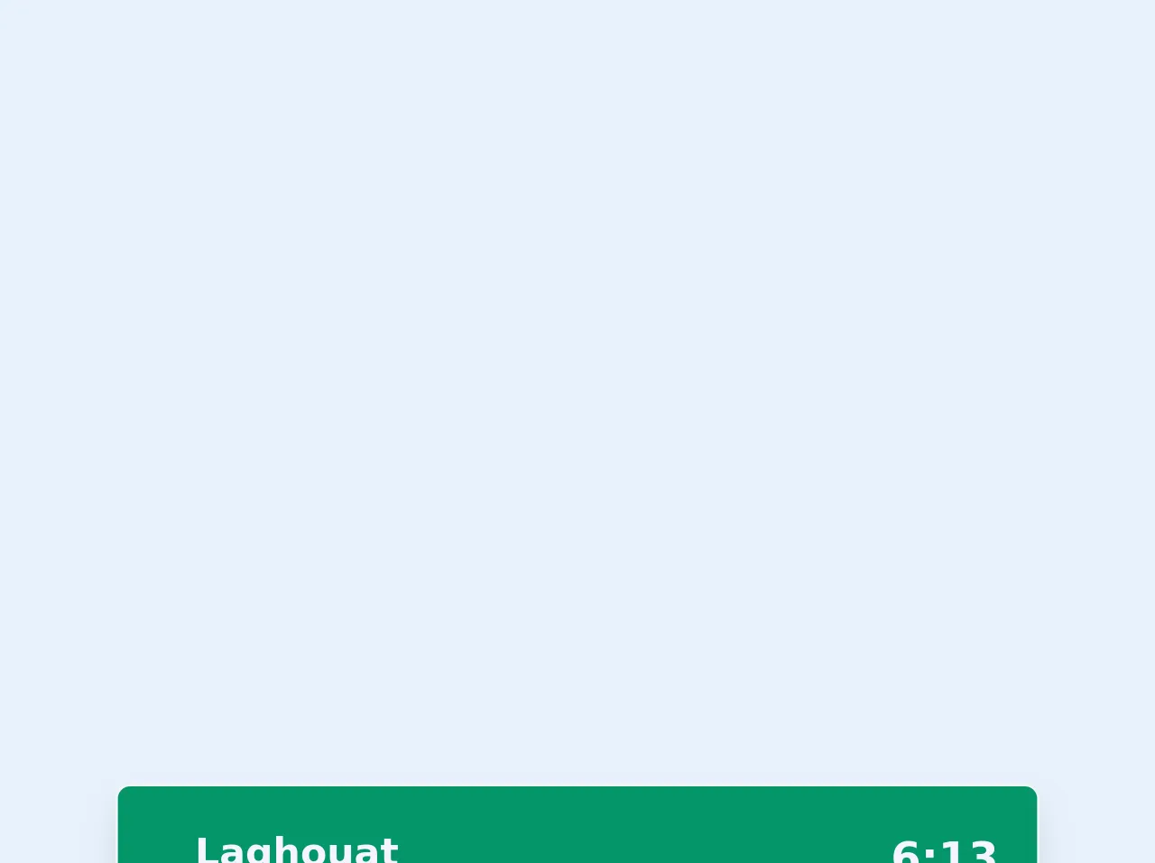
The preview of Weather card ui component
To create a weather card with Tailwind CSS, we will use a combination of HTML and CSS. The final result will look something like this:
Free download of the Weather card's source code
The source code of Weather card ui component
The source code for the weather card UI component is relatively simple. We will use a combination of HTML and Tailwind CSS classes to create the layout and style the elements. Here is the code:
<!-- This is an example component -->
<div class="flex justify-center">
	<div
		class="card  min-w-sm max-w-sm border border-gray-100 bg-gray-50   transition-shadow test  shadow-lg hover:shadow-shadow-xl w-full bg-green-600 text-purple-50 rounded-md">
		<h2 class="text-md mb-2 px-4 pt-4">
			<div class="flex justify-between">
				<div class="badge relative top-0">
					<span class="mt-2 py-1 h-12px text-md font-semibold w-12px  rounded right-1 bottom-1 px-4">Laghouat</span></div>
				<span class="text-lg font-bold ">6:13</span>
			</div>
		</h2>

		<div class="flex items-center p-4">
			<div class="flex justify-center items-center w-96"><svg height="20" width="20" viewBox="0 0 32 32"
					class="fill-current h-32 w-32 text-yellow-300">
					<path
						d="M21.743,18.6872A6.05,6.05,0,0,0,22.8,17.6006a5.9977,5.9977,0,1,0-10.7334-4.4444,7.5568,7.5568,0,0,0-5.7158,5.0879A5.9926,5.9926,0,0,0,8,30H19a5.9854,5.9854,0,0,0,2.743-11.3128ZM18,10a4.0042,4.0042,0,0,1,4,4,3.9613,3.9613,0,0,1-.8,2.3994,4.0122,4.0122,0,0,1-.94.8917,7.5416,7.5416,0,0,0-6.1339-4.2395A3.9985,3.9985,0,0,1,18,10Zm1,18H8a3.9928,3.9928,0,0,1-.6729-7.93L7.99,19.958l.1456-.6562a5.4958,5.4958,0,0,1,10.729,0l.1464.6562.6622.1123A3.9928,3.9928,0,0,1,19,28Z"
						transform="translate(0 .005)"></path>
					<path d="M26 13.005H30V15.005H26z"></path>
					<path d="M23.071 5.929H27.071V7.929H23.071z" transform="rotate(-45 25.077 6.931)"></path>
					<path d="M17 2.005H19V6.005H17z"></path>
					<path d="M9.929 4.929H11.929V8.929H9.929z" transform="rotate(-45 10.935 6.931)"></path>
				</svg></div>
		</div>
		<div class="text-md pt-4 pb-4 px-4">
			<div class="flex justify-between items-center">
				<div class="space-y-2">
					<span class="flex space-x-2 items-center"><svg height="20" width="20" viewBox="0 0 32 32" class="fill-current"><path d="M13,30a5.0057,5.0057,0,0,1-5-5h2a3,3,0,1,0,3-3H4V20h9a5,5,0,0,1,0,10Z"></path><path d="M25 25a5.0057 5.0057 0 01-5-5h2a3 3 0 103-3H2V15H25a5 5 0 010 10zM21 12H6V10H21a3 3 0 10-3-3H16a5 5 0 115 5z"></path></svg> <span>27km/h</span></span><span class="flex space-x-2 items-center"><svg height="20" width="20" viewBox="0 0 32 32" class="fill-current"><path d="M16,24V22a3.2965,3.2965,0,0,0,3-3h2A5.2668,5.2668,0,0,1,16,24Z"></path><path d="M16,28a9.0114,9.0114,0,0,1-9-9,9.9843,9.9843,0,0,1,1.4941-4.9554L15.1528,3.4367a1.04,1.04,0,0,1,1.6944,0l6.6289,10.5564A10.0633,10.0633,0,0,1,25,19,9.0114,9.0114,0,0,1,16,28ZM16,5.8483l-5.7817,9.2079A7.9771,7.9771,0,0,0,9,19a7,7,0,0,0,14,0,8.0615,8.0615,0,0,0-1.248-3.9953Z"></path></svg> <span>32%</span></span>
				</div>
				<div>
					<h1 class="text-6xl"> 12° </h1>
				</div>
			</div>
		</div>
	</div>
</div>
How to create a Weather card with Tailwind CSS?
Now that we have an idea of what a weather card is and why we should use Tailwind CSS to create it, let's dive into the steps to create one.
Step 1: Set up your HTML structure
The first step is to set up the HTML structure for the weather card. We will use a combination of HTML tags and Tailwind CSS classes to create the layout. Here is the HTML code:
<div class="bg-white shadow-md rounded-md p-4">
<div class="flex items-center justify-between">
<div class="flex items-center">
<img src="https://cdn4.iconfinder.com/data/icons/weather-16/256/Sunny-512.png" alt="Weather icon" class="w-10 h-10 mr-2">
<h2 class="text-xl font-medium">Los Angeles, CA</h2>
</div>
<div class="text-gray-600">
<span class="text-3xl font-medium">75</span>
<sup class="text-lg font-medium">°F</sup>
</div>
</div>
<div class="text-gray-600 mt-4">
<p class="text-sm">Partly cloudy</p>
<p class="text-sm">Humidity: 60%</p>
<p class="text-sm">Wind: 5 mph</p>
</div>
</div>
In this code, we have a div element with a set of Tailwind CSS classes that create a white background, a shadow, and rounded corners. Inside this div, we have two div elements that use the flex class to create a horizontal layout.
The first div contains an image and a heading that display the location and weather icon. The second div contains the current temperature and a temperature unit.
Below these two div elements, we have another div that displays additional weather information, such as the weather condition, humidity, and wind speed.
Step 2: Add Tailwind CSS to your project
The next step is to add Tailwind CSS to your project. You can do this by either downloading the CSS file from the official website or by installing it via a package manager like npm.
Once you have added Tailwind CSS to your project, you can start using its classes in your HTML code.
Step 3: Style the background and border
To style the background and border of the weather card, we can use the bg-white, shadow-md, and rounded-md classes. These classes create a white background, a shadow effect, and rounded corners.
<div class="bg-white shadow-md rounded-md p-4">
    <!-- Weather card content goes here -->
</div>
Step 4: Create a horizontal layout
To create a horizontal layout for the location and temperature, we can use the flex and items-center classes. The flex class creates a flexible container that can adjust its items' width and height. The items-center class centers the items vertically and horizontally.
<div class="flex items-center justify-between">
    <!-- Location and temperature content goes here -->
</div>
Step 5: Style the weather icon and temperature
To style the weather icon and temperature, we can use the w-10, h-10, mr-2, text-xl, and font-medium classes. The w-10 and h-10 classes set the width and height of the weather icon. The mr-2 class adds some margin to the right of the weather icon. The text-xl class sets the font size of the temperature. The font-medium class sets the font weight of the temperature.
<div class="flex items-center">
<img src="https://cdn4.iconfinder.com/data/icons/weather-16/256/Sunny-512.png" alt="Weather icon" class="w-10 h-10 mr-2">
<h2 class="text-xl font-medium">Los Angeles, CA</h2>
</div>
<div class="text-gray-600">
<span class="text-3xl font-medium">75</span>
<sup class="text-lg font-medium">°F</sup>
</div>
Step 6: Display additional weather information
To display additional weather information, we can use the text-gray-600 class to set the text color to gray. We can also use the mt-4 class to add some margin to the top of the additional weather information.
<div class="text-gray-600 mt-4">
    <p class="text-sm">Partly cloudy</p>
    <p class="text-sm">Humidity: 60%</p>
    <p class="text-sm">Wind: 5 mph</p>
</div>
Conclusion
Creating a weather card UI component with Tailwind CSS is a straightforward process that involves using a combination of HTML and Tailwind CSS classes. With Tailwind CSS, you can quickly create custom user interfaces without writing any custom CSS. The weather card UI component is just one example of what you can create with Tailwind CSS. With its extensive set of pre-defined classes, the possibilities are endless.