- Published on
Imagine You Make A Video Player With Tailwind CSS Like An Expert. Follow These 6 Steps To Get There
- What is Tailwind CSS?
- The description of Video Player UI component
- Why use Tailwind CSS to create a Video Player UI component?
- The preview of Video Player UI component.
- The source code of Video Player UI component.
- How to create a Video Player with Tailwind CSS?
- Step 1: Set up your HTML structure
- Step 2: Style the video player container
- Step 3: Style the video player
- Step 4: Style the video controls
- Step 5: Style the video timeline
- Step 6: Add interactivity to the video player
- Conclusion
Are you looking to create a video player UI component for your website or application? Do you want to use Tailwind CSS to make it look professional and stylish? In this article, we will guide you through the process of creating a video player with Tailwind CSS like an expert.
What is Tailwind CSS?
Tailwind CSS is a utility-first CSS framework that allows you to create custom designs quickly and efficiently. It provides a set of pre-defined classes that can be used to style your HTML elements. With Tailwind CSS, you can easily create responsive and mobile-first designs without writing any custom CSS.
The description of Video Player UI component
A video player UI component is an essential element of any website or application that displays video content. It allows users to play, pause, and control the video playback. A video player UI component typically consists of a video player container, video controls, and a timeline.
Why use Tailwind CSS to create a Video Player UI component?
Tailwind CSS provides a set of pre-defined classes that can be used to style your HTML elements. It allows you to create custom designs quickly and efficiently without writing any custom CSS. With Tailwind CSS, you can easily create a responsive and mobile-first design for your video player UI component.
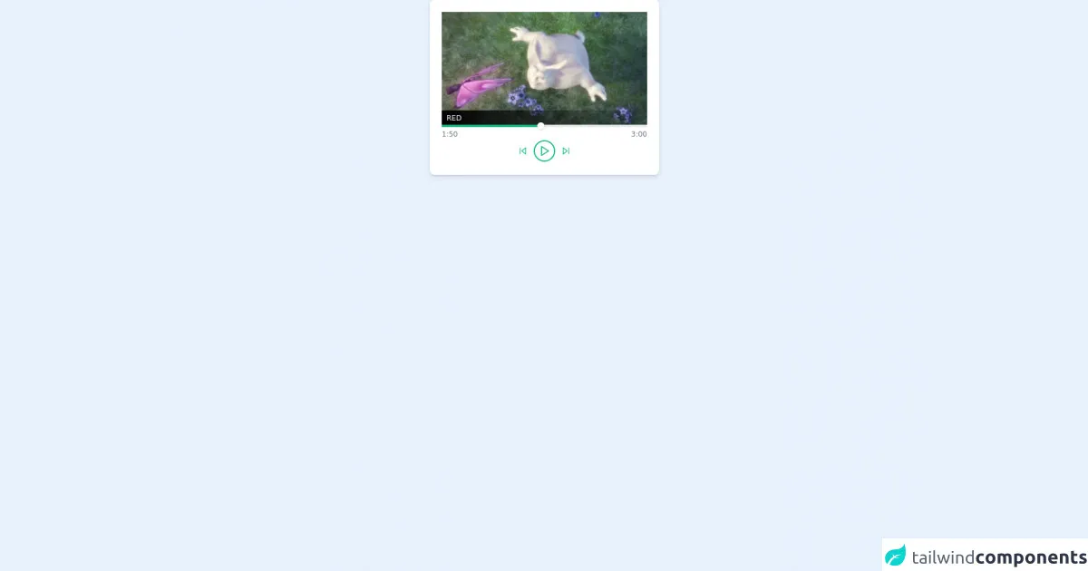
The preview of Video Player UI component.
Creating a video player UI component with Tailwind CSS can make it look professional and stylish. The video player UI component can have a sleek and modern design that is easy to use and navigate.
Free download of the Video Player's source code
The source code of Video Player UI component.
To create a video player UI component with Tailwind CSS, you can use the pre-defined classes provided by the framework. The source code for the video player UI component can be easily customized to fit your specific needs.
<!-- This is an example component -->
<div>
    <div class='flex max-w-sm w-full bg-white shadow-md rounded-lg overflow-hidden mx-auto'>
        <div class="flex flex-col m-5 ">
            <div class="relative">
<video class="w-screen ">
			<source class="w-30 h-30" src='https://www.w3schools.com/html/mov_bbb.mp4' type='video/mp4'>

        </video>
         <div class="absolute bottom-0 w-full bg-gradient-to-r from-black">
            <span class="text-white text-xs uppercase px-2">
                red
            </span>
        </div>
            </div>
        <div>
            <div>
      <div class="relative h-1 bg-gray-200">
        <div class="absolute h-full w-1/2 bg-green-500 flex items-center justify-end">
          <div class="rounded-full w-3 h-3 bg-white shadow"></div>
        </div>
      </div>
    </div>
    <div class="flex justify-between text-xs font-medium text-gray-500 py-1">
      <div>
        1:50
      </div>
      <div class="flex space-x-3 pt-5">
        <button class="focus:outline-none">
          <svg class="w-4 h-4" viewBox="0 0 24 24" fill="none" stroke="#10b981" stroke-width="2" stroke-linecap="round" stroke-linejoin="round"><polygon points="19 20 9 12 19 4 19 20"></polygon><line x1="5" y1="19" x2="5" y2="5"></line></svg>
        </button>
        <button class="rounded-full w-8 h-8 flex items-center justify-center pl-0.5 ring-2 ring-green-500 focus:outline-none">
          <svg class="w-5 h-5" viewBox="0 0 24 24" fill="none" stroke="#10b981" stroke-width="2" stroke-linecap="round" stroke-linejoin="round"><polygon points="5 3 19 12 5 21 5 3"></polygon></svg>
        </button>
        <button class="focus:outline-none">
          <svg class="w-4 h-4" viewBox="0 0 24 24" fill="none" stroke="#10b981" stroke-width="2" stroke-linecap="round" stroke-linejoin="round"><polygon points="5 4 15 12 5 20 5 4"></polygon><line x1="19" y1="5" x2="19" y2="19"></line></svg>
        </button>
      </div>
      <div>
        3:00
      </div>
    </div>
        </div>
        </div>
    </div>
</div>
How to create a Video Player with Tailwind CSS?
Follow these 6 steps to create a video player with Tailwind CSS:
Step 1: Set up your HTML structure
The first step is to set up your HTML structure for the video player UI component. You can use the HTML5 video tag to embed the video player on your website or application.
<div class="video-player-container">
  <video class="video-player" controls>
    <source src="video.mp4" type="video/mp4">
    <source src="video.ogg" type="video/ogg">
    Your browser does not support the video tag.
  </video>
  <div class="video-controls">
    <!-- Video controls go here -->
  </div>
  <div class="video-timeline">
    <!-- Video timeline goes here -->
  </div>
</div>
Step 2: Style the video player container
The next step is to style the video player container. You can use the bg-gray-900 class to set the background color of the container to dark gray.
.video-player-container {
  background-color: #1a202c;
}
Step 3: Style the video player
The third step is to style the video player. You can use the w-full and h-auto classes to make the video player responsive and fit the width of its container.
.video-player {
  width: 100%;
  height: auto;
}
Step 4: Style the video controls
The fourth step is to style the video controls. You can use the flex and justify-between classes to align the video controls to the left and right sides of the container.
.video-controls {
  display: flex;
  justify-content: space-between;
}
Step 5: Style the video timeline
The fifth step is to style the video timeline. You can use the bg-gray-600 class to set the background color of the timeline to gray.
.video-timeline {
  background-color: #4a5568;
}
Step 6: Add interactivity to the video player
The final step is to add interactivity to the video player. You can use JavaScript to add functionality to the video controls and timeline.
Conclusion
Creating a video player UI component with Tailwind CSS is easy and efficient. With the pre-defined classes provided by the framework, you can create a professional and stylish design for your video player. Follow these 6 steps to create a video player with Tailwind CSS like an expert.