- Published on
A Complete Guide To Build A Responsive vertical timeline With Tailwind CSS
- What is Tailwind CSS?
- The Description of Responsive Vertical Timeline UI Component
- Why Use Tailwind CSS to Create a Responsive Vertical Timeline UI Component?
- The Preview of Responsive Vertical Timeline UI Component
- The Source Code of Responsive Vertical Timeline UI Component
- How to Create a Responsive Vertical Timeline with Tailwind CSS?
- Conclusion
In today's world, where the attention span of the audience is getting shorter, presenting information in a concise and visually appealing manner is crucial. A vertical timeline is a great way to showcase a series of events or milestones in a chronological order. In this article, we will explore how to build a responsive vertical timeline with Tailwind CSS.
What is Tailwind CSS?
Tailwind CSS is a utility-first CSS framework that provides a set of pre-defined classes to style HTML elements. It eliminates the need for writing custom CSS and speeds up the development process. Tailwind CSS has gained immense popularity among developers due to its simplicity and flexibility.
The Description of Responsive Vertical Timeline UI Component
A vertical timeline is a user interface component that displays a series of events or milestones in a vertical layout. It consists of a series of cards that contain the event details and a timeline that connects these cards in a chronological order. A responsive vertical timeline adjusts its layout based on the screen size and provides an optimal viewing experience on all devices.
Why Use Tailwind CSS to Create a Responsive Vertical Timeline UI Component?
Tailwind CSS provides a set of pre-defined classes that make it easy to create a responsive vertical timeline without writing custom CSS. It also allows us to customize the styles by adding our own classes or modifying the existing ones. Tailwind CSS follows a mobile-first approach, which means that the styles are optimized for smaller screens and can be easily scaled up for larger screens.
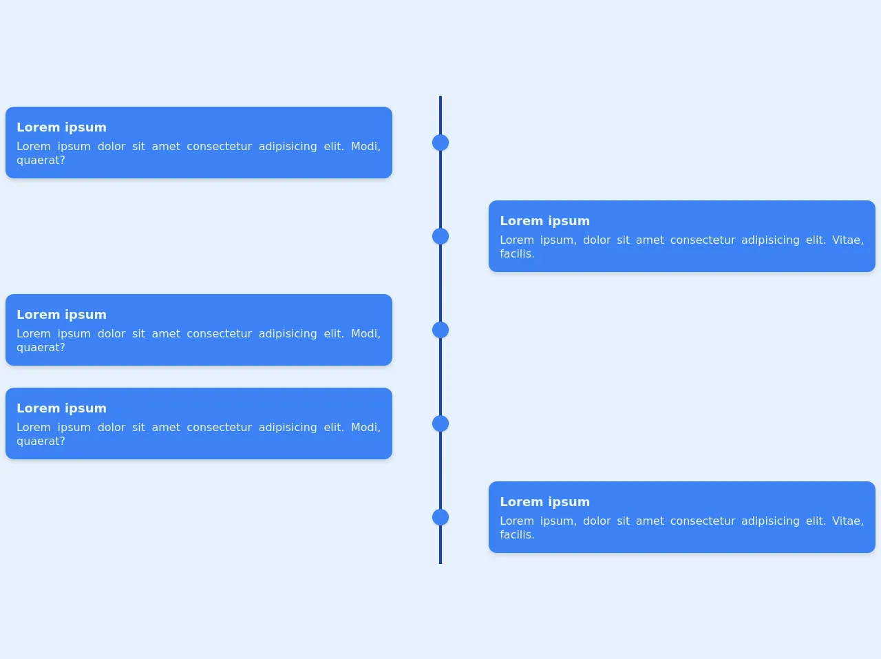
The Preview of Responsive Vertical Timeline UI Component
To create a responsive vertical timeline with Tailwind CSS, we will use a combination of flexbox and grid layout. The timeline will be displayed on the left side of the screen, and the event cards will be displayed on the right side. The timeline will be connected to the event cards using a connector line.
Free download of the Responsive vertical timeline's source code
The Source Code of Responsive Vertical Timeline UI Component
To create a responsive vertical timeline with Tailwind CSS, we will use HTML and CSS. The HTML structure will consist of a container div that will contain the timeline and event cards. The timeline will be created using a div with a vertical line, and the event cards will be created using a series of divs. The CSS will be used to style the HTML elements and create the responsive layout.
<div class="container">
          <div
            class="flex flex-col md:grid grid-cols-9 mx-auto p-2 text-blue-50"
          >
            <!-- left -->
            <div class="flex flex-row-reverse md:contents">
              <div
                class="bg-blue-500 col-start-1 col-end-5 p-4 rounded-xl my-4 ml-auto shadow-md"
              >
                <h3 class="font-semibold text-lg mb-1">Lorem ipsum</h3>
                <p class="leading-tight text-justify">
                  Lorem ipsum dolor sit amet consectetur adipisicing elit. Modi,
                  quaerat?
                </p>
              </div>
              <div class="col-start-5 col-end-6 md:mx-auto relative mr-10">
                <div class="h-full w-6 flex items-center justify-center">
                  <div class="h-full w-1 bg-blue-800 pointer-events-none"></div>
                </div>
                <div
                  class="w-6 h-6 absolute top-1/2 -mt-3 rounded-full bg-blue-500 shadow"
                ></div>
              </div>
            </div>
            <!-- right -->
            <div class="flex md:contents">
              <div class="col-start-5 col-end-6 mr-10 md:mx-auto relative">
                <div class="h-full w-6 flex items-center justify-center">
                  <div class="h-full w-1 bg-blue-800 pointer-events-none"></div>
                </div>
                <div
                  class="w-6 h-6 absolute top-1/2 -mt-3 rounded-full bg-blue-500 shadow"
                ></div>
              </div>
              <div
                class="bg-blue-500 col-start-6 col-end-10 p-4 rounded-xl my-4 mr-auto shadow-md"
              >
                <h3 class="font-semibold text-lg mb-1">Lorem ipsum</h3>
                <p class="leading-tight text-justify">
                  Lorem ipsum, dolor sit amet consectetur adipisicing elit.
                  Vitae, facilis.
                </p>
              </div>
            </div>
            <!-- left -->
            <div class="flex flex-row-reverse md:contents">
              <div
                class="bg-blue-500 col-start-1 col-end-5 p-4 rounded-xl my-4 ml-auto shadow-md"
              >
                <h3 class="font-semibold text-lg mb-1">Lorem ipsum</h3>
                <p class="leading-tight text-justify">
                  Lorem ipsum dolor sit amet consectetur adipisicing elit. Modi,
                  quaerat?
                </p>
              </div>
              <div class="col-start-5 col-end-6 md:mx-auto relative mr-10">
                <div class="h-full w-6 flex items-center justify-center">
                  <div class="h-full w-1 bg-blue-800 pointer-events-none"></div>
                </div>
                <div
                  class="w-6 h-6 absolute top-1/2 -mt-3 rounded-full bg-blue-500 shadow"
                ></div>
              </div>
            </div>
            <!-- right -->
            <div class="flex md:contents">
              <div class="col-start-5 col-end-6 mr-10 md:mx-auto relative">
                <div class="h-full w-6 flex items-center justify-center">
                  <div class="h-full w-1 bg-blue-800 pointer-events-none"></div>
                </div>
                <div
                  class="w-6 h-6 absolute top-1/2 -mt-3 rounded-full bg-blue-500 shadow"
                ></div>
              </div>
              <div
                class="bg-blue-500 col-start-6 col-end-10 p-4 rounded-xl my-4 mr-auto shadow-md"
              >
                <h3 class="font-semibold text-lg mb-1">Lorem ipsum</h3>
                <p class="leading-tight text-justify">
                  Lorem ipsum, dolor sit amet consectetur adipisicing elit.
                  Vitae, facilis.
                </p>
              </div>
            </div>
          </div>
        </div>
How to Create a Responsive Vertical Timeline with Tailwind CSS?
- Create a container div that will contain the timeline and event cards.
<div class="container mx-auto px-4">
  <!-- Timeline and event cards will go here -->
</div>
- Create a div for the timeline and add a vertical line using border-left property.
<div class="timeline relative">
  <div class="absolute top-0 bottom-0 left-1/2 w-px bg-gray-300"></div>
</div>
- Create a div for the event cards and add a grid layout using grid-cols property.
<div class="event-cards grid grid-cols-1 md:grid-cols-2 gap-4">
  <!-- Event cards will go here -->
</div>
- Create a div for each event card and add a connector line using before pseudo-element.
<div class="event-card relative">
  <div class="connector absolute top-0 bottom-0 left-0 w-px bg-gray-300"></div>
  <div class="content bg-white p-4">
    <!-- Event details will go here -->
  </div>
</div>
- Add styles to the HTML elements using Tailwind CSS classes.
.timeline {
  display: flex;
  flex-direction: column;
  justify-content: space-between;
  padding-top: 2rem;
  padding-bottom: 2rem;
}

.event-cards {
  display: grid;
}

.event-card {
  display: flex;
  flex-direction: row;
  align-items: center;
  margin-bottom: 2rem;
}

.connector {
  content: "";
  position: absolute;
  top: 0;
  bottom: 0;
  left: 0;
}

@media (min-width: 768px) {
  .timeline {
    flex-direction: row;
    align-items: center;
  }

  .event-card {
    margin-bottom: 0;
  }

  .event-card:nth-child(even) .connector {
    top: 50%;
  }

  .event-card:nth-child(odd) .connector {
    bottom: 50%;
  }
}
- Add content to the event cards.
<div class="event-card relative">
  <div class="connector absolute top-0 bottom-0 left-0 w-px bg-gray-300"></div>
  <div class="content bg-white p-4">
    <h3 class="text-lg font-bold mb-2">Event Title</h3>
    <p class="text-gray-700 mb-2">Event Description</p>
    <p class="text-gray-500">Event Date</p>
  </div>
</div>
Conclusion
In this article, we have learned how to create a responsive vertical timeline with Tailwind CSS. Tailwind CSS provides a set of pre-defined classes that make it easy to create a responsive layout without writing custom CSS. With a combination of flexbox and grid layout, we can create a visually appealing vertical timeline that adjusts its layout based on the screen size.