- Published on
6 Ideas To Help You Create A User Timeline With Tailwind CSS Like A Pro
- What is Tailwind CSS?
- The description of User Timeline UI component
- Why use Tailwind CSS to create a User Timeline UI component?
- The preview of User Timeline UI component
- The source code of User Timeline UI component
- How to create a User Timeline with Tailwind CSS?
- Conclusion
As a FrontEnd technology blogger, you may have heard of Tailwind CSS, a utility-first CSS framework that provides a set of pre-defined classes to help you build a responsive and customizable user interface quickly. In this article, we will explore how to use Tailwind CSS to create a User Timeline UI component that can display a user's activity history in a chronological order.
What is Tailwind CSS?
Tailwind CSS is a CSS framework that provides a set of pre-defined utility classes to help you style your HTML elements quickly. Unlike other CSS frameworks that come with pre-defined components, Tailwind CSS focuses on providing a set of low-level utility classes that you can combine to create your own custom components. This approach gives you more flexibility and control over your UI design, but it also requires you to write more HTML code.
The description of User Timeline UI component
A User Timeline UI component is a vertical timeline that displays a user's activity history in a chronological order. Each timeline item represents a specific event, such as a post, a comment, or a like, and includes a timestamp, a title, and a description. The timeline items are usually displayed in reverse chronological order, with the most recent event at the top.
Why use Tailwind CSS to create a User Timeline UI component?
Tailwind CSS provides a set of pre-defined utility classes that can help you style your User Timeline UI component quickly and easily. You can use classes like bg-gray-100, text-gray-700, and border-gray-300 to set the background color, text color, and border color of your timeline items. You can also use classes like py-2, px-4, and rounded-lg to set the padding, margin, and border radius of your timeline items.
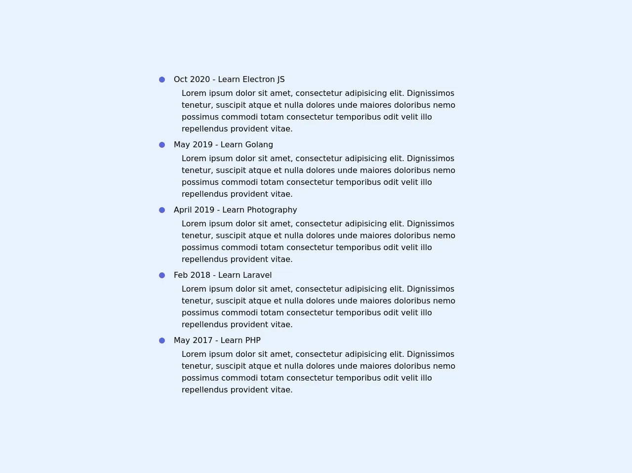
The preview of User Timeline UI component
To create a User Timeline UI component with Tailwind CSS, you can use a combination of HTML and CSS code. Here is a preview of what the final component might look like:
Free download of the User Timeline's source code
The source code of User Timeline UI component
To create a User Timeline UI component with Tailwind CSS, you can use a combination of HTML and CSS code. Here is the source code for the component:
<div class="relative w-1/2 m-8">
            <div class="border-r-2 border-gray-200 border-dotted absolute h-full top-0 z-0" style="left: 7px"></div>
            <ul class="list-none m-0 p-0">
                <li class="mb-2">
                    <div class="flex items-center mb-1">
                        <div class="bg-indigo-600 rounded-full h-4 w-4 border-gray-200 border-2 z-10">
                        </div>
                        <div class="flex-1 ml-4 font-medium">Oct 2020 - Learn Electron JS</div>
                    </div>
                    <div class="ml-12">
                        Lorem ipsum dolor sit amet, consectetur adipisicing elit. Dignissimos tenetur, suscipit atque et
                        nulla dolores unde maiores doloribus nemo possimus commodi totam consectetur temporibus odit
                        velit illo repellendus provident vitae.
                    </div>
                </li>
                <li class="mb-2">
                    <div class="flex items-center mb-1">
                        <div class="bg-indigo-600 rounded-full h-4 w-4 border-gray-200 border-2 z-10">
                        </div>
                        <div class="flex-1 ml-4 font-medium">May 2019 - Learn Golang</div>
                    </div>
                    <div class="ml-12">
                        Lorem ipsum dolor sit amet, consectetur adipisicing elit. Dignissimos tenetur, suscipit atque et
                        nulla dolores unde maiores doloribus nemo possimus commodi totam consectetur temporibus odit
                        velit illo repellendus provident vitae.
                    </div>
                </li>
                <li class="mb-2">
                    <div class="flex items-center mb-1">
                        <div class="bg-indigo-600 rounded-full h-4 w-4 border-gray-200 border-2 z-10">
                        </div>
                        <div class="flex-1 ml-4 font-medium">April 2019 - Learn Photography</div>
                    </div>
                    <div class="ml-12">
                        Lorem ipsum dolor sit amet, consectetur adipisicing elit. Dignissimos tenetur, suscipit atque et
                        nulla dolores unde maiores doloribus nemo possimus commodi totam consectetur temporibus odit
                        velit illo repellendus provident vitae.
                    </div>
                </li>
                <li class="mb-2">
                    <div class="flex items-center mb-1">
                        <div class="bg-indigo-600 rounded-full h-4 w-4 border-gray-200 border-2 z-10">
                        </div>
                        <div class="flex-1 ml-4 font-medium">Feb 2018 - Learn Laravel</div>
                    </div>
                    <div class="ml-12">
                        Lorem ipsum dolor sit amet, consectetur adipisicing elit. Dignissimos tenetur, suscipit atque et
                        nulla dolores unde maiores doloribus nemo possimus commodi totam consectetur temporibus odit
                        velit illo repellendus provident vitae.
                    </div>
                </li>
                <li class="mb-2">
                    <div class="flex items-center mb-1">
                        <div class="bg-indigo-600 rounded-full h-4 w-4 border-gray-200 border-2 z-10">
                        </div>
                        <div class="flex-1 ml-4 font-medium">May 2017 - Learn PHP</div>
                    </div>
                    <div class="ml-12">
                        Lorem ipsum dolor sit amet, consectetur adipisicing elit. Dignissimos tenetur, suscipit atque et
                        nulla dolores unde maiores doloribus nemo possimus commodi totam consectetur temporibus odit
                        velit illo repellendus provident vitae.
                    </div>
                </li>
            </ul>
        </div>
How to create a User Timeline with Tailwind CSS?
To create a User Timeline UI component with Tailwind CSS, you can follow these steps:
- Create a container element for your timeline items, such as a
divelement with a class oftimeline-container. - Create a timeline item element for each event in your timeline, such as a
divelement with a class oftimeline-item. - Inside each timeline item element, create a timestamp element, such as a
pelement with a class oftext-gray-500. - Inside each timeline item element, create a title element, such as a
h3element with a class oftext-lg font-medium text-gray-900. - Inside each timeline item element, create a description element, such as a
pelement with a class oftext-gray-700. - Use Tailwind CSS utility classes to style your timeline items, such as
bg-gray-100,py-2, androunded-lg.
Here is an example of what the HTML code might look like:
<div class="timeline-container">
  <div class="timeline-item bg-white rounded-lg shadow-md mb-4">
    <p class="text-gray-500 text-sm">June 1, 2021</p>
    <h3 class="text-lg font-medium text-gray-900 mb-2">Posted a new article</h3>
    <p class="text-gray-700">Lorem ipsum dolor sit amet, consectetur adipiscing elit. Sed ut perspiciatis unde omnis iste natus error sit voluptatem accusantium doloremque laudantium.</p>
  </div>
  <div class="timeline-item bg-white rounded-lg shadow-md mb-4">
    <p class="text-gray-500 text-sm">May 30, 2021</p>
    <h3 class="text-lg font-medium text-gray-900 mb-2">Received a new comment</h3>
    <p class="text-gray-700">Lorem ipsum dolor sit amet, consectetur adipiscing elit. Sed ut perspiciatis unde omnis iste natus error sit voluptatem accusantium doloremque laudantium.</p>
  </div>
  <div class="timeline-item bg-white rounded-lg shadow-md mb-4">
    <p class="text-gray-500 text-sm">May 28, 2021</p>
    <h3 class="text-lg font-medium text-gray-900 mb-2">Liked a post</h3>
    <p class="text-gray-700">Lorem ipsum dolor sit amet, consectetur adipiscing elit. Sed ut perspiciatis unde omnis iste natus error sit voluptatem accusantium doloremque laudantium.</p>
  </div>
</div>
And here is an example of what the CSS code might look like:
.timeline-container {
  display: flex;
  flex-direction: column;
}

.timeline-item {
  display: flex;
  flex-direction: column;
  padding: 1.25rem;
  border: 1px solid #e2e8f0;
}

.timeline-item:not(:last-child) {
  margin-bottom: 1.25rem;
}

.timeline-item p {
  margin-bottom: 0.75rem;
}
Conclusion
In this article, we have explored how to use Tailwind CSS to create a User Timeline UI component that can display a user's activity history in a chronological order. We have discussed the benefits of using Tailwind CSS for styling your UI components and provided a step-by-step guide for creating a User Timeline UI component with HTML and CSS code. With these ideas and examples, you can create your own User Timeline UI component with Tailwind CSS like a pro.