- Published on
Advanced Guide: Make A user table With Tailwind CSS
- What is Tailwind CSS?
- The Description of User Table UI Component
- Why Use Tailwind CSS to Create a User Table UI Component?
- The Preview of User Table UI Component
- The Source Code of User Table UI Component
- How to Create a User Table with Tailwind CSS?
- Conclusion
As a FrontEnd technology blogger, it is important to stay up-to-date with the latest tools and frameworks. One such tool that has gained popularity in recent years is Tailwind CSS. In this article, we will explore how to create a user table UI component using Tailwind CSS.
What is Tailwind CSS?
Tailwind CSS is a utility-first CSS framework that allows developers to rapidly build custom user interfaces. It provides a set of pre-defined CSS classes that can be used to style HTML elements. Tailwind CSS is highly customizable and allows developers to create unique designs without writing custom CSS.
The Description of User Table UI Component
A user table is a common UI component used in web applications to display a list of users. It typically includes columns for user information such as name, email, and role. The user table may also include actions such as edit and delete buttons.
Why Use Tailwind CSS to Create a User Table UI Component?
Tailwind CSS provides a set of pre-defined CSS classes that can be used to style HTML elements. This makes it easy to create a user table UI component without writing custom CSS. Tailwind CSS also allows for easy customization, making it possible to create unique designs.
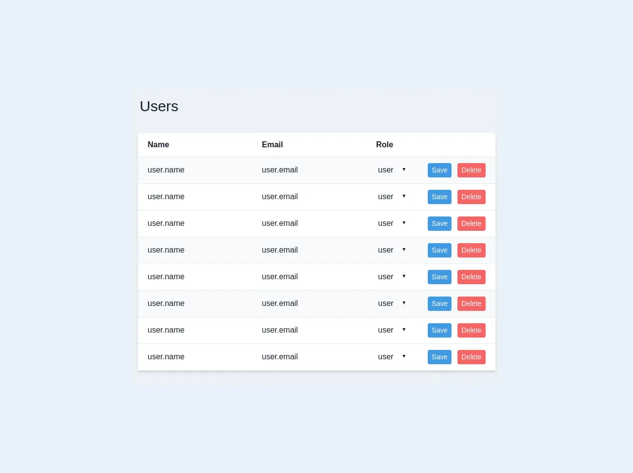
The Preview of User Table UI Component
To create a user table UI component with Tailwind CSS, we will use a combination of HTML and CSS. The HTML will define the structure of the table, while the CSS will define the styles.
Free download of the user table's source code
The Source Code of User Table UI Component
To create a user table UI component with Tailwind CSS, we will use a combination of HTML and CSS. The HTML will define the structure of the table, while the CSS will define the styles.
<div class="text-gray-900 bg-gray-200">
    <div class="p-4 flex">
        <h1 class="text-3xl">
            Users
        </h1>
    </div>
    <div class="px-3 py-4 flex justify-center">
        <table class="w-full text-md bg-white shadow-md rounded mb-4">
            <tbody>
                <tr class="border-b">
                    <th class="text-left p-3 px-5">Name</th>
                    <th class="text-left p-3 px-5">Email</th>
                    <th class="text-left p-3 px-5">Role</th>
                    <th></th>
                </tr>
                <tr class="border-b hover:bg-orange-100 bg-gray-100">
                    <td class="p-3 px-5"><input type="text" value="user.name" class="bg-transparent"></td>
                    <td class="p-3 px-5"><input type="text" value="user.email" class="bg-transparent"></td>
                    <td class="p-3 px-5">
                        <select value="user.role" class="bg-transparent">
                            <option value="user">user</option>
                            <option value="admin">admin</option>
                        </select>
                    </td>
                    <td class="p-3 px-5 flex justify-end"><button type="button" class="mr-3 text-sm bg-blue-500 hover:bg-blue-700 text-white py-1 px-2 rounded focus:outline-none focus:shadow-outline">Save</button><button type="button" class="text-sm bg-red-500 hover:bg-red-700 text-white py-1 px-2 rounded focus:outline-none focus:shadow-outline">Delete</button></td>
                </tr>
                <tr class="border-b hover:bg-orange-100">
                    <td class="p-3 px-5"><input type="text" value="user.name" class="bg-transparent"></td>
                    <td class="p-3 px-5"><input type="text" value="user.email" class="bg-transparent"></td>
                    <td class="p-3 px-5">
                        <select value="user.role" class="bg-transparent">
                            <option value="user">user</option>
                            <option value="admin">admin</option>
                        </select>
                    </td>
                    <td class="p-3 px-5 flex justify-end"><button type="button" class="mr-3 text-sm bg-blue-500 hover:bg-blue-700 text-white py-1 px-2 rounded focus:outline-none focus:shadow-outline">Save</button><button type="button" class="text-sm bg-red-500 hover:bg-red-700 text-white py-1 px-2 rounded focus:outline-none focus:shadow-outline">Delete</button></td>
                </tr>
                <tr class="border-b hover:bg-orange-100 bg-gray-100">
                    <td class="p-3 px-5"><input type="text" value="user.name" class="bg-transparent"></td>
                    <td class="p-3 px-5"><input type="text" value="user.email" class="bg-transparent"></td>
                    <td class="p-3 px-5">
                        <select value="user.role" class="bg-transparent">
                            <option value="user">user</option>
                            <option value="admin">admin</option>
                        </select>
                    </td>
                    <td class="p-3 px-5 flex justify-end"><button type="button" class="mr-3 text-sm bg-blue-500 hover:bg-blue-700 text-white py-1 px-2 rounded focus:outline-none focus:shadow-outline">Save</button><button type="button" class="text-sm bg-red-500 hover:bg-red-700 text-white py-1 px-2 rounded focus:outline-none focus:shadow-outline">Delete</button></td>
                </tr>
                <tr class="border-b hover:bg-orange-100">
                    <td class="p-3 px-5"><input type="text" value="user.name" class="bg-transparent"></td>
                    <td class="p-3 px-5"><input type="text" value="user.email" class="bg-transparent"></td>
                    <td class="p-3 px-5">
                        <select value="user.role" class="bg-transparent">
                            <option value="user">user</option>
                            <option value="admin">admin</option>
                        </select>
                    </td>
                    <td class="p-3 px-5 flex justify-end"><button type="button" class="mr-3 text-sm bg-blue-500 hover:bg-blue-700 text-white py-1 px-2 rounded focus:outline-none focus:shadow-outline">Save</button><button type="button" class="text-sm bg-red-500 hover:bg-red-700 text-white py-1 px-2 rounded focus:outline-none focus:shadow-outline">Delete</button></td>
                </tr>
            </tbody>
        </table>
    </div>
</div>
How to Create a User Table with Tailwind CSS?
To create a user table with Tailwind CSS, follow these steps:
- Create a new HTML file and add the following code:
<div class="bg-white shadow-md rounded my-6">
  <table class="text-left w-full border-collapse">
    <thead>
      <tr class="bg-gray-200">
        <th class="py-4 px-6 bg-grey-lightest font-bold uppercase text-sm text-grey-dark border-b border-grey-light">Name</th>
        <th class="py-4 px-6 bg-grey-lightest font-bold uppercase text-sm text-grey-dark border-b border-grey-light">Email</th>
        <th class="py-4 px-6 bg-grey-lightest font-bold uppercase text-sm text-grey-dark border-b border-grey-light">Role</th>
        <th class="py-4 px-6 bg-grey-lightest font-bold uppercase text-sm text-grey-dark border-b border-grey-light">Actions</th>
      </tr>
    </thead>
    <tbody>
      <tr class="hover:bg-gray-100">
        <td class="py-4 px-6 border-b border-grey-light">John Doe</td>
        <td class="py-4 px-6 border-b border-grey-light">[email protected]</td>
        <td class="py-4 px-6 border-b border-grey-light">Admin</td>
        <td class="py-4 px-6 border-b border-grey-light">
          <button class="bg-blue-500 hover:bg-blue-700 text-white font-bold py-2 px-4 rounded">
            Edit
          </button>
          <button class="bg-red-500 hover:bg-red-700 text-white font-bold py-2 px-4 rounded">
            Delete
          </button>
        </td>
      </tr>
      <tr class="hover:bg-gray-100">
        <td class="py-4 px-6 border-b border-grey-light">Jane Doe</td>
        <td class="py-4 px-6 border-b border-grey-light">[email protected]</td>
        <td class="py-4 px-6 border-b border-grey-light">User</td>
        <td class="py-4 px-6 border-b border-grey-light">
          <button class="bg-blue-500 hover:bg-blue-700 text-white font-bold py-2 px-4 rounded">
            Edit
          </button>
          <button class="bg-red-500 hover:bg-red-700 text-white font-bold py-2 px-4 rounded">
            Delete
          </button>
        </td>
      </tr>
    </tbody>
  </table>
</div>
- Save the file as
index.html. - Open the file in a web browser to see the user table UI component.
Conclusion
In this article, we have explored how to create a user table UI component using Tailwind CSS. Tailwind CSS provides a set of pre-defined CSS classes that can be used to style HTML elements, making it easy to create custom user interfaces. By following the steps outlined in this article, you can create a user table UI component that is both functional and visually appealing.