- Published on
6 Easy Ways To Create A user profile cards With Tailwind CSS
- What is Tailwind CSS?
- The Description of User Profile Cards UI Component
- Why Use Tailwind CSS to Create a User Profile Cards UI Component?
- The Preview of User Profile Cards UI Component
- The Source Code of User Profile Cards UI Component
- How to Create a User Profile Cards with Tailwind CSS?
- 1. Basic User Profile Card
- 2. Rounded User Profile Card
- 3. User Profile Card with Border
- 4. User Profile Card with Gradient Background
- 5. User Profile Card with Avatar
- 6. User Profile Card with Social Icons
- Conclusion
What is Tailwind CSS?
Tailwind CSS is a utility-first CSS framework that provides a set of pre-defined CSS classes to create user interfaces. It allows developers to design and customize UI components quickly and efficiently. With Tailwind CSS, you can create responsive and mobile-first designs with ease.
The Description of User Profile Cards UI Component
User profile cards are a common UI component used in many web applications. They provide a quick overview of user information and can be used in various contexts, such as social media platforms, online marketplaces, and e-commerce websites. A user profile card typically includes a profile picture, user name, bio, and social media links.
Why Use Tailwind CSS to Create a User Profile Cards UI Component?
Tailwind CSS provides a set of pre-defined CSS classes that can be used to create user profile cards quickly and efficiently. With Tailwind CSS, you don't need to write custom CSS styles from scratch, which can save you a lot of time and effort. Additionally, Tailwind CSS is mobile-first and responsive, which means that you can create user profile cards that look great on any device.
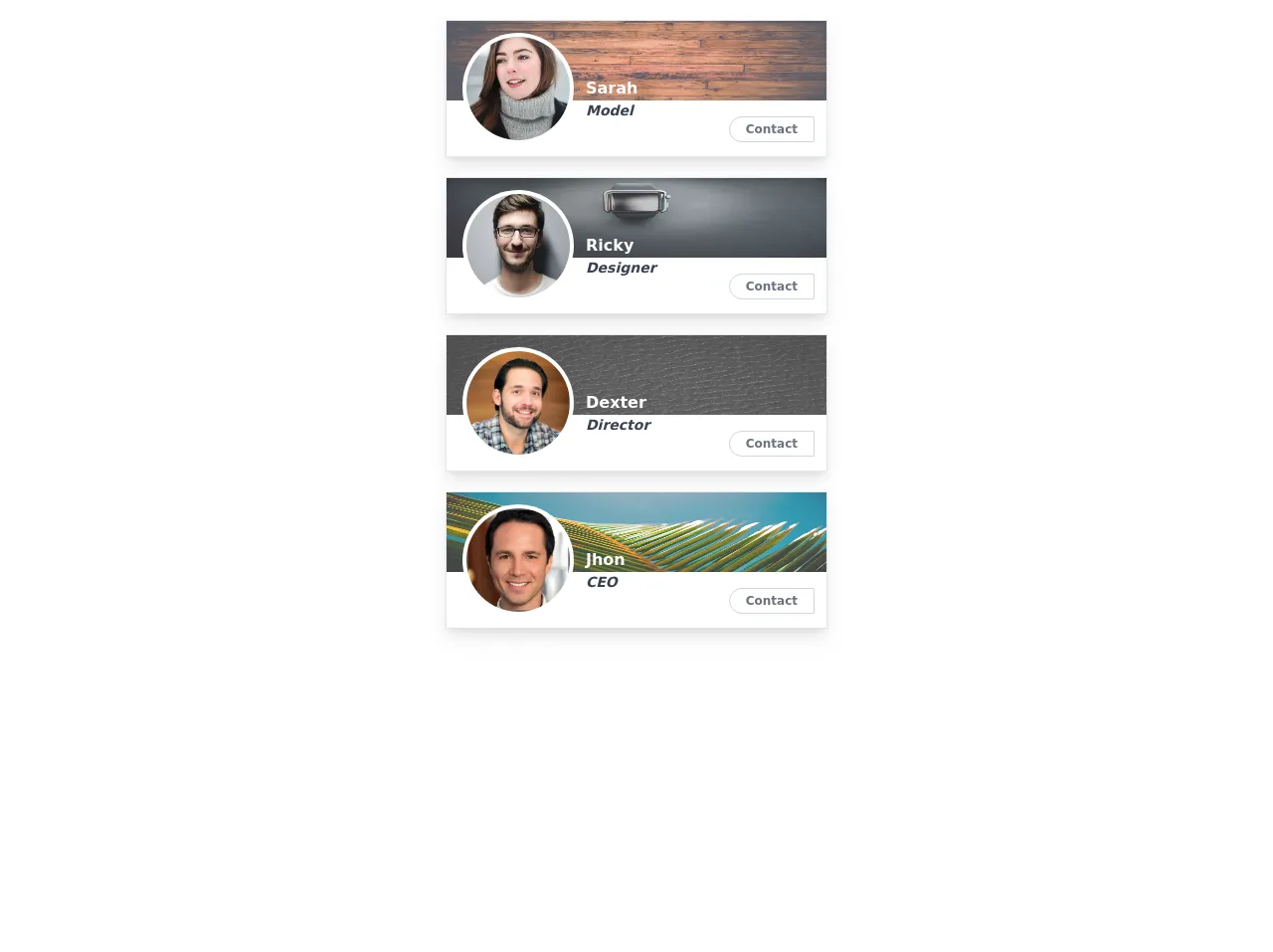
The Preview of User Profile Cards UI Component
User profile cards are a great way to showcase user information on your website. They are easy to create and can be customized to fit your design needs. Here is a preview of what a user profile card can look like:
Free download of the user profile cards's source code
The Source Code of User Profile Cards UI Component
To create a user profile card with Tailwind CSS, you need to use a combination of HTML and CSS classes. Here is an example of the source code for a simple user profile card:
<style>
  .dark{color:rgba(55, 65, 81,1);}
  body{background:white !important;}
</style>

<div class="holder">

  <div class="card border w-96 hover:shadow-none relative flex flex-col mx-auto shadow-lg m-5">
    <img class="max-h-20 w-full opacity-80 absolute top-0" style="z-index:-1" src="https://unsplash.com/photos/h0Vxgz5tyXA/download?force=true&w=640" alt="" />
    <div class="profile w-full flex m-3 ml-4 text-white">
      <img class="w-28 h-28 p-1 bg-white rounded-full" src="https://images.pexels.com/photos/61100/pexels-photo-61100.jpeg?crop=faces&fit=crop&h=200&w=200&auto=compress&cs=tinysrgb" alt=""/>
      <div class="title mt-11 ml-3 font-bold flex flex-col">
        <div class="name break-words">Sarah</div>
        <!--  add [dark] class for bright background -->
        <div class="add font-semibold text-sm italic dark">Model</div>
      </div>
    </div>
    <div class="buttons flex absolute bottom-0 font-bold right-0 text-xs text-gray-500 space-x-0 my-3.5 mr-3">
      <div class="add border rounded-l-2xl rounded-r-sm border-gray-300 p-1 px-4 cursor-pointer hover:bg-gray-700 hover:text-white">Contact</div>
      <!-- <div class="add border rounded-r-2xl rounded-l-sm border-gray-300 p-1 px-4 cursor-pointer hover:bg-gray-700 hover:text-white">Bio</div> -->
    </div>
  </div>
  <!-- card end -->
  <div class="card border w-96 hover:shadow-none relative flex flex-col mx-auto shadow-lg m-5">
    <img class="max-h-20 w-full opacity-80 absolute top-0" style="z-index:-1" src="https://unsplash.com/photos/iFPBRwZ4I-M/download?force=true&w=640" alt="" />
    <div class="profile w-full flex m-3 ml-4 text-white">
      <img class="w-28 h-28 p-1 bg-white rounded-full" src="https://images.pexels.com/photos/220453/pexels-photo-220453.jpeg?crop=faces&fit=crop&h=200&w=200&auto=compress&cs=tinysrgb" alt=""/>
      <div class="title mt-11 ml-3 font-bold flex flex-col">
        <div class="name break-words">Ricky</div>
        <!--  add [dark] class for bright background -->
        <div class="add font-semibold text-sm italic dark">Designer</div>
      </div>
    </div>
    <div class="buttons flex absolute bottom-0 font-bold right-0 text-xs text-gray-500 space-x-0 my-3.5 mr-3">
      <div class="add border rounded-l-2xl rounded-r-sm border-gray-300 p-1 px-4 cursor-pointer hover:bg-gray-700 hover:text-white">Contact</div>
      <!-- <div class="add border rounded-r-2xl rounded-l-sm border-gray-300 p-1 px-4 cursor-pointer hover:bg-gray-700 hover:text-white">Bio</div> -->
    </div>
  </div>
  <!-- card end -->
  <div class="card border w-96 hover:shadow-none relative flex flex-col mx-auto shadow-lg m-5">
    <img class="max-h-20 w-full opacity-80 absolute top-0" style="z-index:-1" src="https://unsplash.com/photos/w1_4YH5IhDg/download?force=true&w=640" alt="" />
    <div class="profile w-full flex m-3 ml-4 text-white">
      <img class="w-28 h-28 p-1 bg-white rounded-full" src="https://i.imgur.com/JFHjdNr.jpg" alt=""/>
      <div class="title mt-11 ml-3 font-bold flex flex-col">
        <div class="name break-words">Dexter</div>
        <!--  add [dark] class for bright background -->
        <div class="add font-semibold text-sm italic dark">Director</div>
      </div>
    </div>
    <div class="buttons flex absolute bottom-0 font-bold right-0 text-xs text-gray-500 space-x-0 my-3.5 mr-3">
      <div class="add border rounded-l-2xl rounded-r-sm border-gray-300 p-1 px-4 cursor-pointer hover:bg-gray-700 hover:text-white">Contact</div>
      <!-- <div class="add border rounded-r-2xl rounded-l-sm border-gray-300 p-1 px-4 cursor-pointer hover:bg-gray-700 hover:text-white">Bio</div> -->
    </div>
  </div>
  <!-- card end -->
  <div class="card border w-96 hover:shadow-none relative flex flex-col mx-auto shadow-lg m-5">
    <img class="max-h-20 w-full opacity-80 absolute top-0" style="z-index:-1" src="https://unsplash.com/photos/TMxUnMAAwFA/download?force=true&w=640" alt="" />
    <div class="profile w-full flex m-3 ml-4 text-white">
      <img class="w-28 h-28 p-1 bg-white rounded-full" src="https://i.imgur.com/zLCYdR9.jpg" alt=""/>
      <div class="title mt-11 ml-3 font-bold flex flex-col">
        <div class="name break-words">Jhon</div>
        <!--  add [dark] class for bright background -->
        <div class="add font-semibold text-sm italic dark">CEO</div>
      </div>
    </div>
    <div class="buttons flex absolute bottom-0 font-bold right-0 text-xs text-gray-500 space-x-0 my-3.5 mr-3">
      <div class="add border rounded-l-2xl rounded-r-sm border-gray-300 p-1 px-4 cursor-pointer hover:bg-gray-700 hover:text-white">Contact</div>
      <!-- <div class="add border rounded-r-2xl rounded-l-sm border-gray-300 p-1 px-4 cursor-pointer hover:bg-gray-700 hover:text-white">Bio</div> -->
    </div>
  </div>
  <!-- card end -->
</div>
How to Create a User Profile Cards with Tailwind CSS?
Now that you understand the benefits of using Tailwind CSS to create user profile cards, let's take a look at how you can create them. Here are six easy ways to create a user profile card with Tailwind CSS:
1. Basic User Profile Card
To create a basic user profile card, you can use the following HTML and CSS code:
<div class="bg-white rounded-lg overflow-hidden shadow-md">
  <img class="w-full" src="https://via.placeholder.com/150" alt="Profile Picture">
  <div class="p-4">
    <h2 class="font-bold text-lg">John Doe</h2>
    <p class="text-gray-600">Web Developer</p>
    <div class="mt-4">
      <a href="#" class="text-blue-500 hover:underline">Twitter</a>
      <a href="#" class="text-blue-500 hover:underline ml-4">LinkedIn</a>
    </div>
  </div>
</div>
2. Rounded User Profile Card
To create a rounded user profile card, you can use the following HTML and CSS code:
<div class="bg-white rounded-lg overflow-hidden shadow-md">
  <img class="w-full rounded-t-lg" src="https://via.placeholder.com/150" alt="Profile Picture">
  <div class="p-4">
    <h2 class="font-bold text-lg">John Doe</h2>
    <p class="text-gray-600">Web Developer</p>
    <div class="mt-4">
      <a href="#" class="text-blue-500 hover:underline">Twitter</a>
      <a href="#" class="text-blue-500 hover:underline ml-4">LinkedIn</a>
    </div>
  </div>
</div>
3. User Profile Card with Border
To create a user profile card with a border, you can use the following HTML and CSS code:
<div class="bg-white rounded-lg overflow-hidden border border-gray-300">
  <img class="w-full" src="https://via.placeholder.com/150" alt="Profile Picture">
  <div class="p-4">
    <h2 class="font-bold text-lg">John Doe</h2>
    <p class="text-gray-600">Web Developer</p>
    <div class="mt-4">
      <a href="#" class="text-blue-500 hover:underline">Twitter</a>
      <a href="#" class="text-blue-500 hover:underline ml-4">LinkedIn</a>
    </div>
  </div>
</div>
4. User Profile Card with Gradient Background
To create a user profile card with a gradient background, you can use the following HTML and CSS code:
<div class="bg-gradient-to-br from-blue-500 to-purple-500 rounded-lg overflow-hidden shadow-md">
  <img class="w-full" src="https://via.placeholder.com/150" alt="Profile Picture">
  <div class="p-4">
    <h2 class="font-bold text-lg text-white">John Doe</h2>
    <p class="text-gray-200">Web Developer</p>
    <div class="mt-4">
      <a href="#" class="text-white hover:underline">Twitter</a>
      <a href="#" class="text-white hover:underline ml-4">LinkedIn</a>
    </div>
  </div>
</div>
5. User Profile Card with Avatar
To create a user profile card with an avatar, you can use the following HTML and CSS code:
<div class="bg-white rounded-lg overflow-hidden shadow-md">
  <div class="flex justify-center items-center h-32 bg-gray-200">
    <img class="w-20 h-20 rounded-full" src="https://via.placeholder.com/150" alt="Profile Picture">
  </div>
  <div class="p-4">
    <h2 class="font-bold text-lg">John Doe</h2>
    <p class="text-gray-600">Web Developer</p>
    <div class="mt-4">
      <a href="#" class="text-blue-500 hover:underline">Twitter</a>
      <a href="#" class="text-blue-500 hover:underline ml-4">LinkedIn</a>
    </div>
  </div>
</div>
6. User Profile Card with Social Icons
To create a user profile card with social icons, you can use the following HTML and CSS code:
<div class="bg-white rounded-lg overflow-hidden shadow-md">
  <img class="w-full" src="https://via.placeholder.com/150" alt="Profile Picture">
  <div class="p-4">
    <h2 class="font-bold text-lg">John Doe</h2>
    <p class="text-gray-600">Web Developer</p>
    <div class="mt-4 flex justify-center items-center">
      <a href="#" class="text-blue-500 hover:text-blue-600">
        <svg class="w-6 h-6" fill="currentColor" viewBox="0 0 24 24">
          <path d="M12 1.5c-5.8 0-10.5 4.7-10.5 10.5s4.7 10.5 10.5 10.5 10.5-4.7 10.5-10.5-4.7-10.5-10.5-10.5zm3.2 8.5c-.2-.2-.4-.3-.7-.3-.3 0-.5.1-.7.3l-2.5 2.5v-1.8c0-.4-.3-.7-.7-.7h-.7c-.4 0-.7.3-.7.7v4.2c0 .4.3.7.7.7h.7c.4 0 .7-.3.7-.7v-2.2l2.5-2.5c.4-.4.4-1 0-1.4z"/>
        </svg>
      </a>
      <a href="#" class="text-blue-500 hover:text-blue-600 ml-4">
        <svg class="w-6 h-6" fill="currentColor" viewBox="0 0 24 24">
          <path d="M12 1.5c-5.8 0-10.5 4.7-10.5 10.5s4.7 10.5 10.5 10.5 10.5-4.7 10.5-10.5-4.7-10.5-10.5-10.5zm4.5 10.5c0 2.5-1.3 4.7-3.3 6-1-.7-2.2-1.1-3.4-1.1s-2.4.4-3.4 1.1c-2-1.3-3.3-3.5-3.3-6s1.3-4.7 3.3-6c1 .7 2.2 1.1 3.4 1.1s2.4-.4 3.4-1.1c2 1.3 3.3 3.5 3.3 6zm-7.5 6.8c3.4 0 6.5-1.7 8.3-4.3-.4 0-.8.1-1.2.1-2.3 0-4.4-.8-6.1-2.1-.2-.2-.4-.4-.7-.6-.2.5-.3 1-.3 1.6 0 2.2 1.8 4 4 4zm6.1-2.1c1.8-2.6 4.9-4.3 8.3-4.3 2.2 0 4-.8 4-2.1 0-.6-.1-1.1-.3-1.6-.3.2-.5.4-.7.6-1.7 1.3-3.8 2.1-6.1 2.1-.4 0-.8-.1-1.2-.1z"/>
        </svg>
      </a>
    </div>
  </div>
</div>
Conclusion
In conclusion, Tailwind CSS is a great tool for creating user profile cards quickly and efficiently. With its pre-defined CSS classes, you can create responsive and mobile-first designs that look great on any device. By using the six easy ways to create a user profile card with Tailwind CSS, you can customize your user interface to fit your design needs. So why not give it a try and see how it can improve your web development workflow?