- Published on
Beginners Guide: Build A User Profile Card With Tailwind CSS
- What is Tailwind CSS?
- The description of User Profile Card ui component
- Why use Tailwind CSS to create a User Profile Card ui component?
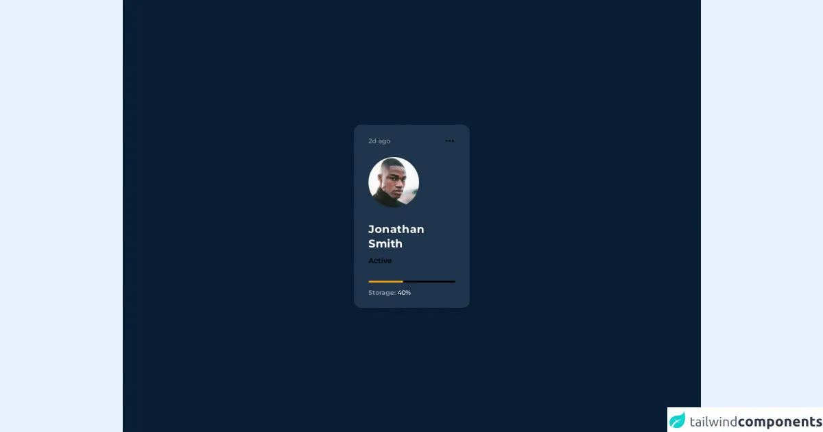
- The preview of User Profile Card ui component.
- The source code of User Profile Card ui component.
- How to create a User Profile Card with Tailwind CSS?
- Conclusion
In the world of web development, CSS frameworks have become an essential tool for front-end developers. Tailwind CSS is one of the popular CSS frameworks that is gaining popularity among developers. In this article, we will guide you on how to build a User Profile Card with Tailwind CSS.
What is Tailwind CSS?
Tailwind CSS is a utility-first CSS framework that allows you to create custom designs without writing any CSS code. It provides a set of pre-defined classes that you can use to style your HTML elements. Tailwind CSS is designed to be highly customizable and easy to use.
The description of User Profile Card ui component
A User Profile Card is a UI component that displays the user's information, such as their name, profile picture, and social media links. It is a common component used in many web applications, especially social media platforms.
Why use Tailwind CSS to create a User Profile Card ui component?
Tailwind CSS provides a set of pre-defined classes that you can use to style your HTML elements. This makes it easy to create a User Profile Card without writing any CSS code. Additionally, Tailwind CSS is highly customizable, which means you can easily modify the styles to match your design requirements.
The preview of User Profile Card ui component.
To create a User Profile Card with Tailwind CSS, we will use the following HTML structure:
<div class="max-w-sm mx-auto bg-white shadow-lg rounded-lg overflow-hidden">
  <div class="sm:flex sm:items-center px-6 py-4">
    <img class="block mx-auto sm:mx-0 sm:flex-shrink-0 h-16 sm:h-24 rounded-full" src="https://via.placeholder.com/150" alt="Profile image">
    <div class="mt-4 sm:mt-0 sm:ml-4 text-center sm:text-left">
      <p class="text-xl leading-tight">John Doe</p>
      <p class="text-sm leading-tight text-gray-600">Web Developer</p>
      <div class="mt-4">
        <a href="#" class="text-blue-500 hover:text-blue-700">
          <svg class="h-6 w-6 fill-current" viewBox="0 0 512 512">
            <path d="M437.019,74.981C388.899,26.861,324.139,0,256,0S123.101,26.861,74.981,74.981C26.861,123.101,0,187.861,0,256
            s26.861,132.899,74.981,181.019C123.101,485.139,187.861,512,256,512s132.899-26.861,181.019-74.981
            C485.139,388.899,512,324.139,512,256S485.139,123.101,437.019,74.981z M256,482c-119.103,0-216-96.897-216-216
            S136.897,50,256,50s216,96.897,216,216S375.103,482,256,482z"/>
            <path d="M256,155c-49.626,0-90,40.374-90,90s40.374,90,90,90s90-40.374,90-90S305.626,155,256,155z M256,305
            c-33.084,0-60-26.916-60-60s26.916-60,60-60s60,26.916,60,60S289.084,305,256,305z"/>
          </svg>
        </a>
        <a href="#" class="ml-4 text-blue-500 hover:text-blue-700">
          <svg class="h-6 w-6 fill-current" viewBox="0 0 512 512">
            <path d="M437.019,74.981C388.899,26.861,324.139,0,256,0S123.101,26.861,74.981,74.981C26.861,123.101,0,187.861,0,256
            s26.861,132.899,74.981,181.019C123.101,485.139,187.861,512,256,512s132.899-26.861,181.019-74.981
            C485.139,388.899,512,324.139,512,256S485.139,123.101,437.019,74.981z M256,482c-119.103,0-216-96.897-216-216
            S136.897,50,256,50s216,96.897,216,216S375.103,482,256,482z"/>
            <path d="M256,155c-49.626,0-90,40.374-90,90s40.374,90,90,90s90-40.374,90-90S305.626,155,256,155z M256,305
            c-33.084,0-60-26.916-60-60s26.916-60,60-60s60,26.916,60,60S289.084,305,256,305z"/>
          </svg>
        </a>
      </div>
    </div>
  </div>
</div>
Free download of the User Profile Card's source code
The source code of User Profile Card ui component.
To create the User Profile Card with Tailwind CSS, we will use the following classes:
max-w-sm mx-auto bg-white shadow-lg rounded-lg overflow-hidden
sm:flex sm:items-center px-6 py-4
block mx-auto sm:mx-0 sm:flex-shrink-0 h-16 sm:h-24 rounded-full
text-xl leading-tight
text-sm leading-tight text-gray-600
mt-4
ml-4 text-blue-500 hover:text-blue-700
<link rel="preconnect" href="https://fonts.googleapis.com">
<link rel="preconnect" href="https://fonts.gstatic.com" crossorigin>
<link href="https://fonts.googleapis.com/css2?family=Montserrat:wght@400;500;600;700&display=swap" rel="stylesheet">

<section style="font-family: Montserrat" class=" bg-[#071e34] flex font-medium items-center justify-center h-screen">

    <section class="w-64 mx-auto bg-[#20354b] rounded-2xl px-8 py-6 shadow-lg">
        <div class="flex items-center justify-between">
            <span class="text-gray-400 text-sm">2d ago</span>
            <span class="text-emerald-400">
                <svg xmlns="http://www.w3.org/2000/svg" class="h-6 w-6" fill="none" viewBox="0 0 24 24" stroke="currentColor">
                <path stroke-linecap="round" stroke-linejoin="round" stroke-width="2" d="M5 12h.01M12 12h.01M19 12h.01M6 12a1 1 0 11-2 0 1 1 0 012 0zm7 0a1 1 0 11-2 0 1 1 0 012 0zm7 0a1 1 0 11-2 0 1 1 0 012 0z" />
              </svg>
            </span>
        </div>
        <div class="mt-6 w-fit mx-auto">
            <img src="https://api.lorem.space/image/face?w=120&h=120&hash=bart89fe" class="rounded-full w-28 " alt="profile picture" srcset="">
        </div>

        <div class="mt-8 ">
            <h2 class="text-white font-bold text-2xl tracking-wide">Jonathan <br/> Smith</h2>
        </div>
        <p class="text-emerald-400 font-semibold mt-2.5" >
            Active
        </p>

        <div class="h-1 w-full bg-black mt-8 rounded-full">
            <div class="h-1 rounded-full w-2/5 bg-yellow-500 "></div>
        </div>
        <div class="mt-3 text-white text-sm">
            <span class="text-gray-400 font-semibold">Storage:</span>
            <span>40%</span>
        </div>

    </section>


</section>
How to create a User Profile Card with Tailwind CSS?
- First, create a new HTML file and add the above HTML structure to it.
- Next, add the Tailwind CSS CDN to your HTML file.
<link href="https://cdn.jsdelivr.net/npm/[email protected]/dist/tailwind.min.css" rel="stylesheet">
- Save the HTML file and open it in your browser. You should see the User Profile Card displayed on the page.
Conclusion
In this article, we have shown you how to create a User Profile Card with Tailwind CSS. Tailwind CSS is a powerful CSS framework that allows you to create custom designs without writing any CSS code. With Tailwind CSS, you can easily create responsive and customizable UI components for your web applications. We hope this article has been helpful in getting you started with Tailwind CSS.