- Published on
How to Make A User dropdown menu With Tailwind CSS?
- What is Tailwind CSS?
- The Description of User Dropdown Menu UI Component
- Why Use Tailwind CSS to Create a User Dropdown Menu UI Component?
- The Preview of User Dropdown Menu UI Component
- The Source Code of User Dropdown Menu UI Component
- How to Create a User Dropdown Menu with Tailwind CSS?
- Conclusion
What is Tailwind CSS?
Tailwind CSS is a utility-first CSS framework that provides a set of pre-defined classes to help you quickly build custom user interfaces. With Tailwind CSS, you can easily create complex layouts and UI components without writing any custom CSS.
The Description of User Dropdown Menu UI Component
A user dropdown menu is a common UI component that allows users to access their account settings, notifications, and other user-related features. This component usually appears as a button with a user's avatar or name, and when clicked, a dropdown menu appears with various options.
Why Use Tailwind CSS to Create a User Dropdown Menu UI Component?
Tailwind CSS provides a set of pre-defined classes that make it easy to create complex UI components like a user dropdown menu. By using Tailwind CSS, you can save time and effort by not having to write custom CSS for every UI component.
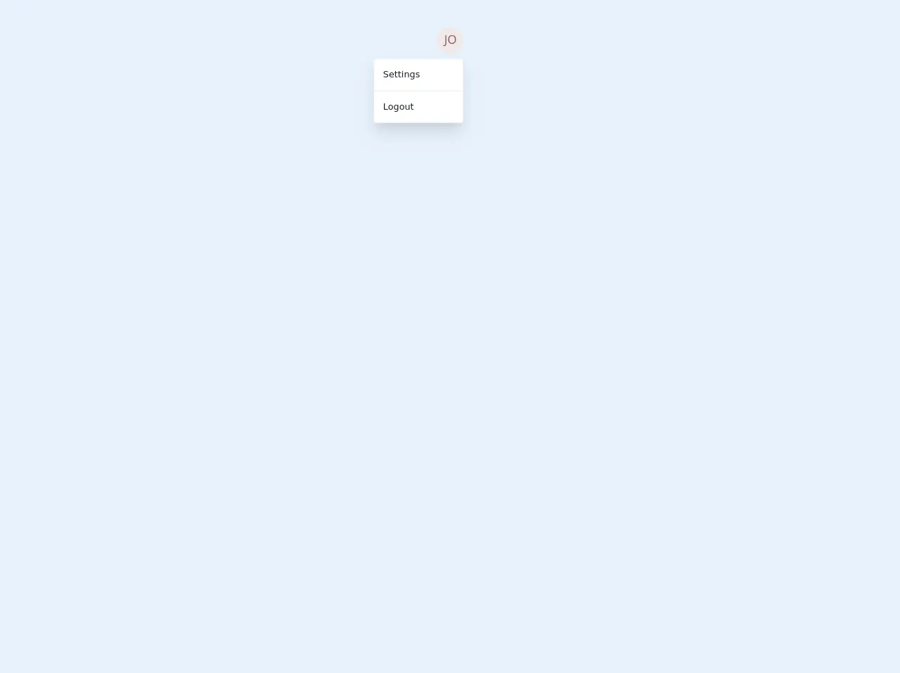
The Preview of User Dropdown Menu UI Component
To create a user dropdown menu with Tailwind CSS, we will use the following classes:
flex: to create a flex container for the menu button and dropdown menuitems-center: to center the items vertically within the flex containerrelative: to create a relative positioning context for the dropdown menuz-10: to set the z-index of the dropdown menu to be above other elements on the pagedropdown: a custom class to style the dropdown menuhidden: to initially hide the dropdown menublock: to show the dropdown menu when the menu button is clicked
Free download of the User dropdown menu's source code
The Source Code of User Dropdown Menu UI Component
To create a user dropdown menu with Tailwind CSS, we can use the following HTML and CSS:
<div class="flex items-center">
  <button class="bg-gray-300 rounded-full w-8 h-8 flex items-center justify-center">
    <img src="avatar.png" alt="User Avatar" class="rounded-full w-6 h-6">
  </button>
  <div class="relative ml-2">
    <button class="bg-gray-300 rounded-md py-2 px-4 text-sm font-medium text-gray-700 hover:text-gray-900 focus:outline-none focus:ring-2 focus:ring-offset-2 focus:ring-offset-gray-100 focus:ring-gray-700" aria-expanded="false" aria-haspopup="true">
      John Doe
      <svg class="ml-2 -mr-0.5 h-4 w-4" xmlns="http://www.w3.org/2000/svg" viewBox="0 0 20 20" fill="currentColor" aria-hidden="true">
        <path fill-rule="evenodd" d="M10 12a2 2 0 100-4 2 2 0 000 4z" clip-rule="evenodd" />
      </svg>
    </button>
    <div class="dropdown hidden bg-white rounded-md shadow-lg py-1 w-48" role="menu" aria-orientation="vertical" aria-labelledby="user-menu">
      <a href="#" class="block px-4 py-2 text-sm text-gray-700 hover:bg-gray-100" role="menuitem">Your Profile</a>
      <a href="#" class="block px-4 py-2 text-sm text-gray-700 hover:bg-gray-100" role="menuitem">Settings</a>
      <a href="#" class="block px-4 py-2 text-sm text-gray-700 hover:bg-gray-100" role="menuitem">Sign out</a>
    </div>
  </div>
</div>
.dropdown:before {
  content: "";
  display: block;
  position: absolute;
  top: -6px;
  right: 16px;
  width: 12px;
  height: 12px;
  transform: rotate(45deg);
  background-color: white;
  border-top: 1px solid #e2e8f0;
  border-left: 1px solid #e2e8f0;
}
<div class="flex justify-center p-12">
  <!-- Dropdown -->
  <div class="relative">
    <button class="block h-12 w-12 rounded-full overflow-hidden focus:outline-none">
      <img class="h-full w-full object-cover" src="https://eu.ui-avatars.com/api/?name=John&size=1000" alt="avatar">
    </button>
    <!-- Dropdown Body -->
    <div class="absolute right-0 w-40 mt-2 py-2 bg-white border rounded shadow-xl">
      <a href="#" class="transition-colors duration-200 block px-4 py-2 text-normal text-gray-900 rounded hover:bg-purple-500 hover:text-white">Settings</a>
      <div class="py-2">
        <hr></hr>
    </div>
    <a href="#" class="transition-colors duration-200 block px-4 py-2 text-normal text-gray-900 rounded hover:bg-purple-500 hover:text-white">
      Logout
    </a>
  </div>
  <!-- // Dropdown Body -->
  </div>
  <!-- // Dropdown -->
</div>
How to Create a User Dropdown Menu with Tailwind CSS?
To create a user dropdown menu with Tailwind CSS, follow these steps:
- Create a flex container for the menu button and dropdown menu:
<div class="flex items-center">
  <!-- Menu button goes here -->
  <!-- Dropdown menu goes here -->
</div>
- Add a button for the menu with an avatar or name:
<button class="bg-gray-300 rounded-full w-8 h-8 flex items-center justify-center">
  <img src="avatar.png" alt="User Avatar" class="rounded-full w-6 h-6">
</button>
- Add a dropdown menu button with the user's name and an arrow icon:
<button class="bg-gray-300 rounded-md py-2 px-4 text-sm font-medium text-gray-700 hover:text-gray-900 focus:outline-none focus:ring-2 focus:ring-offset-2 focus:ring-offset-gray-100 focus:ring-gray-700" aria-expanded="false" aria-haspopup="true">
  John Doe
  <svg class="ml-2 -mr-0.5 h-4 w-4" xmlns="http://www.w3.org/2000/svg" viewBox="0 0 20 20" fill="currentColor" aria-hidden="true">
    <path fill-rule="evenodd" d="M10 12a2 2 0 100-4 2 2 0 000 4z" clip-rule="evenodd" />
  </svg>
</button>
- Add a dropdown menu with various options:
<div class="dropdown hidden bg-white rounded-md shadow-lg py-1 w-48" role="menu" aria-orientation="vertical" aria-labelledby="user-menu">
  <a href="#" class="block px-4 py-2 text-sm text-gray-700 hover:bg-gray-100" role="menuitem">Your Profile</a>
  <a href="#" class="block px-4 py-2 text-sm text-gray-700 hover:bg-gray-100" role="menuitem">Settings</a>
  <a href="#" class="block px-4 py-2 text-sm text-gray-700 hover:bg-gray-100" role="menuitem">Sign out</a>
</div>
- Add the necessary Tailwind CSS classes to style the menu and dropdown:
<div class="flex items-center">
  <button class="bg-gray-300 rounded-full w-8 h-8 flex items-center justify-center">
    <img src="avatar.png" alt="User Avatar" class="rounded-full w-6 h-6">
  </button>
  <div class="relative ml-2">
    <button class="bg-gray-300 rounded-md py-2 px-4 text-sm font-medium text-gray-700 hover:text-gray-900 focus:outline-none focus:ring-2 focus:ring-offset-2 focus:ring-offset-gray-100 focus:ring-gray-700" aria-expanded="false" aria-haspopup="true">
      John Doe
      <svg class="ml-2 -mr-0.5 h-4 w-4" xmlns="http://www.w3.org/2000/svg" viewBox="0 0 20 20" fill="currentColor" aria-hidden="true">
        <path fill-rule="evenodd" d="M10 12a2 2 0 100-4 2 2 0 000 4z" clip-rule="evenodd" />
      </svg>
    </button>
    <div class="dropdown hidden bg-white rounded-md shadow-lg py-1 w-48" role="menu" aria-orientation="vertical" aria-labelledby="user-menu">
      <a href="#" class="block px-4 py-2 text-sm text-gray-700 hover:bg-gray-100" role="menuitem">Your Profile</a>
      <a href="#" class="block px-4 py-2 text-sm text-gray-700 hover:bg-gray-100" role="menuitem">Settings</a>
      <a href="#" class="block px-4 py-2 text-sm text-gray-700 hover:bg-gray-100" role="menuitem">Sign out</a>
    </div>
  </div>
</div>
Conclusion
In this article, we learned how to create a user dropdown menu with Tailwind CSS. By using Tailwind CSS, we can easily create complex UI components without writing any custom CSS. With the pre-defined classes provided by Tailwind CSS, we can save time and effort in creating UI components and focus on building great user experiences.