- Published on
3 Things You Must Know To Build A User Card With Tailwind CSS
- What is Tailwind CSS?
- The description of User Card ui component
- Why use Tailwind CSS to create a User Card ui component?
- The preview of User Card ui component
- The source code of User Card ui component
- How to create a User Card with Tailwind CSS?
- Conclusion
What is Tailwind CSS?
Tailwind CSS is a utility-first CSS framework that provides a set of pre-defined CSS classes that you can use to style your HTML elements. It allows you to create complex UI components with ease and speed up your development process. With Tailwind CSS, you don't have to write custom CSS code from scratch, which can save you a lot of time and effort.
The description of User Card ui component
A User Card is a UI component that displays information about a user, such as their name, profile picture, and bio. It is commonly used in social media platforms, online communities, and e-commerce websites. A well-designed User Card can make a big difference in the user experience and engagement of your website or application.
Why use Tailwind CSS to create a User Card ui component?
Tailwind CSS provides a comprehensive set of CSS classes that can help you create a User Card with ease. You don't have to write custom CSS code from scratch, which can save you a lot of time and effort. Moreover, Tailwind CSS follows a consistent naming convention, which makes it easy to remember and use the classes.
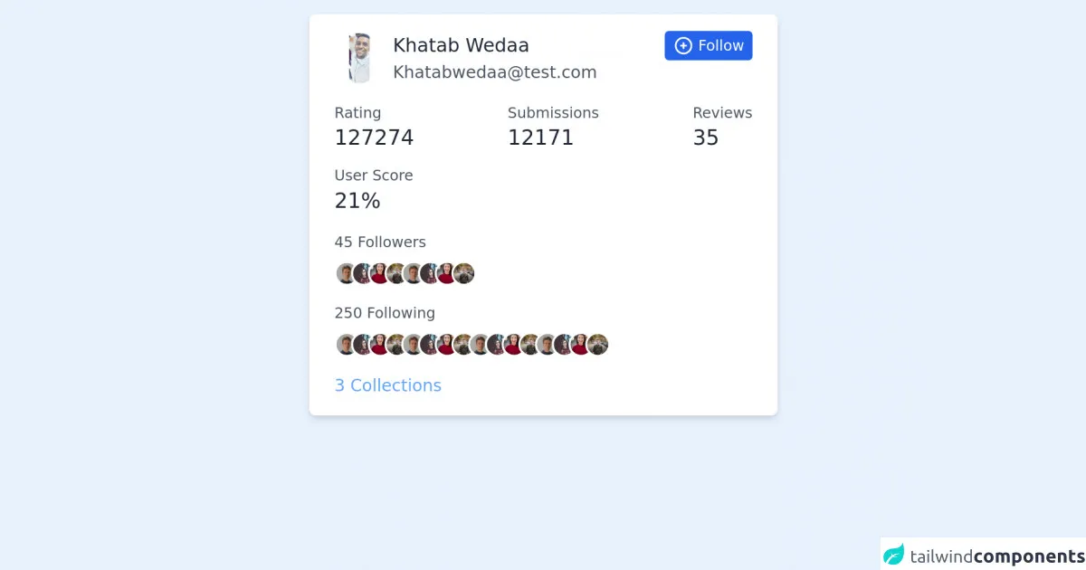
The preview of User Card ui component
To create a User Card with Tailwind CSS, you can use the following classes:
bg-white: sets the background color of the card to white.rounded-lg: rounds the corners of the card.shadow-md: adds a shadow effect to the card.p-4: adds padding to the card.flex: sets the display property of the card to flex.items-center: centers the content of the card vertically.space-x-4: adds horizontal space between the elements inside the card.
Free download of the User Card's source code
The source code of User Card ui component
To create a User Card with Tailwind CSS, you can use the following HTML code:
<div class="bg-white rounded-lg shadow-md p-4 flex items-center space-x-4">
  <img class="h-10 w-10 rounded-full" src="https://via.placeholder.com/150" alt="Profile Picture">
  <div class="text-lg font-medium text-gray-900">John Doe</div>
  <div class="text-gray-500">Software Engineer</div>
</div>
<div class="w-full max-w-md w-full mx-auto bg-white shadow-md rounded-md px-6 py-4 my-6">
        <div class="sm:flex sm:justify-between">
            <div class="flex items-center">
                <img class="h-12 w-12 rounded-full" src="https://lh3.googleusercontent.com/a-/AOh14Gi0DgItGDTATTFV6lPiVrqtja6RZ_qrY91zg42o-g" alt="">
                <div class="ml-2">
                    <h3 class="text-lg text-gray-800 font-medium">Khatab Wedaa</h3>
                    <span class="text-gray-600">[email protected]</span>
                </div>
            </div>
            <div class="mt-2 sm:mt-0">
                <button class="flex items-center text-white bg-blue-600 rounded px-2 py-1 hover:bg-blue-500 focus:outline-none focus:shadow-outline">
                    <svg class="h-5 w-5" fill="none" stroke-linecap="round" stroke-linejoin="round" stroke-width="2" viewBox="0 0 24 24" stroke="currentColor"><path d="M12 9v3m0 0v3m0-3h3m-3 0H9m12 0a9 9 0 11-18 0 9 9 0 0118 0z"></path></svg>
                    <span class="ml-1 text-sm">Follow</span>
                </button>
            </div>
        </div>
        <div class="flex justify-between items-center mt-4">
            <div>
                <h4 class="text-gray-600 text-sm">Rating</h4>
                <span class="mt-2 text-xl font-medium text-gray-800">127274</span>
            </div>
            <div>
                <h4 class="text-gray-600 text-sm">Submissions</h4>
                <span class="mt-2 text-xl font-medium text-gray-800">12171</span>
            </div>
            <div>
                <h4 class="text-gray-600 text-sm">Reviews</h4>
                <span class="mt-2 text-xl font-medium text-gray-800">35</span>
            </div>
        </div>
        <div class="mt-3">
            <h4 class="text-gray-600 text-sm">User Score</h4>
            <span class="mt-2 text-xl font-medium text-gray-800">21%</span>
        </div>
        <div class="mt-4">
            <h4 class="text-sm text-gray-600">45 Followers</h4>
            <div class="flex items-center overflow-hidden mt-2">
                <img class="inline-block h-6 w-6 rounded-full text-white border-2 border-white object-cover object-center" src="https://images.unsplash.com/photo-1570295999919-56ceb5ecca61?ixlib=rb-1.2.1&ixid=eyJhcHBfaWQiOjEyMDd9&auto=format&fit=crop&w=800&q=80" alt="">
                <img class="-ml-2 inline-block h-6 w-6 rounded-full text-white border-2 border-white object-cover object-center" src="https://images.unsplash.com/photo-1510520434124-5bc7e642b61d?ixlib=rb-1.2.1&ixid=eyJhcHBfaWQiOjEyMDd9&auto=format&fit=crop&w=500&q=60" alt="">
                <img class="-ml-2 inline-block h-6 w-6 rounded-full text-white border-2 border-white object-cover object-center" src="https://images.unsplash.com/photo-1494790108377-be9c29b29330?ixlib=rb-1.2.1&ixid=eyJhcHBfaWQiOjEyMDd9&auto=format&fit=crop&w=634&q=80" alt="">
                <img class="-ml-2 inline-block h-6 w-6 rounded-full text-white border-2 border-white object-cover object-center" src="https://images.unsplash.com/photo-1542156822-6924d1a71ace?ixlib=rb-1.2.1&ixid=eyJhcHBfaWQiOjEyMDd9&auto=format&fit=crop&w=750&q=80" alt="">
                <img class="-ml-2 inline-block h-6 w-6 rounded-full text-white border-2 border-white object-cover object-center" src="https://images.unsplash.com/photo-1570295999919-56ceb5ecca61?ixlib=rb-1.2.1&ixid=eyJhcHBfaWQiOjEyMDd9&auto=format&fit=crop&w=800&q=80" alt="">
                <img class="-ml-2 inline-block h-6 w-6 rounded-full text-white border-2 border-white object-cover object-center" src="https://images.unsplash.com/photo-1510520434124-5bc7e642b61d?ixlib=rb-1.2.1&ixid=eyJhcHBfaWQiOjEyMDd9&auto=format&fit=crop&w=500&q=60" alt="">
                <img class="-ml-2 inline-block h-6 w-6 rounded-full text-white border-2 border-white object-cover object-center" src="https://images.unsplash.com/photo-1494790108377-be9c29b29330?ixlib=rb-1.2.1&ixid=eyJhcHBfaWQiOjEyMDd9&auto=format&fit=crop&w=634&q=80" alt="">
                <img class="-ml-2 inline-block h-6 w-6 rounded-full text-white border-2 border-white object-cover object-center" src="https://images.unsplash.com/photo-1542156822-6924d1a71ace?ixlib=rb-1.2.1&ixid=eyJhcHBfaWQiOjEyMDd9&auto=format&fit=crop&w=750&q=80" alt="">
            </div>
        </div>
        <div class="mt-4">
            <h4 class="text-sm text-gray-600">250 Following</h4>
            <div class="flex items-center overflow-hidden mt-2">
                <img class="inline-block h-6 w-6 rounded-full text-white border-2 border-white object-cover object-center" src="https://images.unsplash.com/photo-1570295999919-56ceb5ecca61?ixlib=rb-1.2.1&ixid=eyJhcHBfaWQiOjEyMDd9&auto=format&fit=crop&w=800&q=80" alt="">
                <img class="-ml-2 inline-block h-6 w-6 rounded-full text-white border-2 border-white object-cover object-center" src="https://images.unsplash.com/photo-1510520434124-5bc7e642b61d?ixlib=rb-1.2.1&ixid=eyJhcHBfaWQiOjEyMDd9&auto=format&fit=crop&w=500&q=60" alt="">
                <img class="-ml-2 inline-block h-6 w-6 rounded-full text-white border-2 border-white object-cover object-center" src="https://images.unsplash.com/photo-1494790108377-be9c29b29330?ixlib=rb-1.2.1&ixid=eyJhcHBfaWQiOjEyMDd9&auto=format&fit=crop&w=634&q=80" alt="">
                <img class="-ml-2 inline-block h-6 w-6 rounded-full text-white border-2 border-white object-cover object-center" src="https://images.unsplash.com/photo-1542156822-6924d1a71ace?ixlib=rb-1.2.1&ixid=eyJhcHBfaWQiOjEyMDd9&auto=format&fit=crop&w=750&q=80" alt="">
                <img class="-ml-2 inline-block h-6 w-6 rounded-full text-white border-2 border-white object-cover object-center" src="https://images.unsplash.com/photo-1570295999919-56ceb5ecca61?ixlib=rb-1.2.1&ixid=eyJhcHBfaWQiOjEyMDd9&auto=format&fit=crop&w=800&q=80" alt="">
                <img class="-ml-2 inline-block h-6 w-6 rounded-full text-white border-2 border-white object-cover object-center" src="https://images.unsplash.com/photo-1510520434124-5bc7e642b61d?ixlib=rb-1.2.1&ixid=eyJhcHBfaWQiOjEyMDd9&auto=format&fit=crop&w=500&q=60" alt="">
                <img class="-ml-2 inline-block h-6 w-6 rounded-full text-white border-2 border-white object-cover object-center" src="https://images.unsplash.com/photo-1494790108377-be9c29b29330?ixlib=rb-1.2.1&ixid=eyJhcHBfaWQiOjEyMDd9&auto=format&fit=crop&w=634&q=80" alt="">
                <img class="-ml-2 inline-block h-6 w-6 rounded-full text-white border-2 border-white object-cover object-center" src="https://images.unsplash.com/photo-1542156822-6924d1a71ace?ixlib=rb-1.2.1&ixid=eyJhcHBfaWQiOjEyMDd9&auto=format&fit=crop&w=750&q=80" alt="">
            </div>
        </div>
        <a class="block mt-4 text-blue-400 hover:underline" href="#">3 Collections</a>
    </div>
How to create a User Card with Tailwind CSS?
To create a User Card with Tailwind CSS, you can follow these steps:
- Create a new HTML file and add the following code:
<!DOCTYPE html>
<html>
<head>
  <title>User Card with Tailwind CSS</title>
  <link rel="stylesheet" href="https://cdn.jsdelivr.net/npm/[email protected]/dist/tailwind.min.css">
</head>
<body>
  <div class="bg-gray-100 min-h-screen py-6 flex flex-col justify-center sm:py-12">
    <div class="relative py-3 sm:max-w-xl sm:mx-auto">
      <div class="absolute inset-0 bg-gradient-to-r from-cyan-400 to-light-blue-500 shadow-lg transform -skew-y-6 sm:skew-y-0 sm:-rotate-6 sm:rounded-3xl"></div>
      <div class="relative px-4 py-10 bg-white shadow-lg sm:rounded-3xl sm:p-20">
        <div class="max-w-md mx-auto">
          <div class="flex items-center space-x-4">
            <img class="h-10 w-10 rounded-full" src="https://via.placeholder.com/150" alt="Profile Picture">
            <div class="text-lg font-medium text-gray-900">John Doe</div>
            <div class="text-gray-500">Software Engineer</div>
          </div>
          <div class="text-gray-500 mt-4">
            Lorem ipsum dolor sit amet, consectetur adipiscing elit. Sed vel dolor vel eros eleifend bibendum. Vestibulum ante ipsum primis in faucibus orci luctus et ultrices posuere cubilia curae; Mauris vel interdum urna.
          </div>
        </div>
      </div>
    </div>
  </div>
</body>
</html>
- Save the file as
index.htmland open it in your web browser. You should see a User Card with a profile picture, name, and bio.
Conclusion
Creating a User Card with Tailwind CSS is easy and straightforward. With the pre-defined CSS classes provided by Tailwind CSS, you can style your UI components with ease and save a lot of time and effort. By following the steps outlined in this article, you can create a beautiful and functional User Card for your website or application.