- Published on
Ultimate Guide: Make A user card With Tailwind CSS
- What is Tailwind CSS?
- The Description of User Card UI Component
- Why Use Tailwind CSS to Create a User Card UI Component?
- The Preview of User Card UI Component
- The Source Code of User Card UI Component
- How to Create a User Card with Tailwind CSS?
- Step 1: Create the HTML Markup
- Step 2: Add Tailwind CSS Classes
- Step 3: Customize the User Card
- Conclusion
In today's digital age, user interface design has become an essential aspect of web development. A well-designed user interface can make a website or application more user-friendly and visually appealing. One of the most commonly used UI components is the user card. In this article, we will explore how to create a user card using Tailwind CSS.
What is Tailwind CSS?
Tailwind CSS is a utility-first CSS framework that allows developers to quickly create custom designs without writing any CSS. It provides a set of pre-defined classes that can be used to style HTML elements. Tailwind CSS is gaining popularity among developers due to its flexibility and ease of use.
The Description of User Card UI Component
A user card is a UI component that displays information about a user. It typically includes a profile picture, name, and a brief description of the user. User cards are commonly used in social media platforms, e-commerce websites, and online communities.
Why Use Tailwind CSS to Create a User Card UI Component?
Tailwind CSS provides a set of pre-defined classes that can be used to style HTML elements. This makes it easy to create a user card without writing any custom CSS. Additionally, Tailwind CSS is highly customizable, allowing developers to create unique designs that match their brand or website.
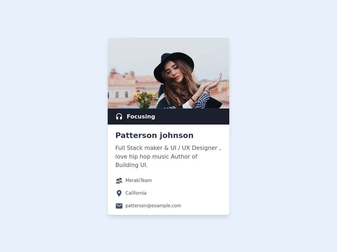
The Preview of User Card UI Component
Creating a user card with Tailwind CSS is easy and straightforward. Here is a preview of what the user card will look like:
Free download of the user card's source code
The Source Code of User Card UI Component
To create a user card with Tailwind CSS, we will use HTML and Tailwind CSS classes. Here is the source code:
<div class="max-w-sm bg-white shadow-lg rounded-lg overflow-hidden my-4">
        <img class="w-full h-56 object-cover object-center" src="https://images.unsplash.com/photo-1517841905240-472988babdf9?ixlib=rb-1.2.1&ixid=eyJhcHBfaWQiOjEyMDd9&auto=format&fit=crop&w=334&q=80" alt="avatar">
        <div class="flex items-center px-6 py-3 bg-gray-900">
            <svg class="h-6 w-6 text-white fill-current" viewBox="0 0 512 512">
                <path d="M256 48C150 48 64 136.2 64 245.1v153.3c0 36.3 28.6 65.7 64 65.7h64V288h-85.3v-42.9c0-84.7 66.8-153.3 149.3-153.3s149.3 68.5 149.3 153.3V288H320v176h64c35.4 0 64-29.3 64-65.7V245.1C448 136.2 362 48 256 48z"/>
            </svg>
            <h1 class="mx-3 text-white font-semibold text-lg">Focusing</h1>
        </div>
        <div class="py-4 px-6">
            <h1 class="text-2xl font-semibold text-gray-800">Patterson johnson</h1>
            <p class="py-2 text-lg text-gray-700">Full Stack maker & UI / UX Designer , love hip hop music Author of Building UI.</p>
            <div class="flex items-center mt-4 text-gray-700">
                <svg class="h-6 w-6 fill-current" viewBox="0 0 512 512">
                    <path d="M239.208 343.937c-17.78 10.103-38.342 15.876-60.255 15.876-21.909 0-42.467-5.771-60.246-15.87C71.544 358.331 42.643 406 32 448h293.912c-10.639-42-39.537-89.683-86.704-104.063zM178.953 120.035c-58.479 0-105.886 47.394-105.886 105.858 0 58.464 47.407 105.857 105.886 105.857s105.886-47.394 105.886-105.857c0-58.464-47.408-105.858-105.886-105.858zm0 186.488c-33.671 0-62.445-22.513-73.997-50.523H252.95c-11.554 28.011-40.326 50.523-73.997 50.523z"/><g><path d="M322.602 384H480c-10.638-42-39.537-81.691-86.703-96.072-17.781 10.104-38.343 15.873-60.256 15.873-14.823 0-29.024-2.654-42.168-7.49-7.445 12.47-16.927 25.592-27.974 34.906C289.245 341.354 309.146 364 322.602 384zM306.545 200h100.493c-11.554 28-40.327 50.293-73.997 50.293-8.875 0-17.404-1.692-25.375-4.51a128.411 128.411 0 0 1-6.52 25.118c10.066 3.174 20.779 4.862 31.895 4.862 58.479 0 105.886-47.41 105.886-105.872 0-58.465-47.407-105.866-105.886-105.866-37.49 0-70.427 19.703-89.243 49.09C275.607 131.383 298.961 163 306.545 200z"/></g>
                </svg>
                <h1 class="px-2 text-sm">MerakiTeam</h1>
            </div>
            <div class="flex items-center mt-4 text-gray-700">
                <svg class="h-6 w-6 fill-current" viewBox="0 0 512 512">
                    <path d="M256 32c-88.004 0-160 70.557-160 156.801C96 306.4 256 480 256 480s160-173.6 160-291.199C416 102.557 344.004 32 256 32zm0 212.801c-31.996 0-57.144-24.645-57.144-56 0-31.357 25.147-56 57.144-56s57.144 24.643 57.144 56c0 31.355-25.148 56-57.144 56z"/>
                </svg>
                <h1 class="px-2 text-sm">California</h1>
            </div>
            <div class="flex items-center mt-4 text-gray-700">
                <svg class="h-6 w-6 fill-current" viewBox="0 0 512 512">
                    <path d="M437.332 80H74.668C51.199 80 32 99.198 32 122.667v266.666C32 412.802 51.199 432 74.668 432h362.664C460.801 432 480 412.802 480 389.333V122.667C480 99.198 460.801 80 437.332 80zM432 170.667L256 288 80 170.667V128l176 117.333L432 128v42.667z"/>
                </svg>
                <h1 class="px-2 text-sm">[email protected]</h1>
            </div>
        </div>
    </div>
How to Create a User Card with Tailwind CSS?
To create a user card with Tailwind CSS, follow these steps:
Step 1: Create the HTML Markup
The first step is to create the HTML markup for the user card. Here is an example of the HTML markup:
<div class="bg-white rounded-lg shadow-lg overflow-hidden">
    <div class="px-6 py-4">
        <div class="flex items-center">
            <img class="h-16 w-16 rounded-full object-cover" src="https://via.placeholder.com/150" alt="User Profile Picture">
            <div class="ml-4">
                <h3 class="text-lg font-semibold text-gray-900">John Doe</h3>
                <p class="text-gray-600">Web Developer</p>
            </div>
        </div>
    </div>
</div>
In the above code, we have used the div element to create the user card. We have also used Tailwind CSS classes to style the user card.
Step 2: Add Tailwind CSS Classes
Next, we need to add Tailwind CSS classes to style the user card. Here is an example of the Tailwind CSS classes:
<div class="bg-white rounded-lg shadow-lg overflow-hidden">
    <div class="px-6 py-4">
        <div class="flex items-center">
            <img class="h-16 w-16 rounded-full object-cover" src="https://via.placeholder.com/150" alt="User Profile Picture">
            <div class="ml-4">
                <h3 class="text-lg font-semibold text-gray-900">John Doe</h3>
                <p class="text-gray-600">Web Developer</p>
            </div>
        </div>
    </div>
</div>
In the above code, we have used Tailwind CSS classes such as bg-white, rounded-lg, shadow-lg, px-6, py-4, flex, items-center, h-16, w-16, rounded-full, object-cover, ml-4, text-lg, font-semibold, text-gray-900, and text-gray-600 to style the user card.
Step 3: Customize the User Card
Finally, we can customize the user card by modifying the HTML markup and Tailwind CSS classes. For example, we can change the background color, font size, and border radius of the user card.
Conclusion
In this article, we explored how to create a user card using Tailwind CSS. Tailwind CSS provides a set of pre-defined classes that can be used to style HTML elements, making it easy to create a user card without writing any custom CSS. Additionally, Tailwind CSS is highly customizable, allowing developers to create unique designs that match their brand or website. With the knowledge gained from this article, you can create stunning user cards for your website or application.