- Published on
6 Incredibly Easy Ways To Build A Updated Date Range Picker with Tailwind and Alpine JS With Tailwind CSS Better While Spending Less
- What is Tailwind CSS?
- The description of Updated Date Range Picker with Tailwind and Alpine JS ui component
- Why use Tailwind CSS to create a Updated Date Range Picker with Tailwind and Alpine JS ui component?
- The preview of Updated Date Range Picker with Tailwind and Alpine JS ui component.
- The source code of Updated Date Range Picker with Tailwind and Alpine JS ui component.
- How to create a Updated Date Range Picker with Tailwind and Alpine JS with Tailwind CSS?
- Step 1: Create a new HTML file and add the necessary HTML markup.
- Step 2: Add the Tailwind CSS CDN to your HTML file.
- Step 3: Add the Alpine JS CDN to your HTML file.
- Step 4: Add the JavaScript code to initialize the Updated Date Range Picker with Tailwind and Alpine JS.
- Step 5: Customize the component to match your website's design.
- Step 6: Test the component to make sure it works as expected.
- Conclusion
As a FrontEnd technology blogger, I am always looking for ways to make UI components more efficient and user-friendly. In this article, I will introduce you to the Updated Date Range Picker with Tailwind and Alpine JS, a UI component that is easy to build and customize. I will also explain why using Tailwind CSS can make this process even easier.
What is Tailwind CSS?
Tailwind CSS is a utility-first CSS framework that makes it easy to create custom designs without writing any CSS. It provides a set of pre-defined classes that can be combined to create any design you want. Tailwind CSS is easy to learn and use, which makes it an ideal choice for developers who want to create beautiful designs quickly.
The description of Updated Date Range Picker with Tailwind and Alpine JS ui component
The Updated Date Range Picker with Tailwind and Alpine JS is a UI component that allows users to select a date range. It is built using Tailwind CSS and Alpine JS, which makes it easy to customize and use. The component includes a calendar view, which allows users to select a start and end date. It also includes a text input field, which displays the selected date range.
Why use Tailwind CSS to create a Updated Date Range Picker with Tailwind and Alpine JS ui component?
Tailwind CSS makes it easy to create custom designs without writing any CSS. It provides a set of pre-defined classes that can be combined to create any design you want. This makes it easy to customize the Updated Date Range Picker with Tailwind and Alpine JS to match your website's design. Additionally, Tailwind CSS is lightweight, which means that it won't slow down your website's performance.
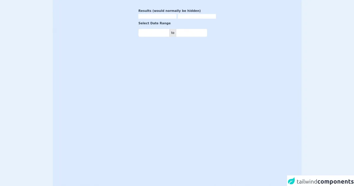
The preview of Updated Date Range Picker with Tailwind and Alpine JS ui component.
To give you an idea of what the Updated Date Range Picker with Tailwind and Alpine JS looks like, here is a preview:
Free download of the Updated Date Range Picker with Tailwind and Alpine JS's source code
The source code of Updated Date Range Picker with Tailwind and Alpine JS ui component.
If you want to build the Updated Date Range Picker with Tailwind and Alpine JS yourself, here is the source code:
<!doctype html>
<html lang="en">
<head>
<meta charset="utf-8">
<meta http-equiv="X-UA-Compatible" content="IE=edge">
<meta name="viewport" content="width=device-width, initial-scale=1">
<link rel="stylesheet" href="https://unpkg.com/tailwindcss@^2/dist/tailwind.min.css">
<script defer src="https://unpkg.com/[email protected]/dist/cdn.min.js"></script>

<style>
[x-cloak] {
  display: none;
}
</style>

</head>
<body class="h-screen overflow-hidden flex justify-center">
<div class="h-screen w-screen flex justify-center bg-blue-100 ">
<div class="antialiased sans-serif">
	<div x-data="app" x-cloak>
		<div class="container mx-auto px-4 py-2 md:py-10">
			<div>
				<span class="font-bold my-1 text-gray-700 block">Results (would normally be hidden)</span>
				<input type="text" name="date_from" x-model="dateFromYmd">
				<input type="text" name="date_to" x-model="dateToYmd">
				<label for="datepicker" class="font-bold mt-3 mb-1 text-gray-700 block">Select Date Range</label>
				<div class="relative" @keydown.escape="closeDatepicker()" @click.outside="closeDatepicker()">
					<div class="inline-flex items-center border rounded-md mt-3 bg-gray-200">
						<input type="text" @click="endToShow = 'from'; init(); showDatepicker = true" x-model="outputDateFromValue" :class="{'font-semibold': endToShow == 'from' }" class="focus:outline-none border-0 p-2 w-40 rounded-l-md border-r border-gray-300"/>
						<div class="inline-block px-2 h-full">to</div>
						<input type="text" @click="endToShow = 'to'; init(); showDatepicker = true" x-model="outputDateToValue" :class="{'font-semibold': endToShow == 'to' }" class="focus:outline-none border-0 p-2 w-40 rounded-r-md border-l border-gray-300"/>
					</div>
					<div
						class="bg-white mt-2 rounded-lg shadow p-4 absolute"
						style="width: 17rem"
						x-show="showDatepicker"
						x-transition
					>
						<div class="flex flex-col items-center">

							<div class="w-full flex justify-between items-center mb-2">
								<div>
									<span x-text="MONTH_NAMES[month]" class="text-lg font-bold text-gray-800"></span>
									<span x-text="year" class="ml-1 text-lg text-gray-600 font-normal"></span>
								</div>
								<div>
									<button
										type="button"
										class="transition ease-in-out duration-100 inline-flex cursor-pointer hover:bg-gray-200 p-1 rounded-full"
										@click="if (month == 0) {year--; month=11;} else {month--;} getNoOfDays()">
										<svg class="h-6 w-6 text-gray-500 inline-flex"  fill="none" viewBox="0 0 24 24" stroke="currentColor">
											<path stroke-linecap="round" stroke-linejoin="round" stroke-width="2" d="M15 19l-7-7 7-7"/>
										</svg>
									</button>
									<button
										type="button"
										class="transition ease-in-out duration-100 inline-flex cursor-pointer hover:bg-gray-200 p-1 rounded-full"
										@click="if (month == 11) {year++; month=0;} else {month++;}; getNoOfDays()">
										<svg class="h-6 w-6 text-gray-500 inline-flex"  fill="none" viewBox="0 0 24 24" stroke="currentColor">
											<path stroke-linecap="round" stroke-linejoin="round" stroke-width="2" d="M9 5l7 7-7 7"/>
										</svg>
									</button>
								</div>
							</div>

							<div class="w-full flex flex-wrap mb-3 -mx-1">
								<template x-for="(day, index) in DAYS" :key="index">
									<div style="width: 14.26%" class="px-1">
										<div
											x-text="day"
											class="text-gray-800 font-medium text-center text-xs"
										></div>
									</div>
								</template>
							</div>

							<div class="flex flex-wrap -mx-1">
								<template x-for="blankday in blankdays">
									<div
										style="width: 14.28%"
										class="text-center border p-1 border-transparent text-sm"
									></div>
								</template>
								<template x-for="(date, dateIndex) in no_of_days" :key="dateIndex">
									<div style="width: 14.28%">
										<div
											@click="getDateValue(date, false)"
											@mouseover="getDateValue(date, true)"
											x-text="date"
											class="p-1 cursor-pointer text-center text-sm leading-none leading-loose transition ease-in-out duration-100"
											:class="{'font-bold': isToday(date) == true, 'bg-blue-800 text-white rounded-l-full': isDateFrom(date) == true, 'bg-blue-800 text-white rounded-r-full': isDateTo(date) == true, 'bg-blue-200': isInRange(date) == true }"
										></div>
									</div>
								</template>
							</div>
						</div>
					</div>

				</div>
			</div>

		</div>
	</div>

	<script>
		const MONTH_NAMES = ['January', 'February', 'March', 'April', 'May', 'June', 'July', 'August', 'September', 'October', 'November', 'December'];
		const DAYS = ['Sun', 'Mon', 'Tue', 'Wed', 'Thu', 'Fri', 'Sat'];

		document.addEventListener('alpine:init', () => {
			Alpine.data('app', () => ({
				showDatepicker: false,
				dateFromYmd: '',
				dateToYmd: '',
				outputDateFromValue: '',
				outputDateToValue: '',
				dateFromValue: '',
				dateToValue: '',
				currentDate: null,
				dateFrom: null,
				dateTo: null,
				endToShow: '',
				selecting: false,
				month: '',
				year: '',
				no_of_days: [],
				blankdays: [],

				convertFromYmd(dateYmd) {
					const year = Number(dateYmd.substr(0, 4));
					const month = Number(dateYmd.substr(5, 2)) - 1;
					const date = Number(dateYmd.substr(8, 2));

					return new Date(year, month, date);
				},

				convertToYmd(dateObject) {
					const year = dateObject.getFullYear();
					const month = dateObject.getMonth() + 1;
					const date = dateObject.getDate();

					return year + "-" + ('0' + month).slice(-2) + "-" +  ('0' + date).slice(-2);
				},

				init() {
				this.selecting = ( this.endToShow === 'to' && this.dateTo ) || ( this.endToShow === 'from' && this.dateFrom);
					if ( ! this.dateFrom ) {
						if ( this.dateFromYmd ) {
							this.dateFrom = this.convertFromYmd( this.dateFromYmd );
						}
					}
					if ( ! this.dateTo ) {
						if ( this.dateToYmd ) {
							this.dateTo = this.convertFromYmd( this.dateToYmd );
						}
					}
					if ( ! this.dateFrom ) {
						this.dateFrom = this.dateTo;
					}
					if ( ! this.dateTo ) {
						this.dateTo = this.dateFrom;
					}
					if ( this.endToShow === 'from' && this.dateFrom ) {
						this.currentDate = this.dateFrom;
					} else if ( this.endToShow === 'to' && this.dateTo ) {
						this.currentDate = this.dateTo;
					} else {
						this.currentDate = new Date();
					}
					currentMonth = this.currentDate.getMonth();
					currentYear = this.currentDate.getFullYear();
					if ( this.month !== currentMonth || this.year !== currentYear ) {
						this.month = currentMonth;
						this.year = currentYear;
						this.getNoOfDays();
					}
					this.setDateValues();
				},

				isToday(date) {
					const today = new Date();
					const d = new Date(this.year, this.month, date);

					return today.toDateString() === d.toDateString();
				},

				isDateFrom(date) {
					const d = new Date(this.year, this.month, date);

					if ( !this.dateFrom ) {
						return false;
					}

					return d.getTime() === this.dateFrom.getTime();
				},

				isDateTo(date) {
					const d = new Date(this.year, this.month, date);

					if ( !this.dateTo ) {
						return false;
					}

					return d.getTime() === this.dateTo.getTime();
				},

				isInRange(date) {
					const d = new Date(this.year, this.month, date);

					return d > this.dateFrom && d < this.dateTo;
				},

				outputDateValues() {
					if (this.dateFrom) {
						this.outputDateFromValue = this.dateFrom.toDateString();
						this.dateFromYmd = this.convertToYmd(this.dateFrom);
					}
					if (this.dateTo) {
						this.outputDateToValue = this.dateTo.toDateString();
						this.dateToYmd = this.convertToYmd(this.dateTo);
					}
				},

				setDateValues() {
					if (this.dateFrom) {
						this.dateFromValue = this.dateFrom.toDateString();
					}
					if (this.dateTo) {
						this.dateToValue = this.dateTo.toDateString();
					}
				},

				getDateValue(date, temp) {
					// if we are in mouse over mode but have not started selecting a range, there is nothing more to do.
					if (temp && !this.selecting) {
						return;
					}
					let selectedDate = new Date(this.year, this.month, date);
					if ( this.endToShow === 'from' ) {
						this.dateFrom = selectedDate;
						if ( ! this.dateTo ) {
							this.dateTo = selectedDate;
						} else if ( selectedDate > this.dateTo ) {
							this.endToShow = 'to';
							this.dateFrom = this.dateTo;
							this.dateTo = selectedDate;
						}
					} else if ( this.endToShow === 'to' ) {
						this.dateTo = selectedDate;
						if ( ! this.dateFrom ) {
							this.dateFrom = selectedDate;
						} else if ( selectedDate < this.dateFrom ) {
							this.endToShow = 'from';
							this.dateTo = this.dateFrom;
							this.dateFrom = selectedDate;
						}
					}
					this.setDateValues();

					if (!temp) {
						if (this.selecting) {
							this.outputDateValues();
							this.closeDatepicker();
						}
						this.selecting = !this.selecting;
					}
				},

				getNoOfDays() {
					let daysInMonth = new Date(this.year, this.month + 1, 0).getDate();

					// find where to start calendar day of week
					let dayOfWeek = new Date(this.year, this.month).getDay();
					let blankdaysArray = [];
					for ( var i=1; i <= dayOfWeek; i++) {
						blankdaysArray.push(i);
					}

					let daysArray = [];
					for ( var i=1; i <= daysInMonth; i++) {
						daysArray.push(i);
					}

					this.blankdays = blankdaysArray;
					this.no_of_days = daysArray;
				},

				closeDatepicker() {
					this.endToShow = '';
					this.showDatepicker = false;
				}
			}))
		})
	</script>
</div>
</div>
</body>
</html>
How to create a Updated Date Range Picker with Tailwind and Alpine JS with Tailwind CSS?
Now that you understand what the Updated Date Range Picker with Tailwind and Alpine JS is and why using Tailwind CSS is beneficial, let's dive into how to create it. Here are six easy steps:
- Create a new HTML file and add the necessary HTML markup.
- Add the Tailwind CSS CDN to your HTML file.
- Add the Alpine JS CDN to your HTML file.
- Add the JavaScript code to initialize the Updated Date Range Picker with Tailwind and Alpine JS.
- Customize the component to match your website's design.
- Test the component to make sure it works as expected.
Let's go through each step in more detail.
Step 1: Create a new HTML file and add the necessary HTML markup.
Start by creating a new HTML file and adding the necessary HTML markup. Here is an example:
<!DOCTYPE html>
<html lang="en">
<head>
  <meta charset="UTF-8">
  <title>Updated Date Range Picker with Tailwind and Alpine JS</title>
</head>
<body>
  <div class="w-64">
    <div x-data="daterange()" x-init="[initDate(), getNoOfDays()]" x-cloak>
      <div class="mb-5">
        <label for="datepicker" class="font-bold mb-1 text-gray-700 block">Date Range</label>
        <input type="text" name="datepicker" id="datepicker" x-ref="datepicker" x-model="startDate + ' to ' + endDate" readonly
          class="appearance-none block w-full bg-gray-200 text-gray-700 border border-gray-200 rounded py-3 px-4 leading-tight focus:outline-none focus:bg-white focus:border-gray-500">
      </div>
      <div class="relative">
        <div x-text="month" class="text-lg font-bold text-gray-800"></div>
        <div x-text="year" class="text-lg font-bold text-gray-800"></div>
        <div class="absolute top-0 right-0">
          <button type="button" class="inline-flex items-center justify-center w-8 h-8 mr-2 text-gray-500 rounded-full hover:text-gray-700 focus:outline-none focus:shadow-outline-blue focus:text-gray-700"
            x-on:click="month--; getNoOfDays()">
            <svg class="h-6 w-6" fill="none" viewBox="0 0 24 24" stroke="currentColor">
              <path stroke-linecap="round" stroke-linejoin="round" stroke-width="2" d="M15 19l-7-7 7-7" />
            </svg>
          </button>
          <button type="button" class="inline-flex items-center justify-center w-8 h-8 text-gray-500 rounded-full hover:text-gray-700 focus:outline-none focus:shadow-outline-blue focus:text-gray-700"
            x-on:click="month++; getNoOfDays()">
            <svg class="h-6 w-6" fill="none" viewBox="0 0 24 24" stroke="currentColor">
              <path stroke-linecap="round" stroke-linejoin="round" stroke-width="2" d="M9 5l7 7-7 7" />
            </svg>
          </button>
        </div>
      </div>
      <div class="flex flex-wrap mb-3 -mx-1">
        <template x-for="(day, index) in days" :key="index">
          <div style="width: 14.26%" class="px-1">
            <div x-text="day" class="text-gray-800 font-medium text-center text-xs"></div>
          </div>
        </template>
      </div>
      <div class="flex flex-wrap -mx-1">
        <template x-for="blankday in blankdays">
          <div style="width: 14.28%" class="text-center border p-1 border-transparent text-sm"></div>
        </template>
        <template x-for="(date, dateIndex) in no_of_days" :key="dateIndex">
          <div style="width: 14.28%" class="px-1 mb-1">
            <div x-text="date"
              class="cursor-pointer text-center text-sm leading-none rounded-full transition ease-in-out duration-100"
              :class="{'bg-blue-500 text-white': isToday(date) == true, 'text-gray-700 hover:bg-blue-200': isToday(date) == false && isInRange(date) == false, 'bg-blue-200': isInRange(date) == true && isToday(date) == false, 'text-white': isInRange(date) == true && isToday(date) == false }"
              @click="setDate(date)">
            </div>
          </div>
        </template>
      </div>
    </div>
  </div>
</body>
</html>
Step 2: Add the Tailwind CSS CDN to your HTML file.
Next, add the Tailwind CSS CDN to your HTML file. You can find the CDN on the Tailwind CSS website. Here is an example:
<!DOCTYPE html>
<html lang="en">
<head>
  <meta charset="UTF-8">
  <title>Updated Date Range Picker with Tailwind and Alpine JS</title>
  <link rel="stylesheet" href="https://cdn.jsdelivr.net/npm/[email protected]/dist/tailwind.min.css">
</head>
<body>
  <!-- HTML markup -->
</body>
</html>
Step 3: Add the Alpine JS CDN to your HTML file.
After adding the Tailwind CSS CDN, add the Alpine JS CDN to your HTML file. You can find the CDN on the Alpine JS website. Here is an example:
<!DOCTYPE html>
<html lang="en">
<head>
  <meta charset="UTF-8">
  <title>Updated Date Range Picker with Tailwind and Alpine JS</title>
  <link rel="stylesheet" href="https://cdn.jsdelivr.net/npm/[email protected]/dist/tailwind.min.css">
  <script src="https://cdn.jsdelivr.net/npm/[email protected]/dist/alpine.js"></script>
</head>
<body>
  <!-- HTML markup -->
</body>
</html>
Step 4: Add the JavaScript code to initialize the Updated Date Range Picker with Tailwind and Alpine JS.
Next, add the JavaScript code to initialize the Updated Date Range Picker with Tailwind and Alpine JS. Here is an example:
<!DOCTYPE html>
<html lang="en">
<head>
  <meta charset="UTF-8">
  <title>Updated Date Range Picker with Tailwind and Alpine JS</title>
  <link rel="stylesheet" href="https://cdn.jsdelivr.net/npm/[email protected]/dist/tailwind.min.css">
  <script src="https://cdn.jsdelivr.net/npm/[email protected]/dist/alpine.js"></script>
</head>
<body>
  <div class="w-64">
    <div x-data="daterange()" x-init="[initDate(), getNoOfDays()]" x-cloak>
      <!-- HTML markup -->
    </div>
  </div>
  <script>
    function daterange() {
      return {
        startDate: '',
        endDate: '',
        initDate() {
          this.startDate = this.formatDate(new Date())
          this.endDate = this.formatDate(new Date())
        },
        formatDate(date) {
          var d = new Date(date),
            month = '' + (d.getMonth() + 1),
            day = '' + d.getDate(),
            year = d.getFullYear()

          if (month.length < 2)
            month = '0' + month
          if (day.length < 2)
            day = '0' + day

          return [year, month, day].join('-')
        },
        isToday(date) {
          const today = new Date()
          const d = new Date(date)

          return today.toDateString() === d.toDateString()
        },
        selectedStartDate: null,
        selectedEndDate: null,
        no_of_days: [],
        blankdays: [],
        days: ['Sun', 'Mon', 'Tue', 'Wed', 'Thu', 'Fri', 'Sat'],
        month: '',
        year: '',
        currentMonth: '',
        currentYear: '',
        getDateArray(start, end) {
          const arr = new Array()
          const dt = new Date(start)
          while (dt <= end) {
            arr.push(new Date(dt))
            dt.setDate(dt.getDate() + 1)
          }
          return arr
        },
        getNoOfDays() {
          let daysInMonth = new Date(this.currentYear, this.currentMonth + 1, 0).getDate()
          let daysInPrevMonth = new Date(this.currentYear, this.currentMonth, 0).getDate()
          let firstDayInMonth = new Date(this.currentYear, this.currentMonth, 1).getDay()
          let noOfDays = [...Array(daysInMonth + 1).keys()].slice(1)
          let noOfDaysPrev = [...Array(daysInPrevMonth + 1).keys()].slice(1)
          let blankdaysArray = [...Array(firstDayInMonth).keys()].map(x => '')
          this.blankdays = blankdaysArray
          this.no_of_days = [...blankdaysArray, ...noOfDays]
          if (this.no_of_days.length > 35) {
            this.no_of_days = [noOfDaysPrev.slice(-6), ...this.no_of_days]
          }
        },
        setDate(date) {
          if (this.selectedStartDate && !this.selectedEndDate && date >= this.selectedStartDate) {
            this.selectedEndDate = date
            this.endDate = this.formatDate(date)
          } else {
            this.selectedStartDate = date
            this.selectedEndDate = null
            this.startDate = this.formatDate(date)
            this.endDate = this.formatDate(date)
          }
        },
        isInRange(date) {
          if (date > this.selectedStartDate && date < this.selectedEndDate) {
            return true
          }
          if (date < this.selectedStartDate && date > this.selectedEndDate) {
            return true
          }
          if (date == this.selectedStartDate || date == this.selectedEndDate) {
            return true
          }
          return false
        }
      }
    }
  </script>
</body>
</html>
Step 5: Customize the component to match your website's design.
After adding the JavaScript code, customize the component to match your website's design. You can do this by modifying the Tailwind CSS classes in the HTML markup.
Step 6: Test the component to make sure it works as expected.
Finally, test the component to make sure it works as expected. Try selecting different date ranges and make sure the text input field displays the correct date range.
Conclusion
In conclusion, the Updated Date Range Picker with Tailwind and Alpine JS is an easy-to-use UI component that can be customized to match your website's design. By using Tailwind CSS, you can make the customization process even easier. Follow the six easy steps outlined in this article to create your own Updated Date Range Picker with Tailwind and Alpine JS.