- Published on
Here Are 6 Ways To Create A UI Design Daily Subscription Card With Tailwind CSS
- What is Tailwind CSS?
- The description of UI Design Daily Subscription Card ui component
- Why use Tailwind CSS to create a UI Design Daily Subscription Card ui component?
- The preview of UI Design Daily Subscription Card ui component
- The source code of UI Design Daily Subscription Card ui component
- How to create a UI Design Daily Subscription Card with Tailwind CSS?
- Step 1: Set up the HTML structure
- Step 2: Style the card element
- Step 3: Style the form fields
- Step 4: Style the subscribe button
- Step 5: Make the card responsive
- Step 6: Add interactivity
- Conclusion
What is Tailwind CSS?
Tailwind CSS is a utility-first CSS framework that is rapidly gaining popularity among developers. It is a highly customizable framework that allows developers to create complex designs with minimal effort. Tailwind CSS provides a set of pre-defined classes that can be used to style HTML elements. It also has a responsive design system that makes it easy to create designs that work across different screen sizes.
The description of UI Design Daily Subscription Card ui component
A UI Design Daily Subscription Card is a UI component that is used to display a subscription form for a daily design newsletter. It typically includes a form with fields for the user's name and email address, as well as a subscribe button. The design of the card should be visually appealing and easy to use.
Why use Tailwind CSS to create a UI Design Daily Subscription Card ui component?
Tailwind CSS is an excellent choice for creating a UI Design Daily Subscription Card because it provides a set of pre-defined classes that can be used to style the card quickly and easily. Additionally, Tailwind CSS has a responsive design system that makes it easy to create designs that work across different screen sizes.
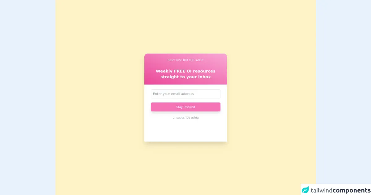
The preview of UI Design Daily Subscription Card ui component
To create a UI Design Daily Subscription Card, we will use Tailwind CSS to style the card and form elements. The card will have a white background with a border radius of 8px and a box shadow. The form fields will have a light grey background and a border radius of 4px. The subscribe button will have a blue background and white text.
Free download of the UI Design Daily Subscription Card's source code
The source code of UI Design Daily Subscription Card ui component
To create a UI Design Daily Subscription Card with Tailwind CSS, we will use HTML and Tailwind CSS classes. The HTML code will include a form element with fields for the user's name and email address, as well as a subscribe button. The Tailwind CSS classes will be used to style the card and form elements.
<div class="min-h-screen min-w-screen flex items-center justify-center bg-yellow-100">
  <div class="flex flex-col shadow-xl">
    <div class="py-6 px-14 bg-gradient-to-tr from-pink-500 to-pink-300 rounded-tl-2xl rounded-tr-2xl text-center space-y-8">
      <h2 class="text-white text-xs uppercase">don't miss out the latest</h2>
      <h4 class="text-white text-center font-bold text-xl">
        Weekly FREE UI resources<br />
        straight to your inbox
      </h4>
    </div>
    <div class="flex flex-col py-6 px-8 space-y-5 bg-white">
      <input type="text" placeholder="Enter your email address" class="px-2 py-2 border-2 rounded-md border-gray-200 focus:outline-none focus:ring-1 focus:ring-pink-300 focus:border-transparent" />
      <button class="w-full py-3 bg-pink-400 text-white rounded-md text-sm focus:outline-none focus:ring-2 focus:ring-pink-500 focus:border-transparent shadow-lg">Stay Inspired</button>
      <span class="text-center text-gray-400 text-sm">or subscribe using</span>
      <div class="flex justify-between">
        <div class="w-16 h-16 p-3 flex items-center justify-center border-2 border-transparent hover:border-gray-200 fill-current text-blue-300">
          <svg role="img" xmlns="http://www.w3.org/2000/svg" viewBox="0 0 24 24">
            <title>Twitter icon</title>
            <path d="M23.953 4.57a10 10 0 01-2.825.775 4.958 4.958 0 002.163-2.723c-.951.555-2.005.959-3.127 1.184a4.92 4.92 0 00-8.384 4.482C7.69 8.095 4.067 6.13 1.64 3.162a4.822 4.822 0 00-.666 2.475c0 1.71.87 3.213 2.188 4.096a4.904 4.904 0 01-2.228-.616v.06a4.923 4.923 0 003.946 4.827 4.996 4.996 0 01-2.212.085 4.936 4.936 0 004.604 3.417 9.867 9.867 0 01-6.102 2.105c-.39 0-.779-.023-1.17-.067a13.995 13.995 0 007.557 2.209c9.053 0 13.998-7.496 13.998-13.985 0-.21 0-.42-.015-.63A9.935 9.935 0 0024 4.59z" />
          </svg>
        </div>
        <div class="w-16 h-16 p-3 flex items-center justify-center border-2 border-transparent hover:border-gray-200 fill-current text-red-600">
          <svg role="img" viewBox="0 0 24 24" xmlns="http://www.w3.org/2000/svg">
            <title>Google icon</title>
            <path d="M12.48 10.92v3.28h7.84c-.24 1.84-.853 3.187-1.787 4.133-1.147 1.147-2.933 2.4-6.053 2.4-4.827 0-8.6-3.893-8.6-8.72s3.773-8.72 8.6-8.72c2.6 0 4.507 1.027 5.907 2.347l2.307-2.307C18.747 1.44 16.133 0 12.48 0 5.867 0 .307 5.387.307 12s5.56 12 12.173 12c3.573 0 6.267-1.173 8.373-3.36 2.16-2.16 2.84-5.213 2.84-7.667 0-.76-.053-1.467-.173-2.053H12.48z" />
          </svg>
        </div>
        <div class="w-16 h-16 p-4 flex items-center justify-center border-2 border-transparent hover:border-gray-200 fill-current text-blue-800">
          <svg role="img" xmlns="http://www.w3.org/2000/svg" viewBox="0 0 24 24">
            <title>Facebook icon</title>
            <path d="M24 12.073c0-6.627-5.373-12-12-12s-12 5.373-12 12c0 5.99 4.388 10.954 10.125 11.854v-8.385H7.078v-3.47h3.047V9.43c0-3.007 1.792-4.669 4.533-4.669 1.312 0 2.686.235 2.686.235v2.953H15.83c-1.491 0-1.956.925-1.956 1.874v2.25h3.328l-.532 3.47h-2.796v8.385C19.612 23.027 24 18.062 24 12.073z" />
          </svg>
        </div>
      </div>
    </div>
  </div>
</div>
How to create a UI Design Daily Subscription Card with Tailwind CSS?
Here are six steps to create a UI Design Daily Subscription Card with Tailwind CSS:
Step 1: Set up the HTML structure
The first step is to set up the HTML structure for the card and form elements. We will use a div element with a class of "card" to create the card, and a form element with fields for the user's name and email address, as well as a subscribe button.
<div class="card">
  <h2 class="text-lg font-bold mb-4">Subscribe to our daily design newsletter</h2>
  <form>
    <div class="mb-4">
      <label class="block text-gray-700 font-bold mb-2" for="name">Name</label>
      <input class="appearance-none border rounded w-full py-2 px-3 text-gray-700 leading-tight focus:outline-none focus:shadow-outline" id="name" type="text" placeholder="John Doe">
    </div>
    <div class="mb-4">
      <label class="block text-gray-700 font-bold mb-2" for="email">Email</label>
      <input class="appearance-none border rounded w-full py-2 px-3 text-gray-700 leading-tight focus:outline-none focus:shadow-outline" id="email" type="email" placeholder="[email protected]">
    </div>
    <button class="bg-blue-500 hover:bg-blue-700 text-white font-bold py-2 px-4 rounded focus:outline-none focus:shadow-outline" type="button">
      Subscribe
    </button>
  </form>
</div>
Step 2: Style the card element
The next step is to style the card element using Tailwind CSS classes. We will give the card a white background with a border radius of 8px and a box shadow.
.card {
  background-color: #fff;
  border-radius: 8px;
  box-shadow: 0 0 10px rgba(0, 0, 0, 0.1);
  padding: 2rem;
}
Step 3: Style the form fields
The next step is to style the form fields using Tailwind CSS classes. We will give the form fields a light grey background and a border radius of 4px.
input[type="text"],
input[type="email"] {
  background-color: #f7fafc;
  border-radius: 4px;
  border: none;
  padding: 0.5rem;
  width: 100%;
}
Step 4: Style the subscribe button
The next step is to style the subscribe button using Tailwind CSS classes. We will give the button a blue background and white text.
button {
  background-color: #4299e1;
  border: none;
  border-radius: 4px;
  color: #fff;
  cursor: pointer;
  font-size: 1rem;
  padding: 0.5rem 1rem;
}
Step 5: Make the card responsive
The next step is to make the card responsive using Tailwind CSS classes. We will use the "sm" breakpoint to adjust the layout for smaller screens.
@media (min-width: 640px) {
  .card {
    max-width: 640px;
    margin: 0 auto;
  }
}
Step 6: Add interactivity
The final step is to add interactivity to the subscribe button using JavaScript. We will use the "click" event to handle the form submission.
const form = document.querySelector('form');
const button = document.querySelector('button');

button.addEventListener('click', () => {
  const name = document.querySelector('#name').value;
  const email = document.querySelector('#email').value;
  const data = {
    name,
    email,
  };
  console.log(data);
  form.reset();
});
Conclusion
In conclusion, Tailwind CSS is an excellent choice for creating a UI Design Daily Subscription Card. It provides a set of pre-defined classes that can be used to style the card quickly and easily. Additionally, Tailwind CSS has a responsive design system that makes it easy to create designs that work across different screen sizes. By following the six steps outlined in this article, you can create a UI Design Daily Subscription Card with ease.