- Published on
6 Tips To Build A Simple Card #1 With Tailwind CSS
- What is Tailwind CSS?
- The description of Simple Card #1 ui component
- Why use Tailwind CSS to create a Simple Card #1 ui component?
- The preview of Simple Card #1 ui component.
- The source code of Simple Card #1 ui component.
- How to create a Simple Card #1 with Tailwind CSS?
- Step 1: Set up your HTML structure
- Step 2: Add Tailwind CSS to your project
- Step 3: Add the necessary classes to your HTML
- Step 4: Customize the styles to match your design
- Conclusion
As a FrontEnd technology blogger, I am always looking for ways to simplify my workflow and create beautiful user interfaces. One tool that I have found to be particularly useful in this regard is Tailwind CSS. In this article, I will share with you 6 tips for building a simple card #1 with Tailwind CSS.
What is Tailwind CSS?
Tailwind CSS is a utility-first CSS framework that provides a set of pre-defined classes that you can use to style your HTML elements. Unlike other CSS frameworks that come with pre-built components, Tailwind CSS focuses on providing a set of low-level utility classes that can be combined to create custom designs.
The description of Simple Card #1 ui component
The simple card #1 is a basic UI component that consists of a container with an image, a title, and a description. This component is commonly used in web applications to display information in a visually appealing way.
Why use Tailwind CSS to create a Simple Card #1 ui component?
Tailwind CSS is an excellent choice for creating a simple card #1 UI component because it provides a set of utility classes that can be used to quickly and easily style the component. Additionally, Tailwind CSS is highly customizable, which means that you can easily modify the default styles to match your specific design requirements.
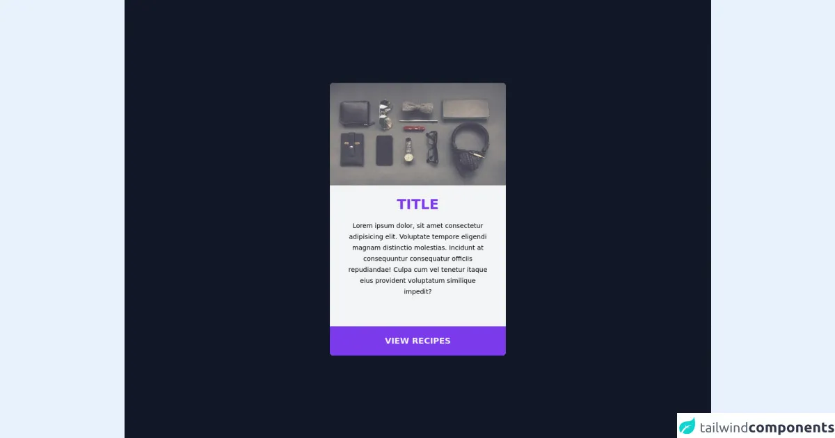
The preview of Simple Card #1 ui component.
To give you an idea of what the Simple Card #1 UI component looks like, here is a preview:
Free download of the Simple Card #1's source code
The source code of Simple Card #1 ui component.
Here is the source code for the Simple Card #1 UI component:
<main class="flex min-h-screen w-full items-center justify-center bg-gray-900">
  <div class="w-96 rounded-lg bg-gray-100">
    <img
      src="https://unsplash.it/640/425"
      alt=""
      class="h-48 w-full rounded-t-lg opacity-80 transition duration-300 hover:opacity-100 sm:h-56"
    />

    <div class="mb-10 px-10 py-6 text-center">
      <div class="mb-4 text-3xl font-bold uppercase text-purple-600">title</div>
      <span class="text-sm">
        Lorem ipsum dolor, sit amet consectetur adipisicing elit. Voluptate
        tempore eligendi magnam distinctio molestias. Incidunt at consequuntur
        consequatur officiis repudiandae! Culpa cum vel tenetur itaque eius
        provident voluptatum similique impedit?
      </span>
    </div>
    <button
      class="h-16 w-full rounded-b-lg bg-purple-600 text-lg font-extrabold text-gray-100 transition duration-300 hover:bg-purple-700"
    >
      VIEW RECIPES
    </button>
  </div>
</main>
How to create a Simple Card #1 with Tailwind CSS?
Now that you have a basic understanding of what Tailwind CSS is and why it's a great choice for creating a Simple Card #1 UI component, let's dive into the steps for creating this component.
Step 1: Set up your HTML structure
The first step in creating a Simple Card #1 UI component with Tailwind CSS is to set up your HTML structure. Here is an example of what your HTML might look like:
<div class="card">
  <img src="https://via.placeholder.com/150" alt="Placeholder image">
  <div class="card-body">
    <h2 class="card-title">Card title</h2>
    <p class="card-text">Some quick example text to build on the card title and make up the bulk of the card's content.</p>
  </div>
</div>
Step 2: Add Tailwind CSS to your project
The next step is to add Tailwind CSS to your project. You can do this by either downloading the CSS file and linking to it in your HTML, or by using a package manager like npm to install Tailwind CSS.
Step 3: Add the necessary classes to your HTML
Once you have added Tailwind CSS to your project, you can start adding the necessary classes to your HTML to style the Simple Card #1 UI component. Here is an example of what your HTML might look like with the necessary classes added:
<div class="card bg-white rounded-lg shadow-lg overflow-hidden">
  <img class="w-full" src="https://via.placeholder.com/150" alt="Placeholder image">
  <div class="card-body">
    <h2 class="card-title text-gray-900 font-bold text-2xl mb-2">Card title</h2>
    <p class="card-text text-gray-600 text-base">Some quick example text to build on the card title and make up the bulk of the card's content.</p>
  </div>
</div>
In this example, we have added the following classes to our HTML:
bg-white: Sets the background color of the card to white.rounded-lg: Rounds the corners of the card.shadow-lg: Adds a shadow to the card to give it depth.overflow-hidden: Hides any content that overflows the card.w-full: Sets the image width to 100% of its container.text-gray-900: Sets the text color of the card title to black.font-bold: Makes the card title bold.text-2xl: Sets the font size of the card title to 2xl (which is 1.5rem by default in Tailwind CSS).mb-2: Adds a margin-bottom of 0.5rem to the card title.text-gray-600: Sets the text color of the card description to gray.text-base: Sets the font size of the card description to base (which is 1rem by default in Tailwind CSS).
Step 4: Customize the styles to match your design
The final step in creating a Simple Card #1 UI component with Tailwind CSS is to customize the styles to match your specific design requirements. This can be done by modifying the default styles or by adding your own custom classes.
Conclusion
In this article, we have explored 6 tips for building a simple card #1 with Tailwind CSS. By following these tips, you can create a visually appealing UI component that is easy to customize and maintain. Whether you are a seasoned developer or just getting started with FrontEnd development, Tailwind CSS is a powerful tool that can help you streamline your workflow and create beautiful user interfaces.