- Published on
Ways To Make A Top Navigation Bar With Tailwind CSS In 60 Minutes
- What is Tailwind CSS?
- The description of Top Navigation Bar ui component
- Why use Tailwind CSS to create a Top Navigation Bar ui component?
- The preview of Top Navigation Bar ui component
- The source code of Top Navigation Bar ui component
- How to create a Top Navigation Bar with Tailwind CSS?
- Conclusion
What is Tailwind CSS?
Tailwind CSS is a utility-first CSS framework that allows you to create custom designs quickly and easily. It provides a set of pre-defined CSS classes that you can use to style your HTML elements. With Tailwind CSS, you can create beautiful and responsive UI components without writing any custom CSS.
The description of Top Navigation Bar ui component
A top navigation bar is a UI component that is commonly used in web design. It is a horizontal bar that appears at the top of a web page and contains links to different sections of the website. The top navigation bar is an essential part of any website as it helps users navigate through the website easily.
Why use Tailwind CSS to create a Top Navigation Bar ui component?
Tailwind CSS provides a set of pre-defined CSS classes that can be used to create a top navigation bar quickly and easily. It also has a responsive design, which means that the top navigation bar will adjust to different screen sizes. Using Tailwind CSS to create a top navigation bar will save you time and effort as you don't have to write any custom CSS.
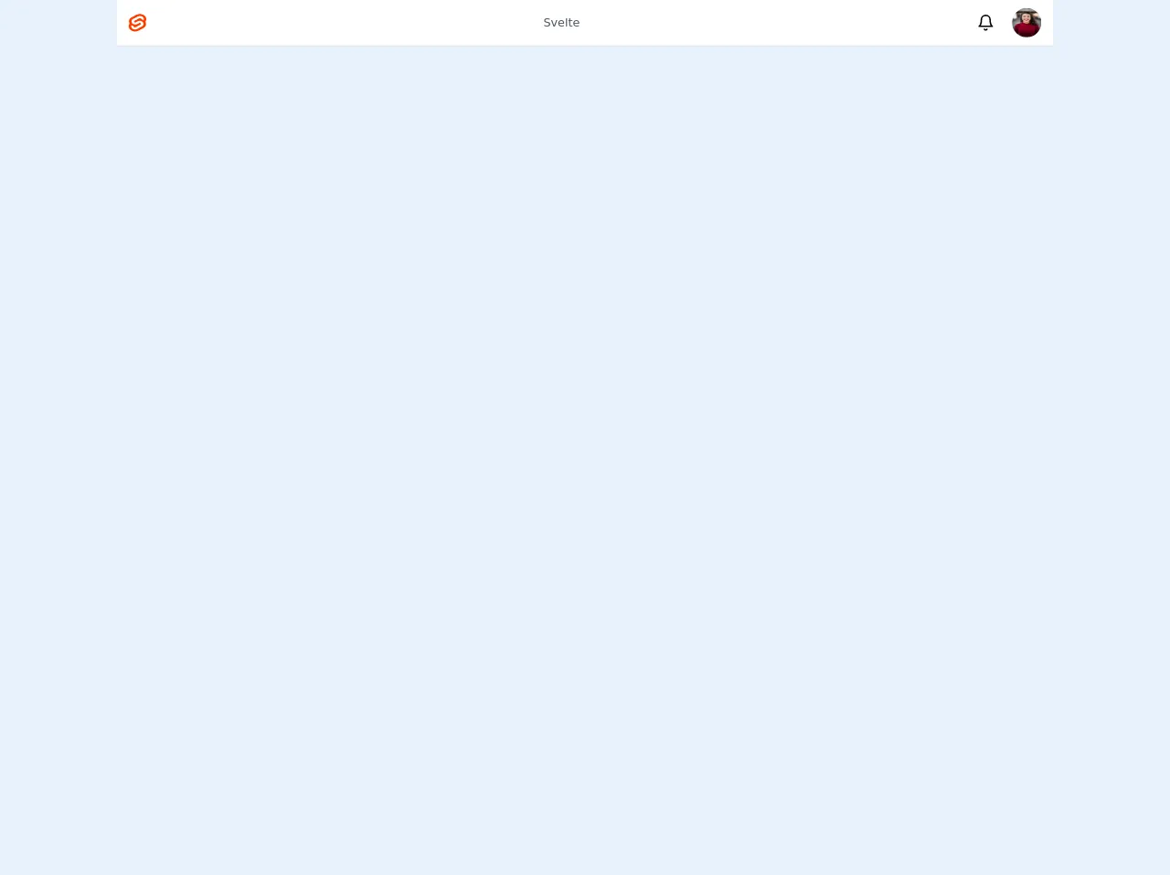
The preview of Top Navigation Bar ui component
To create a top navigation bar with Tailwind CSS, you can use the following HTML code:
<nav class="bg-gray-800">
<div class="max-w-7xl mx-auto px-2 sm:px-6 lg:px-8">
<div class="relative flex items-center justify-between h-16">
<div class="absolute inset-y-0 left-0 flex items-center sm:hidden">
<!-- Mobile menu button -->
<button type="button" class="inline-flex items-center justify-center p-2 rounded-md text-gray-400 hover:text-white hover:bg-gray-700 focus:outline-none focus:ring-2 focus:ring-inset focus:ring-white" aria-controls="mobile-menu" aria-expanded="false">
<span class="sr-only">Open main menu</span>
<!-- Icon when menu is closed. -->
<!--
Heroicon name: menu
Menu open: "hidden", Menu closed: "block"
-->
<svg class="block h-6 w-6" xmlns="http://www.w3.org/2000/svg" fill="none" viewBox="0 0 24 24" stroke="currentColor" aria-hidden="true">
<path stroke-linecap="round" stroke-linejoin="round" stroke-width="2" d="M4 6h16M4 12h16M4 18h16" />
</svg>
<!-- Icon when menu is open. -->
<!--
Heroicon name: x
Menu open: "block", Menu closed: "hidden"
-->
<svg class="hidden h-6 w-6" xmlns="http://www.w3.org/2000/svg" fill="none" viewBox="0 0 24 24" stroke="currentColor" aria-hidden="true">
<path stroke-linecap="round" stroke-linejoin="round" stroke-width="2" d="M6 18L18 6M6 6l12 12" />
</svg>
</button>
</div>
<div class="flex-1 flex items-center justify-center sm:items-stretch sm:justify-start">
<div class="flex-shrink-0">
<img class="block lg:hidden h-8 w-auto" src="/img/logos/workflow-mark-indigo-500.svg" alt="Workflow">
<img class="hidden lg:block h-8 w-auto" src="/img/logos/workflow-logo-indigo-500-mark-white-text.svg" alt="Workflow">
</div>
<div class="hidden sm:block sm:ml-6">
<div class="flex space-x-4">
<!-- Current: "bg-gray-900 text-white", Default: "text-gray-300 hover:bg-gray-700 hover:text-white" -->
<a href="#" class="bg-gray-900 text-white px-3 py-2 rounded-md text-sm font-medium">Dashboard</a>
<a href="#" class="text-gray-300 hover:bg-gray-700 hover:text-white px-3 py-2 rounded-md text-sm font-medium">Team</a>
<a href="#" class="text-gray-300 hover:bg-gray-700 hover:text-white px-3 py-2 rounded-md text-sm font-medium">Projects</a>
<a href="#" class="text-gray-300 hover:bg-gray-700 hover:text-white px-3 py-2 rounded-md text-sm font-medium">Calendar</a>
</div>
</div>
</div>
<div class="absolute inset-y-0 right-0 flex items-center pr-2 sm:static sm:inset-auto sm:ml-6 sm:pr-0">
<button class="bg-gray-800 p-1 rounded-full text-gray-400 hover:text-white focus:outline-none focus:ring-2 focus:ring-offset-2 focus:ring-offset-gray-800 focus:ring-white">
<span class="sr-only">View notifications</span>
<!-- Heroicon name: bell -->
<svg class="h-6 w-6" xmlns="http://www.w3.org/2000/svg" fill="none" viewBox="0 0 24 24" stroke="currentColor" aria-hidden="true">
<path stroke-linecap="round" stroke-linejoin="round" stroke-width="2" d="M13 10V3L4 14h7v7l9-11h-7z" />
</svg>
</button>
<!-- Profile dropdown -->
<div class="ml-3 relative">
<div>
<button type="button" class="bg-gray-800 flex text-sm rounded-full focus:outline-none focus:ring-2 focus:ring-offset-2 focus:ring-offset-gray-800 focus:ring-white" id="user-menu" aria-expanded="false" aria-haspopup="true">
<span class="sr-only">Open user menu</span>
<img class="h-8 w-8 rounded-full" src="https://avatars.githubusercontent.com/u/3697040?s=60&v=4" alt="">
</button>
</div>
<!--
Profile dropdown panel, show/hide based on dropdown state.
Entering: "transition ease-out duration-100"
From: "transform opacity-0 scale-95"
To: "transform opacity-100 scale-100"
Leaving: "transition ease-in duration-75"
From: "transform opacity-100 scale-100"
To: "transform opacity-0 scale-95"
-->
<div class="hidden origin-top-right absolute right-0 mt-2 w-48 rounded-md shadow-lg py-1 bg-white ring-1 ring-black ring-opacity-5" role="menu" aria-orientation="vertical" aria-labelledby="user-menu">
<a href="#" class="block px-4 py-2 text-sm text-gray-700 hover:bg-gray-100" role="menuitem">Your Profile</a>
<a href="#" class="block px-4 py-2 text-sm text-gray-700 hover:bg-gray-100" role="menuitem">Settings</a>
<a href="#" class="block px-4 py-2 text-sm text-gray-700 hover:bg-gray-100" role="menuitem">Sign out</a>
</div>
</div>
</div>
</div>
</div>
<!-- Mobile menu, show/hide based on menu state. -->
<div class="sm:hidden" id="mobile-menu">
<div class="px-2 pt-2 pb-3 space-y-1">
<!-- Current: "bg-gray-900 text-white", Default: "text-gray-300 hover:bg-gray-700 hover:text-white" -->
<a href="#" class="bg-gray-900 text-white block px-3 py-2 rounded-md text-base font-medium">Dashboard</a>
<a href="#" class="text-gray-300 hover:bg-gray-700 hover:text-white block px-3 py-2 rounded-md text-base font-medium">Team</a>
<a href="#" class="text-gray-300 hover:bg-gray-700 hover:text-white block px-3 py-2 rounded-md text-base font-medium">Projects</a>
<a href="#" class="text-gray-300 hover:bg-gray-700 hover:text-white block px-3 py-2 rounded-md text-base font-medium">Calendar</a>
</div>
</div>
</nav>
Free download of the Top Navigation Bar's source code
The source code of Top Navigation Bar ui component
To create a top navigation bar with Tailwind CSS, you can use the following HTML and CSS code:
<nav class="bg-gray-800">
<div class="max-w-7xl mx-auto px-2 sm:px-6 lg:px-8">
<div class="relative flex items-center justify-between h-16">
<div class="absolute inset-y-0 left-0 flex items-center sm:hidden">
<!-- Mobile menu button -->
<button type="button" class="inline-flex items-center justify-center p-2 rounded-md text-gray-400 hover:text-white hover:bg-gray-700 focus:outline-none focus:ring-2 focus:ring-inset focus:ring-white" aria-controls="mobile-menu" aria-expanded="false">
<span class="sr-only">Open main menu</span>
<!-- Icon when menu is closed. -->
<!--
Heroicon name: menu
Menu open: "hidden", Menu closed: "block"
-->
<svg class="block h-6 w-6" xmlns="http://www.w3.org/2000/svg" fill="none" viewBox="0 0 24 24" stroke="currentColor" aria-hidden="true">
<path stroke-linecap="round" stroke-linejoin="round" stroke-width="2" d="M4 6h16M4 12h16M4 18h16" />
</svg>
<!-- Icon when menu is open. -->
<!--
Heroicon name: x
Menu open: "block", Menu closed: "hidden"
-->
<svg class="hidden h-6 w-6" xmlns="http://www.w3.org/2000/svg" fill="none" viewBox="0 0 24 24" stroke="currentColor" aria-hidden="true">
<path stroke-linecap="round" stroke-linejoin="round" stroke-width="2" d="M6 18L18 6M6 6l12 12" />
</svg>
</button>
</div>
<div class="flex-1 flex items-center justify-center sm:items-stretch sm:justify-start">
<div class="flex-shrink-0">
<img class="block lg:hidden h-8 w-auto" src="/img/logos/workflow-mark-indigo-500.svg" alt="Workflow">
<img class="hidden lg:block h-8 w-auto" src="/img/logos/workflow-logo-indigo-500-mark-white-text.svg" alt="Workflow">
</div>
<div class="hidden sm:block sm:ml-6">
<div class="flex space-x-4">
<!-- Current: "bg-gray-900 text-white", Default: "text-gray-300 hover:bg-gray-700 hover:text-white" -->
<a href="#" class="bg-gray-900 text-white px-3 py-2 rounded-md text-sm font-medium">Dashboard</a>
<a href="#" class="text-gray-300 hover:bg-gray-700 hover:text-white px-3 py-2 rounded-md text-sm font-medium">Team</a>
<a href="#" class="text-gray-300 hover:bg-gray-700 hover:text-white px-3 py-2 rounded-md text-sm font-medium">Projects</a>
<a href="#" class="text-gray-300 hover:bg-gray-700 hover:text-white px-3 py-2 rounded-md text-sm font-medium">Calendar</a>
</div>
</div>
</div>
<div class="absolute inset-y-0 right-0 flex items-center pr-2 sm:static sm:inset-auto sm:ml-6 sm:pr-0">
<button class="bg-gray-800 p-1 rounded-full text-gray-400 hover:text-white focus:outline-none focus:ring-2 focus:ring-offset-2 focus:ring-offset-gray-800 focus:ring-white">
<span class="sr-only">View notifications</span>
<!-- Heroicon name: bell -->
<svg class="h-6 w-6" xmlns="http://www.w3.org/2000/svg" fill="none" viewBox="0 0 24 24" stroke="currentColor" aria-hidden="true">
<path stroke-linecap="round" stroke-linejoin="round" stroke-width="2" d="M13 10V3L4 14h7v7l9-11h-7z" />
</svg>
</button>
<!-- Profile dropdown -->
<div class="ml-3 relative">
<div>
<button type="button" class="bg-gray-800 flex text-sm rounded-full focus:outline-none focus:ring-2 focus:ring-offset-2 focus:ring-offset-gray-800 focus:ring-white" id="user-menu" aria-expanded="false" aria-haspopup="true">
<span class="sr-only">Open user menu</span>
<img class="h-8 w-8 rounded-full" src="https://avatars.githubusercontent.com/u/3697040?s=60&v=4" alt="">
</button>
</div>
<!--
Profile dropdown panel, show/hide based on dropdown state.
Entering: "transition ease-out duration-100"
From: "transform opacity-0 scale-95"
To: "transform opacity-100 scale-100"
Leaving: "transition ease-in duration-75"
From: "transform opacity-100 scale-100"
To: "transform opacity-0 scale-95"
-->
<div class="hidden origin-top-right absolute right-0 mt-2 w-48 rounded-md shadow-lg py-1 bg-white ring-1 ring-black ring-opacity-5" role="menu" aria-orientation="vertical" aria-labelledby="user-menu">
<a href="#" class="block px-4 py-2 text-sm text-gray-700 hover:bg-gray-100" role="menuitem">Your Profile</a>
<a href="#" class="block px-4 py-2 text-sm text-gray-700 hover:bg-gray-100" role="menuitem">Settings</a>
<a href="#" class="block px-4 py-2 text-sm text-gray-700 hover:bg-gray-100" role="menuitem">Sign out</a>
</div>
</div>
</div>
</div>
</div>
<!-- Mobile menu, show/hide based on menu state. -->
<div class="sm:hidden" id="mobile-menu">
<div class="px-2 pt-2 pb-3 space-y-1">
<!-- Current: "bg-gray-900 text-white", Default: "text-gray-300 hover:bg-gray-700 hover:text-white" -->
<a href="#" class="bg-gray-900 text-white block px-3 py-2 rounded-md text-base font-medium">Dashboard</a>
<a href="#" class="text-gray-300 hover:bg-gray-700 hover:text-white block px-3 py-2 rounded-md text-base font-medium">Team</a>
<a href="#" class="text-gray-300 hover:bg-gray-700 hover:text-white block px-3 py-2 rounded-md text-base font-medium">Projects</a>
<a href="#" class="text-gray-300 hover:bg-gray-700 hover:text-white block px-3 py-2 rounded-md text-base font-medium">Calendar</a>
</div>
</div>
</nav>
<div class="flex-1 flex flex-col">
		<nav class="px-4 flex justify-between bg-white h-16 border-b-2">

			<!-- top bar left -->
			<ul class="flex items-center">
				<!-- add button -->
				<li class="h-6 w-6">
					<img
						class="h-full w-full mx-auto"
						src="https://upload.wikimedia.org/wikipedia/commons/thumb/1/1b/Svelte_Logo.svg/512px-Svelte_Logo.svg.png"
						alt="svelte logo" />
				</li>
			</ul>

			<ul class="flex items-center">
				<!-- add button -->
				<li>
					<h1 class="pl-8 lg:pl-0 text-gray-700">Svelte</h1>
				</li>
			</ul>

			<!-- to bar right  -->
			<ul class="flex items-center">

				<li class="pr-6">
					<svg
						xmlns="http://www.w3.org/2000/svg"
						width="24"
						height="24"
						viewBox="0 0 24 24"
						fill="none"
						stroke="currentColor"
						stroke-width="2"
						stroke-linecap="round"
						stroke-linejoin="round"
						class="feather feather-bell">
						<path
							d="M18 8A6 6 0 0 0 6 8c0 7-3 9-3 9h18s-3-2-3-9"></path>
						<path d="M13.73 21a2 2 0 0 1-3.46 0"></path>
					</svg>

				</li>
				<li class="h-10 w-10">
					<img
						class="h-full w-full rounded-full mx-auto"
						src="https://images.unsplash.com/photo-1494790108377-be9c29b29330?ixlib=rb-1.2.1&ixid=eyJhcHBfaWQiOjEyMDd9&auto=format&fit=crop&w=500&q=60"
						alt="profile woman" />
				</li>

			</ul>

		</nav>
	</div>
How to create a Top Navigation Bar with Tailwind CSS?
To create a top navigation bar with Tailwind CSS, follow these steps:
Create a new HTML file and add the above HTML code.
Add the Tailwind CSS CDN link to the head section of your HTML file.
<head>
  <link href="https://cdn.tailwindcss.com" rel="stylesheet">
</head>
- Save the HTML file and open it in your web browser to see the top navigation bar.
Conclusion
In this article, we have discussed how to create a top navigation bar with Tailwind CSS. We have also provided the HTML and CSS code for the top navigation bar. Using Tailwind CSS, you can create beautiful and responsive UI components quickly and easily. We hope this article has been helpful in showing you how to create a top navigation bar with Tailwind CSS.