- Published on
What You Need To Make A Top Header With Tailwind CSS
- What is Tailwind CSS?
- The description of Top Header ui component
- Why use Tailwind CSS to create a Top Header ui component?
- The preview of Top Header ui component.
- The source code of Top Header ui component.
- How to create a Top Header with Tailwind CSS?
- Step 1: Set up the HTML structure
- Step 2: Style the Top Header
- Step 3: Add Responsive Design
- Conclusion
What is Tailwind CSS?
Tailwind CSS is a utility-first CSS framework that provides a set of pre-defined classes to make it easier for developers to build responsive and customizable user interfaces. It allows developers to quickly create UI components without writing custom CSS code. Tailwind CSS is gaining popularity among developers due to its simplicity and ease of use.
The description of Top Header ui component
A top header is a UI component that is usually placed at the top of a web page. It contains important information such as the website logo, navigation menu, search bar, and user profile. A well-designed top header can enhance the user experience and make it easier for users to navigate through the website.
Why use Tailwind CSS to create a Top Header ui component?
Tailwind CSS provides a set of pre-defined classes that can be used to create a top header UI component quickly. It also allows developers to customize the UI component according to their needs. Tailwind CSS provides a responsive design that works on all screen sizes, making it easier for developers to create a UI component that looks great on all devices.
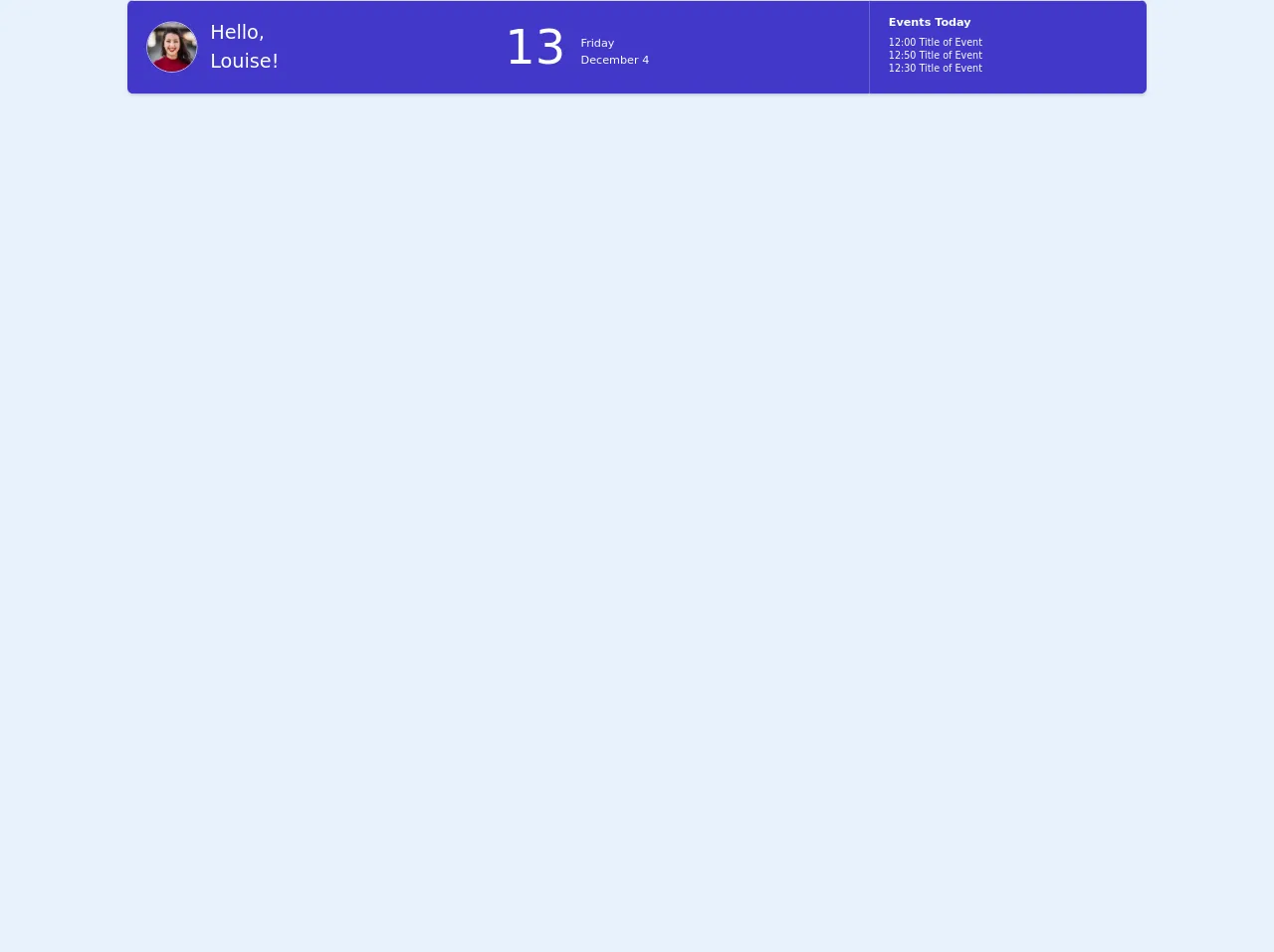
The preview of Top Header ui component.
To create a top header UI component using Tailwind CSS, we will need to use a combination of pre-defined classes such as flex, justify-between, items-center, p-4, bg-white, shadow-md, rounded-b-lg, and border-b-2. These classes will help us create a top header that looks great and is responsive on all devices.
Free download of the Top Header's source code
The source code of Top Header ui component.
To create a top header UI component using Tailwind CSS, we will need to write HTML and CSS code. The HTML code will contain the structure of the UI component, while the CSS code will contain the styling of the UI component.
<div class="flex flex-col">
<div class="-my-2 overflow-x-auto sm:-mx-6 lg:-mx-8">
<div class="py-2 align-middle inline-block min-w-full sm:px-6 lg:px-8">
<div class="shadow overflow-hidden border-b border-gray-200 sm:rounded-lg">
<table class="min-w-full divide-y divide-white">
<thead class="bg-gray-50">
</thead>
<tbody class="bg-indigo-700">
<tr>
<td class="px-6 py-4 whitespace-nowrap">
<div class="flex items-center">
<div class="flex-shrink-0 h-16 w-16">
<img class="h-16 w-16 rounded-full border" src="https://images.unsplash.com/photo-1494790108377-be9c29b29330?ixlib=rb-1.2.1&ixid=eyJhcHBfaWQiOjEyMDd9&auto=format&fit=facearea&facepad=4&w=256&h=256&q=60" alt="">
</div>
<div class="ml-4">
<div class="text-2xl text-white font-light leading-normal">
Hello,<br>Louise!
</div>
</div>
</div>
</td>
<td class="px-6 py-4 whitespace-nowrap text-white text-6xl font-thin">
13
<div class="text-sm inline-block leading-normal"> <strong>Friday</strong> <br>December 4</div>
</td>
<td class="px-6 py-4 whitespace-nowrap text-left text-sm text-white font-bold leading-normal">
Events Today
<ul class="font-thin text-xs py-2">
<li>12:00 Title of Event</li>
<li>12:50 Title of Event</li>
<li>12:30 Title of Event</li>
</ul>
</td>
</tr>
<!-- More rows... -->
</tbody>
</table>
</div>
</div>
</div>
</div>
How to create a Top Header with Tailwind CSS?
To create a top header UI component using Tailwind CSS, follow these steps:
Step 1: Set up the HTML structure
The first step is to set up the HTML structure of the top header. Here is an example of the HTML code:
<header class="bg-white shadow-md">
  <div class="container mx-auto px-4">
    <div class="flex justify-between items-center py-4">
      <div class="flex items-center">
        <a href="#">
          <img class="h-8" src="logo.png" alt="Logo">
        </a>
      </div>
      <div class="flex items-center">
        <nav>
          <ul class="flex">
            <li class="mr-6">
              <a href="#" class="text-gray-600 hover:text-gray-800">Home</a>
            </li>
            <li class="mr-6">
              <a href="#" class="text-gray-600 hover:text-gray-800">About</a>
            </li>
            <li class="mr-6">
              <a href="#" class="text-gray-600 hover:text-gray-800">Contact</a>
            </li>
          </ul>
        </nav>
        <div class="ml-4">
          <button class="bg-blue-500 hover:bg-blue-700 text-white font-bold py-2 px-4 rounded">
            Sign In
          </button>
        </div>
      </div>
    </div>
  </div>
</header>
In this code, we have used the header tag to define the top header. We have also used the container class to center the content of the top header. The flex, justify-between, and items-center classes are used to align the content of the top header.
Step 2: Style the Top Header
The next step is to style the top header using Tailwind CSS classes. Here is an example of the CSS code:
.bg-white {
  background-color: #fff;
}
.shadow-md {
  box-shadow: 0 4px 6px -1px rgba(0, 0, 0, 0.1), 0 2px 4px -1px rgba(0, 0, 0, 0.06);
}
.rounded-b-lg {
  border-bottom-left-radius: 0.5rem;
  border-bottom-right-radius: 0.5rem;
}
.border-b-2 {
  border-bottom-width: 2px;
}
In this code, we have defined the background color, box shadow, border radius, and border width of the top header.
Step 3: Add Responsive Design
The final step is to add responsive design to the top header. Here is an example of the CSS code:
@media (max-width: 640px) {
  .py-4 {
    padding-top: 1rem;
    padding-bottom: 1rem;
  }
  .ml-4 {
    margin-left: 1rem;
  }
}
In this code, we have used the @media rule to apply styles to the top header when the screen size is less than 640px. We have reduced the padding and margin of the top header to make it more compact on smaller screens.
Conclusion
Tailwind CSS is a great tool for creating UI components quickly and easily. In this article, we have learned how to create a top header UI component using Tailwind CSS. We have also discussed the benefits of using Tailwind CSS and how it can help developers create responsive and customizable UI components. With Tailwind CSS, developers can focus on building great user experiences without worrying about writing custom CSS code.