- Published on
Learn How To Make A Tooltip With Tailwind CSS Like an Expert
- What is Tailwind CSS?
- The description of Tooltip UI component
- Why use Tailwind CSS to create a Tooltip UI component?
- The preview of Tooltip UI component
- The source code of Tooltip UI component
- How to create a Tooltip with Tailwind CSS?
- Conclusion
What is Tailwind CSS?
Tailwind CSS is a utility-first CSS framework that helps developers to create responsive and customizable user interfaces quickly. It provides a set of pre-defined CSS classes that can be used to create any design or layout. Tailwind CSS is a popular choice among developers because it allows them to create complex designs with minimal CSS code.
The description of Tooltip UI component
A tooltip is a small popup that appears when the user hovers over an element. It usually contains additional information about the element or provides a hint to the user. Tooltips are commonly used in web applications to provide contextual information to the user.
Why use Tailwind CSS to create a Tooltip UI component?
Tailwind CSS provides a set of pre-defined CSS classes that can be used to create a tooltip UI component quickly. It also allows developers to customize the tooltip's appearance and behavior easily. Tailwind CSS is a lightweight framework, which means that it does not add unnecessary bloat to the application's CSS code.
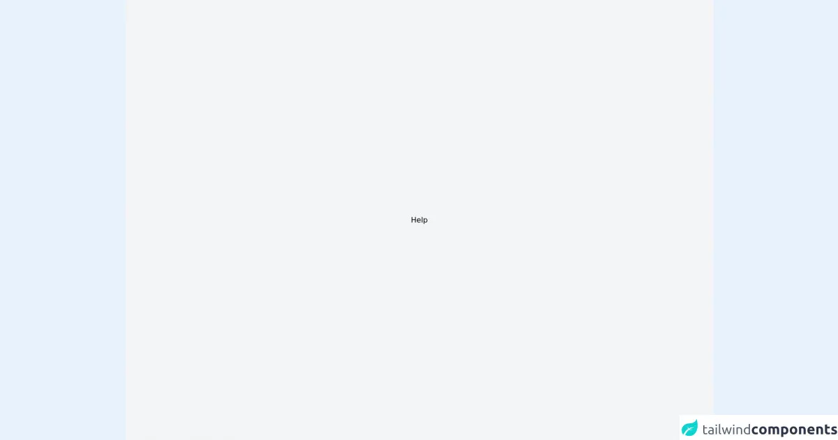
The preview of Tooltip UI component
Tooltips can be used to provide additional information to the user or to provide a hint about an element. They are commonly used in web applications to provide contextual information to the user.
Free download of the Tooltip's source code
The source code of Tooltip UI component
Creating a tooltip with Tailwind CSS is easy. The following code snippet shows how to create a simple tooltip:
<div class="relative">
  <button class="bg-blue-500 text-white font-bold py-2 px-4 rounded">
    Hover me
  </button>
  <div class="absolute bg-gray-100 text-gray-800 rounded p-2 shadow-md">
    This is a tooltip
  </div>
</div>
In the above code, we have created a button and a div element. The div element contains the tooltip text. We have used the relative and absolute classes to position the tooltip correctly. The bg-gray-100 and text-gray-800 classes are used to style the tooltip's background color and text color, respectively.
<style>
.tooltip:hover .tooltip-item {
    visibility: visible;
}
</style>

<div class="w-screen bg-gray-100 h-screen flex items-center justify-center">
  <div class="relative inline-block tooltip">
    <a to="" class="hover:text-gray-400 px-2 py-1 font-medium">Help</a>
    <div class="flex flex-col p-4 bg-white w-60 h-80 rounded-md z-20 absolute right-0 invisible tooltip-item ">
      <a href="" class="font-semibold pb-4">Help</a>
      <ul class="list-disc space-y-2">
        <li class="flex items-start">
          <a href="" class="font-medium text-sm text-gray-500 hover:text-black"> Order Status </a>
        </li>
        <li class="flex items-start">
          <a href="" class="font-medium text-sm text-gray-500 hover:text-black"> Shipping & Delivery </a>
        </li>
        <li class="flex items-start">
          <a href="" class="font-medium text-sm text-gray-500 hover:text-black"> Returns </a>
        </li>
        <li class="flex items-start">
          <a href="" class="font-medium text-sm text-gray-500 hover:text-black"> Size Charts </a>
        </li>
        <li class="flex items-start">
          <a href="" class="font-medium text-sm text-gray-500 hover:text-black"> Contact Us </a>
        </li>
        <li class="flex items-start">
          <a href="" class="font-medium text-sm text-gray-500 hover:text-black"> Privacy Policy </a>
        </li>
        <li class="flex items-start">
          <a href="" class="font-medium text-sm text-gray-500 hover:text-black"> Terms of Sale </a>
        </li>
        <li class="flex items-start">
          <a href="" class="font-medium text-sm text-gray-500 hover:text-black"> Terms of Use </a>
        </li>
        <li class="flex items-start">
          <a href="" class="font-medium text-sm text-gray-500 hover:text-black"> Send Us Feedback </a>
        </li>
      </ul>
    </div>
  </div>
</div>
How to create a Tooltip with Tailwind CSS?
Creating a tooltip with Tailwind CSS is easy. We can use the relative and absolute classes to position the tooltip correctly. The following steps show how to create a tooltip with Tailwind CSS:
- Create a container element and add the
relativeclass to it.
<div class="relative">
  <!-- Add the element that will trigger the tooltip here -->
</div>
- Add the element that will trigger the tooltip inside the container element.
<div class="relative">
  <button>Hover me</button>
</div>
- Add the tooltip element inside the container element and add the
absoluteclass to it.
<div class="relative">
  <button>Hover me</button>
  <div class="absolute">
    This is a tooltip
  </div>
</div>
- Position the tooltip correctly using the
top,bottom,left, orrightclasses.
<div class="relative">
  <button>Hover me</button>
  <div class="absolute top-0 left-0">
    This is a tooltip
  </div>
</div>
- Style the tooltip using the pre-defined Tailwind CSS classes.
<div class="relative">
  <button class="bg-blue-500 text-white font-bold py-2 px-4 rounded">
    Hover me
  </button>
  <div class="absolute bg-gray-100 text-gray-800 rounded p-2 shadow-md">
    This is a tooltip
  </div>
</div>
Conclusion
Creating a tooltip with Tailwind CSS is easy. Tailwind CSS provides a set of pre-defined CSS classes that can be used to create a tooltip UI component quickly. It also allows developers to customize the tooltip's appearance and behavior easily. With Tailwind CSS, developers can create complex UI components with minimal CSS code.