- Published on
Advanced Guide: Build A Toggle Control With Tailwind CSS
- What is Tailwind CSS?
- The description of Toggle Control UI component
- Why use Tailwind CSS to create a Toggle Control UI component?
- The preview of Toggle Control UI component
- The source code of Toggle Control UI component
- How to create a Toggle Control with Tailwind CSS?
- Step 1: Set up the HTML
- Step 2: Style the Toggle Control
- Step 3: Customize the Toggle Control
- Conclusion
In this article, we will be discussing how to build a Toggle Control UI component using Tailwind CSS. We will be covering the basics of Tailwind CSS, the description of the Toggle Control UI component, why Tailwind CSS is the perfect tool for building this component, and finally, a step-by-step guide on how to create the Toggle Control using Tailwind CSS.
What is Tailwind CSS?
Tailwind CSS is a utility-first CSS framework that provides a set of pre-defined classes that can be used to style HTML elements. It is highly customizable and allows developers to create complex UI components with ease. Tailwind CSS is designed to be used with modern front-end frameworks such as React, Vue, and Angular.
The description of Toggle Control UI component
A Toggle Control is a UI component that allows users to switch between two states, typically on/off or yes/no. It is commonly used in settings or preference pages where users can enable or disable certain features. The Toggle Control consists of a switch that can be toggled on or off.
Why use Tailwind CSS to create a Toggle Control UI component?
Tailwind CSS is the perfect tool for creating a Toggle Control UI component because it provides a set of pre-defined classes that can be used to style the component. The classes are highly customizable and allow developers to create a unique design for the Toggle Control. Additionally, Tailwind CSS is lightweight and easy to use, making it an ideal choice for building UI components.
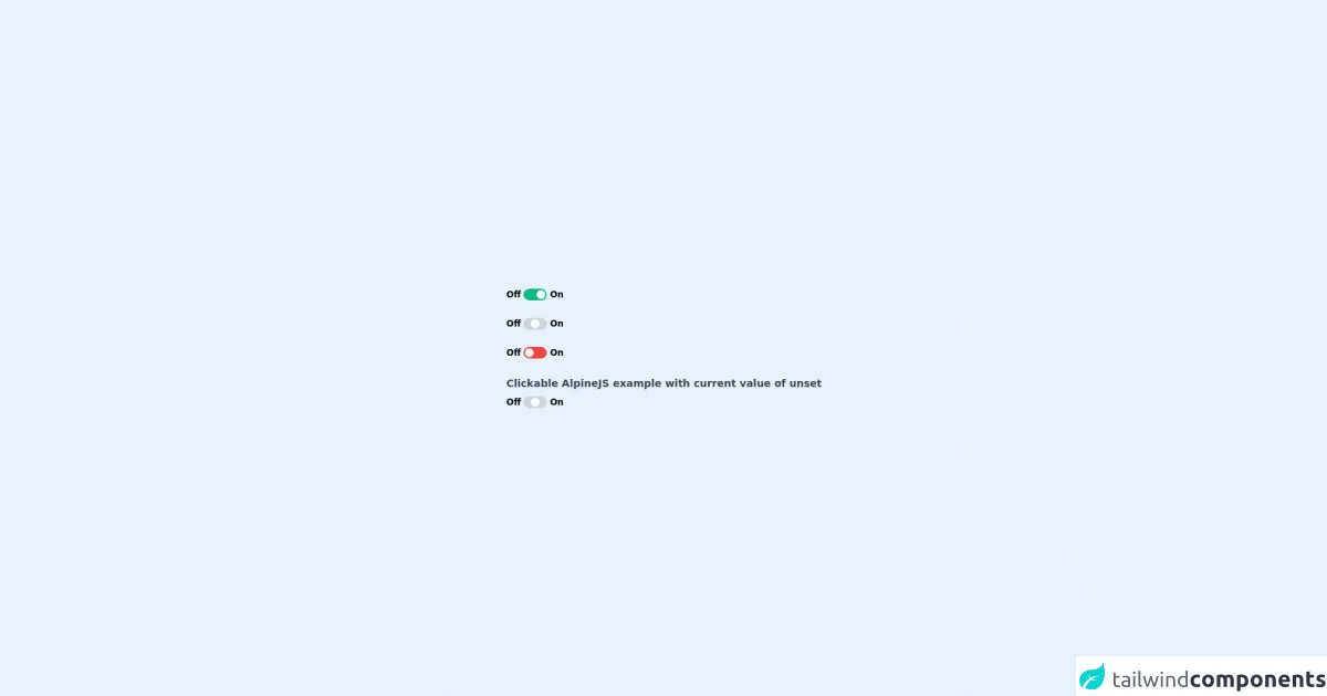
The preview of Toggle Control UI component
To give you an idea of what the Toggle Control UI component looks like, here is a preview:
Free download of the Toggle Control's source code
The source code of Toggle Control UI component
Here is the source code for the Toggle Control UI component:
<script src="https://cdn.jsdelivr.net/gh/alpinejs/[email protected]/dist/alpine.min.js" defer></script>
<div class="min-h-screen py-6 flex flex-col justify-center sm:py-12">
  <div class="relative py-3 sm:max-w-xl sm:mx-auto">

    <!-- On -->
    <div class="flex items-center m-2 cursor-pointer cm-toggle-wrapper mb-6">
      <span class="font-semibold text-xs mr-1">
        Off
      </span>
      <div class="rounded-full w-8 h-4 p-0.5 bg-green-500">
        <div class="rounded-full w-3 h-3 bg-white translate-x-2 transform mx-auto duration-300 ease-in-out"></div>
      </div>
      <span class="font-semibold text-xs ml-1">
        On
      </span>
    </div>

    <!-- Unset -->
    <div class="flex items-center m-2 cursor-pointer cm-toggle-wrapper mb-6">
      <span class="font-semibold text-xs mr-1">
        Off
      </span>
      <div class="rounded-full w-8 h-4 p-0.5 bg-gray-300">
        <div class="rounded-full w-3 h-3 bg-white transform mx-auto duration-300 ease-in-out"></div>
      </div>
      <span class="font-semibold text-xs ml-1">
        On
      </span>
    </div>

    <!-- On -->
    <div class="flex items-center m-2 cursor-pointer cm-toggle-wrapper mb-6">
      <span class="font-semibold text-xs mr-1">
        Off
      </span>
      <div class="rounded-full w-8 h-4 p-0.5 bg-red-500">
        <div class="rounded-full w-3 h-3 bg-white -translate-x-2 transform mx-auto duration-300 ease-in-out"></div>
      </div>
      <span class="font-semibold text-xs ml-1">
        On
      </span>
    </div>

    <!-- AlpineJS -->
    <div  x-data="{value: 'unset', offValue: 'Off', onValue:'On'}">
        <div class="flex items-center m-2 cursor-pointer cm-toggle-wrapper">
            <span class="font-semibold text-gray-700 text-sm">Clickable AlpineJS example with current value of <span class="font-bold" x-text="value"/></span>
        </div>

        <div class="flex items-center m-2 cursor-pointer cm-toggle-wrapper"  x-on:click="value =  (value == onValue ? offValue : onValue);">
            <span class="font-semibold text-xs mr-1">
                Off
            </span>
            <div class="rounded-full w-8 h-4 p-0.5 bg-gray-300" :class="{'bg-red-500': value == offValue,'bg-green-500': value == onValue}">
                <div class="rounded-full w-3 h-3 bg-white transform mx-auto duration-300 ease-in-out" :class="{'-translate-x-2': value == offValue,'translate-x-2': value == onValue}"></div>
            </div>
            <span class="font-semibold text-xs ml-1">
                On
            </span>
        </div>
    </div>


  </div>
</div>
How to create a Toggle Control with Tailwind CSS?
Now that we have covered the basics of Tailwind CSS and the Toggle Control UI component, let's dive into how to create the Toggle Control using Tailwind CSS.
Step 1: Set up the HTML
The first step is to set up the HTML for the Toggle Control. We will use a checkbox input and a label element to create the switch. Here is the code:
<div class="relative inline-block w-10 mr-2 align-middle select-none">
  <input type="checkbox" name="toggle" id="toggle" class="toggle-checkbox absolute block w-6 h-6 rounded-full bg-white border-4 appearance-none cursor-pointer"/>
  <label for="toggle" class="toggle-label block overflow-hidden h-6 rounded-full bg-gray-300 cursor-pointer"></label>
</div>
Step 2: Style the Toggle Control
Now that we have set up the HTML, we can start styling the Toggle Control using Tailwind CSS classes. Here is the code:
.toggle-checkbox:checked + .toggle-label {
  transform: translateX(100%);
  background-color: #48bb78;
}
Step 3: Customize the Toggle Control
Tailwind CSS provides a set of pre-defined classes that can be used to customize the Toggle Control. Here is an example of how to customize the color of the Toggle Control:
<div class="relative inline-block w-10 mr-2 align-middle select-none">
  <input type="checkbox" name="toggle" id="toggle" class="toggle-checkbox absolute block w-6 h-6 rounded-full bg-white border-4 appearance-none cursor-pointer"/>
  <label for="toggle" class="toggle-label block overflow-hidden h-6 rounded-full bg-gray-300 cursor-pointer"></label>
</div>

<style>
  .toggle-checkbox:checked + .toggle-label {
    transform: translateX(100%);
    background-color: #48bb78;
  }

  .toggle-checkbox:checked + .toggle-label::before {
    content: '';
    transform: translateX(150%);
    background-color: white;
  }

  .toggle-label {
    background-color: #ddd;
  }

  .toggle-checkbox:focus + .toggle-label {
    outline: 2px solid #48bb78;
  }
</style>
Conclusion
In conclusion, Tailwind CSS is a powerful tool for building UI components, and the Toggle Control is a great example of how easy it is to create complex components using Tailwind CSS. With its pre-defined classes and customization options, Tailwind CSS makes it easy to create unique designs that are both functional and visually appealing. We hope this guide has been helpful in showing you how to create a Toggle Control using Tailwind CSS.