- Published on
Ultimate Guide: Create A Toggle Button With Tailwind CSS
- What is Tailwind CSS?
- The description of Toggle Button ui component
- Why use Tailwind CSS to create a Toggle Button ui component?
- The preview of Toggle Button ui component.
- The source code of Toggle Button ui component.
- How to create a Toggle Button with Tailwind CSS?
- Step 1: Create the HTML
- Step 2: Style the Button
- Step 3: Style the Line
- Step 4: Style the Dot
- Step 5: Style the Checked State
- Conclusion
As a FrontEnd technology blogger, it's important to stay up-to-date with the latest trends and tools in the industry. One of the most popular tools in recent years is Tailwind CSS, a utility-first CSS framework that allows developers to quickly and easily create beautiful UI components. In this article, we'll explore how to create a Toggle Button with Tailwind CSS.
What is Tailwind CSS?
Tailwind CSS is a CSS framework that provides a set of pre-defined utility classes that can be used to style HTML elements. It's designed to be highly customizable and flexible, allowing developers to easily create unique designs without writing custom CSS. Tailwind CSS has gained popularity in recent years due to its ease of use and ability to speed up development time.
The description of Toggle Button ui component
A Toggle Button is a UI component that allows users to switch between two states, such as on/off or open/closed. It's commonly used in web applications to control settings or preferences. A Toggle Button typically consists of a button or switch that can be clicked or tapped to change its state.
Why use Tailwind CSS to create a Toggle Button ui component?
Tailwind CSS is a great choice for creating a Toggle Button UI component for several reasons. Firstly, it provides a wide range of utility classes that can be used to style the button and its various states. Secondly, it's highly customizable, allowing developers to easily change the appearance of the button to match the design of their application. Finally, Tailwind CSS is easy to learn and use, making it a great choice for developers of all skill levels.
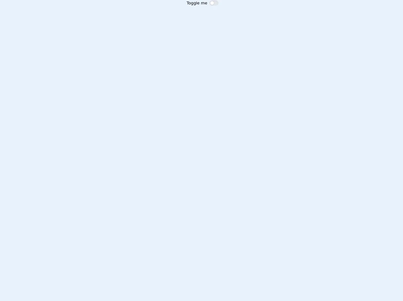
The preview of Toggle Button ui component.
To create a Toggle Button with Tailwind CSS, we'll use a combination of utility classes to style the button and its various states. Here's a preview of what the final Toggle Button will look like:
Free download of the Toggle Button's source code
The source code of Toggle Button ui component.
To create the Toggle Button, we'll use HTML and Tailwind CSS classes. Here's the source code for the Toggle Button:
<!-- This is an example component -->
<div class="flex justify-center">
     <label for="toogleButton" class="flex items-center cursor-pointer">
        <div class="px-2">Toggle me</div>
    <!-- toggle -->
    <div class="relative">
      <input id="toogleButton" type="checkbox" class="hidden" />
      <!-- path -->
      <div
        class="toggle-path bg-gray-200 w-9 h-5 rounded-full shadow-inner"
      ></div>
      <!-- crcle -->
      <div
        class="toggle-circle absolute w-3.5 h-3.5 bg-white rounded-full shadow inset-y-0 left-0"
      ></div>
    </div>
  </label>

</div>


<style>

.toggle-path {
    transition: background 0.3s ease-in-out;
}
.toggle-circle {
    top: 0.2rem;
    left: 0.25rem;
    transition: all 0.3s ease-in-out;
}
input:checked ~ .toggle-circle {
    transform: translateX(100%);
}
input:checked ~ .toggle-path {
    background-color:#81E6D9;
}
</style>
How to create a Toggle Button with Tailwind CSS?
To create a Toggle Button with Tailwind CSS, follow these steps:
Step 1: Create the HTML
First, we'll create the HTML for the Toggle Button. We'll use a label element to wrap the button and provide accessibility. Inside the label, we'll use an input element with a type of checkbox to represent the current state of the button. We'll also add a span element to represent the button itself.
<label class="flex items-center cursor-pointer">
  <div class="relative">
    <input type="checkbox" class="hidden" />
    <div class="toggle__line w-10 h-4 bg-gray-400 rounded-full shadow-inner"></div>
    <div class="toggle__dot absolute w-6 h-6 bg-white rounded-full shadow inset-y-0 left-0"></div>
  </div>
  <div class="ml-3 text-gray-700 font-medium">
    Toggle Button
  </div>
</label>
Step 2: Style the Button
Next, we'll use Tailwind CSS classes to style the button and its various states. We'll use the hidden class to hide the input element, and the cursor-pointer class to change the cursor to a pointer when hovering over the label. We'll also use the flex and items-center classes to center the button vertically.
.cursor-pointer {
  cursor: pointer;
}
Step 3: Style the Line
We'll use the w-10 and h-4 classes to set the width and height of the line, and the bg-gray-400 class to set the background color. We'll also use the rounded-full class to make the line rounded.
.toggle__line {
  transition: all 0.2s ease;
}

.toggle__line:before {
  content: "";
  display: block;
  width: 100%;
  height: 100%;
  background-color: inherit;
  border-radius: inherit;
  transform: translateX(-100%);
}

.toggle__line:after {
  content: "";
  display: block;
  width: 100%;
  height: 100%;
  background-color: inherit;
  border-radius: inherit;
  transform: translateX(0%);
}
Step 4: Style the Dot
We'll use the w-6 and h-6 classes to set the width and height of the dot, and the bg-white class to set the background color. We'll also use the rounded-full class to make the dot rounded. We'll use the shadow class to add a drop shadow to the dot, and the inset-y-0 and left-0 classes to position the dot on the left side of the line.
.toggle__dot {
  transition: all 0.2s ease;
  transform: translateX(-50%);
}

.toggle__dot:before {
  content: "";
  display: block;
  width: 100%;
  height: 100%;
  background-color: inherit;
  border-radius: inherit;
  transform: translateX(50%);
}
Step 5: Style the Checked State
Finally, we'll use the checked pseudo-class to style the button when it's checked. We'll use the bg-green-500 class to set the background color of the line, and the translate-x-full class to move the dot to the right side of the line.
input:checked + .toggle__line {
  background-color: #48bb78;
}

input:checked + .toggle__line:before {
  transform: translateX(0%);
}

input:checked + .toggle__line:after {
  transform: translateX(100%);
}

input:checked + .toggle__dot {
  transform: translateX(50%);
}
Conclusion
In this article, we've explored how to create a Toggle Button with Tailwind CSS. We've seen how Tailwind CSS can be used to quickly and easily create beautiful UI components, and how the utility-first approach can speed up development time. By following the steps outlined in this article, you'll be able to create your own Toggle Button in no time.