- Published on
Surprisingly Effective Ways To Make A Todos App With Tailwind CSS
- What is Tailwind CSS?
- The description of Todos App ui component
- Why use Tailwind CSS to create a Todos App ui component?
- The preview of Todos App ui component
- The source code of Todos App ui component
- How to create a Todos App with Tailwind CSS?
- Conclusion
Are you tired of creating boring and plain Todo apps? Do you want to create a visually appealing and functional Todo app with ease? Look no further than Tailwind CSS! In this article, we will explore the surprisingly effective ways to make a Todos app with Tailwind CSS.
What is Tailwind CSS?
Tailwind CSS is a utility-first CSS framework that provides pre-defined classes to style HTML elements. It allows developers to create custom designs with ease by using pre-defined classes and avoiding the need to write custom CSS. Tailwind CSS is highly customizable and can be used with any front-end framework or library.
The description of Todos App ui component
A Todos app is a simple application that allows users to create, edit, and delete tasks or to-do items. It is a popular application for learning front-end development as it involves basic CRUD (Create, Read, Update, Delete) operations.
Why use Tailwind CSS to create a Todos App ui component?
Tailwind CSS provides pre-defined classes for common UI components, including forms, buttons, and cards. This makes it easy to create a visually appealing and functional Todos app UI component without writing custom CSS. Additionally, Tailwind CSS allows for easy customization, so you can make your Todos app unique.
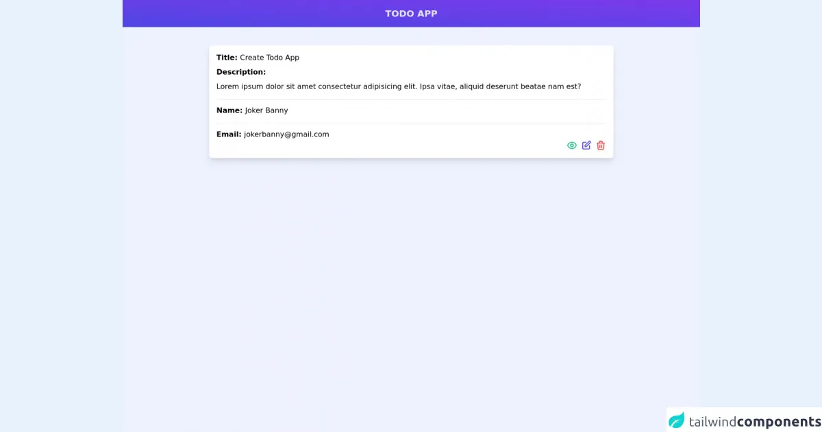
The preview of Todos App ui component
To create a Todos app UI component with Tailwind CSS, we will use the following components:
- A form to add new tasks
- A list to display existing tasks
- A button to delete tasks
Free download of the Todos App's source code
The source code of Todos App ui component
To create a Todos app UI component with Tailwind CSS, we will use HTML and Tailwind CSS classes. The HTML code will consist of a form, a list, and a button. The Tailwind CSS classes will be used to style these elements.
<div class="bg-indigo-50 h-screen">
	<nav>
		<div class="w-full bg-gradient-to-tr from-indigo-600 to-purple-600 py-4">
			<h1 class="text-center text-indigo-100 text-xl font-bold">TODO APP</h1>
		</div>
	</nav>
	<div class="px-10 mt-10">
		<div class="bg-white rounded-md max-w-4xl mx-auto p-4 space-y-4 shadow-lg">
			<h3 class="mb-2 font-semibold">Title: <span class="font-thin">Create Todo App</span></p>
				<div class="pt-2">
					<h3 class="font-semibold">Description:</p>
						<p class="font-thin mt-2">Lorem ipsum dolor sit amet consectetur adipisicing elit. Ipsa vitae,
							aliquid deserunt beatae nam est?</p>
				</div>
				<h3 class="border-t mb-2 pt-3 font-semibold">Name: <span class="font-thin">Joker Banny</span></p>
					<h3 class="border-t mb-2 pt-3 font-semibold">Email:
						<span class="font-thin">[email protected]</span></p>
						<div class="flex justify-end space-x-2">
							<svg xmlns="http://www.w3.org/2000/svg" class="h-6 w-6 text-green-500 cursor-pointer" fill="none"
								viewBox="0 0 24 24" stroke="currentColor">
								<path stroke-linecap="round" stroke-linejoin="round" stroke-width="2"
									d="M15 12a3 3 0 11-6 0 3 3 0 016 0z" />
								<path stroke-linecap="round" stroke-linejoin="round" stroke-width="2"
									d="M2.458 12C3.732 7.943 7.523 5 12 5c4.478 0 8.268 2.943 9.542 7-1.274 4.057-5.064 7-9.542 7-4.477 0-8.268-2.943-9.542-7z" />
							</svg>
							<svg xmlns="http://www.w3.org/2000/svg" class="h-6 w-6 text-indigo-600 cursor-pointer"
								fill="none" viewBox="0 0 24 24" stroke="currentColor">
								<path stroke-linecap="round" stroke-linejoin="round" stroke-width="2"
									d="M11 5H6a2 2 0 00-2 2v11a2 2 0 002 2h11a2 2 0 002-2v-5m-1.414-9.414a2 2 0 112.828 2.828L11.828 15H9v-2.828l8.586-8.586z" />
							</svg>
							<svg xmlns="http://www.w3.org/2000/svg" class="h-6 w-6 text-red-500 cursor-pointer"
								fill="none" viewBox="0 0 24 24" stroke="currentColor">
								<path stroke-linecap="round" stroke-linejoin="round" stroke-width="2"
									d="M19 7l-.867 12.142A2 2 0 0116.138 21H7.862a2 2 0 01-1.995-1.858L5 7m5 4v6m4-6v6m1-10V4a1 1 0 00-1-1h-4a1 1 0 00-1 1v3M4 7h16" />
							</svg>
						</div>
		</div>
	</div>
</div>
</div>
How to create a Todos App with Tailwind CSS?
To create a Todos app with Tailwind CSS, we will use HTML, JavaScript, and Tailwind CSS classes. The HTML code will consist of a form, a list, and a button. The JavaScript code will handle the CRUD operations and update the UI accordingly. The Tailwind CSS classes will be used to style these elements.
- Create a new HTML file and add the following code:
<!DOCTYPE html>
<html lang="en">
  <head>
    <meta charset="UTF-8" />
    <meta name="viewport" content="width=device-width, initial-scale=1.0" />
    <meta http-equiv="X-UA-Compatible" content="ie=edge" />
    <title>Todos App</title>
    <link rel="stylesheet" href="https://cdn.jsdelivr.net/npm/[email protected]/dist/tailwind.min.css" />
  </head>
  <body>
    <div class="container mx-auto px-4 py-8">
      <h1 class="text-2xl font-bold mb-4">Todos App</h1>
      <form class="mb-4">
        <div class="flex items-center">
          <input
            type="text"
            class="rounded-l-lg p-4 border-t mr-0 border-b border-l text-gray-800 border-gray-200 bg-white"
            placeholder="Add new task"
          />
          <button
            class="px-8 rounded-r-lg bg-green-500 text-white font-bold p-4 uppercase border-green-600 border-t border-b border-r"
          >
            Add
          </button>
        </div>
      </form>
      <ul class="list-disc list-inside">
        <li class="flex items-center mb-4">
          <input type="checkbox" class="form-checkbox h-5 w-5 text-green-600" />
          <span class="ml-2 text-gray-800">Task 1</span>
          <button class="ml-auto bg-red-500 hover:bg-red-700 text-white font-bold py-2 px-4 rounded">
            Delete
          </button>
        </li>
      </ul>
    </div>
  </body>
</html>
- Add the following JavaScript code to handle the CRUD operations:
const form = document.querySelector("form");
const taskList = document.querySelector("ul");

form.addEventListener("submit", (e) => {
  e.preventDefault();
  const input = form.querySelector("input");
  const task = input.value;
  if (task) {
    const li = document.createElement("li");
    li.classList.add("flex", "items-center", "mb-4");
    li.innerHTML = `
      <input type="checkbox" class="form-checkbox h-5 w-5 text-green-600" />
      <span class="ml-2 text-gray-800">${task}</span>
      <button class="ml-auto bg-red-500 hover:bg-red-700 text-white font-bold py-2 px-4 rounded">
        Delete
      </button>
    `;
    taskList.appendChild(li);
    input.value = "";
  }
});

taskList.addEventListener("click", (e) => {
  if (e.target.tagName === "BUTTON") {
    e.target.parentElement.remove();
  }
});
- Save the file and open it in your browser. You should see a Todos app with a form to add new tasks, a list to display existing tasks, and a button to delete tasks.
Conclusion
Tailwind CSS is a powerful CSS framework that can be used to create visually appealing and functional UI components with ease. By following the steps outlined in this article, you can create a Todos app UI component and a fully functional Todos app with Tailwind CSS. So, what are you waiting for? Give it a try and see the results for yourself!