- Published on
Best Ways To Build A Todo List App With Tailwind CSS
- What is Tailwind CSS?
- The description of Todo List App ui component
- Why use Tailwind CSS to create a Todo List App ui component?
- The preview of Todo List App ui component
- The source code of Todo List App ui component
- How to create a Todo List App with Tailwind CSS?
- Step 1: Set up your project
- Step 2: Create the HTML structure
- Step 3: Add Tailwind CSS classes
- Step 4: Customize the styles
- Step 5: Add functionality with JavaScript
- Conclusion
Are you looking for a way to build a Todo List App with Tailwind CSS? Look no further! In this article, we will discuss the best ways to build a Todo List App with Tailwind CSS.
What is Tailwind CSS?
Tailwind CSS is a utility-first CSS framework that allows you to quickly build custom designs. It provides a set of pre-defined CSS classes that you can use to style your HTML elements. With Tailwind CSS, you can easily create responsive designs and customize your styles without writing a lot of CSS code.
The description of Todo List App ui component
A Todo List App is a simple application that allows users to create and manage their tasks. The UI component of a Todo List App typically consists of a list of tasks, an input field to add new tasks, and buttons to mark tasks as completed or delete them.
Why use Tailwind CSS to create a Todo List App ui component?
Tailwind CSS is a great choice for building a Todo List App UI component because it provides a set of pre-defined CSS classes that can be used to quickly style the different UI elements. This can save a lot of time and effort compared to writing custom CSS code.
Additionally, Tailwind CSS is highly customizable, which means that you can easily customize the styles of the UI elements to match your design requirements. This makes it easy to create a unique and visually appealing Todo List App UI component.
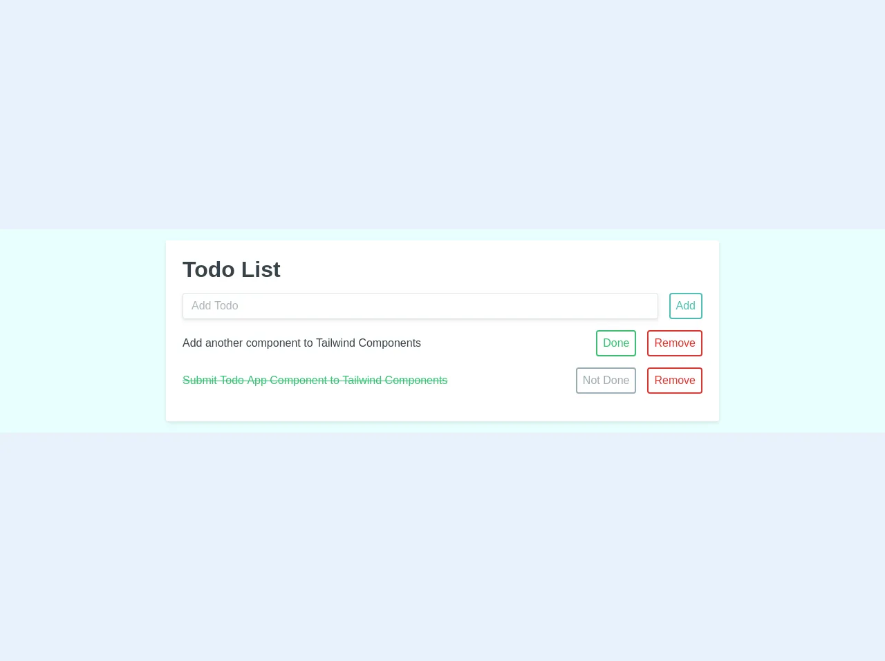
The preview of Todo List App ui component
To give you an idea of what a Todo List App UI component built with Tailwind CSS might look like, here is a preview:
Free download of the Todo List App's source code
The source code of Todo List App ui component
If you're interested in seeing the source code for a Todo List App UI component built with Tailwind CSS, here is an example:
<div class="h-100 w-full flex items-center justify-center bg-teal-lightest font-sans">
	<div class="bg-white rounded shadow p-6 m-4 w-full lg:w-3/4 lg:max-w-lg">
        <div class="mb-4">
            <h1 class="text-grey-darkest">Todo List</h1>
            <div class="flex mt-4">
                <input class="shadow appearance-none border rounded w-full py-2 px-3 mr-4 text-grey-darker" placeholder="Add Todo">
                <button class="flex-no-shrink p-2 border-2 rounded text-teal border-teal hover:text-white hover:bg-teal">Add</button>
            </div>
        </div>
        <div>
            <div class="flex mb-4 items-center">
                <p class="w-full text-grey-darkest">Add another component to Tailwind Components</p>
                <button class="flex-no-shrink p-2 ml-4 mr-2 border-2 rounded hover:text-white text-green border-green hover:bg-green">Done</button>
                <button class="flex-no-shrink p-2 ml-2 border-2 rounded text-red border-red hover:text-white hover:bg-red">Remove</button>
            </div>
          	<div class="flex mb-4 items-center">
                <p class="w-full line-through text-green">Submit Todo App Component to Tailwind Components</p>
                <button class="flex-no-shrink p-2 ml-4 mr-2 border-2 rounded hover:text-white text-grey border-grey hover:bg-grey">Not Done</button>
                <button class="flex-no-shrink p-2 ml-2 border-2 rounded text-red border-red hover:text-white hover:bg-red">Remove</button>
            </div>
        </div>
    </div>
</div>
How to create a Todo List App with Tailwind CSS?
Now that you have an idea of what a Todo List App UI component built with Tailwind CSS might look like, let's take a look at how to create one.
Step 1: Set up your project
The first step is to set up your project. You can do this by creating a new HTML file and linking to the Tailwind CSS stylesheet. You can also use a build tool like Webpack or Gulp to compile your CSS.
Step 2: Create the HTML structure
Next, you need to create the HTML structure for your Todo List App UI component. This typically consists of a list of tasks, an input field to add new tasks, and buttons to mark tasks as completed or delete them.
Step 3: Add Tailwind CSS classes
Once you have created the HTML structure, you can start adding Tailwind CSS classes to style the different UI elements. You can use classes like bg-gray-200, text-lg, and p-4 to style the background color, font size, and padding of the different elements.
Step 4: Customize the styles
If you want to customize the styles of the UI elements further, you can use Tailwind CSS's customization options. For example, you can use the theme object to customize the colors, fonts, and spacing of your UI elements.
Step 5: Add functionality with JavaScript
Finally, you can add functionality to your Todo List App UI component with JavaScript. This typically involves adding event listeners to the buttons and input field to handle user interactions.
Conclusion
In conclusion, building a Todo List App UI component with Tailwind CSS is a great way to quickly create a visually appealing and customizable UI. By using Tailwind CSS's pre-defined CSS classes and customization options, you can save time and effort while still creating a unique and functional UI.