- Published on
6 Critical Skills To Build A Todo list With Tailwind CSS Remarkably Well
- What is Tailwind CSS?
- The description of Todo list ui component
- Why use Tailwind CSS to create a Todo list ui component?
- The preview of Todo list ui component
- The source code of Todo list ui component
- How to create a Todo list with Tailwind CSS?
- 1. Define the HTML structure
- 2. Style the container
- 3. Style the form
- 4. Style the list
- 5. Add functionality
- 6. Test and refine
- Conclusion
What is Tailwind CSS?
Tailwind CSS is a utility-first CSS framework that offers a set of pre-defined classes to help you style your website quickly and efficiently. It provides a lot of flexibility and customization options, allowing developers to create unique and responsive designs.
The description of Todo list ui component
A Todo list is a simple yet useful user interface component that allows users to create, edit, and delete tasks. It is a great way to organize your work and increase productivity.
Why use Tailwind CSS to create a Todo list ui component?
Tailwind CSS is an excellent choice for creating a Todo list ui component because it offers a lot of pre-defined classes that can help you style your component quickly and efficiently. Additionally, it is easy to customize and provides a lot of flexibility, allowing you to create unique and responsive designs.
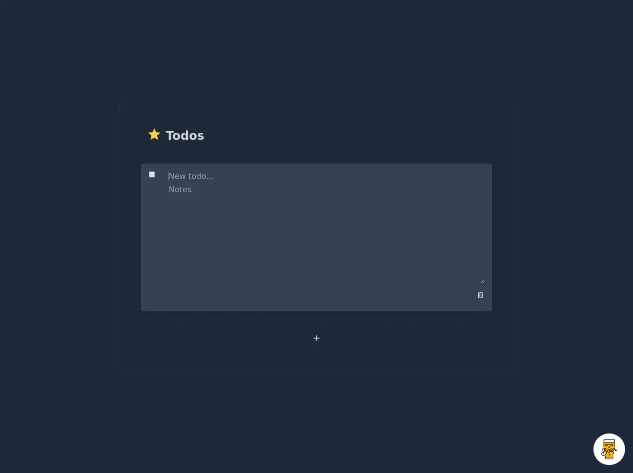
The preview of Todo list ui component
To create a Todo list ui component with Tailwind CSS, you can use a combination of pre-defined classes to style your component. Here is an example of what a Todo list ui component might look like:
Free download of the Todo list's source code
The source code of Todo list ui component
To create a Todo list ui component with Tailwind CSS, you can use a combination of HTML and CSS. Here is an example of what the code might look like:
<script src="https://cdn.jsdelivr.net/gh/alpinejs/[email protected]/dist/alpine.js" defer></script>
<style>@import url(https://cdnjs.cloudflare.com/ajax/libs/MaterialDesign-Webfont/5.3.45/css/materialdesignicons.min.css);</style>

<div class="min-w-screen min-h-screen bg-gray-800 flex items-center justify-center px-5 py-5">
    <div class="w-full mx-auto rounded-lg border border-gray-700 p-8 lg:py-12 lg:px-14 text-gray-300" style="max-width: 800px" x-data="app()" x-init="addItem()">
        <div class="mb-10">
            <h1 class="text-2xl font-bold"><i class="mdi mdi-star text-yellow-300 text-3xl leading-none align-bottom"></i> Todos</h1>
        </div>
        <div class="mb-10">
            <template x-if="todos.length">
                <ul @click.away="defocusItems()" class="-mx-1">
                    <template x-for="(item,index) in todos">
                        <li @click="focusItem(index)" @dblclick="openItem(index)" class="px-2 py-2 rounded transition-all flex text-md" :class="{'bg-indigo-800':item.focused,'bg-gray-700 shadow-lg px-4 py-4 my-10 -mx-2':item.open,'mb-1 cursor-pointer':!item.open}" :key="index">
                            <div class="flex-none w-10 leading-none">
                                <input type="checkbox" :checked="item.checked" @click="item.checked=!item.checked">
                            </div>
                            <div class="flex-grow max-w-full">
                                <div class="w-full leading-none">
                                    <h3 class="text-md leading-none truncate w-full pr-10" :class="item.title.length?'text-gray-300':'text-gray-500'" x-text="item.title||'New todo...'" x-show="!item.open"></h3>
                                    <input type="text" x-show="item.open" class="text-md w-full bg-transparent text-gray-300 leading-none focus:outline-none mb-2" x-model="item.title" :id="`titleField${index}`" placeholder="New todo..."/>
                                </div>
                                <div class="w-full" x-show="item.open">
                                    <textarea class="text-md w-full bg-transparent text-gray-300 leading-tight focus:outline-none" rows="10" x-model="item.notes" placeholder="Notes"></textarea>
                                </div>
                                <div class="w-full flex justify-end" x-show="item.open">
                                    <button class="p-1 -mr-1 focus:outline-none hover:text-red-300" @click="removeItem(index)"><i class="mdi mdi-trash-can-outline"></i></button>
                                </div>
                            </div>
                        </li>
                    </template>
                </ul>
            </template>
            <template x-if="!todos.length">
                <p class="text-gray-500">No todos</p>
            </template>
        </div>
        <div class="flex justify-center">
            <button class="py-1 px-10 border border-gray-800 hover:border-gray-700 rounded leading-none focus:outline-none text-xl" @click="addItem()"><i class="mdi mdi-plus"></i></button>
        </div>
    </div>
</div>

<script>
function app(){
    return {
        todos: [],
        focusItem: function(index) {
            if ( !this.todos[index].open ) {
                for(let i = 0; i < this.todos.length; i++){
                    this.todos[i].open = false;
                    this.todos[i].focused = i == index;
                }
            }
        },
        openItem: function(index) {
            for(let i = 0; i < this.todos.length; i++){
                this.todos[i].focused = false;
                this.todos[i].open = i == index;
            }
            setTimeout(()=>document.getElementById(`titleField${index}`).focus(),10);
        },
        defocusItems: function() {
            for(let i = 0; i < this.todos.length; i++){
                this.todos[i].focused = false;
                this.todos[i].open = false;
            }
        },
        removeItem: function(index) {
            this.todos = this.todos.filter((todo, i) => {
                return i == index ? false : true;
            });
            setTimeout(()=>this.defocusItems(),10);
        },
        addItem: function() {
            this.todos.push({
                title: '',
                notes: '',
                checked: false,
                focused: false,
                open: false
            });
            setTimeout(()=>this.openItem(this.todos.length-1),10);
        }
    }
}
</script>

<!-- BUY ME A BEER AND HELP SUPPORT OPEN-SOURCE RESOURCES -->
<div class="flex items-end justify-end fixed bottom-0 right-0 mb-4 mr-4 z-10">
    <div>
        <a title="Buy me a beer" href="https://www.buymeacoffee.com/scottwindon" target="_blank" class="block w-16 h-16 rounded-full transition-all shadow hover:shadow-lg transform hover:scale-110 hover:rotate-12">
            <img class="object-cover object-center w-full h-full rounded-full" src="https://i.pinimg.com/originals/60/fd/e8/60fde811b6be57094e0abc69d9c2622a.jpg"/>
        </a>
    </div>
</div>
How to create a Todo list with Tailwind CSS?
To create a Todo list with Tailwind CSS, you will need to follow these six critical skills:
1. Define the HTML structure
The first step in creating a Todo list with Tailwind CSS is to define the HTML structure. This includes creating a container for the Todo list, a form to add new tasks, and a list to display existing tasks.
2. Style the container
Once you have defined the HTML structure, you can start styling the container. This includes setting the background color, border, and padding.
3. Style the form
Next, you can style the form by setting the font size, color, and padding. You can also use Tailwind CSS classes to create a responsive design that adjusts to different screen sizes.
4. Style the list
After styling the form, you can style the list by setting the font size, color, and padding. You can also use Tailwind CSS classes to create a responsive design that adjusts to different screen sizes.
5. Add functionality
Once you have styled the Todo list, you can add functionality to allow users to add, edit, and delete tasks. You can use JavaScript or a JavaScript framework like React to handle user interactions.
6. Test and refine
Finally, you should test your Todo list to ensure that it works as expected. You can also refine the design and functionality based on user feedback.
Conclusion
In conclusion, creating a Todo list with Tailwind CSS is an excellent way to improve your FrontEnd development skills. By following these six critical skills, you can create a Todo list ui component that is not only functional but also visually appealing and responsive. So, what are you waiting for? Start building your Todo list with Tailwind CSS today!