- Published on
Build A Toaster Card With Tailwind CSS Like A Pro With The Help Of These 6 Tips
- What is Tailwind CSS?
- The description of Toaster Card ui component
- Why use Tailwind CSS to create a Toaster Card ui component?
- The preview of Toaster Card ui component
- The source code of Toaster Card ui component
- How to create a Toaster Card with Tailwind CSS?
- 1. Define the HTML structure
- 2. Style the card
- 3. Add animation
- 4. Position the card
- 5. Add close button
- 6. Make it dynamic
- Conclusion
What is Tailwind CSS?
Tailwind CSS is a utility-first CSS framework that allows developers to quickly build custom user interfaces. It provides a set of pre-defined classes that can be used to style HTML elements without having to write custom CSS. Tailwind CSS is designed to be highly customizable, which means that developers can create their own classes to suit their specific needs.
The description of Toaster Card ui component
A Toaster Card is a user interface component that displays a small notification message at the bottom of the screen. It is commonly used to display messages such as alerts, confirmations, and error messages. The Toaster Card is designed to be unobtrusive, so it does not interrupt the user's workflow.
Why use Tailwind CSS to create a Toaster Card ui component?
Tailwind CSS is a great choice for creating a Toaster Card ui component because it provides a set of pre-defined classes that can be used to style the card. This means that developers can quickly build a Toaster Card without having to write custom CSS. Additionally, Tailwind CSS is highly customizable, which means that developers can create their own classes to suit their specific needs.
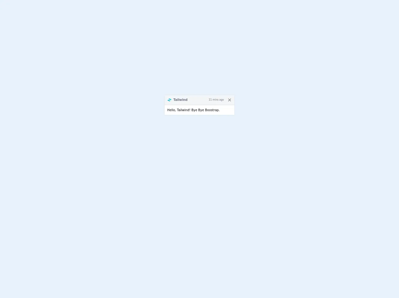
The preview of Toaster Card ui component
Toaster Card ui component is a small notification message that appears at the bottom of the screen. It is designed to be unobtrusive and does not interrupt the user's workflow.
Free download of the Toaster Card's source code
The source code of Toaster Card ui component
To create a Toaster Card ui component with Tailwind CSS, you will need to use HTML and CSS. The HTML code will define the structure of the card, while the CSS code will define the styles.
<div class="flex items-center justify-center min-h-screen">
  <div class="max-w-full text-sm rounded border shadow-sm pointer-events-auto bg-clip-padding w-80">
    <div class="flex items-center px-3 py-2 text-gray-500 bg-gray-100 border-b-2 rounded-t bg-clip-padding">
      <svg class="mr-2 text-lg rounded select-none" width="20" height="20" xmlns="http://www.w3.org/2000/svg" fill="none" viewBox="0 0 54 33">
        <path fill="#06B6D4" fill-rule="evenodd" d="M27 0c-7.2 0-11.7 3.6-13.5 10.8 2.7-3.6 5.85-4.95 9.45-4.05 2.054.513 3.522 2.004 5.147 3.653C30.744 13.09 33.808 16.2 40.5 16.2c7.2 0 11.7-3.6 13.5-10.8-2.7 3.6-5.85 4.95-9.45 4.05-2.054-.513-3.522-2.004-5.147-3.653C36.756 3.11 33.692 0 27 0zM13.5 16.2C6.3 16.2 1.8 19.8 0 27c2.7-3.6 5.85-4.95 9.45-4.05 2.054.514 3.522 2.004 5.147 3.653C17.244 29.29 20.308 32.4 27 32.4c7.2 0 11.7-3.6 13.5-10.8-2.7 3.6-5.85 4.95-9.45 4.05-2.054-.513-3.522-2.004-5.147-3.653C23.256 19.31 20.192 16.2 13.5 16.2z" clip-rule="evenodd" />
      </svg>
      <strong class="mr-auto">Tailwind</strong>
      <small>11 mins ago</small>
      <button type="button" class="box-content p-1 ml-3 -mr-1 text-black rounded opacity-50 hover:opacity-100">
        <svg class="w-5 h-5" xmlns="http://www.w3.org/2000/svg" width="192" height="192" fill="#000000" viewBox="0 0 256 256">
          <rect width="256" height="256" fill="none"></rect>
          <line x1="200" y1="56" x2="56" y2="200" stroke="#000000" stroke-linecap="round" stroke-linejoin="round" stroke-width="24" fill="none"></line>
          <line x1="200" y1="200" x2="56" y2="56" stroke="#000000" stroke-linecap="round" stroke-linejoin="round" stroke-width="24" fill="none"></line>
        </svg>
      </button>
    </div>
    <div class="p-3 bg-white">Hello, Tailwind! Bye Bye Boostrap.</div>
  </div>
</div>
How to create a Toaster Card with Tailwind CSS?
Here are 6 tips to help you create a Toaster Card with Tailwind CSS:
1. Define the HTML structure
The first step in creating a Toaster Card is to define the HTML structure. The card should be a container element that contains the message text. Here is an example of the HTML code:
<div class="bg-green-500 text-white p-4 rounded-lg shadow-lg">
  This is a success message.
</div>
2. Style the card
The next step is to style the card using Tailwind CSS classes. You can use the bg-* classes to set the background color of the card, the text-* classes to set the text color, and the rounded-lg and shadow-lg classes to add rounded corners and a shadow effect. Here is an example of the CSS code:
.bg-green-500 {
  background-color: #48bb78;
}

.text-white {
  color: #fff;
}

.p-4 {
  padding: 1rem;
}

.rounded-lg {
  border-radius: 0.5rem;
}

.shadow-lg {
  box-shadow: 0 10px 15px -3px rgba(0, 0, 0, 0.1),
    0 4px 6px -2px rgba(0, 0, 0, 0.05);
}
3. Add animation
To make the Toaster Card more visually appealing, you can add animation using Tailwind CSS. You can use the animate-* classes to add different animation effects. Here is an example of the CSS code:
.animate-bounce {
  animation: bounce 1s infinite;
}

@keyframes bounce {
  0%,
  100% {
    transform: translateY(-25%);
    animation-timing-function: cubic-bezier(0.8, 0, 1, 1);
  }

  50% {
    transform: translateY(0);
    animation-timing-function: cubic-bezier(0, 0, 0.2, 1);
  }
}
4. Position the card
By default, the Toaster Card will be positioned at the top of the screen. To position it at the bottom of the screen, you can use the fixed and bottom-0 classes. Here is an example of the HTML code:
<div class="fixed bottom-0 right-0">
  <div class="bg-green-500 text-white p-4 rounded-lg shadow-lg animate-bounce">
    This is a success message.
  </div>
</div>
5. Add close button
To allow the user to dismiss the Toaster Card, you can add a close button. You can use the absolute and top-0 classes to position the button at the top-right corner of the card. Here is an example of the HTML code:
<div class="fixed bottom-0 right-0">
  <div class="bg-green-500 text-white p-4 rounded-lg shadow-lg animate-bounce">
    <button class="absolute top-0 right-0 px-2 py-1 text-white rounded-lg hover:bg-white hover:text-green-500">
      X
    </button>
    This is a success message.
  </div>
</div>
6. Make it dynamic
To make the Toaster Card dynamic, you can use JavaScript to add and remove the card from the DOM. Here is an example of the JavaScript code:
function showToast(message, type) {
  const toast = document.createElement("div");
  toast.classList.add("fixed", "bottom-0", "right-0");

  const toastMessage = document.createElement("div");
  toastMessage.classList.add(
    "bg-green-500",
    "text-white",
    "p-4",
    "rounded-lg",
    "shadow-lg",
    "animate-bounce"
  );
  toastMessage.innerText = message;

  const closeButton = document.createElement("button");
  closeButton.classList.add(
    "absolute",
    "top-0",
    "right-0",
    "px-2",
    "py-1",
    "text-white",
    "rounded-lg",
    "hover:bg-white",
    "hover:text-green-500"
  );
  closeButton.innerText = "X";
  closeButton.addEventListener("click", () => {
    toast.remove();
  });

  toastMessage.appendChild(closeButton);
  toast.appendChild(toastMessage);

  document.body.appendChild(toast);
}
Conclusion
In this article, we have learned how to create a Toaster Card ui component with Tailwind CSS. We have covered 6 tips that will help you create a dynamic and visually appealing Toaster Card. With Tailwind CSS, you can quickly build custom user interfaces without having to write custom CSS.