- Published on
Learn How To Create A three skills or focus With Tailwind CSS Like an Expert
- What is Tailwind CSS?
- The Description of Three Skills or Focus UI Component
- Why Use Tailwind CSS to Create a Three Skills or Focus UI Component?
- The Preview of Three Skills or Focus UI Component
- The Source Code of Three Skills or Focus UI Component
- How to Create a Three Skills or Focus With Tailwind CSS?
- Conclusion
What is Tailwind CSS?
Tailwind CSS is a utility-first CSS framework that helps you to create custom designs without writing any CSS code. It provides you with a set of pre-defined classes that you can use to style your HTML elements. Tailwind CSS is a popular choice among developers because it is easy to use, customizable, and has a low learning curve.
The Description of Three Skills or Focus UI Component
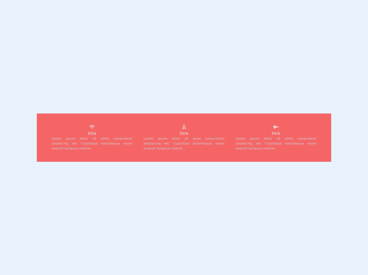
The three skills or focus UI component is a design pattern that is commonly used on websites and applications to showcase the user's skills or areas of expertise. This component usually consists of three boxes that display the user's skills or focus areas, along with an icon or image that represents each skill.
Why Use Tailwind CSS to Create a Three Skills or Focus UI Component?
Tailwind CSS is an excellent choice for creating a three skills or focus UI component because it provides you with a set of pre-defined classes that you can use to style your component quickly. Tailwind CSS also allows you to customize your styles easily, so you can create a unique design that matches your brand or website.
The Preview of Three Skills or Focus UI Component
To create a three skills or focus UI component, we will use Tailwind CSS classes to style our HTML elements. The component will consist of three boxes that display the user's skills or focus areas, along with an icon or image that represents each skill.
Free download of the three skills or focus's source code
The Source Code of Three Skills or Focus UI Component
To create a three skills or focus UI component, we will use HTML and Tailwind CSS classes. The HTML code will consist of three boxes that display the user's skills or focus areas, along with an icon or image that represents each skill.
<head>

    <script src="https://kit.fontawesome.com/479346cc73.js" crossorigin="anonymous"></script>


</head>

<div class=" sm:flex bg-red-500 p-10">
    <div class=" ml-auto mr-auto  sm:w-1/3 text-center text-gray-400 p-2">
        <i class=" fas fa-wifi  text-red-200 text-lg"> </i>
        <h3 class=" text-red-100 text-lg"> titre </h3>
        <p class=" text-sm text-justify mx-4"> Lorem ipsum dolor sit amet consectetur adipisicing elit. Cupiditate
            doloremque
            nemo eveniet tempore ratione
        </p>

    </div>
    <div class=" ml-auto mr-auto  sm:w-1/3 text-center text-gray-400 p-2">
        <i class=" fas fa-user-astronaut text-red-200 text-lg"> </i>
        <h3 class=" text-red-100 text-lg"> titre </h3>
        <p class=" text-sm text-justify mx-4"> Lorem ipsum dolor sit amet consectetur adipisicing elit. Cupiditate
            doloremque
            nemo eveniet tempore ratione
        </p>

    </div>
    <div class=" ml-auto mr-auto  sm:w-1/3 text-center text-gray-400 p-2">
        <i class=" fas fa-space-shuttle  text-red-200 text-lg"> </i>
        <h3 class=" text-red-100 text-lg"> titre </h3>
        <p class=" text-sm text-justify mx-4"> Lorem ipsum dolor sit amet consectetur adipisicing elit. Cupiditate
            doloremque
            nemo eveniet tempore ratione
        </p>

    </div>
</div>
How to Create a Three Skills or Focus With Tailwind CSS?
Let's start by creating the HTML code for our three skills or focus UI component. We will use the div element to create three boxes that will display our skills or focus areas. Each box will contain an icon or image that represents the skill, along with a heading and a paragraph that describes the skill.
<div class="flex justify-center">
  <div class="w-1/3 p-4">
    <div class="bg-white rounded-lg shadow-lg p-4">
      <div class="text-center">
        <img src="https://via.placeholder.com/150" alt="Skill 1" class="mx-auto mb-2">
        <h3 class="text-xl font-semibold mb-2">Skill 1</h3>
        <p class="text-gray-700">Lorem ipsum dolor sit amet, consectetur adipiscing elit. Sed euismod, justo euismod, dignissim turpis.</p>
      </div>
    </div>
  </div>
  <div class="w-1/3 p-4">
    <div class="bg-white rounded-lg shadow-lg p-4">
      <div class="text-center">
        <img src="https://via.placeholder.com/150" alt="Skill 2" class="mx-auto mb-2">
        <h3 class="text-xl font-semibold mb-2">Skill 2</h3>
        <p class="text-gray-700">Lorem ipsum dolor sit amet, consectetur adipiscing elit. Sed euismod, justo euismod, dignissim turpis.</p>
      </div>
    </div>
  </div>
  <div class="w-1/3 p-4">
    <div class="bg-white rounded-lg shadow-lg p-4">
      <div class="text-center">
        <img src="https://via.placeholder.com/150" alt="Skill 3" class="mx-auto mb-2">
        <h3 class="text-xl font-semibold mb-2">Skill 3</h3>
        <p class="text-gray-700">Lorem ipsum dolor sit amet, consectetur adipiscing elit. Sed euismod, justo euismod, dignissim turpis.</p>
      </div>
    </div>
  </div>
</div>
In the above code, we have created three boxes using the div element. We have used the flex and justify-center classes to center the boxes horizontally. We have also used the w-1/3 class to set the width of each box to one-third of the parent container.
Inside each box, we have created a div element with the bg-white, rounded-lg, and shadow-lg classes to create a white background with rounded corners and a shadow effect. We have also used the p-4 class to add padding to the box.
Inside the box, we have created a div element with the text-center class to center the content vertically. We have used the img element to display an icon or image that represents the skill. We have also used the text-xl, font-semibold, and mb-2 classes to style the heading of the box.
Finally, we have used the text-gray-700 class to style the paragraph that describes the skill.
Now that we have created the HTML code, let's add some styles using Tailwind CSS classes. We will use the bg-blue-500 class to set the background color of the heading, and the text-white class to set the text color to white.
<div class="flex justify-center">
  <div class="w-1/3 p-4">
    <div class="bg-white rounded-lg shadow-lg p-4">
      <div class="text-center">
        <img src="https://via.placeholder.com/150" alt="Skill 1" class="mx-auto mb-2">
        <h3 class="text-xl font-semibold mb-2 bg-blue-500 text-white">Skill 1</h3>
        <p class="text-gray-700">Lorem ipsum dolor sit amet, consectetur adipiscing elit. Sed euismod, justo euismod, dignissim turpis.</p>
      </div>
    </div>
  </div>
  <div class="w-1/3 p-4">
    <div class="bg-white rounded-lg shadow-lg p-4">
      <div class="text-center">
        <img src="https://via.placeholder.com/150" alt="Skill 2" class="mx-auto mb-2">
        <h3 class="text-xl font-semibold mb-2 bg-blue-500 text-white">Skill 2</h3>
        <p class="text-gray-700">Lorem ipsum dolor sit amet, consectetur adipiscing elit. Sed euismod, justo euismod, dignissim turpis.</p>
      </div>
    </div>
  </div>
  <div class="w-1/3 p-4">
    <div class="bg-white rounded-lg shadow-lg p-4">
      <div class="text-center">
        <img src="https://via.placeholder.com/150" alt="Skill 3" class="mx-auto mb-2">
        <h3 class="text-xl font-semibold mb-2 bg-blue-500 text-white">Skill 3</h3>
        <p class="text-gray-700">Lorem ipsum dolor sit amet, consectetur adipiscing elit. Sed euismod, justo euismod, dignissim turpis.</p>
      </div>
    </div>
  </div>
</div>
In the above code, we have added the bg-blue-500 and text-white classes to the heading of each box to set the background color to blue and the text color to white.
Conclusion
In this article, we have learned how to create a three skills or focus UI component using Tailwind CSS. We have used HTML and Tailwind CSS classes to create a simple yet effective design that showcases the user's skills or focus areas. With Tailwind CSS, you can create custom designs quickly and easily, without writing any CSS code. So, go ahead and give it a try!