- Published on
Build A Simple Terminal With Tailwind CSS Like A Pro With The Help Of These 6 Tips
- What is Tailwind CSS?
- The description of Simple Terminal ui component
- Why use Tailwind CSS to create a Simple Terminal ui component?
- The preview of Simple Terminal ui component.
- The source code of Simple Terminal ui component.
- How to create a Simple Terminal with Tailwind CSS?
- 1. Use the bg-gray-900 class to set the background color of the Simple Terminal.
- 2. Use the text-green-500 class to set the color of the user name.
- 3. Use the input type="text" element to create a text input field.
- 4. Use the mt-2 class to add some margin to the text area.
- 5. Use the color classes to set the color of the text.
- 6. Use the rounded-lg class to add some rounding to the corners of the Simple Terminal.
- Conclusion
As a FrontEnd technology blogger, you must have heard of Tailwind CSS. It is a utility-first CSS framework that helps you to create custom designs without writing any CSS. In this article, we will discuss how to build a Simple Terminal with Tailwind CSS like a pro with the help of these 6 tips.
What is Tailwind CSS?
Tailwind CSS is a utility-first CSS framework that helps you to create custom designs without writing any CSS. It provides a set of pre-defined classes that you can use to style your HTML elements. Tailwind CSS is highly customizable and allows you to create your own classes to match your design needs.
The description of Simple Terminal ui component
A Simple Terminal is a user interface component that emulates a command-line interface. It is often used in applications that require users to enter commands to perform certain actions. The Simple Terminal component consists of a text input field and a text area where the output of the commands is displayed.
Why use Tailwind CSS to create a Simple Terminal ui component?
Tailwind CSS is an excellent choice for creating a Simple Terminal ui component because it provides a set of pre-defined classes that can be used to style the component quickly and easily. Additionally, Tailwind CSS is highly customizable, which means that you can create your own classes to match your design needs.
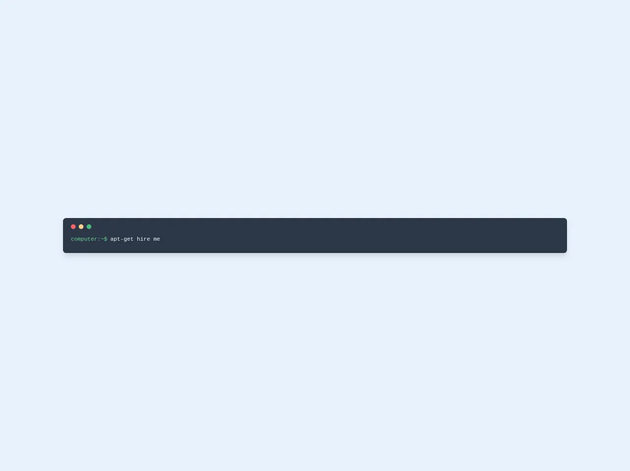
The preview of Simple Terminal ui component.
To create a Simple Terminal with Tailwind CSS, we will use the following HTML markup:
<div class="bg-gray-900 text-white rounded-lg p-4">
  <div class="flex items-center">
    <span class="text-green-500 mr-2">guest@tailwind:</span>
    <input type="text" class="bg-transparent border-none text-white flex-1" placeholder="Enter command...">
  </div>
  <div class="mt-2 text-gray-400">
    {{__placeholder1__}}
  </div>
</div>
Free download of the Simple Terminal's source code
The source code of Simple Terminal ui component.
To create a Simple Terminal with Tailwind CSS, we will use the following CSS:
@tailwind base;
@tailwind components;
@tailwind utilities;

.bg-gray-900 {
  background-color: #1a202c;
}

.text-green-500 {
  color: #48bb78;
}

.text-white {
  color: #fff;
}

.text-gray-400 {
  color: #cbd5e0;
}
<div class="w-full">
  <div class="coding inverse-toggle px-5 pt-4 shadow-lg text-gray-100 text-sm font-mono subpixel-antialiased
              bg-gray-800  pb-6 pt-4 rounded-lg leading-normal overflow-hidden">
      <div class="top mb-2 flex">
          <div class="h-3 w-3 bg-red-500 rounded-full"></div>
          <div class="ml-2 h-3 w-3 bg-orange-300 rounded-full"></div>
          <div class="ml-2 h-3 w-3 bg-green-500 rounded-full"></div>
      </div>
      <div class="mt-4 flex">
          <span class="text-green-400">computer:~$</span>
          <p class="flex-1 typing items-center pl-2">
              apt-get hire me
              <br>
          </p>
      </div>
  </div>
</div>
How to create a Simple Terminal with Tailwind CSS?
Now that we have the HTML and CSS code, we can start creating the Simple Terminal with Tailwind CSS. Here are the 6 tips to help you build a Simple Terminal like a pro:
1. Use the bg-gray-900 class to set the background color of the Simple Terminal.
<div class="bg-gray-900 text-white rounded-lg p-4">
2. Use the text-green-500 class to set the color of the user name.
<span class="text-green-500 mr-2">guest@tailwind:</span>
3. Use the input type="text" element to create a text input field.
<input type="text" class="bg-transparent border-none text-white flex-1" placeholder="Enter command...">
4. Use the mt-2 class to add some margin to the text area.
<div class="mt-2 text-gray-400">
5. Use the color classes to set the color of the text.
.text-green-500 {
  color: #48bb78;
}

.text-white {
  color: #fff;
}

.text-gray-400 {
  color: #cbd5e0;
}
6. Use the rounded-lg class to add some rounding to the corners of the Simple Terminal.
<div class="bg-gray-900 text-white rounded-lg p-4">
Conclusion
In this article, we discussed how to build a Simple Terminal with Tailwind CSS like a pro with the help of these 6 tips. Tailwind CSS is an excellent choice for creating a Simple Terminal ui component because it provides a set of pre-defined classes that can be used to style the component quickly and easily. Additionally, Tailwind CSS is highly customizable, which means that you can create your own classes to match your design needs.