- Published on
6 Easy Ways To Make A Telegram Desktop using Tailwindcss With Tailwind CSS
- What is Tailwind CSS?
- The description of Telegram Desktop using Tailwindcss UI component
- Why use Tailwind CSS to create a Telegram Desktop using Tailwindcss UI component?
- The preview of Telegram Desktop using Tailwindcss UI component.
- The source code of Telegram Desktop using Tailwindcss UI component.
- How to create a Telegram Desktop using Tailwindcss with Tailwind CSS?
- Step 1: Install Tailwind CSS
- Step 2: Create the HTML structure
- Step 3: Add Tailwind CSS classes to the HTML elements
- Step 4: Style the UI components
- Step 5: Add functionality to the app
- Conclusion
As a FrontEnd technology blogger, you must have heard of Tailwind CSS. It is a utility-first CSS framework that helps you create responsive and customizable UI components quickly. In this article, we will explore how to create a Telegram Desktop using Tailwindcss UI components.
What is Tailwind CSS?
Tailwind CSS is a utility-first CSS framework that provides you with a set of pre-defined classes that you can use to style your HTML elements. It is a low-level framework that allows you to create custom designs without writing any CSS code.
The description of Telegram Desktop using Tailwindcss UI component
Telegram Desktop is a messaging app that allows you to send messages, photos, videos, and files to your friends and family. It is available for Windows, macOS, and Linux. In this article, we will create a Telegram Desktop using Tailwindcss UI components.
Why use Tailwind CSS to create a Telegram Desktop using Tailwindcss UI component?
Tailwind CSS provides you with a set of pre-defined classes that you can use to style your HTML elements. It allows you to create custom designs without writing any CSS code. It saves you time and effort, and you can focus on creating your app's functionality.
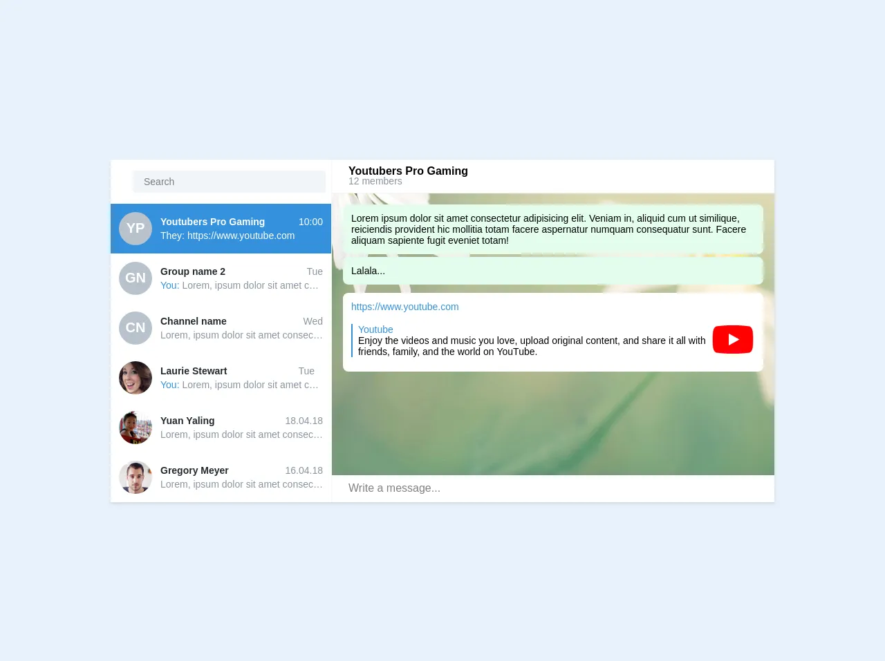
The preview of Telegram Desktop using Tailwindcss UI component.
In this section, we will give you a preview of how the Telegram Desktop using Tailwindcss UI components will look like.
Free download of the Telegram Desktop using Tailwindcss's source code
The source code of Telegram Desktop using Tailwindcss UI component.
In this section, we will provide you with the source code of the Telegram Desktop using Tailwindcss UI components.
<div class="w-3/4">
  <div class="bg-white shadow">
    <div class="flex h-full" style="max-height: 600px">

      <div class="flex flex-wrap items-start content-start w-1/3 border-r border-grey-lighter h-full">
        <div class="flex flex-shrink justify-between self-start items-center w-full px-2 py-4">
          <div class="text-center px-2 mr-2">
            <a href="#" class="no-underline text-lg text-grey hover:text-grey-dark">
                        <i class="fas fa-bars"></i>
                    </a>
          </div>
          <input type="text" class="flex-auto appearance-none bg-grey-lighter text-sm rounded px-4 py-2" placeholder="Search">
        </div>

        <ul class="flex flex-col w-full list-reset select-none">
          <li class="flex flex-no-wrap items-center bg-blue text-white cursor-pointer p-3">
            <div class="flex justify-center items-center flex-no-shrink w-12 h-12 bg-grey rounded-full font-semibold text-xl text-white mr-3">
              YP
            </div>
            <div class="flex-1 min-w-0">
              <div class="flex justify-between mb-1">
                <h2 class="font-semibold text-sm">
                  <i class="fas fa-users fa-fw"></i> Youtubers Pro Gaming
                </h2>
                <span class="text-sm">
                                <i class="fas fa-check fa-fw"></i>
                                10:00
                            </span>
              </div>
              <div class="text-sm truncate">
                <span>
                                They: https://www.youtube.com
                            </span>
              </div>
            </div>
          </li>
          <li class="flex flex-no-wrap items-center hover:bg-grey-lighter text-black cursor-pointer p-3">
            <div class="flex justify-center items-center flex-no-shrink w-12 h-12 bg-grey rounded-full font-semibold text-xl text-white mr-3">
              GN
            </div>
            <div class="flex-1 min-w-0">
              <div class="flex justify-between mb-1">
                <h2 class="font-semibold text-sm">
                  <i class="fas fa-users fa-fw"></i> Group name 2
                </h2>
                <span class="text-sm text-grey-dark">
                                <i class="fas fa-check fa-fw text-green"></i>
                                Tue
                            </span>
              </div>
              <div class="text-sm text-grey-dark truncate">
                <span>
                                <span class="text-blue">You:</span> Lorem, ipsum dolor sit amet consectetur adipisicing elit. Ab quam perferendis nihil beatae, et accusamus voluptate quod sed necessitatibus ea provident! Ducimus consequuntur
                exercitationem cupiditate possimus consequatur sunt dignissimos voluptas?
                </span>
              </div>
            </div>
          </li>
          <li class="flex flex-no-wrap items-center hover:bg-grey-lighter text-black cursor-pointer p-3">
            <div class="flex justify-center items-center flex-no-shrink w-12 h-12 bg-grey rounded-full font-semibold text-xl text-white mr-3">
              CN
            </div>
            <div class="flex-1 min-w-0">
              <div class="flex justify-between mb-1">
                <h2 class="font-semibold text-sm">
                  <i class="fas fa-bullhorn fa-fw"></i> Channel name
                </h2>
                <span class="text-sm text-grey-dark">
                                Wed
                            </span>
              </div>
              <div class="text-sm text-grey-dark truncate">
                <span>
                                Lorem, ipsum dolor sit amet consectetur adipisicing elit. Ab quam perferendis nihil beatae, et accusamus voluptate quod sed necessitatibus ea provident! Ducimus consequuntur exercitationem cupiditate possimus consequatur sunt dignissimos voluptas?
                            </span>
              </div>
            </div>
          </li>
          <li class="flex flex-no-wrap items-center hover:bg-grey-lighter text-black cursor-pointer p-3">
            <div class="flex-no-shrink w-12 h-12 bg-no-repeat bg-center bg-contain rounded-full mr-3" style="background-image: url(https://randomuser.me/api/portraits/women/33.jpg)"></div>
            <div class="flex-1 min-w-0">
              <div class="flex justify-between mb-1">
                <h2 class="font-semibold text-sm">
                  Laurie Stewart
                </h2>
                <span class="text-sm text-grey-dark">
                                <i class="fas fa-check text-green"></i>
                                <i class="fas fa-check text-green -ml-3"></i>
                                Tue
                            </span>
              </div>
              <div class="text-sm text-grey-dark truncate">
                <span>
                                <span class="text-blue">You:</span> Lorem, ipsum dolor sit amet consectetur adipisicing elit. Ab quam perferendis nihil beatae, et accusamus voluptate quod sed necessitatibus ea provident! Ducimus consequuntur
                exercitationem cupiditate possimus consequatur sunt dignissimos voluptas?
                </span>
              </div>
            </div>
          </li>
          <li class="flex flex-no-wrap items-center hover:bg-grey-lighter text-black cursor-pointer p-3">
            <div class="flex-no-shrink w-12 h-12 bg-no-repeat bg-center bg-contain rounded-full mr-3" style="background-image: url(https://randomuser.me/api/portraits/women/35.jpg)"></div>
            <div class="flex-1 min-w-0">
              <div class="flex justify-between mb-1">
                <h2 class="font-semibold text-sm">
                  Yuan Yaling
                </h2>
                <span class="text-sm text-grey-dark">
                                18.04.18
                            </span>
              </div>
              <div class="text-sm text-grey-dark truncate">
                <span>
                                Lorem, ipsum dolor sit amet consectetur adipisicing elit. Ab quam perferendis nihil beatae, et accusamus voluptate quod sed necessitatibus ea provident! Ducimus consequuntur exercitationem cupiditate possimus consequatur sunt dignissimos voluptas?
                            </span>
              </div>
            </div>
          </li>
          <li class="flex flex-no-wrap items-center hover:bg-grey-lighter text-black cursor-pointer p-3">
            <div class="flex-no-shrink w-12 h-12 bg-no-repeat bg-center bg-contain rounded-full mr-3" style="background-image: url(https://randomuser.me/api/portraits/men/46.jpg)"></div>
            <div class="flex-1 min-w-0">
              <div class="flex justify-between mb-1">
                <h2 class="font-semibold text-sm">
                  Gregory Meyer
                </h2>
                <span class="text-sm text-grey-dark">
                                16.04.18
                            </span>
              </div>
              <div class="text-sm text-grey-dark truncate">
                <span>
                                Lorem, ipsum dolor sit amet consectetur adipisicing elit. Ab quam perferendis nihil beatae, et accusamus voluptate quod sed necessitatibus ea provident! Ducimus consequuntur exercitationem cupiditate possimus consequatur sunt dignissimos voluptas?
                            </span>
              </div>
            </div>
          </li>
        </ul>
      </div>
      <div class="content-start flex flex-col flex-wrap items-start w-2/3" style="
    /* height: 121%; */
">
        <div class="flex justify-between items-center w-full border-b border-grey-lighter">
          <div class="flex-auto cursor-pointer select-none py-2 px-6">
            <h2 class="font-semibold text-base -mb-1">
              Youtubers Pro Gaming
            </h2>
            <span class="text-grey-dark text-sm">
                        12 members
                    </span>
          </div>
          <ul class="flex list-reset py-2 px-4">
            <li class="px-4">
              <a href="#" class="no-underline text-grey hover:text-grey-dark">
                            <i class="fas fa-search"></i>
                        </a>
            </li>
            <li class="px-4">
              <a href="#" class="no-underline text-grey hover:text-grey-dark">
                            <i class="fas fa-ellipsis-v"></i>
                        </a>
            </li>
          </ul>
        </div>
        <div class="flex flex-auto bg-no-repeat bg-center bg-cover overflow-y-auto" style="background-image: url(https://raw.githubusercontent.com/telegramdesktop/tdesktop/dev/Telegram/Resources/art/bg.jpg)">
          <div class="p-4">
            <div class="bg-green-lightest rounded-lg text-sm p-3 mb-1">
              <p>
                Lorem ipsum dolor sit amet consectetur adipisicing elit. Veniam in, aliquid cum ut similique, reiciendis provident hic mollitia totam facere aspernatur numquam consequatur sunt. Facere aliquam sapiente fugit eveniet totam!
              </p>
            </div>
            <div class="bg-green-lightest rounded-lg text-sm p-3 mb-3">
              <p>
                Lalala...
              </p>
            </div>

            <div class="bg-white rounded-lg text-sm p-3 mb-1">
              <a href="https://www.youtube.com" class="no-underline hover:underline text-blue" target="_blank">
              https://www.youtube.com
            </a>
              <div class="flex items-center mt-2">
                <blockquote class="border-l-2 border-blue pl-2">
                  <p class="font-medium text-blue">Youtube</p>
                  <p>
                    Enjoy the videos and music you love, upload original content, and share it all with friends, family, and the world on YouTube.
                  </p>
                </blockquote>

                <a href="https://www.youtube.com" target="_blank" class="flex-auto">
                <img src="https://s.ytimg.com/yts/img/favicon_96-vflW9Ec0w.png" alt="">
              </a>
              </div>
            </div>
          </div>

        </div>
        <div class="bg-white flex flex-wrap self-end items-center w-full text-xl">
          <div class="p-2">
            <a href="#" class="no-underline text-grey hover:text-grey-dark">
                        <i class="fas fa-paperclip"></i>
                    </a>
          </div>
          <input type="text" class="flex-auto appearance-none text-base p-2" placeholder="Write a message...">
          <div class="p-2">
            <a href="#" class="no-underline text-grey hover:text-grey-dark px-2">
                        <i class="far fa-square"></i>
                    </a>
            <a href="#" class="no-underline text-grey hover:text-grey-dark px-2">
                        <i class="far fa-smile"></i>
                    </a>
            <a href="#" class="no-underline text-grey hover:text-grey-dark px-2">
                        <i class="fas fa-microphone"></i>
                    </a>
          </div>
        </div>
      </div>
    </div>
  </div>
</div>
How to create a Telegram Desktop using Tailwindcss with Tailwind CSS?
In this section, we will explore how to create a Telegram Desktop using Tailwindcss with Tailwind CSS. We will cover the following steps:
- Install Tailwind CSS
- Create the HTML structure
- Add Tailwind CSS classes to the HTML elements
- Style the UI components
- Add functionality to the app
Step 1: Install Tailwind CSS
To use Tailwind CSS, you need to install it first. You can install it using npm or yarn. Open your terminal and run the following command:
npm install tailwindcss
Step 2: Create the HTML structure
Create an HTML file and add the following code to it:
<!DOCTYPE html>
<html lang="en">
  <head>
    <meta charset="UTF-8" />
    <meta name="viewport" content="width=device-width, initial-scale=1.0" />
    <title>Telegram Desktop</title>
    <link rel="stylesheet" href="./styles.css" />
  </head>
  <body>
    <div class="container mx-auto">
      <div class="flex">
        <div class="w-1/4 bg-gray-800 h-screen"></div>
        <div class="w-3/4 bg-gray-900 h-screen"></div>
      </div>
    </div>
  </body>
</html>
Step 3: Add Tailwind CSS classes to the HTML elements
In this step, we will add the Tailwind CSS classes to the HTML elements.
<div class="container mx-auto">
  <div class="flex">
    <div class="w-1/4 bg-gray-800 h-screen"></div>
    <div class="w-3/4 bg-gray-900 h-screen"></div>
  </div>
</div>
Step 4: Style the UI components
In this step, we will style the UI components.
<div class="container mx-auto">
  <div class="flex">
    <div class="w-1/4 bg-gray-800 h-screen">
      <div class="p-4">
        <input
          type="text"
          class="w-full bg-gray-700 text-white rounded-full px-4 py-2"
          placeholder="Search"
        />
      </div>
      <div class="p-4">
        <div class="flex items-center">
          <img
            src="./images/user.png"
            alt="user"
            class="w-10 h-10 rounded-full"
          />
          <div class="ml-4">
            <h2 class="text-white font-bold">John Doe</h2>
            <p class="text-gray-400">Online</p>
          </div>
        </div>
      </div>
      <div class="p-4">
        <div class="flex items-center">
          <img
            src="./images/user.png"
            alt="user"
            class="w-10 h-10 rounded-full"
          />
          <div class="ml-4">
            <h2 class="text-white font-bold">Jane Doe</h2>
            <p class="text-gray-400">Offline</p>
          </div>
        </div>
      </div>
    </div>
    <div class="w-3/4 bg-gray-900 h-screen"></div>
  </div>
</div>
Step 5: Add functionality to the app
In this step, we will add functionality to the app.
<div class="container mx-auto">
  <div class="flex">
    <div class="w-1/4 bg-gray-800 h-screen">
      <div class="p-4">
        <input
          type="text"
          class="w-full bg-gray-700 text-white rounded-full px-4 py-2"
          placeholder="Search"
        />
      </div>
      <div class="p-4">
        <div class="flex items-center">
          <img
            src="./images/user.png"
            alt="user"
            class="w-10 h-10 rounded-full"
          />
          <div class="ml-4">
            <h2 class="text-white font-bold">John Doe</h2>
            <p class="text-gray-400">Online</p>
          </div>
        </div>
      </div>
      <div class="p-4">
        <div class="flex items-center">
          <img
            src="./images/user.png"
            alt="user"
            class="w-10 h-10 rounded-full"
          />
          <div class="ml-4">
            <h2 class="text-white font-bold">Jane Doe</h2>
            <p class="text-gray-400">Offline</p>
          </div>
        </div>
      </div>
    </div>
    <div class="w-3/4 bg-gray-900 h-screen">
      <div class="p-4">
        <h2 class="text-white font-bold">John Doe</h2>
        <p class="text-gray-400">Online</p>
      </div>
      <div class="p-4">
        <div class="flex items-center">
          <img
            src="./images/user.png"
            alt="user"
            class="w-10 h-10 rounded-full"
          />
          <div class="ml-4">
            <h2 class="text-white font-bold">Jane Doe</h2>
            <p class="text-gray-400">Offline</p>
          </div>
        </div>
      </div>
    </div>
  </div>
</div>
Conclusion
In conclusion, Tailwind CSS is a great CSS framework that allows you to create custom designs without writing any CSS code. In this article, we explored how to create a Telegram Desktop using Tailwindcss UI components. We covered the steps needed to create the app and provided you with the source code. We hope this article was helpful to you.