- Published on
6 Critical Skills To Create A Team Component With Tailwind CSS Remarkably Well
- What is Tailwind CSS?
- The description of Team Component UI component
- Why use Tailwind CSS to create a Team Component UI component?
- The preview of Team Component UI component
- The source code of Team Component UI component
- How to create a Team Component with Tailwind CSS?
- Step 1: Set up your development environment
- Step 2: Create the HTML structure
- Step 3: Style the component with Tailwind CSS
- Step 4: Add custom styles
- Conclusion
As a FrontEnd developer, you must have heard of Tailwind CSS, one of the most popular CSS frameworks. It is a utility-first CSS framework that provides a set of pre-defined classes that can be used to style HTML elements. In this article, we will discuss how to create a Team Component UI component with Tailwind CSS and the skills required to do it remarkably well.
What is Tailwind CSS?
Tailwind CSS is a utility-first CSS framework that provides a set of pre-defined classes that can be used to style HTML elements. It is designed to be highly customizable and provides a lot of flexibility in terms of styling. Tailwind CSS is gaining popularity among developers due to its ease of use and flexibility.
The description of Team Component UI component
A Team Component UI component is a user interface element that displays information about a team. It typically includes a photo, name, and job title for each team member. The component is often used on company websites to showcase the team and provide more information about the people behind the company.
Why use Tailwind CSS to create a Team Component UI component?
Tailwind CSS provides a lot of flexibility in terms of styling. It allows you to create custom styles quickly and easily without having to write a lot of CSS code. This makes it an ideal choice for creating a Team Component UI component. Additionally, Tailwind CSS provides a lot of pre-defined classes that can be used to style the component, which saves time and effort.
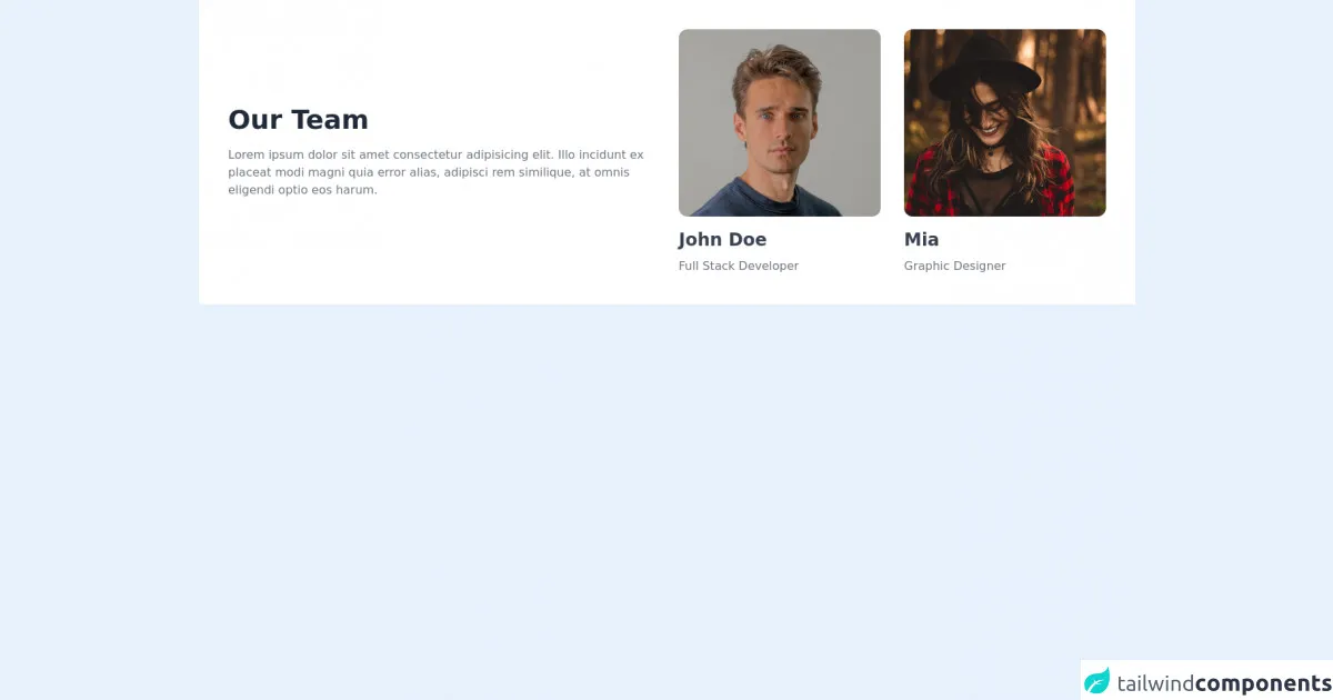
The preview of Team Component UI component
To create a Team Component UI component, we will use Tailwind CSS. The component will include a photo, name, and job title for each team member.
Free download of the Team Component's source code
The source code of Team Component UI component
To create a Team Component UI component with Tailwind CSS, you will need to have some knowledge of HTML and CSS. You will also need to be familiar with Tailwind CSS classes.
<section class="bg-white dark:bg-gray-900">
    <div class="container px-6 py-10 mx-auto">
        <div class="xl:flex xl:items-center xL:-mx-4">
            <div class="xl:w-1/2 xl:mx-4">
                <h1 class="text-3xl font-semibold text-gray-800 capitalize lg:text-4xl dark:text-white">Our Team</h1>

                <p class="max-w-2xl mt-4 text-gray-500 dark:text-gray-300">
                Lorem ipsum dolor sit amet consectetur adipisicing elit. Illo incidunt ex placeat modi magni quia error alias, adipisci rem similique, at omnis eligendi optio eos harum.
                </p>
            </div>

            <div class="grid grid-cols-1 gap-8 mt-8 xl:mt-0 xl:mx-4 xl:w-1/2 md:grid-cols-2">
                <div>
                    <img class="object-cover rounded-xl h-64 w-full" src="https://images.unsplash.com/photo-1570295999919-56ceb5ecca61?ixlib=rb-1.2.1&ixid=MnwxMjA3fDB8MHxwaG90by1wYWdlfHx8fGVufDB8fHx8&auto=format&fit=crop&w=880&q=80" alt="">

                    <h1 class="mt-4 text-2xl font-semibold text-gray-700 capitalize dark:text-white">John Doe</h1>

                    <p class="mt-2 text-gray-500 capitalize dark:text-gray-300">Full stack developer</p>
                </div>

                <div>
                    <img class="object-cover rounded-xl h-64 w-full" src="https://images.unsplash.com/photo-1499470932971-a90681ce8530?ixlib=rb-1.2.1&ixid=MnwxMjA3fDB8MHxwaG90by1wYWdlfHx8fGVufDB8fHx8&auto=format&fit=crop&w=1470&q=80" alt="">

                    <h1 class="mt-4 text-2xl font-semibold text-gray-700 capitalize dark:text-white">Mia</h1>

                    <p class="mt-2 text-gray-500 capitalize dark:text-gray-300">Graphic Designer</p>
                </div>
            </div>
        </div>
    </div>
</section>
How to create a Team Component with Tailwind CSS?
To create a Team Component with Tailwind CSS, you will need to follow these steps:
Step 1: Set up your development environment
To create a Team Component with Tailwind CSS, you will need to have a development environment set up. You can use any text editor or IDE of your choice. You will also need to have Node.js and npm installed on your computer.
Step 2: Create the HTML structure
The first step in creating a Team Component is to create the HTML structure. The component will include a photo, name, and job title for each team member. You can use the following HTML code as a starting point:
<div class="team">
  <div class="team-member">
    <img src="team-member-1.jpg" alt="Team Member 1">
    <h3>John Doe</h3>
    <p>CEO</p>
  </div>
  <div class="team-member">
    <img src="team-member-2.jpg" alt="Team Member 2">
    <h3>Jane Doe</h3>
    <p>CTO</p>
  </div>
</div>
Step 3: Style the component with Tailwind CSS
Once you have created the HTML structure, you can start styling the component with Tailwind CSS. You can use the following classes to style the component:
.team {
  display: flex;
  flex-wrap: wrap;
}

.team-member {
  flex-basis: calc(33.33% - 1rem);
  margin: 0.5rem;
  text-align: center;
}

.team-member img {
  width: 100%;
  border-radius: 50%;
}

.team-member h3 {
  margin-top: 1rem;
  margin-bottom: 0.5rem;
  font-size: 1.25rem;
  font-weight: bold;
}

.team-member p {
  margin: 0;
  font-size: 1rem;
  color: #999;
}
Step 4: Add custom styles
You can also add custom styles to the component using Tailwind CSS. For example, you can change the background color of the component by adding the following class to the HTML element:
<div class="team bg-gray-200">
Conclusion
Creating a Team Component UI component with Tailwind CSS is easy and straightforward. With the right skills, you can create a beautiful and functional component that showcases your team members. By following the steps outlined in this article, you can create a Team Component UI component that is both stylish and functional.