- Published on
What You Need To Make A Task Widget with Progress bar With Tailwind CSS
- The description of Task Widget with Progress bar ui component
- Why use Tailwind CSS to create a Task Widget with Progress bar ui component?
- The preview of Task Widget with Progress bar ui component.
- The source code of Task Widget with Progress bar ui component.
- How to create a Task Widget with Progress bar with Tailwind CSS?
- Conclusion
Tailwind CSS is a utility-first CSS framework that allows developers to quickly and easily create custom user interfaces. It provides a set of pre-defined CSS classes that can be used to style HTML elements without the need for writing custom CSS code. Tailwind CSS is highly customizable and can be configured to fit the needs of any project.
The description of Task Widget with Progress bar ui component
A task widget with progress bar is a user interface component that displays the progress of a task in a visual way. It is commonly used in task management applications to help users keep track of their progress and stay motivated to complete their tasks. The widget typically consists of a progress bar that fills up as the task is completed, along with a description of the task and any other relevant information.
Why use Tailwind CSS to create a Task Widget with Progress bar ui component?
Tailwind CSS is an excellent choice for creating a task widget with progress bar UI component for several reasons:
- Tailwind CSS provides a set of pre-defined classes that can be used to style the widget quickly and easily.
- Tailwind CSS is highly customizable, allowing developers to tweak the widget's appearance to fit the needs of their project.
- Tailwind CSS is lightweight and fast, ensuring that the widget loads quickly and doesn't slow down the user experience.
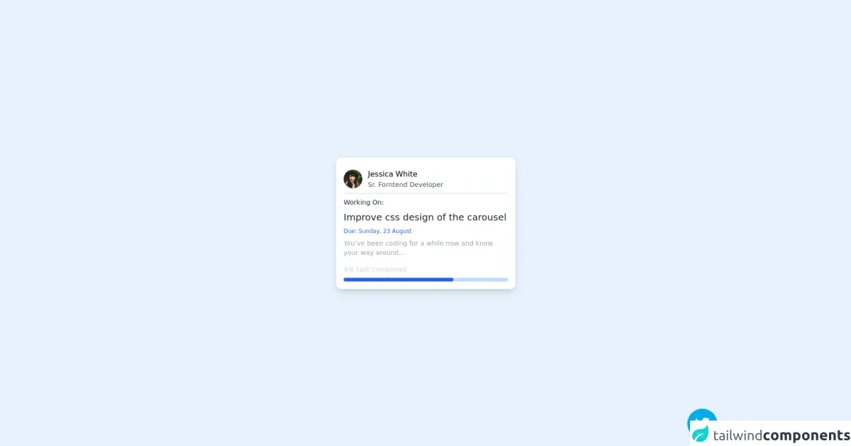
The preview of Task Widget with Progress bar ui component.
To create a task widget with progress bar UI component, we can use Tailwind CSS to style the HTML elements. Here's a preview of what the widget might look like:
<div class="bg-gray-100 rounded-lg p-4">
  <div class="flex items-center justify-between mb-2">
    <h2 class="text-lg font-medium">Task Name</h2>
    <span class="text-gray-500 text-sm">50%</span>
  </div>
  <div class="bg-gray-300 rounded-full h-2">
    <div class="bg-blue-500 rounded-full h-2" style="width: 50%"></div>
  </div>
  <p class="text-sm text-gray-500 mt-2">Task Description</p>
</div>
Free download of the Task Widget with Progress bar's source code
The source code of Task Widget with Progress bar ui component.
To create a task widget with progress bar UI component using Tailwind CSS, we can use the following HTML and CSS code:
<div class="bg-gray-100 rounded-lg p-4">
  <div class="flex items-center justify-between mb-2">
    <h2 class="text-lg font-medium">Task Name</h2>
    <span class="text-gray-500 text-sm">50%</span>
  </div>
  <div class="bg-gray-300 rounded-full h-2">
    <div class="bg-blue-500 rounded-full h-2" style="width: 50%"></div>
  </div>
  <p class="text-sm text-gray-500 mt-2">Task Description</p>
</div>
<!-- follow me on twitter @asad_codes -->
<div class="flex flex-wrap place-items-center h-screen">
    <!-- card -->
    <div class="shadow-lg rounded-xl w-72 md:w-96 p-4 bg-white relative overflow-hidden">
        <a href="#" class="w-full h-full block">
            <div class="flex items-center border-b-2 mb-2 py-2">
                <img class='w-10 h-10 object-cover rounded-full' alt='User avatar' src='https://images.unsplash.com/photo-1477118476589-bff2c5c4cfbb?ixlib=rb-1.2.1&ixid=eyJhcHBfaWQiOjEyMDd9&auto=format&fit=crop&w=200&q=200'>

                <div class="pl-3">
                    <div class="font-medium">
                        Jessica White
                    </div>
                    <div class="text-gray-600 text-sm">
                        Sr. Forntend Developer
                    </div>
                </div>
            </div>
            <div class="w-full">
                <p class="text-gray-800 text-sm font-medium mb-2">
                    Working On:
                </p>
                <p class="text-gray-800 text-xl font-medium mb-2">
                    Improve css design of the carousel
                </p>
                <p class="text-blue-600 text-xs font-medium mb-2">
                    Due: Sunday, 23 August
                </p>
                <p class="text-gray-400 text-sm mb-4">
                    You’ve been coding for a while now and know your way around...
                </p>
            </div>
            <div class="flex items-center justify-between my-2">
                <p class="text-gray-300 text-sm">
                    4/6 task completed
                </p>
            </div>
            <div class="w-full h-2 bg-blue-200 rounded-full">
                <div class="w-2/3 h-full text-center text-xs text-white bg-blue-600 rounded-full">
                </div>
            </div>
        </a>
    </div>
</div>

<!-- Does this resource worth a follow? -->
<div class="flex items-end justify-end fixed bottom-0 right-0 mb-4 mr-4 z-10">
    <div>
        <a title="Follow me on twitter" href="https://www.twitter.com/asad_codes" target="_blank" class="block w-16 h-16 rounded-full transition-all shadow hover:shadow-lg transform hover:scale-110 hover:rotate-12">
            <img class="object-cover object-center w-full h-full rounded-full" src="https://www.imore.com/sites/imore.com/files/styles/large/public/field/image/2019/12/twitter-logo.jpg"/>
        </a>
    </div>
</div>
How to create a Task Widget with Progress bar with Tailwind CSS?
To create a task widget with progress bar UI component using Tailwind CSS, follow these steps:
- Create a new HTML file and add the following code:
<div class="bg-gray-100 rounded-lg p-4">
  <div class="flex items-center justify-between mb-2">
    <h2 class="text-lg font-medium">Task Name</h2>
    <span class="text-gray-500 text-sm">50%</span>
  </div>
  <div class="bg-gray-300 rounded-full h-2">
    <div class="bg-blue-500 rounded-full h-2" style="width: 50%"></div>
  </div>
  <p class="text-sm text-gray-500 mt-2">Task Description</p>
</div>
- Add the Tailwind CSS CDN to the head of the HTML file:
<head>
  <link rel="stylesheet" href="https://cdn.jsdelivr.net/npm/tailwindcss@latest/dist/tailwind.min.css">
</head>
- Customize the widget's appearance by adding or modifying Tailwind CSS classes as needed. For example, you can change the background color of the widget by adding the
bg-red-500class to the outerdivelement:
<div class="bg-red-500 rounded-lg p-4">
  ...
</div>
- Save the HTML file and open it in a web browser to see the task widget with progress bar UI component.
Conclusion
In conclusion, Tailwind CSS is an excellent choice for creating a task widget with progress bar UI component. It provides a set of pre-defined classes that can be used to style the widget quickly and easily, and it is highly customizable, ensuring that the widget fits the needs of any project. By following the steps outlined in this article, you can create a task widget with progress bar UI component using Tailwind CSS in no time.