- Published on
6 Incredibly Easy Ways To Build A Tailwindcss card component With Tailwind CSS Better While Spending Less
- What is Tailwind CSS?
- The Description of Tailwindcss Card Component UI Component
- Why use Tailwind CSS to create a Tailwindcss Card Component UI Component?
- The Preview of Tailwindcss Card Component UI Component
- The Source Code of Tailwindcss Card Component UI Component
- How to Create a Tailwindcss Card Component with Tailwind CSS?
- 1. Start with a container
- 2. Add a header section
- 3. Add a body section
- 4. Add a footer section
- 5. Add shadows and rounded corners
- 6. Customize the card with Tailwind CSS
- Conclusion
What is Tailwind CSS?
Tailwind CSS is a utility-first CSS framework that allows developers to quickly and easily create custom user interfaces. It provides a set of pre-defined CSS classes that can be used to style HTML elements, and also allows for the creation of custom classes. Tailwind CSS is highly customizable and can be configured to suit the needs of any project.
The Description of Tailwindcss Card Component UI Component
A card component is a UI element that is commonly used to display content in a visually appealing way. It typically consists of a container with a header, body, and footer section. The header section usually contains a title or image, the body section contains the main content, and the footer section contains additional information or actions.
Why use Tailwind CSS to create a Tailwindcss Card Component UI Component?
Tailwind CSS provides a set of pre-defined classes that can be used to quickly and easily create a card component. These classes can be used to style the different sections of the card, such as the header, body, and footer, as well as to add additional features such as shadows and rounded corners. Using Tailwind CSS to create a card component can save time and effort, as it eliminates the need to write custom CSS code.
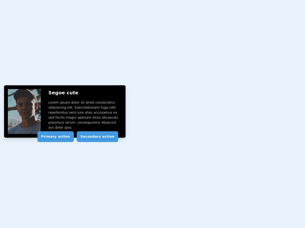
The Preview of Tailwindcss Card Component UI Component
Creating a card component with Tailwind CSS is incredibly easy. Here is a preview of what the final product will look like:
Free download of the Tailwindcss card component's source code
The Source Code of Tailwindcss Card Component UI Component
To create a card component with Tailwind CSS, you can use the following HTML and CSS code:
<!-- This is an example component -->
<div class="container mx-auto py-12 px-4">
        <div class="inline-grid max-w-xs sm:max-w-xs lg:max-w-lg lg:flex bg-black rounded-lg border shadow-lg pb-6 lg:pb-0">
            <div class="w-full lg:w-1/3 lg:p-4">
                <!-- <img src="img/profile.jpg" alt="profile picture" class="rounded-lg"> -->
                <img src="https://source.unsplash.com/nqEJ548Hqjs/800x600" alt="image" class="h-64 lg:h-full object-cover object-center w-full">
            </div>

            <div class="w-full lg:w-2/3 p-4">
                <div class="inline-grid">
                    <p class="work-sans font-semibold text-xl text-white">Segoe cute</p>
                    <p class="raleway text-sm my-4 text-white opacity-75">Lorem ipsum dolor sit amet consectetur adipisicing elit. Exercitationem fuga odit repellendus vero iure alias accusamus ex sed facilis magni aperiam dicta obcaecati, possimus rerum, consequuntur deserunt aut dolor ipsa.</p>
                </div>
            </div>
        </div>
        <div class="flex justify-center -mt-8 rounded-b-lg max-w-xs lg:max-w-lg lg:-mt-8 lg:justify-end lg:pr-8 py-1">
            <button type="button" class="text-white py-3 px-4 rounded-lg bg-blue-500"><p class="work-sans font-semibold text-sm tracking-wide">Primary action</p></button>
            <button type="button" class="py-3 px-4 bg-blue-500 rounded-lg ml-3 text-white"><p class="work-sans font-semibold text-sm tracking-wide">Secondary action</p></button>
        </div>
    </div>
How to Create a Tailwindcss Card Component with Tailwind CSS?
Here are 6 incredibly easy ways to build a Tailwindcss card component with Tailwind CSS better while spending less:
1. Start with a container
The first step in creating a card component is to create a container element. This element will serve as the main container for the card and will hold all of the other elements.
<div class="bg-white rounded-lg shadow-lg">
  <!-- Card content goes here -->
</div>
2. Add a header section
The header section of the card typically contains a title or image. To add a header section, you can use the following code:
<div class="bg-white rounded-lg shadow-lg">
  <div class="bg-gray-200 rounded-t-lg p-4">
    <h2 class="text-lg font-bold">Card Title</h2>
  </div>
  <!-- Card content goes here -->
</div>
3. Add a body section
The body section of the card typically contains the main content. To add a body section, you can use the following code:
<div class="bg-white rounded-lg shadow-lg">
  <div class="bg-gray-200 rounded-t-lg p-4">
    <h2 class="text-lg font-bold">Card Title</h2>
  </div>
  <div class="p-4">
    <p class="text-gray-700">Card content goes here</p>
  </div>
</div>
4. Add a footer section
The footer section of the card typically contains additional information or actions. To add a footer section, you can use the following code:
<div class="bg-white rounded-lg shadow-lg">
  <div class="bg-gray-200 rounded-t-lg p-4">
    <h2 class="text-lg font-bold">Card Title</h2>
  </div>
  <div class="p-4">
    <p class="text-gray-700">Card content goes here</p>
  </div>
  <div class="bg-gray-200 rounded-b-lg p-4">
    <p class="text-gray-700">Card footer goes here</p>
  </div>
</div>
5. Add shadows and rounded corners
To add shadows and rounded corners to the card, you can use the following classes:
<div class="bg-white rounded-lg shadow-lg">
  <!-- Card content goes here -->
</div>
6. Customize the card with Tailwind CSS
Tailwind CSS provides a wide range of classes that can be used to customize the card component. For example, you can change the background color of the header section by using the bg-red-500 class:
<div class="bg-white rounded-lg shadow-lg">
  <div class="bg-red-500 rounded-t-lg p-4">
    <h2 class="text-lg font-bold text-white">Card Title</h2>
  </div>
  <!-- Card content goes here -->
</div>
Conclusion
In conclusion, creating a card component with Tailwind CSS is incredibly easy and can be done in just a few simple steps. By using Tailwind CSS, you can save time and effort while still creating a visually appealing and functional UI element. With the wide range of classes and customization options available, Tailwind CSS is the perfect choice for creating card components and other UI elements.