- Published on
The Ninja Guide To How To Build A Tailwind Spotify Player With Tailwind CSS Better
- What is Tailwind CSS?
- The description of Tailwind Spotify Player ui component
- Why use Tailwind CSS to create a Tailwind Spotify Player ui component?
- The preview of Tailwind Spotify Player ui component
- The source code of Tailwind Spotify Player ui component
- How to create a Tailwind Spotify Player with Tailwind CSS?
- Step 1: Set up your project
- Step 2: Add the HTML markup
- Step 3: Add the CSS styles
- Step 4: Add the JavaScript functionality
- Conclusion
Are you a music lover who wants to create a Spotify player for your website or application? Or maybe you're a FrontEnd technology enthusiast who wants to learn how to create a Tailwind Spotify Player with Tailwind CSS? If so, you're in the right place! In this article, we'll guide you through the process of building a Tailwind Spotify Player with Tailwind CSS, step by step.
What is Tailwind CSS?
Tailwind CSS is a utility-first CSS framework that allows you to create custom designs without writing any CSS code. It provides a set of pre-defined classes that you can use to style your HTML elements. With Tailwind CSS, you can create responsive and mobile-first designs quickly and easily.
The description of Tailwind Spotify Player ui component
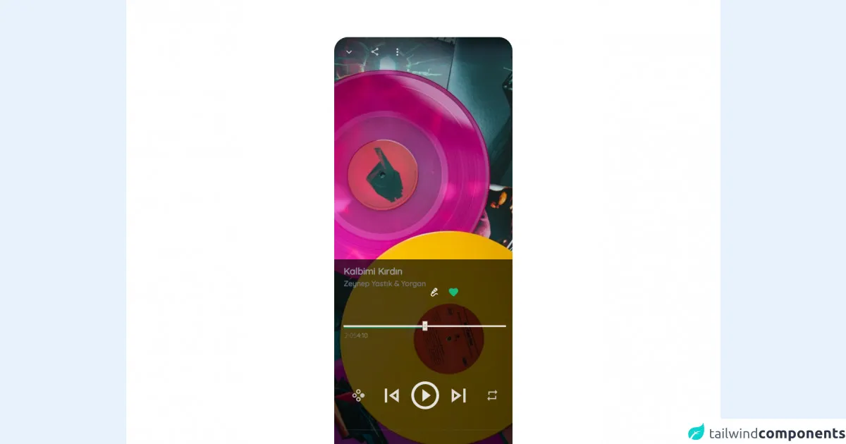
The Tailwind Spotify Player is a user interface component that allows you to play music from Spotify on your website or application. It consists of a player bar that displays the song title, artist name, album cover, and play/pause button. You can customize the design of the player to match your website or application's theme.
Why use Tailwind CSS to create a Tailwind Spotify Player ui component?
Tailwind CSS is an excellent choice for creating a Tailwind Spotify Player ui component for several reasons:
- Tailwind CSS provides a set of pre-defined classes that you can use to style your HTML elements. This makes it easy to create a custom design without writing any CSS code.
- Tailwind CSS is mobile-first and responsive, which means that your Tailwind Spotify Player will look great on all devices.
- Tailwind CSS is highly customizable, which means that you can easily customize the design of your Tailwind Spotify Player to match your website or application's theme.
The preview of Tailwind Spotify Player ui component
To give you an idea of what the Tailwind Spotify Player ui component looks like, here's a preview:
Free download of the Tailwind Spotify Player's source code
The source code of Tailwind Spotify Player ui component
Here's the source code for the Tailwind Spotify Player ui component:
<!-- MDI Icons -->
<link rel="stylesheet" href="https://cdn.materialdesignicons.com/6.5.95/css/materialdesignicons.min.css" />

<!-- AlpineJS -->
<script src="https://cdnjs.cloudflare.com/ajax/libs/alpinejs/3.8.1/cdn.min.js" defer></script>

<!-- Quicksand -->
<link rel="preconnect" href="https://fonts.googleapis.com">
<link rel="preconnect" href="https://fonts.gstatic.com" crossorigin>
<link href="https://fonts.googleapis.com/css2?family=Quicksand:wght@300;400;500&display=swap" rel="stylesheet">

<style>
    html, body {
        font-family: 'Quicksand', sans-serif;
    }

    /* alpinejs */
    [x-cloak] {
        display: none !important;
    }

    /* custom rounded classes */
    .rounded-xxl {
        border-radius: 30px;
    }

    .rounded-t-xxl {
        border-top-left-radius: 30px;
        border-top-right-radius: 30px;
    }

    .rounded-b-xxl {
        border-bottom-left-radius: 30px;
        border-bottom-right-radius: 30px;
    }

    /* Range Input */

    .x-slider * {
        width: 350px !important;
    }

    .x-slider input::-webkit-slider-thumb {
        width: 20px;
        height: 20px;
        border-radius: 50%;
        background-color: #636363;
        border: 5px solid #24c55d;
        box-shadow: 0px 0px 40px -4px rgba(0, 0, 0, 0.76);
        transition: all 0.1s ease-in-out;
        outline: none;
        appearance: none;
    }

    .x-slider input::-webkit-slider-thumb:hover {
        border-color: #1bb350;
    }

    /* Player Controls */
    .x-player-controls .play-pause{
        transform: scale(3);
    }

    .x-player-controls .play-pause:hover{
        transform: scale(3.1);
    }

    .x-player-controls .center-controls{
        transform: scale(2.5);
    }

    .x-player-controls .center-controls:hover{
        transform: scale(2.7);
    }

    .x-player-controls .side-controls{
        transform: scale(1.8);
    }

    .x-player-controls .side-controls:hover{
        transform: scale(2);
    }
</style>

<!-- Page Container -->
<div class="flex flex-col items-center justify-center bg-white" x-cloak x-data="appData()" x-init="appInit()">

    <!-- Player -->
    <div class="relative min-h-screen bg-white
            rounded-xxl bg-amber-500 w-96 mx-auto my-20">

        <!-- Player Cover -->
        <img class="absolute rounded-xxl object-cover h-full w-full"
            src="https://images.unsplash.com/photo-1619983081563-430f63602796?fit=crop&w=450&h=800&q=80"
            alt="Product Preview" />

        <div class="flex flex-col absolute h-full w-full">
            <!-- Top -->
            <div class="flex-none group h-20 w-fit-screen rounded-t-xxl mb-auto">
                <!-- Shadow Bar -->
                <div class="flex flex-row flex-grow justify-start rounded-t-xxl
                    h-16 w-fit-screen px-3 space-x-2
                    bg-gradient-to-b from-black/70 via-gray-800/70 to-transparent
                    opacity-80 group-hover:opacity-100
                    transition-all ease-in-out duration-200 delay-100">

                    <!-- Slide Down Button -->
                    <button class="flex-none px-1 h-10 w-10 my-auto hover:scale-125
                        transition-all duration-200 ease-in-out" title="Slide Down">
                        <i class="mdi mdi-chevron-down text-2xl text-gray-200
                            hover:text-white transition-all duration-200"></i>
                    </button>

                    <!-- Grow Space -->
                    <div class="grow"></div>

                    <!-- Share Button -->
                    <button class="flex-none h-10 w-10 my-auto hover:scale-125
                        transition-all duration-200 ease-in-out" title="Share With">
                        <i class="mdi mdi-share-variant-outline text-xl text-gray-200
                            hover:text-white transition-all duration-200"></i>
                    </button>

                    <!-- Options Button -->
                    <button class="flex-none h-10 w-10 my-auto hover:scale-125
                        transition-all duration-200 ease-in-out" title="Show Options">
                        <i class="mdi mdi-dots-vertical text-2xl text-gray-200
                            hover:text-white transition-all duration-200"></i>
                    </button>
                </div>
            </div>

            <div class="my-auto"></div>

            <!-- Player -->
            <div class="flex-none group h-2/4 w-fit-screen rounded-b-xxl mt-auto backdrop-blur-md">
                <!-- Shadow Bar -->
                <div class="flex flex-col justify-start rounded-b-xxl
                    h-full w-fit-screen px-3 space-x-2 my-auto
                    bg-black/70 via-gray-800/70 to-transparent
                    opacity-95 group-hover:opacity-100
                    transition-all ease-in-out duration-200 delay-100">

                    <!-- Song Details -->
                    <div class="flex flex-row flex-grow justify-start mt-3 pl-2">
                        <div class="flex flex-col">
                            <div class="text-gray-400/90 text-xl font-semibold select-none">
                                Kalbimi Kırdın
                            </div>

                            <div class="text-gray-500/90 text-base font-semibold select-none">
                                Zeynep Yastık & Yorgan
                            </div>
                        </div>

                        <!-- Grow Space -->
                        <div class="grow"></div>

                        <div class="flex flex-row">
                            <!-- Make Karaoke -->
                            <button class="flex-none px-1 h-10 w-10 my-auto hover:scale-125 rotate-45
                                transition-all duration-200 ease-in-out" title="Karaoke">
                                <i class="mdi mdi-microphone-variant text-2xl text-gray-200
                                    hover:text-white transition-all duration-200"></i>
                            </button>

                            <!-- Like This Song -->
                            <button class="flex-none px-1 h-10 w-10 my-auto hover:scale-125
                                transition-all duration-200 ease-in-out" title="Like This Song">
                                <i class="mdi mdi-heart text-2xl text-green-500 shadow-lg
                                    hover:text-white transition-all duration-200"></i>
                            </button>
                        </div>
                    </div>

                    <!-- Player Slider Container -->
                    <div class="x-slider flex relative my-3">
                        <!-- Player Slider -->
                        <div class="x-slider inline justify-center rounded-md">
                            <!-- Range Input -->
                            <input class="absolute bg-transparent rounded-md
                                z-10 h-1 w-80 outline-0 appearance-none" type="range"
                                step="1" min='0' max="100" value="0"
                                x-model="sliderValue"
                                x-on:change.debounce="sliderProgressTime = sliderProgressToTime(sliderValue, songLength)">

                            <!-- Slider Placeholder -->
                            <div class="absolute z-0 w-80 h-0.5 mt-0.5 rounded-md bg-gray-500/70"></div>

                            <!-- Progress -->
                            <div class="absolute z-0 w-80 h-1.5 rounded-md bg-green-600
                                bg-gradient-to-r from-emerald-700 to-green-500"
                                x-bind:style="'width: ' + (sliderValue * 3.5) + 'px !important; '"></div>
                            <!-- x-slider is width 350px -->
                        </div>
                    </div>

                    <!-- Duration Container -->
                    <div class="flex flex-row flex-grow justify-start px-0.5">
                        <!-- Current Time -->
                        <div class="text-gray-500/90 text-sm select-none" x-text="sliderProgressTime"></div>

                        <!-- Grow Space -->
                        <div class="grow"></div>

                        <!-- Total Time -->
                        <div class="text-gray-400/90 text-sm select-none pr-1" x-text="secondsToDuration(songLength)"></div>
                    </div>

                    <!-- Player Controls Container -->
                    <div class="x-player-controls flex flex-row flex-grow justify-start
                        space-x-8 mx-4 px-3">
                        <!-- Suffle -->
                        <button class="side-controls flex-none px-1 h-10 w-10 my-auto
                            transition-all duration-200 ease-in-out" title="Suffle">
                            <i class="mdi mdi-gamepad-circle-right text-gray-300/90
                                hover:text-white transition-all duration-200"></i>
                        </button>

                        <!-- Previous - Begining -->
                        <button class="center-controls flex-none px-1 h-10 w-10 my-auto
                            transition-all duration-200 ease-in-out" title="Previous">
                            <i class="mdi mdi-skip-previous-outline text-2xl text-gray-200/95
                                hover:text-white transition-all duration-200"></i>
                        </button>

                        <!-- Play - Pause -->
                        <button class="play-pause flex-none px-1 h-10 w-10 my-auto
                            transition-all duration-200 ease-in-out" title="Play/Pause">
                            <i class="mdi mdi-play-circle-outline text-2xl text-gray-200
                                hover:text-white transition-all duration-200"></i>
                        </button>

                        <!-- Next - End -->
                        <button class="center-controls flex-none px-1 h-10 w-10 my-auto
                            transition-all duration-200 ease-in-out" title="Next Song">
                            <i class="mdi mdi-skip-next-outline text-2xl text-gray-200/95
                                hover:text-white transition-all duration-200"></i>
                        </button>

                        <!-- Repeat -->
                        <button class="side-controls flex-none px-1 h-10 w-10 my-auto
                            transition-all duration-200 ease-in-out" title="Repeat">
                            <i class="mdi mdi-repeat text-gray-300/90
                                hover:text-white transition-all duration-200"></i>
                        </button>
                    </div>

                    <!-- Source Playlist -->
                    <div class="flex flex-row flex-grow justify-start
                        border-t border-gray-600/50 mt-5 pt-1">
                        <!-- Album -->
                        <button class="side-controls flex-none
                            h-10 w-10 my-auto hover:scale-125
                            transition-all duration-200">
                            <!-- Cover -->
                            <img class="h-8 w-8 rounded-full border border-gray-600"
                                src="https://images.unsplash.com/photo-1612982663544-54e9d6d2818d?fit=crop&w=50&h=50&q=80" alt="Album">
                        </button>

                        <!-- Playlist -->
                        <div class="flex flex-col my-auto mx-2 ">
                            <!-- Title -->
                            <div class="text-gray-500/90 text-xs font-semibold select-none cursor-pointer">
                                From Playlist
                            </div>

                            <!-- Playlist Name -->
                            <div class="text-gray-300/90 text-base font-semibold select-none cursor-pointer">
                                Daily Discover
                            </div>
                        </div>

                        <!-- Grow Space -->
                        <div class="grow"></div>

                        <!-- Slide Down Button -->
                        <button class="flex-none px-1 h-10 w-10 my-auto hover:scale-125
                            transition-all duration-200 ease-in-out" title="Show Playlist">
                            <i class="mdi mdi-chevron-up text-2xl text-gray-200
                                hover:text-white transition-all duration-200"></i>
                        </button>
                    </div>
                </div>
            </div>
        </div>
    </div>

    <!-- Notes -->
    <span class="text-center font-bold my-20">
        MDI (npm i @mdi/font) reuqired for icons

        <hr class="my-4">

        <a href="https://egoistdeveloper.github.io/twcss-to-sass-playground/" target="_blank" class="text-blue-600">
            Convetert to SASS
        </a>

        <hr class="my-4">

        <a href="https://www.tailwindcsscomponent.com/progress-slider-component" target="_blank" class="text-blue-600">
            Standalone Slider Component
        </a>

        <hr class="my-4">

        <a href="https://unsplash.com/photos/QzpgqElvSiA" target="_blank" class="text-blue-600">
            Cover Image
        </a>

        <hr class="my-4">

        <a href="https://unsplash.com/photos/af0KTGlI4ss" target="_blank" class="text-blue-600">
            Playlist Image
        </a>
    </span>
</div>

<script>
    function appData() {
        return {
            sliderValue: 50,
            songLength: 250,
            sliderProgressTime: '00:00',

            appInit() {
                this.sliderProgressTime = this.sliderProgressToTime(this.sliderValue, this.songLength);
            },

            /*
            * Convert slider value to time
            */
            secondsToDuration(seconds) {
                var minutes = Math.floor(seconds / 60).toFixed(0),
                    seconds = Math.floor(seconds % 60).toFixed(0);

                return minutes + ":" + (seconds < 10 ? "0" : "") + seconds;
            },

            /*
            * Slider progress value to time
            */
            sliderProgressToTime(sliderValue, songLength) {
                return this.secondsToDuration((songLength / 100) * sliderValue);
            }
        }
    }
</script>
How to create a Tailwind Spotify Player with Tailwind CSS?
Now that you know what the Tailwind Spotify Player ui component is and why you should use Tailwind CSS to create it, let's dive into the step-by-step process of building it.
Step 1: Set up your project
The first step is to set up your project. You'll need to create an HTML file, a CSS file, and a JavaScript file. You can use any text editor or IDE of your choice.
Step 2: Add the HTML markup
The next step is to add the HTML markup for the Tailwind Spotify Player. Here's an example:
<div class="spotify-player flex items-center justify-between bg-gray-100 rounded-lg px-4 py-2">
  <div class="flex items-center">
    <img src="https://i.scdn.co/image/ab67616d0000b2735c8e0a9e6b3a1c0c5a9a6f24" alt="Album cover" class="w-12 h-12 rounded-lg mr-4">
    <div>
      <p class="text-gray-800 font-medium">Good Days</p>
      <p class="text-gray-600">SZA</p>
    </div>
  </div>
  <div class="flex items-center">
    <button class="bg-green-500 hover:bg-green-600 text-white font-medium rounded-lg px-4 py-2 mr-4">Play</button>
    <svg xmlns="http://www.w3.org/2000/svg" class="h-6 w-6 text-gray-800" fill="none" viewBox="0 0 24 24" stroke="currentColor">
      <path stroke-linecap="round" stroke-linejoin="round" stroke-width="2" d="M6 4l15 8-15 8V4z" />
    </svg>
  </div>
</div>
In this example, we've used Tailwind CSS classes to style the HTML elements. We've used the flex class to create a flexbox container that aligns the elements horizontally. We've used the bg-gray-100 class to set the background color of the container to gray. We've used the rounded-lg class to round the corners of the container. We've used the px-4 and py-2 classes to add padding to the container. We've used the text-gray-800 class to set the color of the text to gray.
Step 3: Add the CSS styles
The next step is to add the CSS styles to customize the design of the Tailwind Spotify Player. Here's an example:
.spotify-player {
  max-width: 400px;
}

.spotify-player img {
  object-fit: cover;
}

.spotify-player button {
  transition: background-color 0.2s ease-in-out;
}

.spotify-player button:hover {
  background-color: #34d399;
}
In this example, we've used CSS to customize the design of the Tailwind Spotify Player. We've used the max-width property to set the maximum width of the container to 400 pixels. We've used the object-fit property to set the image to cover the container. We've used the transition property to add a smooth transition effect to the button. We've used the :hover pseudo-class to change the background color of the button when the user hovers over it.
Step 4: Add the JavaScript functionality
The final step is to add the JavaScript functionality to the Tailwind Spotify Player. Here's an example:
const playButton = document.querySelector('.spotify-player button');
const playIcon = document.querySelector('.spotify-player svg');

playButton.addEventListener('click', () => {
  if (playButton.textContent === 'Play') {
    playButton.textContent = 'Pause';
    playIcon.innerHTML = '<path stroke-linecap="round" stroke-linejoin="round" stroke-width="2" d="M6 6h4v12H6zm8 0h4v12h-4z" />';
  } else {
    playButton.textContent = 'Play';
    playIcon.innerHTML = '<path stroke-linecap="round" stroke-linejoin="round" stroke-width="2" d="M6 4l15 8-15 8V4z" />';
  }
});
In this example, we've used JavaScript to add functionality to the Tailwind Spotify Player. We've used the querySelector method to select the play button and the play icon. We've used the addEventListener method to add a click event listener to the play button. We've used an if/else statement to toggle the text content and the inner HTML of the play button and the play icon.
Conclusion
In this article, we've shown you how to create a Tailwind Spotify Player with Tailwind CSS. We've explained what the Tailwind Spotify Player is, why you should use Tailwind CSS to create it, and how to build it step by step. We hope that this guide has been helpful to you and that you're now ready to create your own Tailwind Spotify Player!